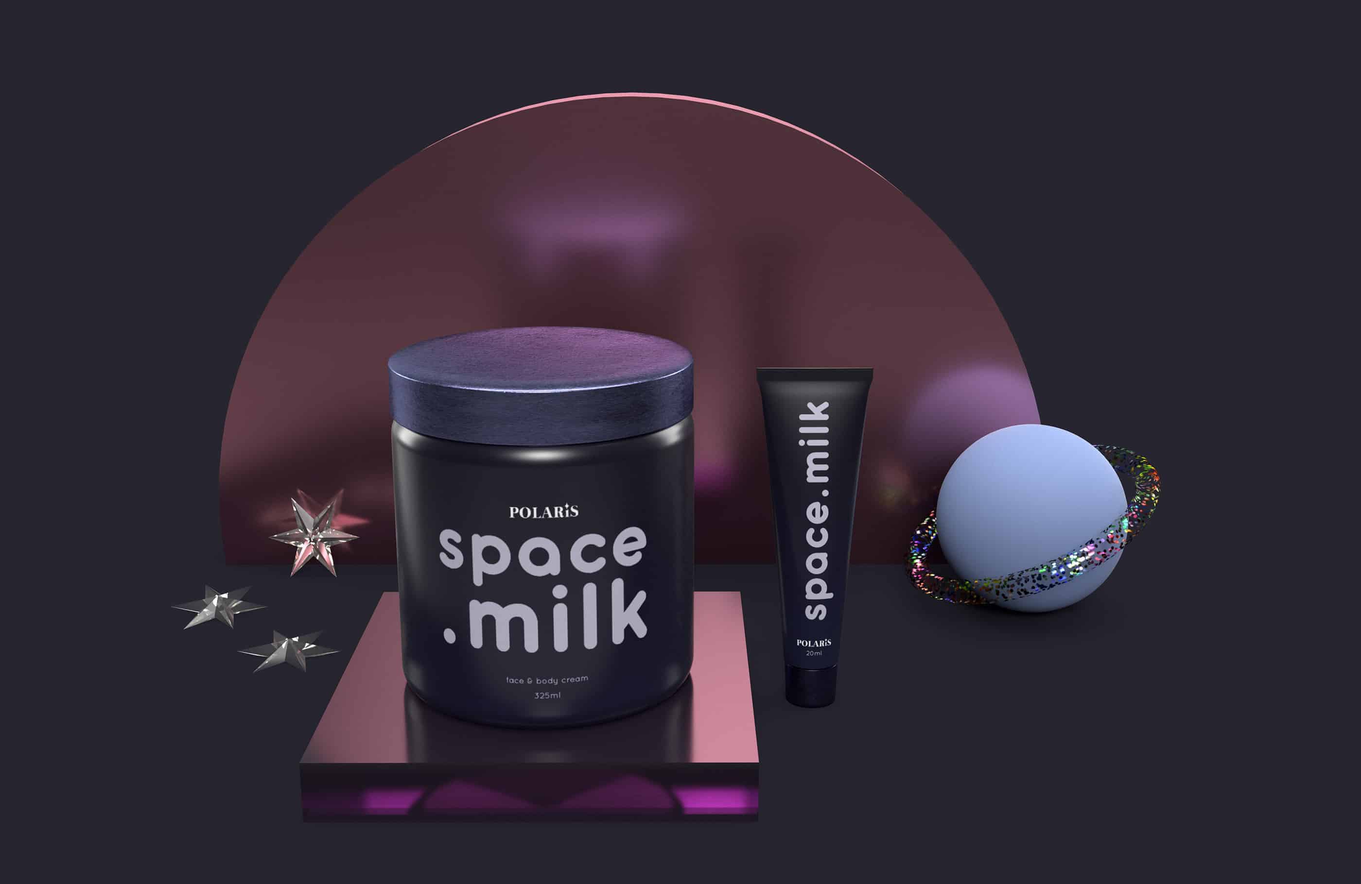
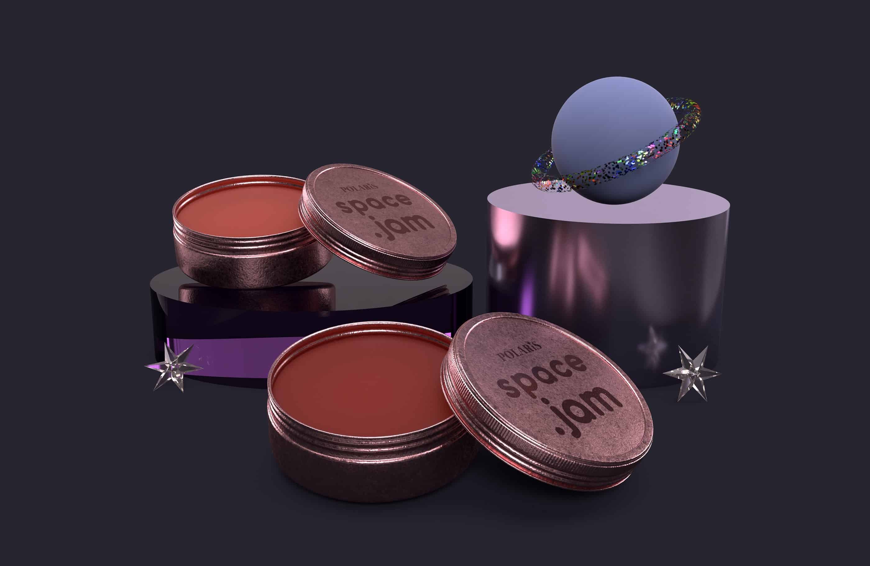
Polaris, also known as The North Star, is the brightest star in the Ursa Minor constellation. With the ever-growing beauty industry across the world, Polaris Beauty promises celestial beauty and "to glow like the stars" with its impressive line of skin care and cosmetic products.
Being a consumer as well as a Graphic Designer, I've always known I wanted to make a personal project on a beauty line. For the longest time, the lingering question in my head was: "What kind of look and feel would it have?". There are already hundreds, if not thousands, available brands in the market - how would I make mine stand out?
The space theme idea came up to me while I was playing around with the available materials on Dimension.
I wanted to play up on the idea of it being in an out-of-this world set-up. At the same time, I wanted it to be the opposite of my previous dog treats project, Treatz, which was all bright colors.
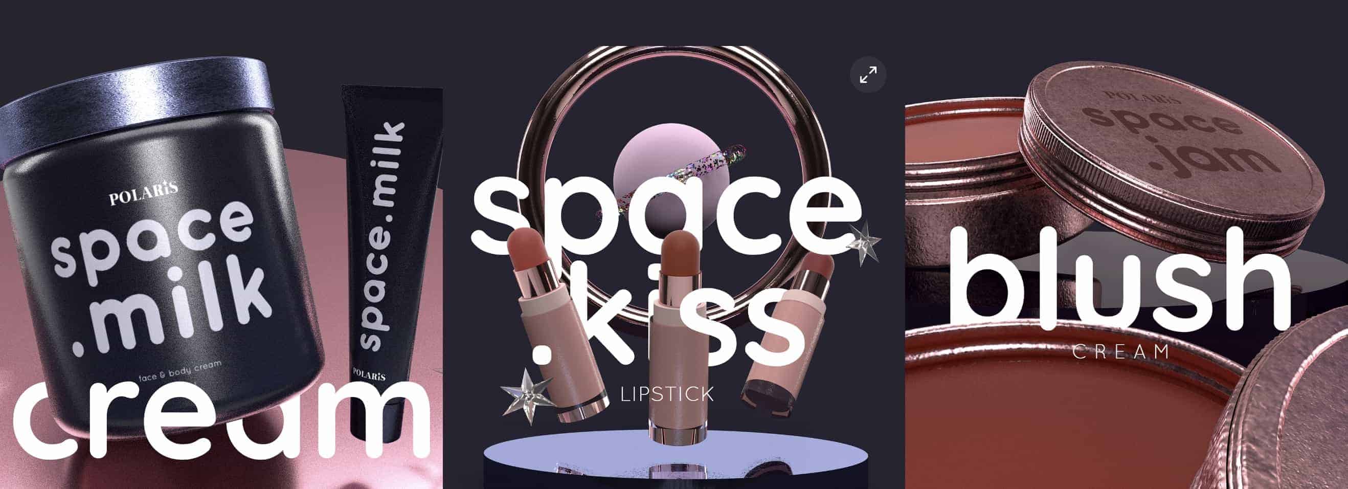
As I was doing my research, it dawned on me that I wanted my line to follow a theme and have it reflect across all products hence the word "space" before each assigned name; "space.milk", "space.kiss", and "space.jam". Milk for the main component of the moisturizer, jam for the similarity of the product to its namesake, and kiss because, well, it's a lipstick.
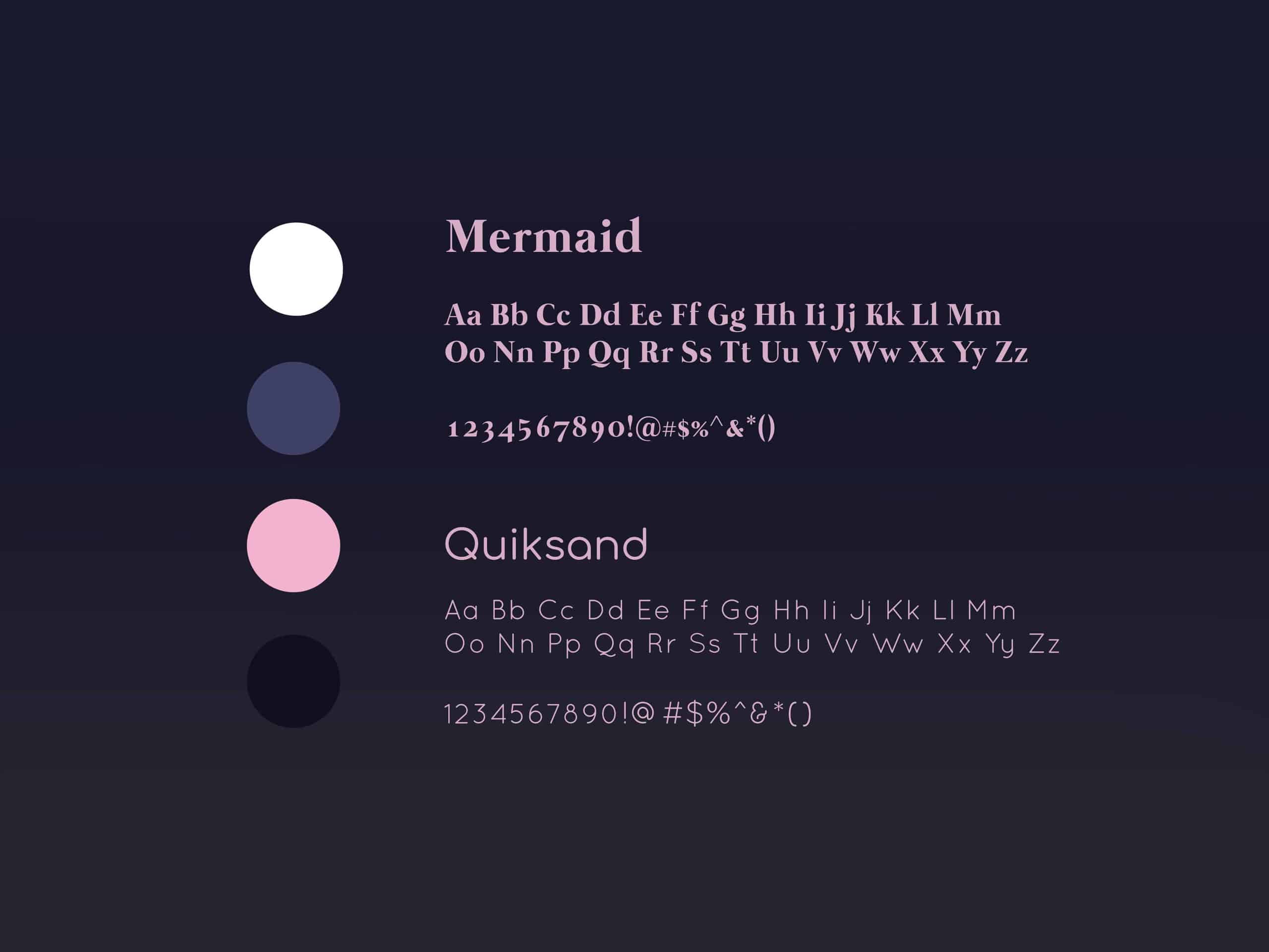
The main tools I used for this project were Adobe Photoshop and Adobe Dimension. Before I had something to work with it, I was just casually playing around with the latter mentioned software. I was amazed with its features and materials - plus, it's easy to use! That's coming from me, a 3D software noob.
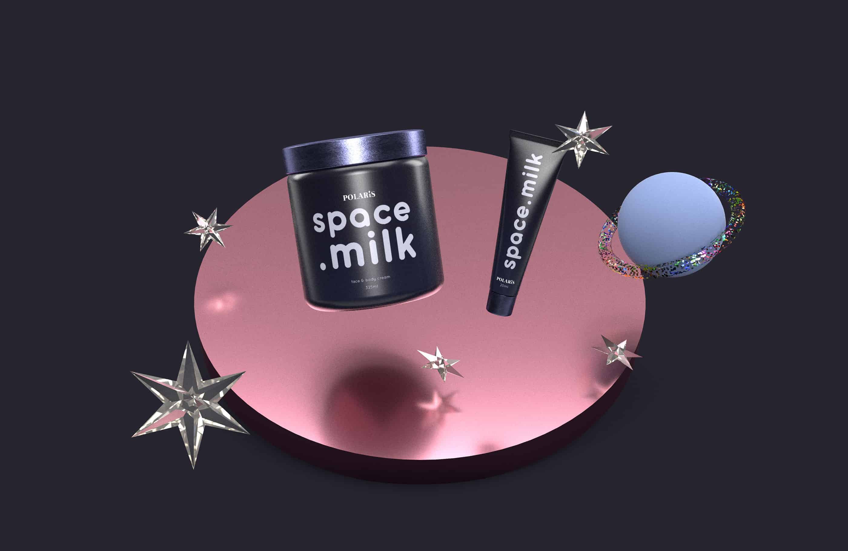
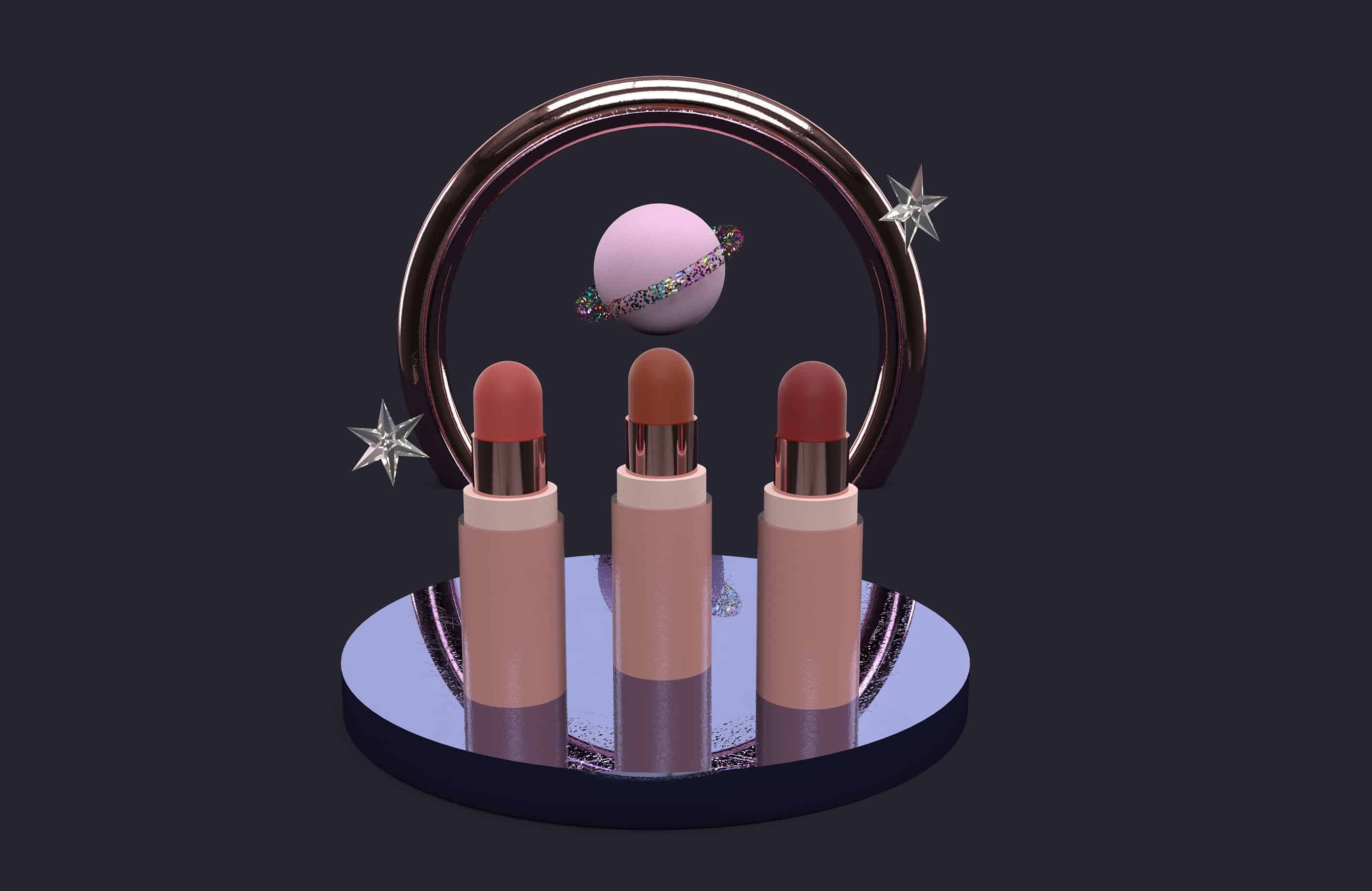
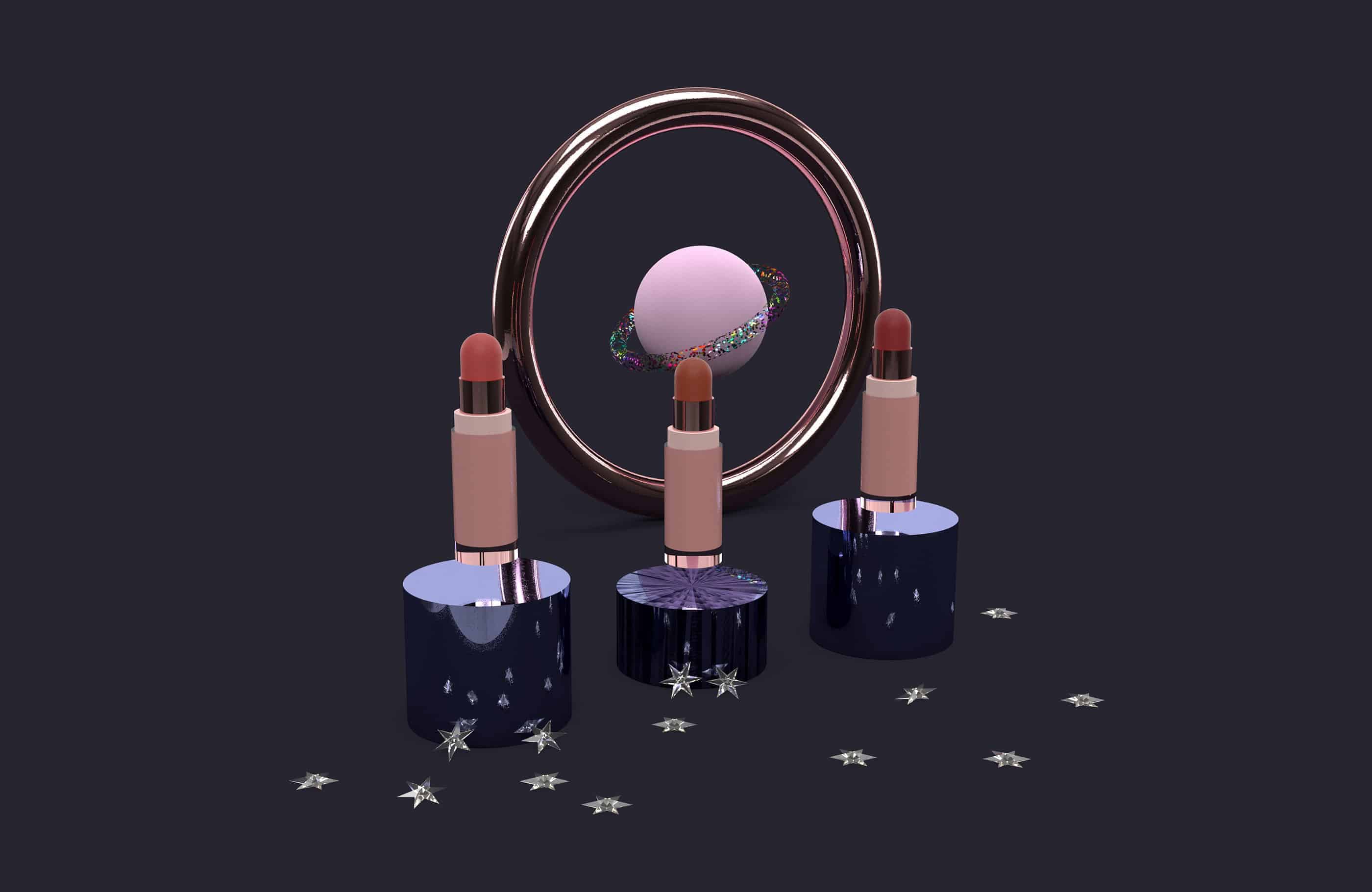
Polaris Beauty is more of a visual experimentation rather than a branding project which is why it focuses on more on the products and the visual elements.
A lot of ideas don't bloom naturally - it needs a little bit of nudging and lots of effort.