


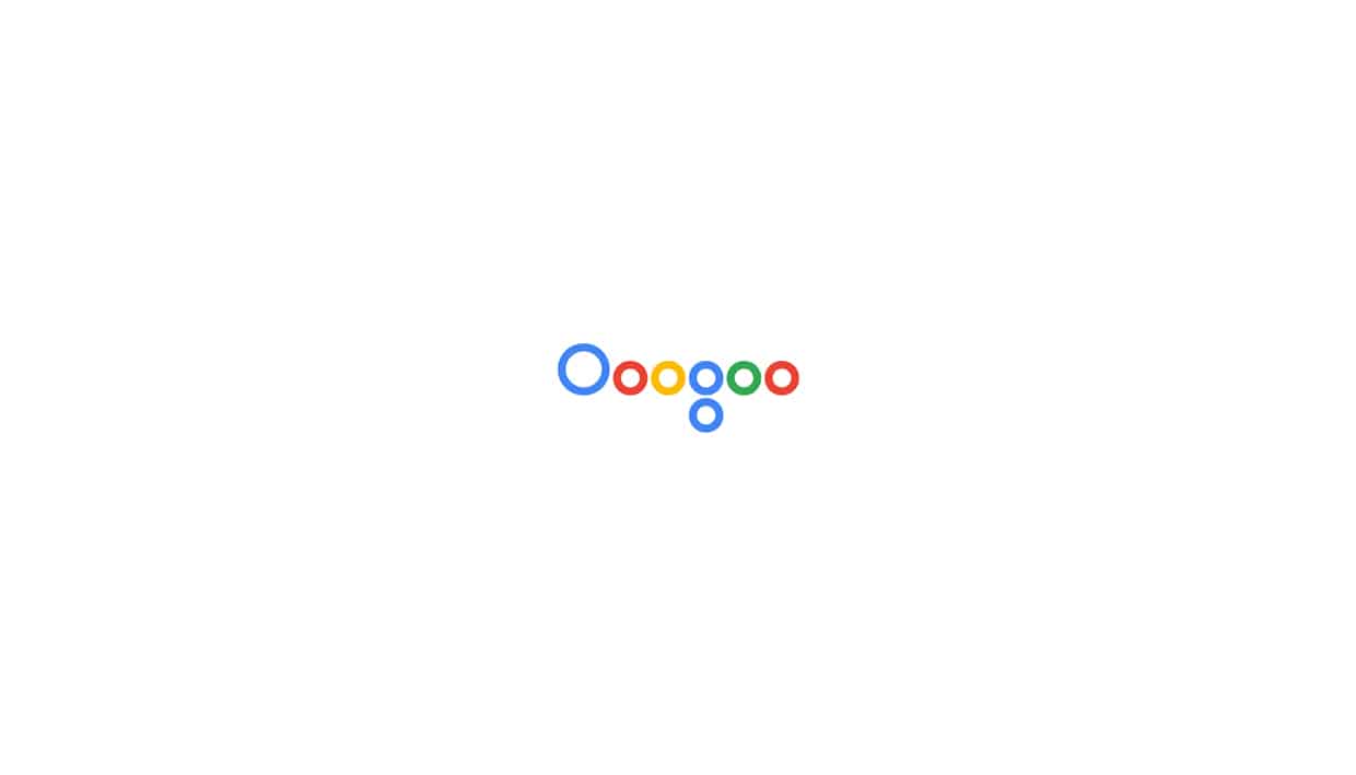
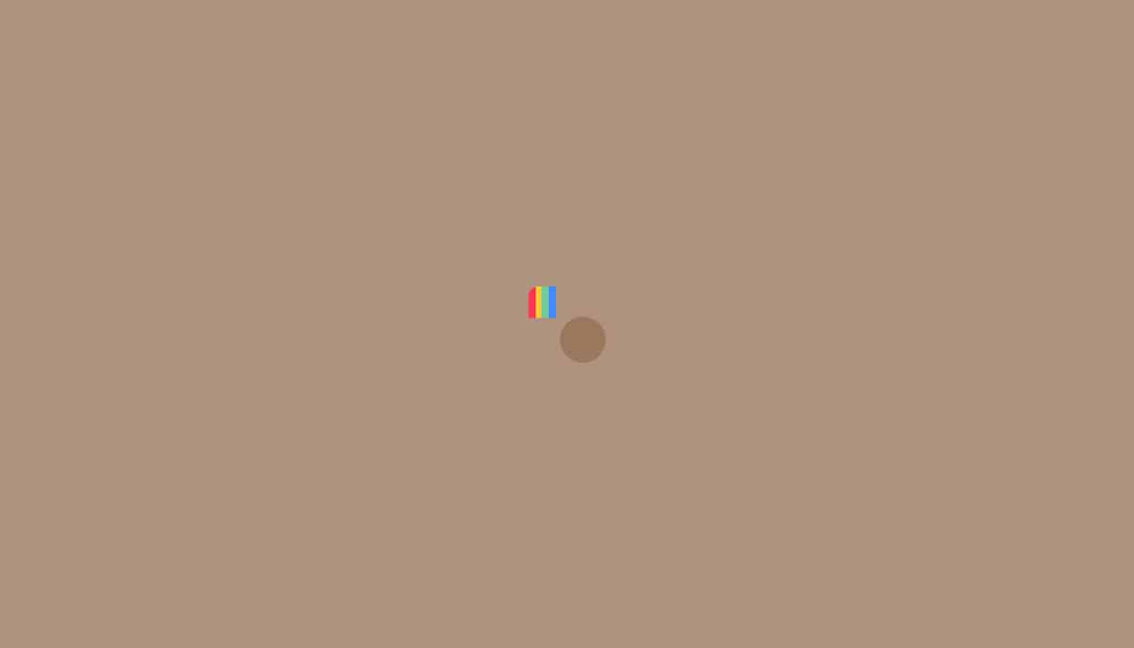
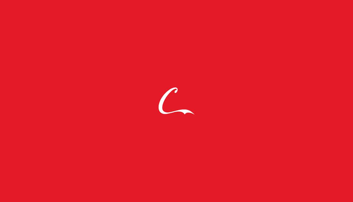
In this personal project of Graphic Designer Pedro Almeida, he wanted to promote the importance of visual communication and showing that having a logo/brand identity is extremely important if you want to start a business. As you will see, Pedro only used the logo's main colors and unique lines and shapes, yet, you can still recognize which brand it is.


I wanted to emphasize the value of creating a logo that would leave a memorable impression. I took this project as a challenge and also to demonstrate and practice my graphic design and marketing experience, making people recognize a brand with only showcasing it's simple lines/forms and logo's main colors.
-Pedro Almeida


To make this specific project, I got inspired by the brands I showcased and their unique impressions/looks.I got into this field because I loved how some creative agencies approached their graphic design skills, by keeping it simple. And simple does not mean it's easy. I think that making something simple and at the same time beautiful that works, is so smart/clever and interesting. And I knew this was the style I wanted to implement in my graphic design skills, because it is the right style, it is the style that society needs.
-Pedro Almeida

I can't exactly say by who I get inspired but, besides creative agencies/studios works like: FocusLab, Anagrama, RoAndCo Studio, Firmalt, Studio-JQ and many, many others, I get inspired by simplicity and modernism, which means objects, things or/and infrastructure, architecture that I find beautiful and pleasant to see/watch/stare at.
-Pedro Almeida
Read, follow and learn from those who are/have been successful, to keep updated from the visual communication evolution. Because think of this way, who contributes on the evolution of visual communication? I give you google as an example: 15 years ago, Google's logo had that fancy, curved, glassy, shiny with drop shadow typeface look. And today, is "just" a flat typeface. Who was the guy, that came in and said: "Hey look, this(past) design is not going to work anymore, this(now) is better."Who was responsible for this and many other evolution in graphic design? Simple is better, that is the answer. Studies and research shows that our eyes/brain enjoys simple things because, we don't have to make much/any effort to understand it and that is pleasant and clever/smart.
-Pedro Almeida


So, if you find something that is simple, beautiful and works, it's better. If you find a way to improve this thing, show it to the world because you are contributing to the future of visual communication or anything else.
-Pedro Almeida


About Pedro Almeida
Born in Brasil, been in France (3 years) and currently living in Lisbon, Portugal, Pedro Fonseca Almeida is a self-taught graphic and web designer along with marketing, specialized on brand identity development. Being passionate about what he does, he wants to contribute to visual communication evolution/development in society. Pedro Almeida also focuses on marketing for the reason that, in order to make design efficient, you have to invest on marketing and vice versa. Pedro wants to build brands and communicate it's values. See more of his works on Behance.