Shimada Corporation CI by Masaomi Fujita

Shimada Corporation Ltd is an old firm established in 1921 and based in Nishiyodogawa-ku Osaka city that sells furniture materials and interior materials, as well as makes furniture. In response to the company’s consultation regarding CI renewal upon the office relocation, Masaomi Fujita, a talented designer from Japan, established CI and a guideline for use of it and designed signatures and business cards. Read on and enjoy!
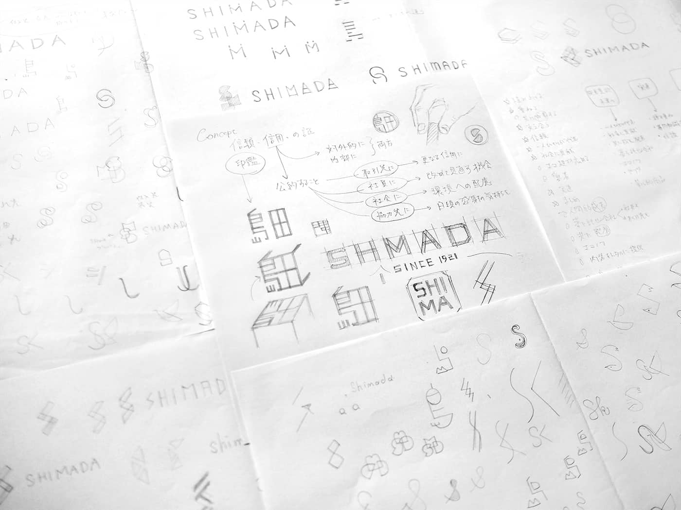
I inspired by the company’s following three policies (summary).
1) Provide every employee with a feeling of happiness.
2) Grow with customers and affiliates to offer innovative services.
3) Always contribute to society.
These reflect the president’s honest personality and company-wide sincere attitude, which led us to the key words including “confidence”, “conscientious”, “partnership”, “history and tradition” and “experience.” Based on these key words, two specific motifs were embedded into the identity of design.- Masaomi Fujita
![]()
![]()
Process:
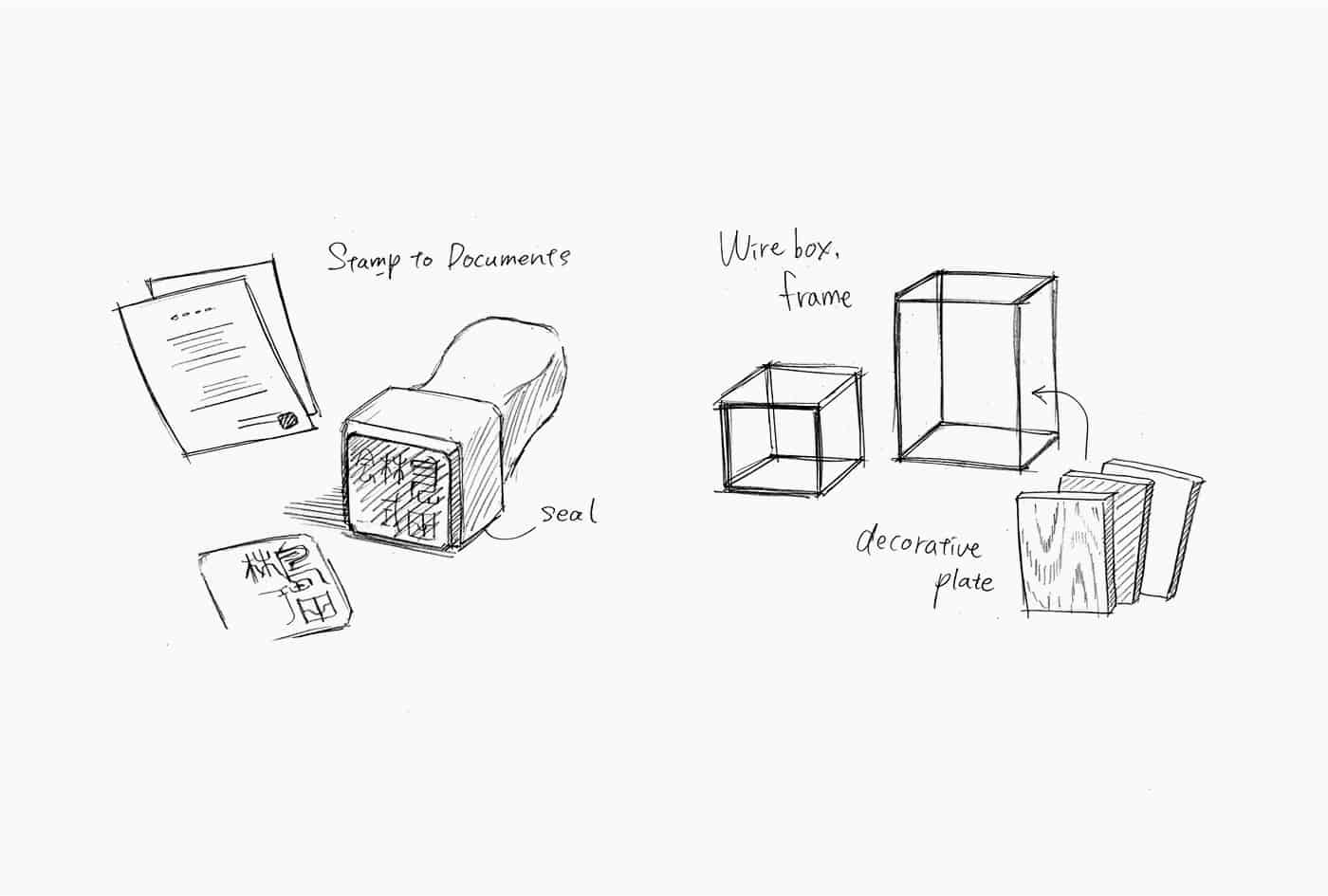
First is “seal and signature.” As is called “Hanko (seal) society”, Japan has traditionally used a seal to express that a document, both business and public, or a bankbook is authorized. Thus, a seal can be said as a symbol of “credit” and “trust”. This inspired us to design Shimada’s succession of almost 100-year history and determination to achieve the three policies with a forward-looking attitude in the motif of a seal.
Second is “a structural object such as box or frame“. I chose frames and white boxes subject to design, because these are associated with an idea that decorative laminate and furniture materials offer “new value” and “colors” to a space or décor, and that motif suggests that the company “quickens something incomplete”. The symbol I created consists of the combination of the above and arranged Chinese characters for “Shimada” (島田)- Masaomi Fujita
OLYMPUS DIGITAL CAMERA
![]()
The logo forms an impression of a square seal, a typical shape of corporate seals, having all characters including alphabets fit inside the square. The guideline specifies the margins to be secured when the logo is used and all samples of color patterns to be used other than its basic color, to unify the corporate image. And I used Illustrator, Photoshop.
- Masaomi Fujita
![]()
![]()
I wanted to value the nearly 100 years history of Shimada corporation. Therefore, I decided to transform the Chinese character to universal simple form. Firstly, I made some logo designs for this project. After that, I brushed up one design which was selected by client. That's why I didn't revision the logo design.
- Masaomi Fujita
![]()
![]()
![]()
Masaomi Fujita
Masaomi Fujita has graduated from the Faculty of Design of Shizuoka University of Art and Culture, engaged in planning, editing and directing for several years. He reinvented himself as a designer and worked in an advertising production company as a design and art director for cosmetics, fashion and magazines. You can find more of his works on his Behance profile or website.