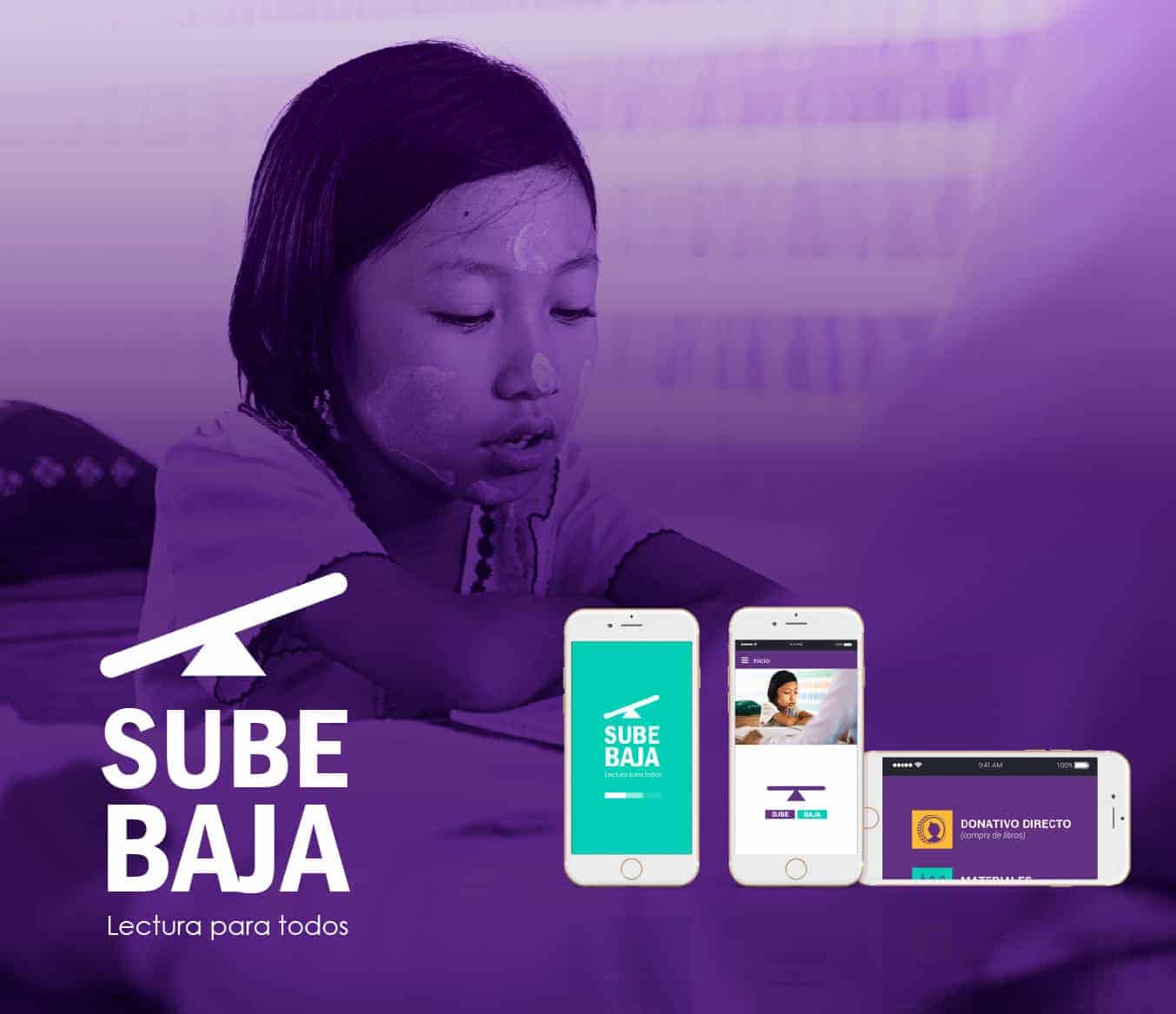
SUBE BAJA "READ OUT FOR ALL" / APP Social
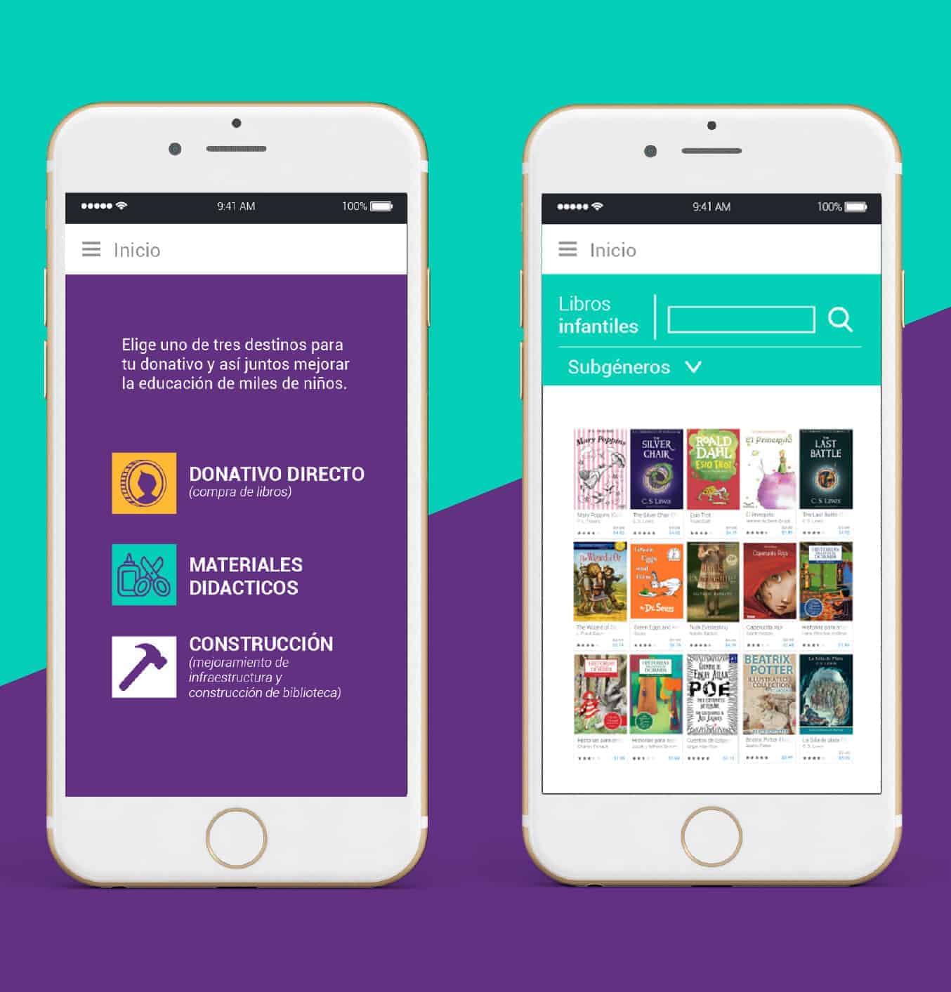
SUBE BAJA is an APP designed to create a balance in public education, since in places of low resources is limited or not available. Create spreads like libraries, educational centers and improvements in them. In this application you can donate directly from an amount of $ 5 or buy packages of materials; The other way is to buy books or download free books.
It was for a project of some of the subjects of my university, we had to create a social APP, which could help people. In my case I have always been outraged by the lack of quality education in public schools and the lack of support they give them; Apart from the poor infrastructure of the schools and also that there are those who have never had the opportunity to study.
Then I thought that the APP could be a way for people to donate either money, educational materials (specific contribution) or resources to build schools and libraries (specific contribution)
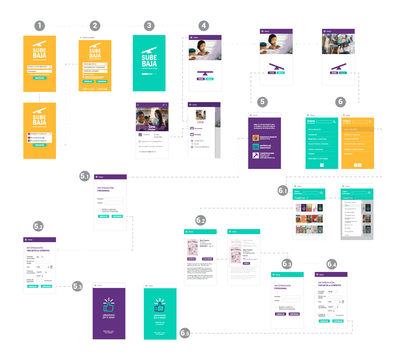
First I had to think as an official, how many windows would have and that in turn you could not only donate, but buy (this would also be a way to donate) and download books, and accept a free library where you could enter or save books that You have bought; Creating your user account.
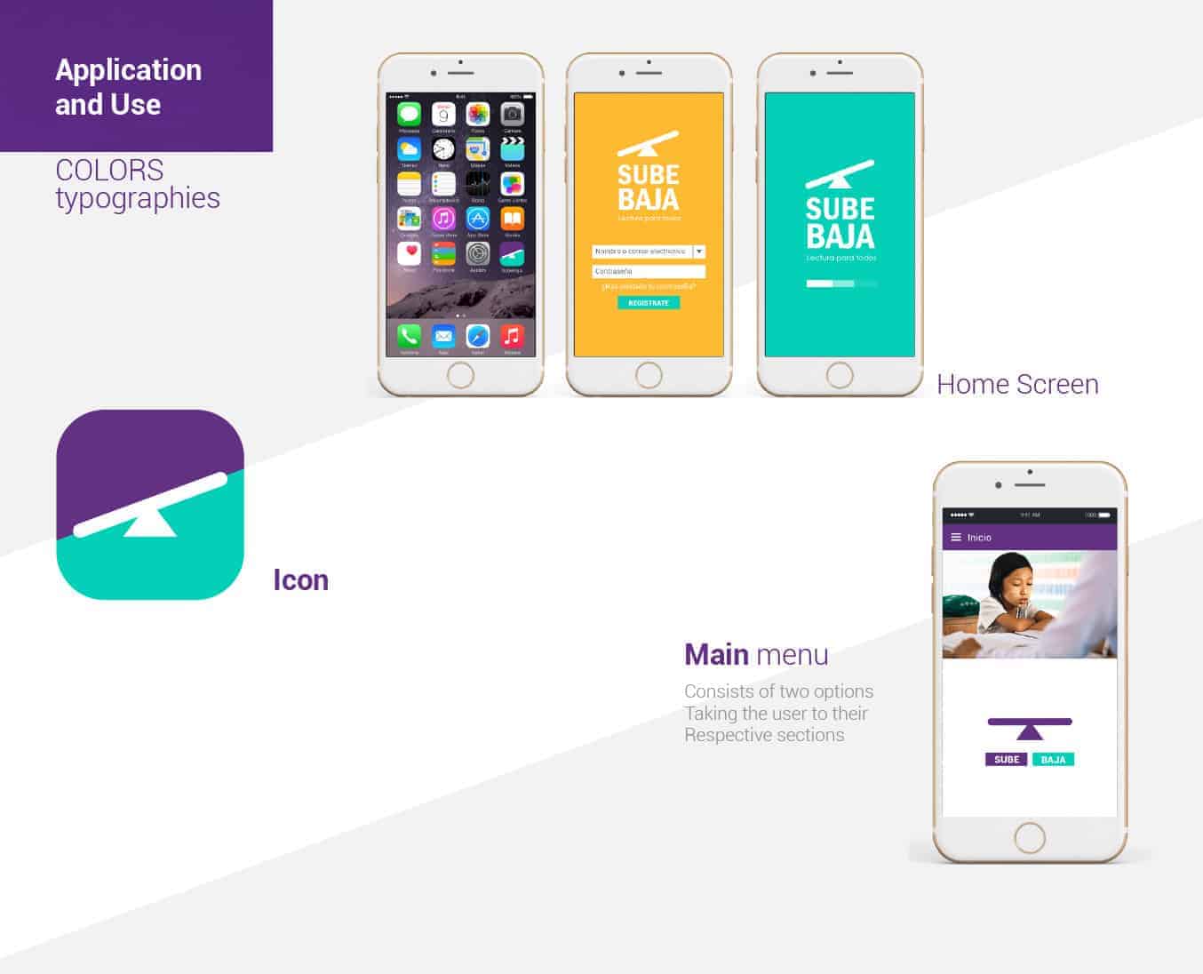
Once you have established the operation of the APP, proceed to create the name of the APP; Which came to be UP LOW, game in which is played between two persons or children; Where the fun is when they manage together to maintain a balance of the weight allowing both of them not to touch the ground.
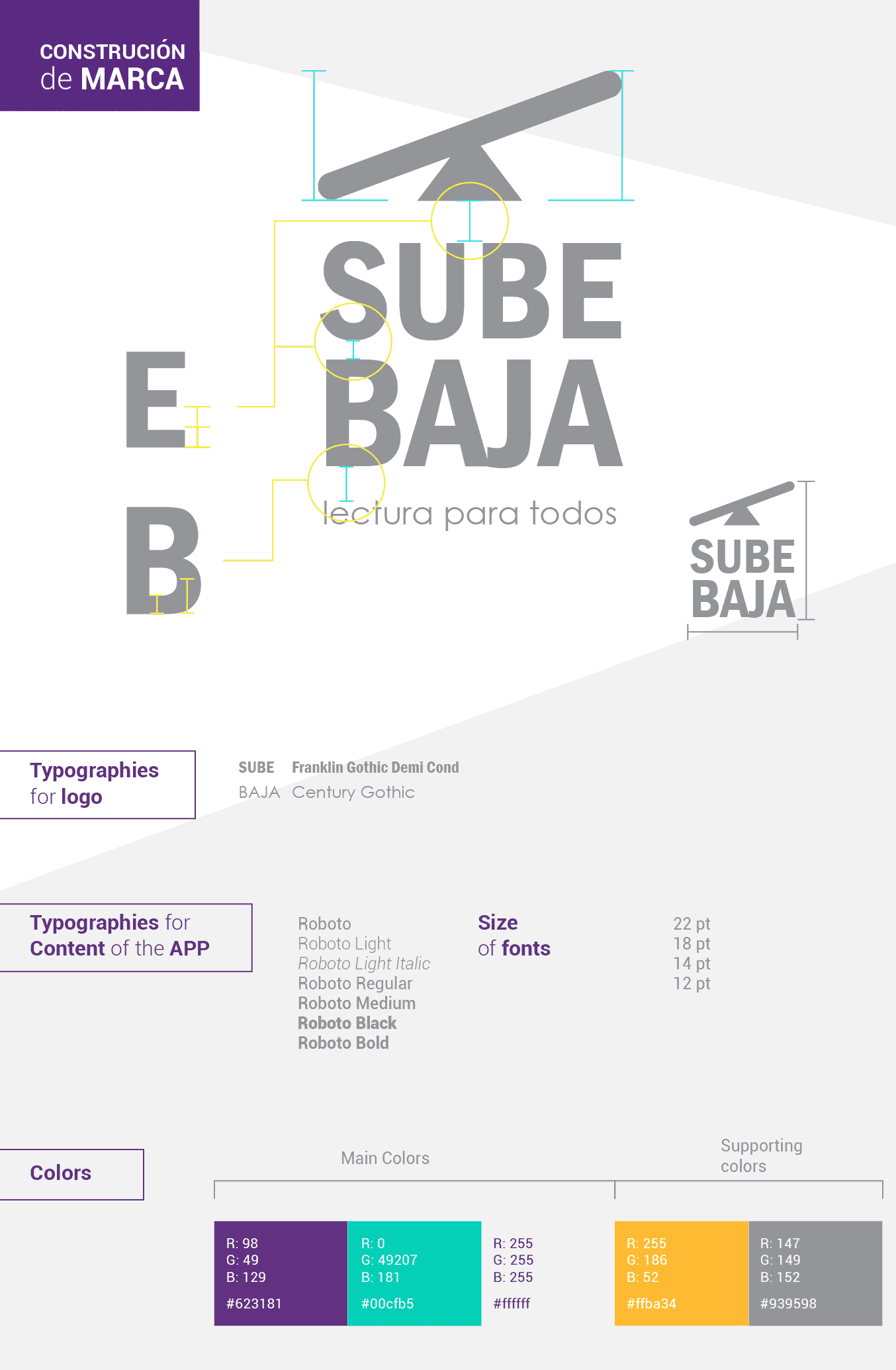
The colors used were violet, turquoise and white as the main ones; Yellow as complementary color. All these colors give dynamism and balance in each of the sections of the APP
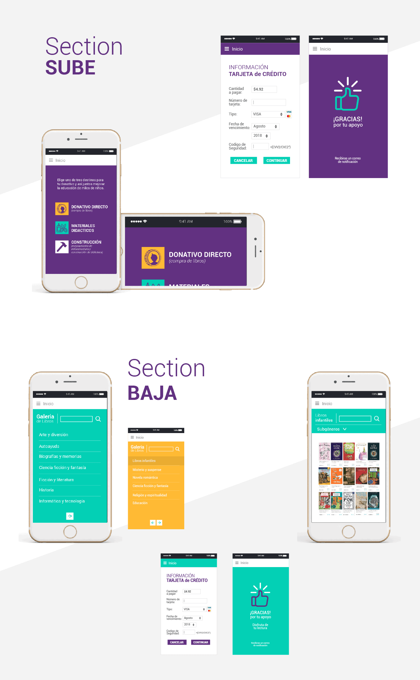
For example in the Sube Section (where you make direct donation)
The predominant color is the violet having as secondary the turquoise and complementary color the yellow in the menu.
In the Lower Section, you can download books and guards to your account and you can also buy
The turquoise color takes center stage, having yellow support in book gallery, to give a touch of dynamism.
Roboto was the typography used for the texts of the APP
Roboto Regular 18pt
Roboto Bold 14pt
Roboto Light Italic 12pt
Create the graphic line of the APP and its logo and photograph, use Adobe ilustrator
First create the sketches of each of the windows of the APP, as it would be entered whether or not with an account or were new, both the design of the login and each of the windows were thought to be totally minimalist without so much detail to Not to lose the user.
Already after creating the map of navigation of the application, and the sketch of each window and logo to design in Illustrator and to give color.

The people who have so far been aware of this project have drawn their attention and hope that it can bring it to reality. For me it was a wonderful experience to see that the design can not only be commercial, but also social; In my case having worked in an O.N.G helped me to realize the reality of my country and that through my career I can make a change, motivate others to want to help those who do not have the same opportunities. Apart from that I have seen first hand by my adopted family as they have supported me in my race and in my dreams; So why can not I help others to have a better education and have the same opportunities as me to have a good education and have access to it. As well as the slogan "Reading for all" we all have the same rights regardless of your social status.