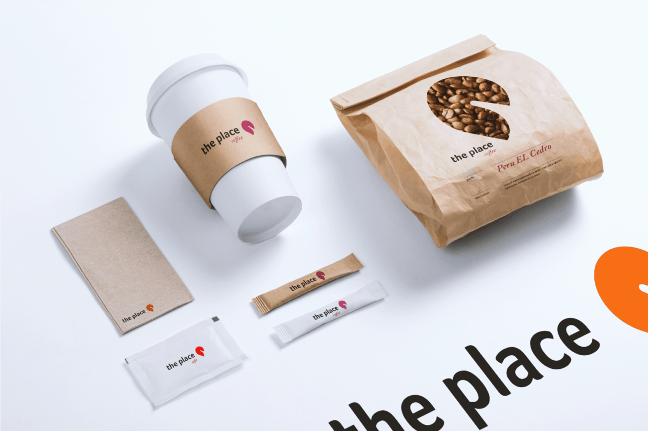
the place - a restaurant in the city Innopolis.
A bit about the city: Innopolis - a new city in Russia, located in the Republic of Tatarstan. The city's economy is based on high-tech industries. The Innopolis has created a unique urban environment with a modern residential infrastructure, the environment, secure environment, ample opportunities for education and professional development.
Why this place?
Because this is the place that combine the coffee shop, a restaurant, a coffee shop, a bakery, and a hookah.
All in one place - the place.


The basis was taken the visual image of the place, location and combined with the letter P - place.
A primary color orange, because:
- By itself, a warm color, also represents the brand as a friendly,
confident and at the same time without excessive severity, shall we say "easy to talk"
- The marketing is considered that represents a call to action:
come, buy, subscribe.
- Well, if we consider the human chakra, orange is - sacred,
it is associated with creativity and fun.
- And such common characteristics as comfort, a little playfulness, determination.


I naturally started with paper and pencil. And then of course I used adobe illustrator, already to paint and building proportions.
But I've not lined proportion initially, as it will then have just tinkering.
Because I believe that the basis of ideal proportions is our soul.


People respond positively while only and it is very good because the restaurant opens in the city Innopolis. And this is the first Russian city built in the 21st century, it is a modern and technological requirements so high there. And to participate in this, though indirectly it is important for me.
I just want to say thank you and express my sincere gratitude to all, because for me the recognition of my projects - is the most important! It motivates me and gives me the confidence to do even better.
Become a great designer - my goal in life. Thank you all.