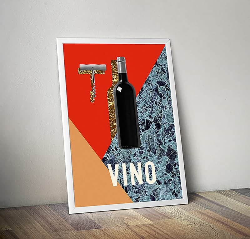
Vino, Italian or Spanish for "wine." The bold colors and symbols attempt to summon recollections of a common experience pertaining to the subject matter; stark iconography directs the viewer to an examination of memories and the powerful associations of a near-universal image.


Here I attempted to reconcile my memories of an image with my current perception of the same imagery. Presence is molded by memory; we make maps with our minds, geographically, ideologically, conceptually, constantly. That is my experience of consciousness. In Vino, I draw upon what’s left of my first impressions and associations of wine. I tried to illustrate the evolution of the abstract in my consciousness using simple textures. It would be easy to call these textures are evocative, but I can never control what they evoke in others; my intention is not to evoke something in others but to expose something in myself.


I used Adobe Illustrator and Adobe Photoshop to create the artwork. First, I compiled the materials such as the texture/pattern photos and color palette. I used Adobe Illustrator to create the artwork and then Adobe Photoshop to construct the mockups.

I didn't submit this piece because of anything somebody said. Praise has been sparse; people have called it "aesthetically pleasing." For some reason, I like it a lot. I made the piece quickly and I believe I learned something about working with constraints and limitations as a source for inspiration and a more visceral creative process.