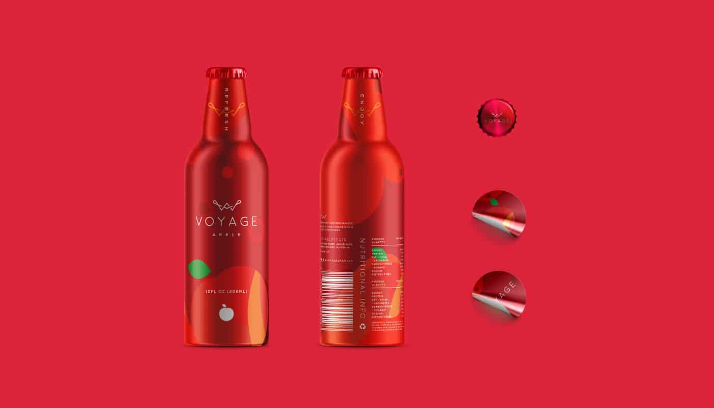
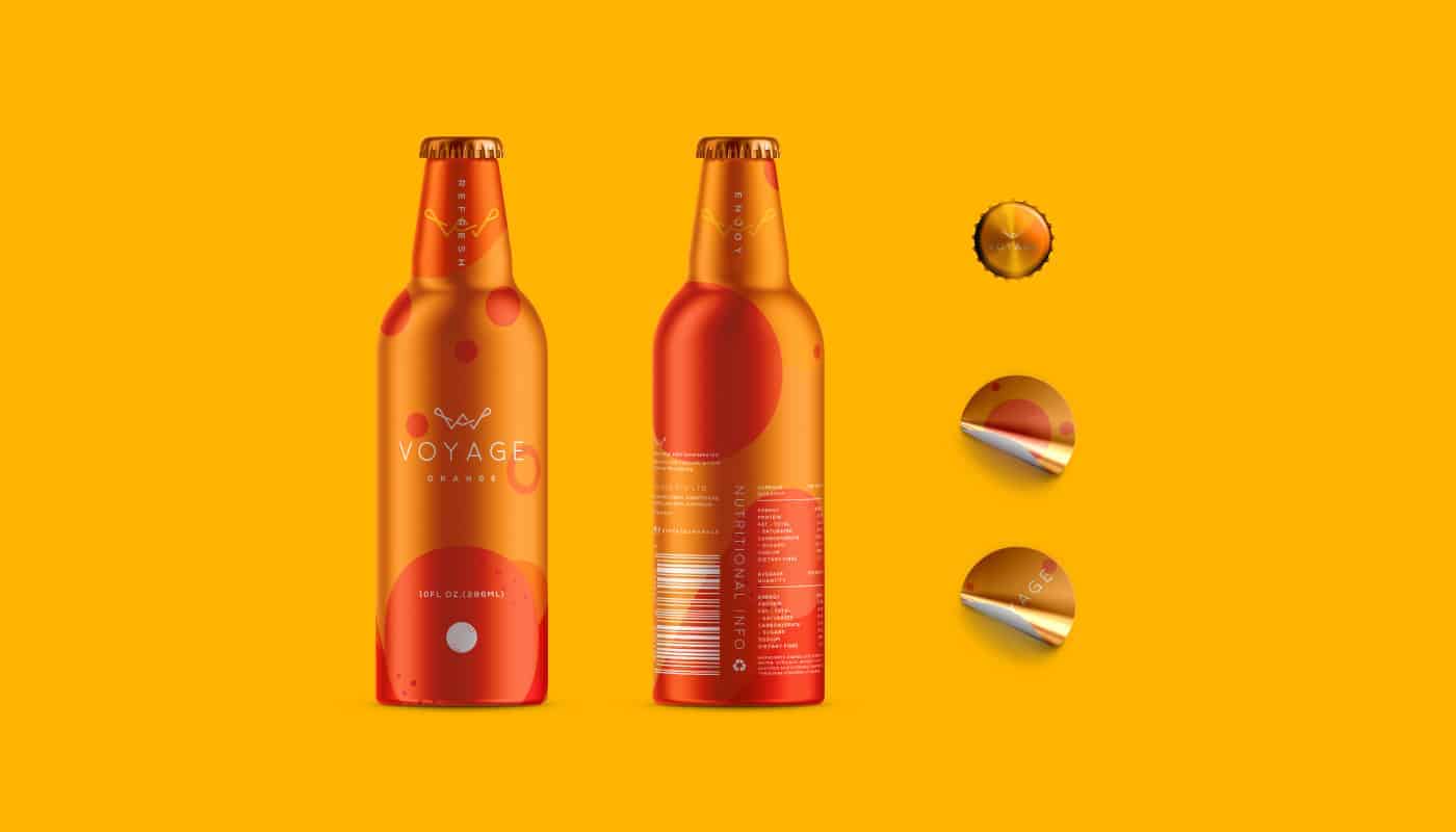
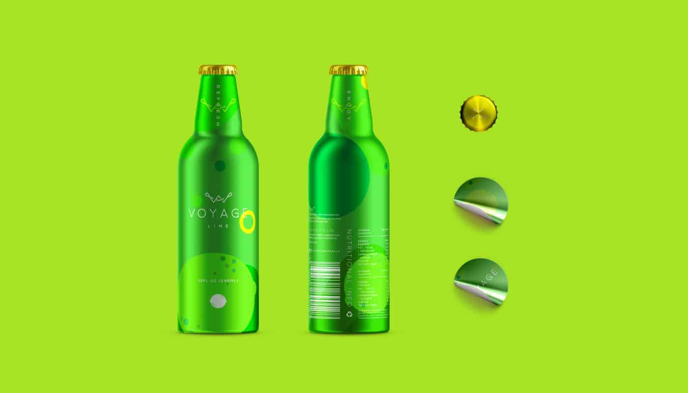
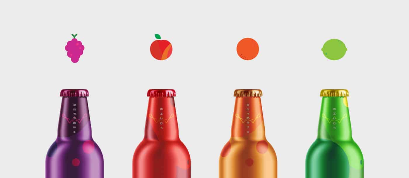
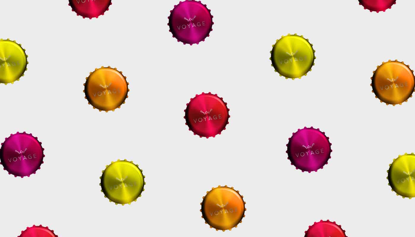
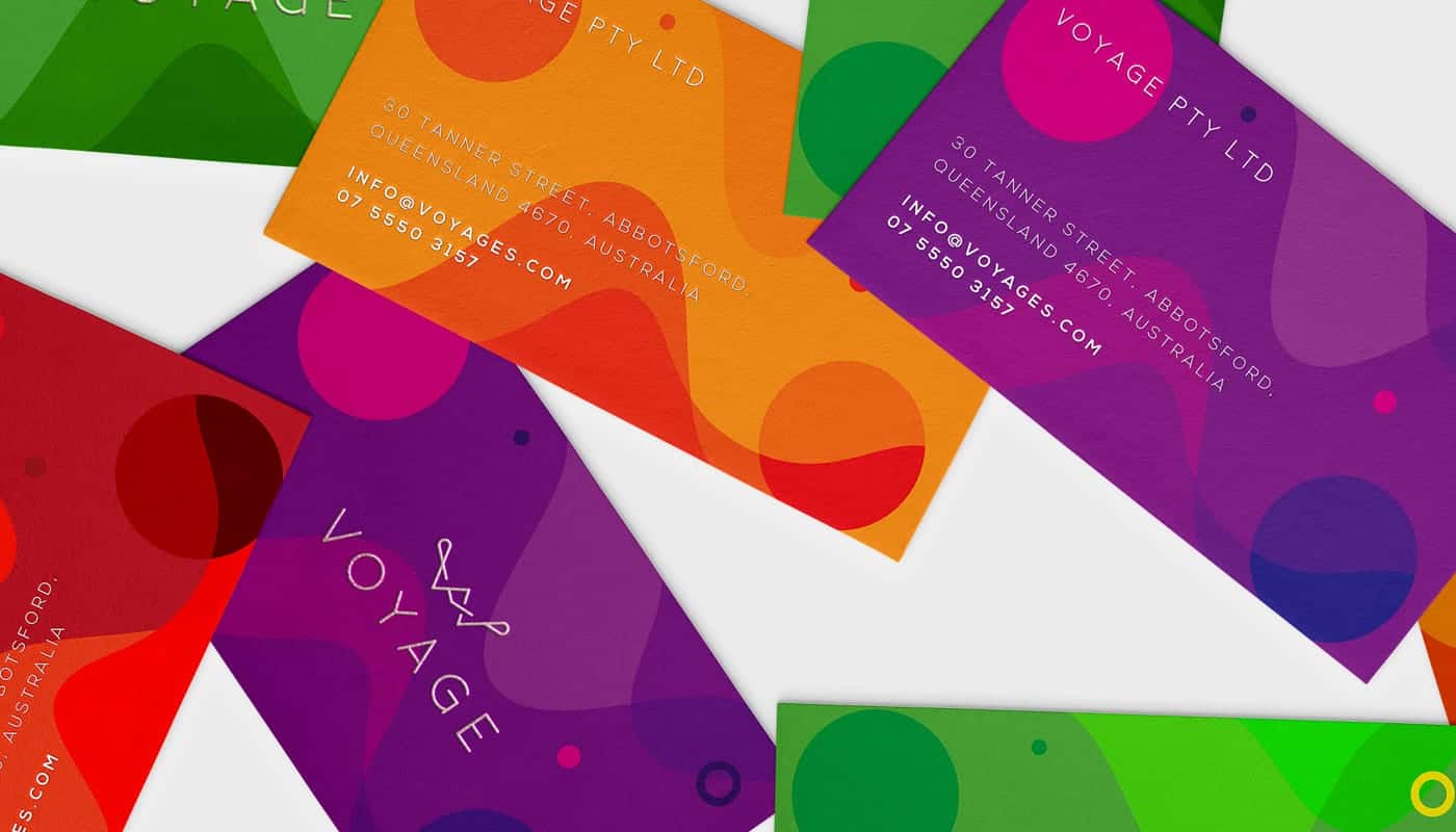
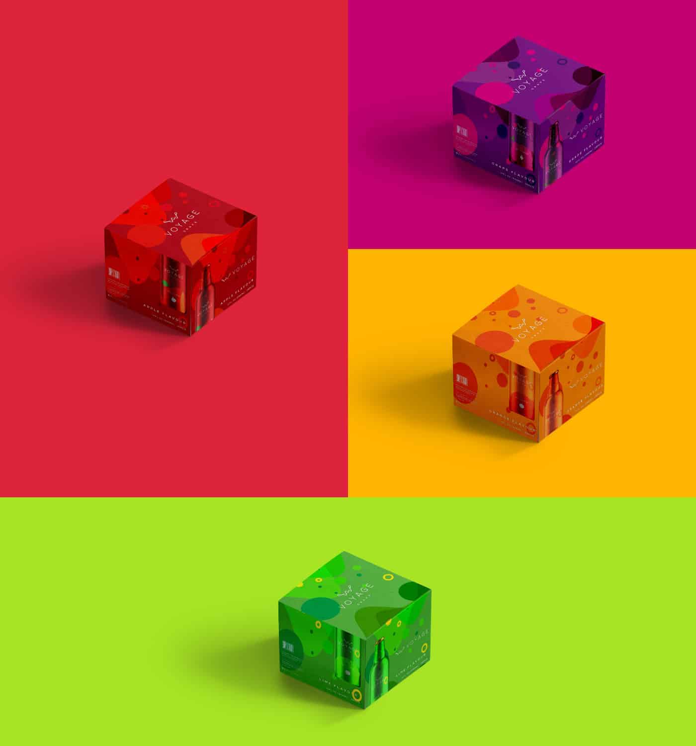
"Voyage" is a brand design and packaging for a sparkling juice beverage. The loud vibrant use of colors is employed in this design to make the brand bigger than life to enhance the flavors of the product. The colors are also used to help consumers to identify the respective flavors of the brand.
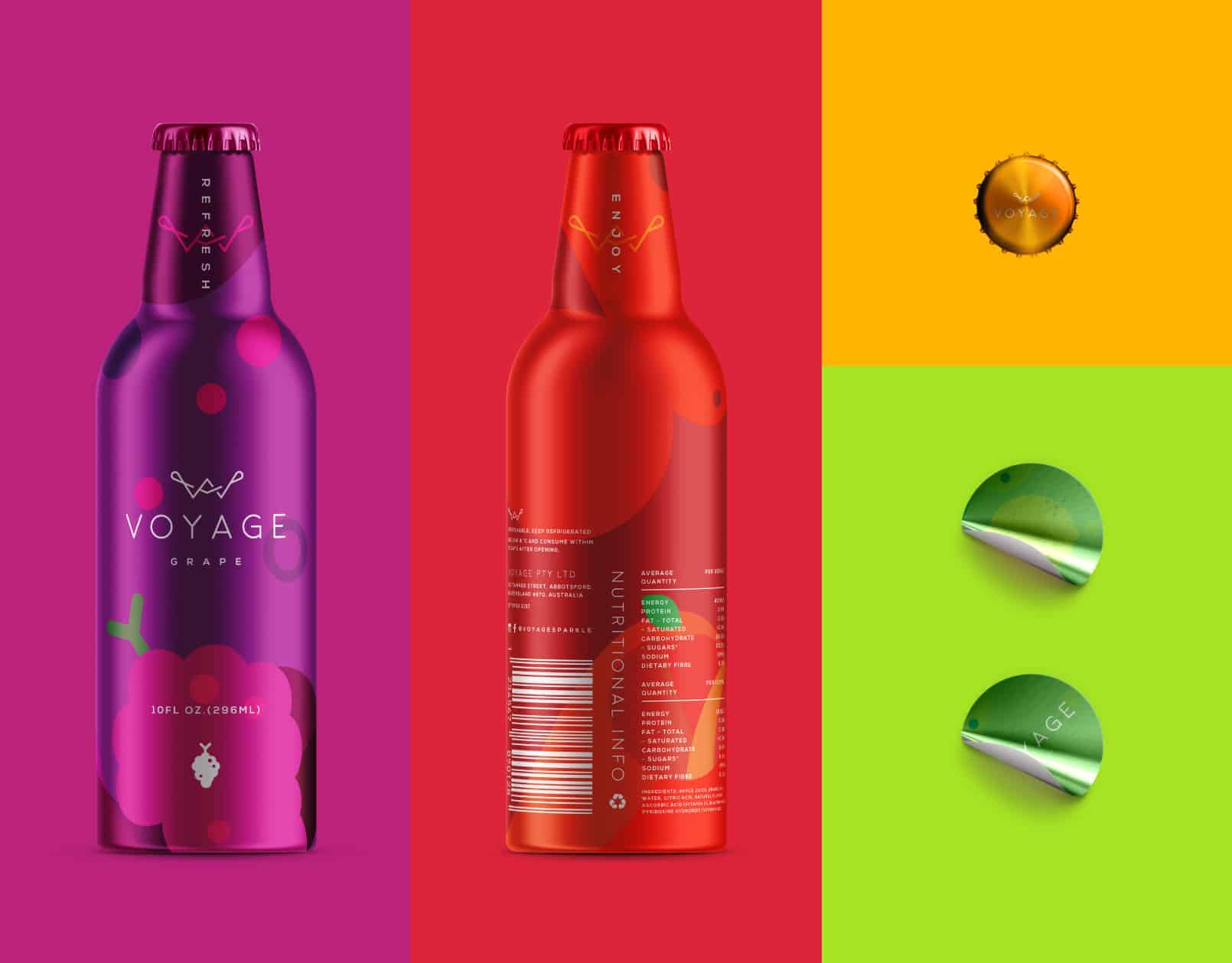
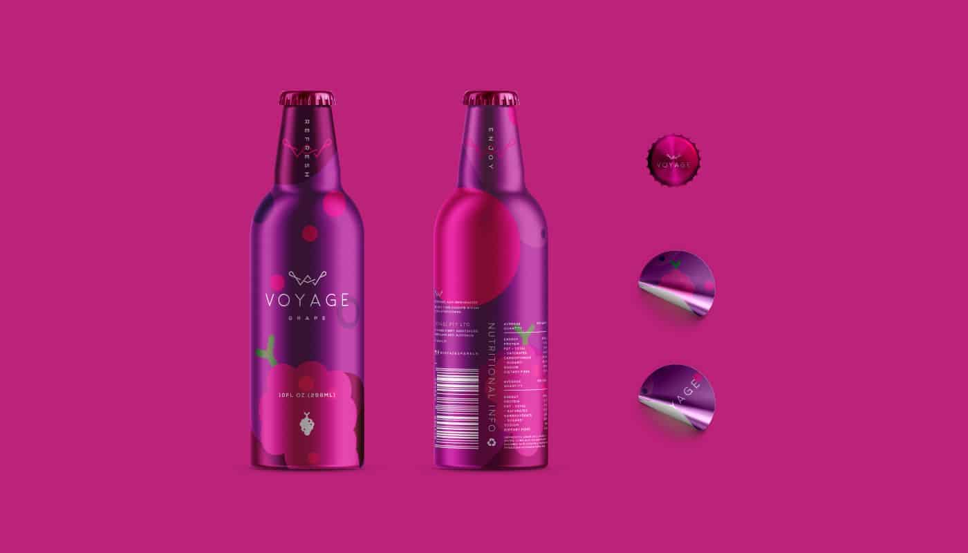
The scope of this project is direct and straightforward, using relative colors of the actual fruit to reflect on its organic qualities to the consumers perspective. This approach is to differentiate from other brands that use actual images of fruits to promote their products. This project is to showcase the importance of appropriating colors and icons in design rather than using informative appeal to the consumers.
I have a habit of sketching out ideas on paper. I always make sure the the idea is intact and precise to guarantee the consistency when it gets to the digital process. Details of colors are adjusted easier when experimenting using Illustrator and Photoshop towards the end
I have always felt that the responses I receive are mainly positive. I do learn that it is important to be personally attentive to the feedback from other designers, especially ones that have constructive opinions. Design is a learning process that never ends and being able to expose my work to similar professionals that take interest in my work is always motivational.