


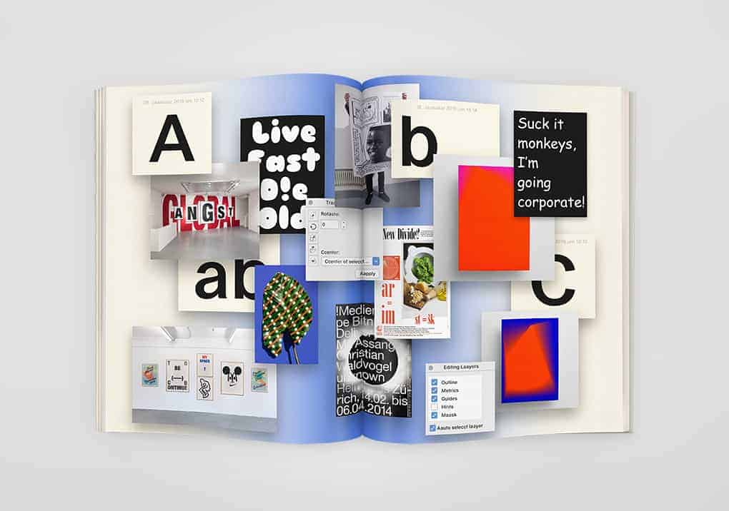
In early 2016 Moby Digg designed the branding of the exhibition "Aabbc" and curated the contemporary works of national and international graphic designers in collaboration with Noëm Held. The exhibition "Aabbc" shows a wide spread of graphical artwork and challenges the borders of art and graphic design. The font was exclusively provided by Dinamo. Works of Eike König, Erik Brandt, Johannes Breyer, Kasper & Florio, Kevin Bray, Linda van Deursen, Lou Buche, Matthias Singer, Maximilian Heitsch, Michiel Schuurman, Mirko Borsche, Noem Held, Public Possession and Sarah Illenberger were exhibited.

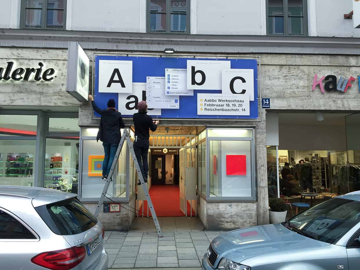
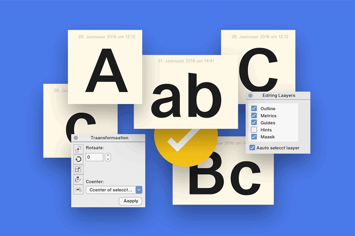
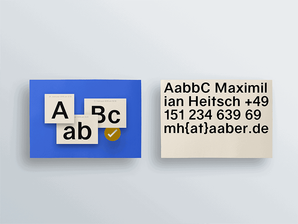
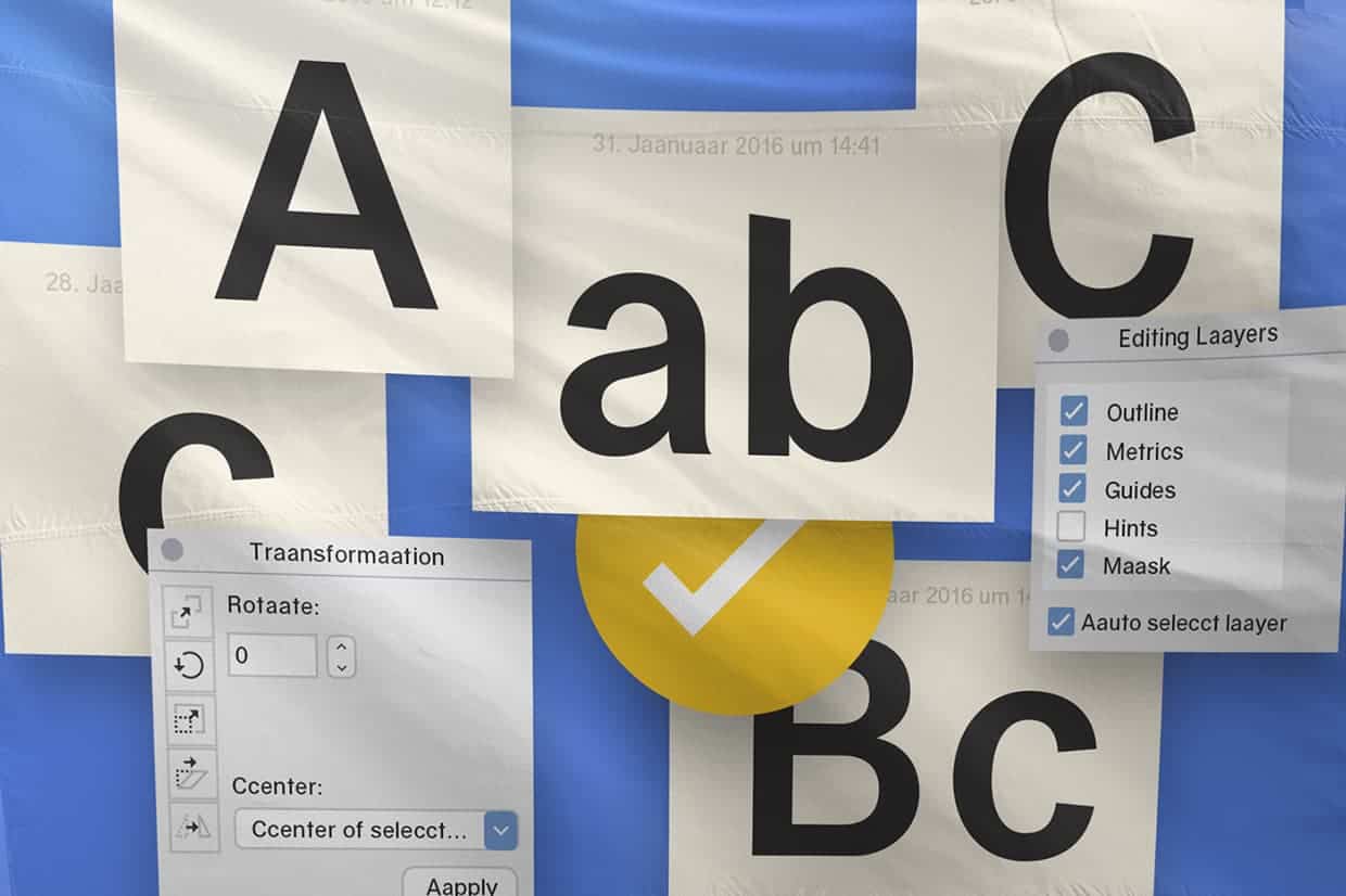
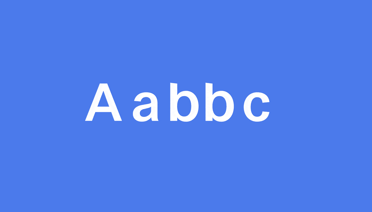
The graphic design and exhibition design was inspired by interfaces of modern desktops. "Aabbc“ stands as a paradigm of a toolkit (the alphabet), a set of elements which can be arranged in new order over and over again to serve its purpose. Once arranged the letters are not seen as individual elements - in fact the combination of them creates a new element on its own. Their true meaning is stated through their final combination.

We use Illustrator, Indesign and Photoshop. First we start with an idea, then sketch it in several variations with Illustrator. Later we bring it all together in Indesign and work on the different layputs. Photoshop is used to give it a final touch.
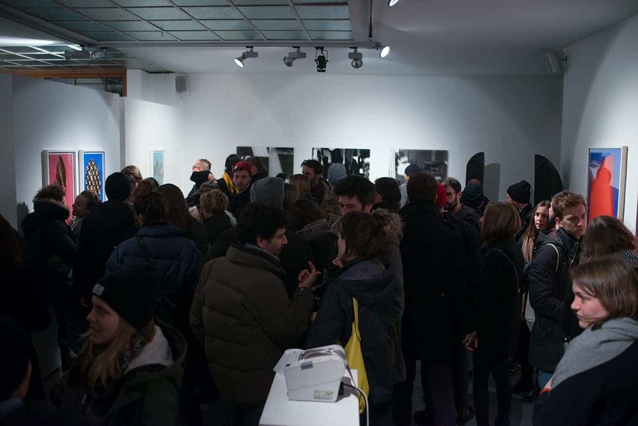
The response was great. The exhibition was a huge success and the concept of bringing art and graphic design together worked out very well. You never stop learning but we had a great time and fun is the key to success.

