


I was contracted to design logo for a coffee shop. The client required the logo to be a minimalist design which depicts the nature of the store as well as represents the initials of his name, hence the name “LC cafe”. For the entire career of mine as a motion graphics & graphic designer, I have been very intrigued by minimalist designs, and it’s only fair to say that minimalist design is my style. So when I was tasked with designing this logo, I was very thrilled to work on the logo design and accomplished the task effortlessly. I must say that the client and I were very happy how the design turned out.


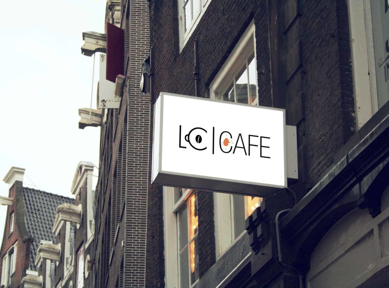
When I initially started collating ideas for the logo, the first thought that crossed my mind was that the logo should represent one thing that people love the most about cafes, ‘Coffee’!!! I began working on the logo with design elements that best-symbolised coffee, and hey guess what? A coffee cup came to my rescue ? so as you can see in the logo, the letter C, which is also the client’s initial was integrated with a symbolic representation of a coffee cup. The hard part was to play with the letters L and C and turn one of the letters into a coffee cup, yet making the letter look like an actual alphabet. I finally chose the letter C and turned it into a coffee cup!
Talking about the colours that I have used for the logo, I chose black, white & orange to keep the logo as simple and eye-catching as possible. Black goes well with all most every colour & you cannot go wrong with black, and as for orange, it stimulates the brain, which increases mental activity and often stirs up a sensation of hunger, the colour orange also makes people feel welcome and when someone is comfortable, eating sounds like a great idea ( The client will be making big bucks, won't he?). I have designed 3 variations of the logo each with different background colour and combination. Fonts that are used are simple and easily readable to everyone. I just wanted the logo to look well put together, I believe I have done justice to the logo.


I fired up Illustrator, set up my document and started working on design elements, choosing the right font for the design elements was a task. Then finally I had 4 designs which I saved them in the black, white and orange background. Then I created cafe signboard mockup with all 4 designs and also the branding so that the client could visually see how the logo appear.
Softwares: Adobe Illustrator CC and Adobe Photoshop CC
Tools: Mostly pen tool


The client Name is Leela Chalikonda. He was more than happy, "looks bloody good" were his exact words when I presented my designs to him.
I followed the most basic rule any designer would follow while designing a logo which is,
1. Discuss
2. Research
3. Brainstorm
4. Sketch and ideas
5. Rough design
6. Feedback
7. Final design and branding.
8. Deliver

