


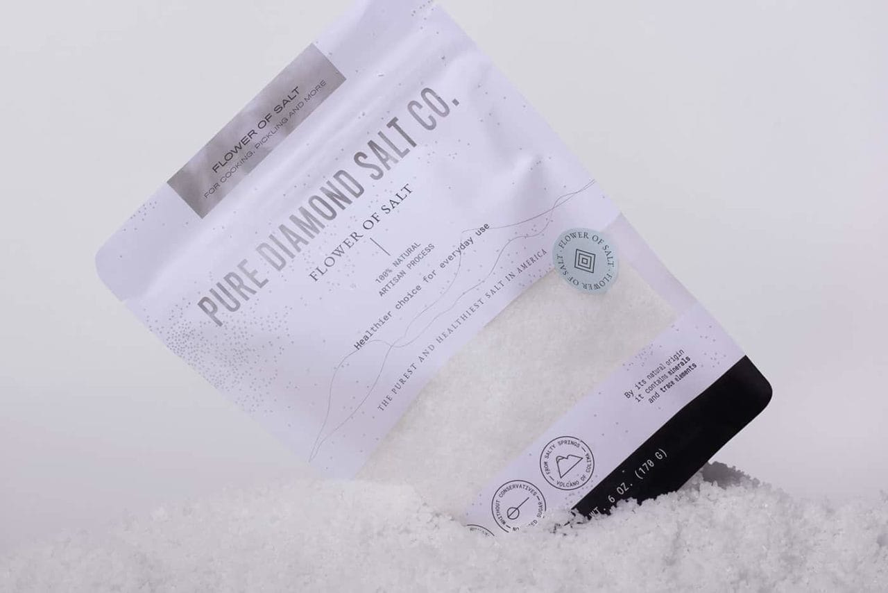
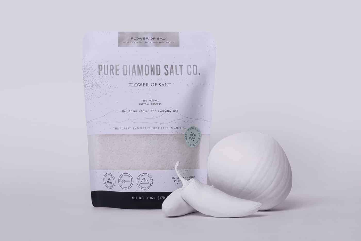
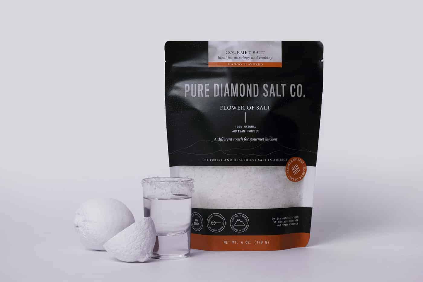
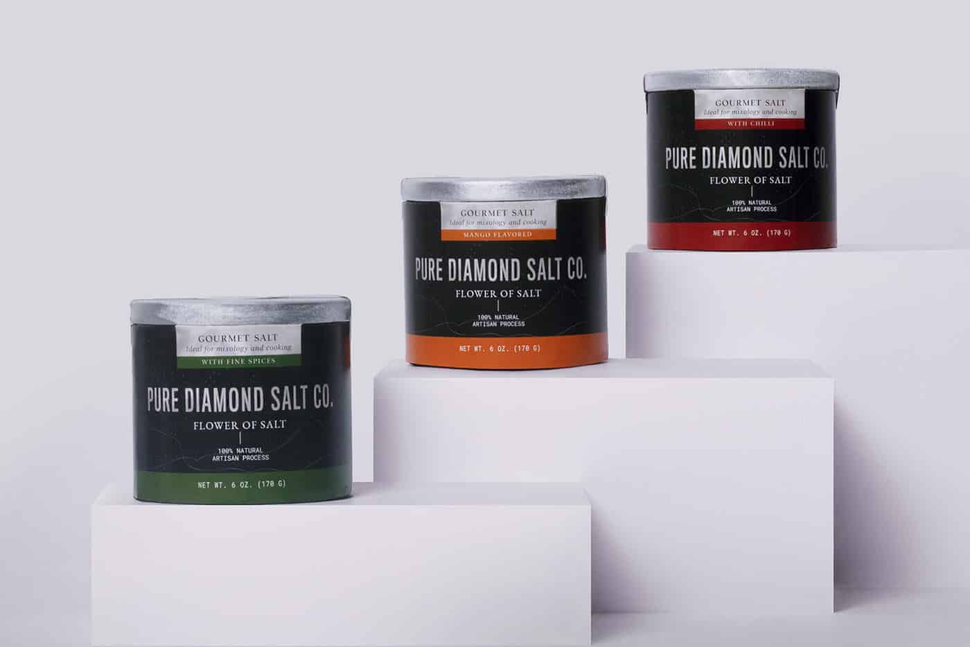
Pure Diamond Salt Co is a flower of salt brand. The product is harvested by hand in Mexico and distributed in the United States. It seeks to highlight the health benefits that this type of salt grants. We made naming, branding and packaging.


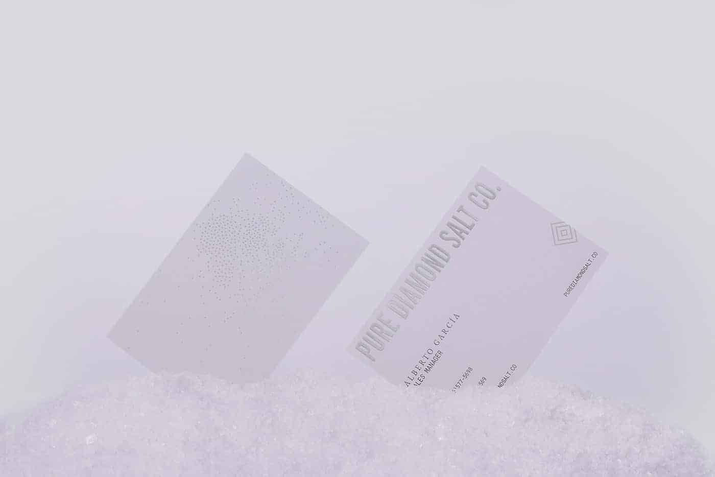
Our work started with naming, using purity as the main brand attribute, which is transmitted throughout the graphic line of branding and packaging.
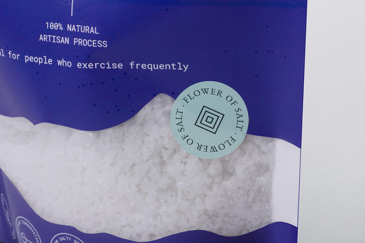
Lines and dots represent traditional craftsmanship of the process of collecting salt, while the colors refer to the purity and brightness reflected by the sun when make contact with the salt mountains.

Everything started with sketches. We made some graphics to represent the delicaded and manual process, but also the gourmet and premium side of the brand. All of this graphic elements were created using Adobe Illustrator: logotype, isotype, dots, lines, etc.

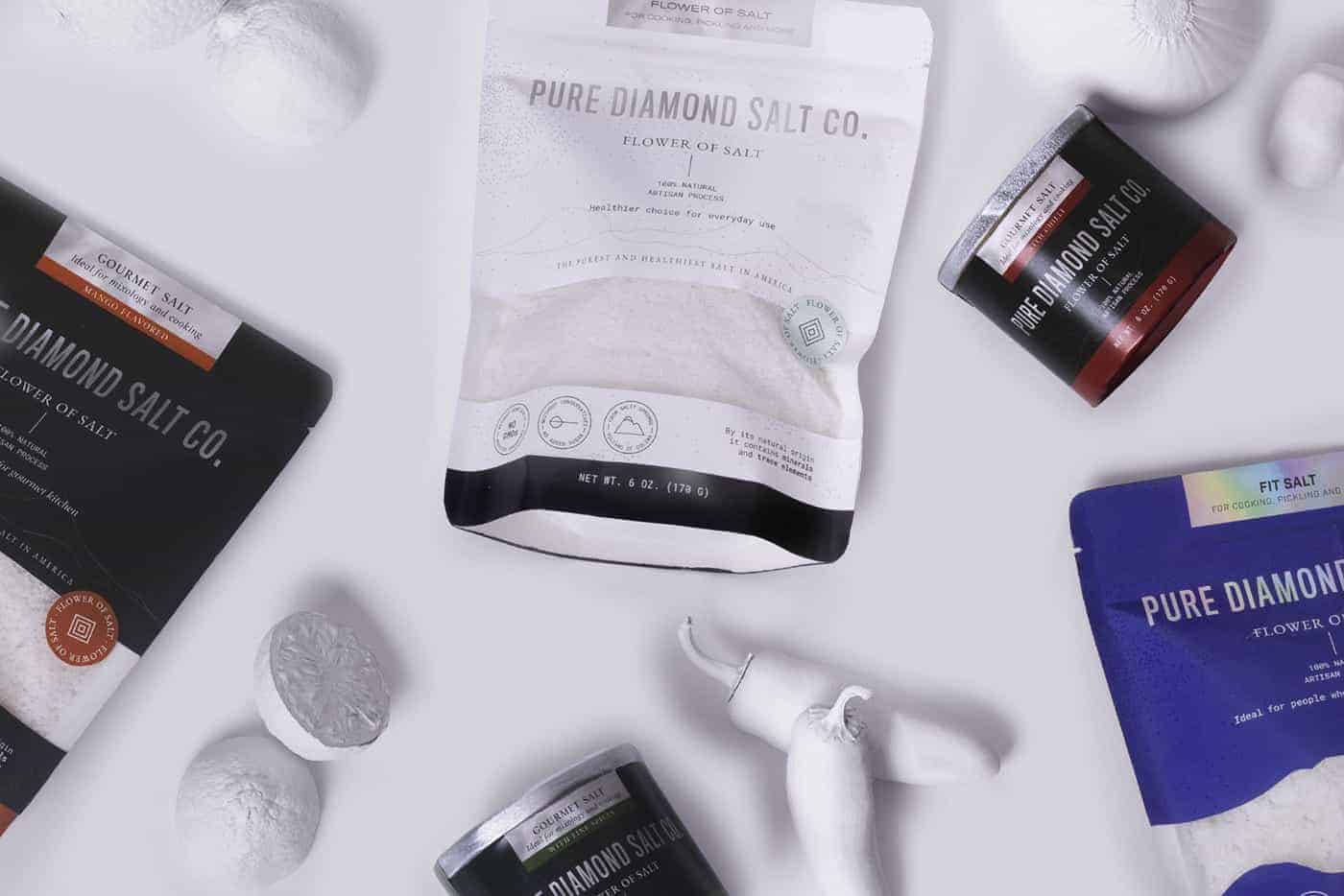
Since the first time the client saw the main concept and idea, they loved it. They helped us to make some adjustements in order to stand out some benefits of this product. This feedback helped us to make a better project.

