Lettering Collection 1
This is a random collection of some of my recent typographic lettering based projects, both personal and professional. I like to incorporate and experiment with various styles in order to keep the brain fresh and maybe even pick up some new tricks or knowledge. Recently I have been making a more focused effort on developing my typography skills as primarily I am an illustrator. It's difficult to sum up the entire project here as it is a collection of various works, but if i had to I can say it is definitely an overall summary of my stylistic interests.
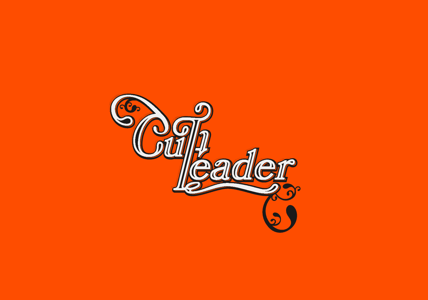
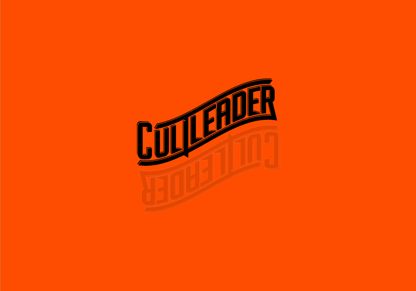
For the Cult Leader pieces, they came about through experimentation and breaking up existing type to create something new. I have a particular fondness for 70's prog rock band logos and word marks which I tried to incorporate here.
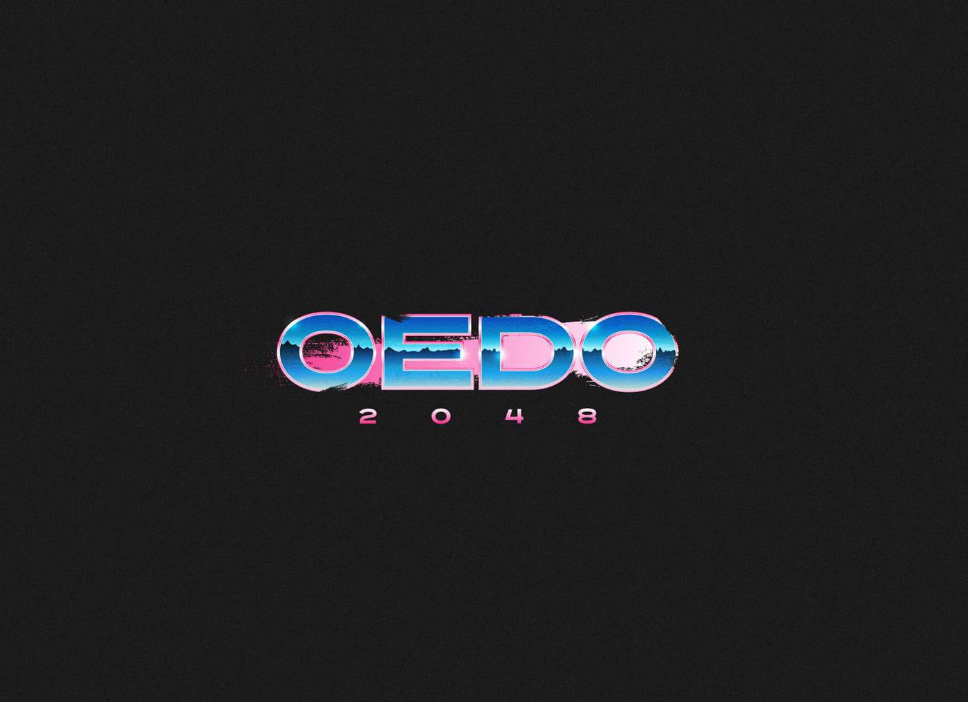
The Oedo 2048 logo piece was a little more focused as that needed to reflect an 80's neon cyberpunk vibe. If I am not being inspired by crazy 70's lettering then it's loud neon 80's style logos and airbrushed type. With this piece I wanted to create something which is shiny yet gritty at the same time.
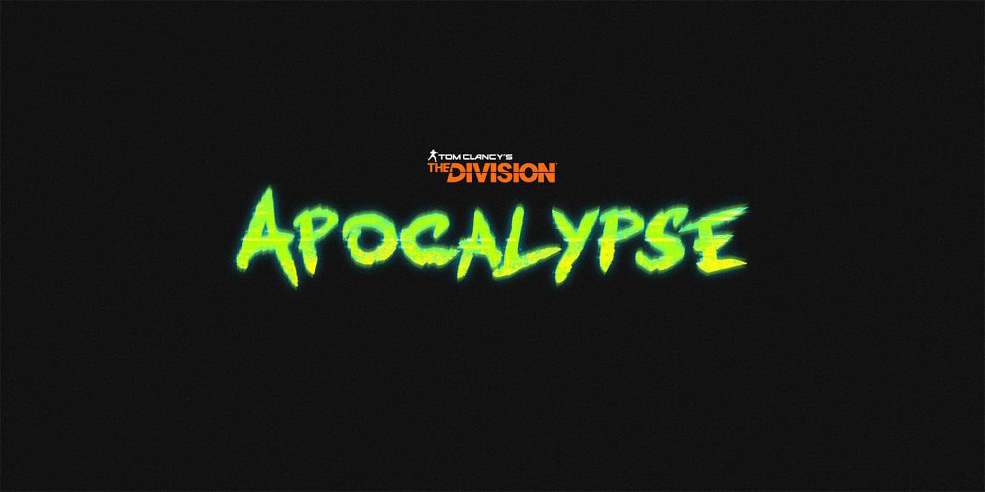
As for The Division piece, it is fan art. I had the idea to create a distressed brush style lettering piece for a fictional expansion for the game when watching E3 2017, so it is not real and not at all officially affiliated with The Division, unfortunately.
I used Illustrator and Photoshop for all these pieces. To keep it brief I'll run through the process of the OEDO 2048 piece.
Basically I started in Illustrator with about 30 browser tabs open in the background full of references. I found an appropriate sans serif typeface that needed to be bold to allow for space to fill with gradients for the metallic chrome look. Then using offset paths, clipping masks and the gradient tool created the chrome fill.
Next i used a vector dry brush and went over it lightly to slightly distress the piece and give it a gritty feel. I then moved over to Photoshop and added some subtle highlights to make it look more reflective and chrome. Finally a noise layer set to soft light to give it some extra texture.
I try and use every project to learn something new, no matter how small it may be like a shortcut or new brush technique. If there was one major thing I learned overall from all of these pieces it would be gaining a better understanding of typography construction.
Thanks. You can follow me at apple_jail on Instagram or find me on Behance at https://www.behance.net/aaronjakubenko.