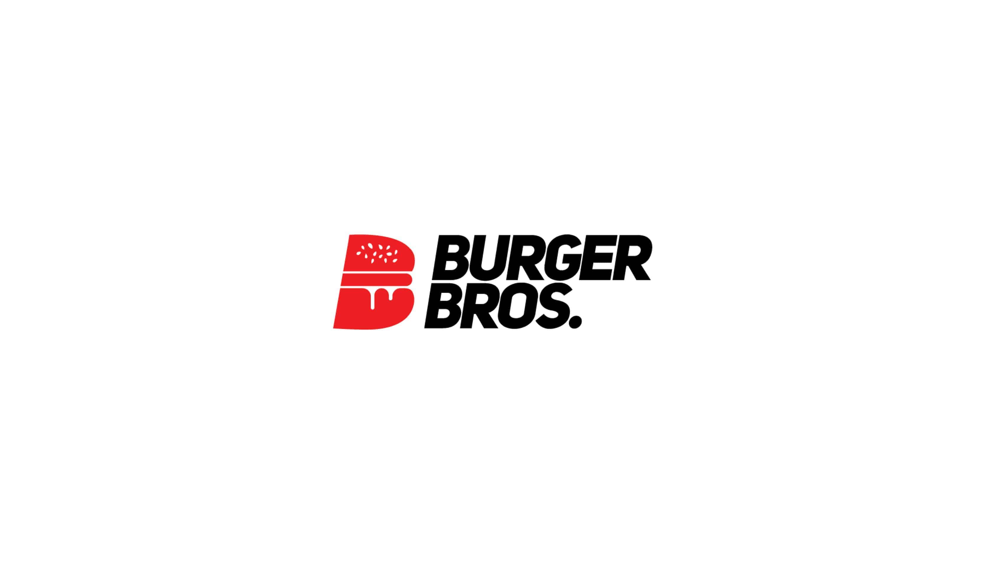
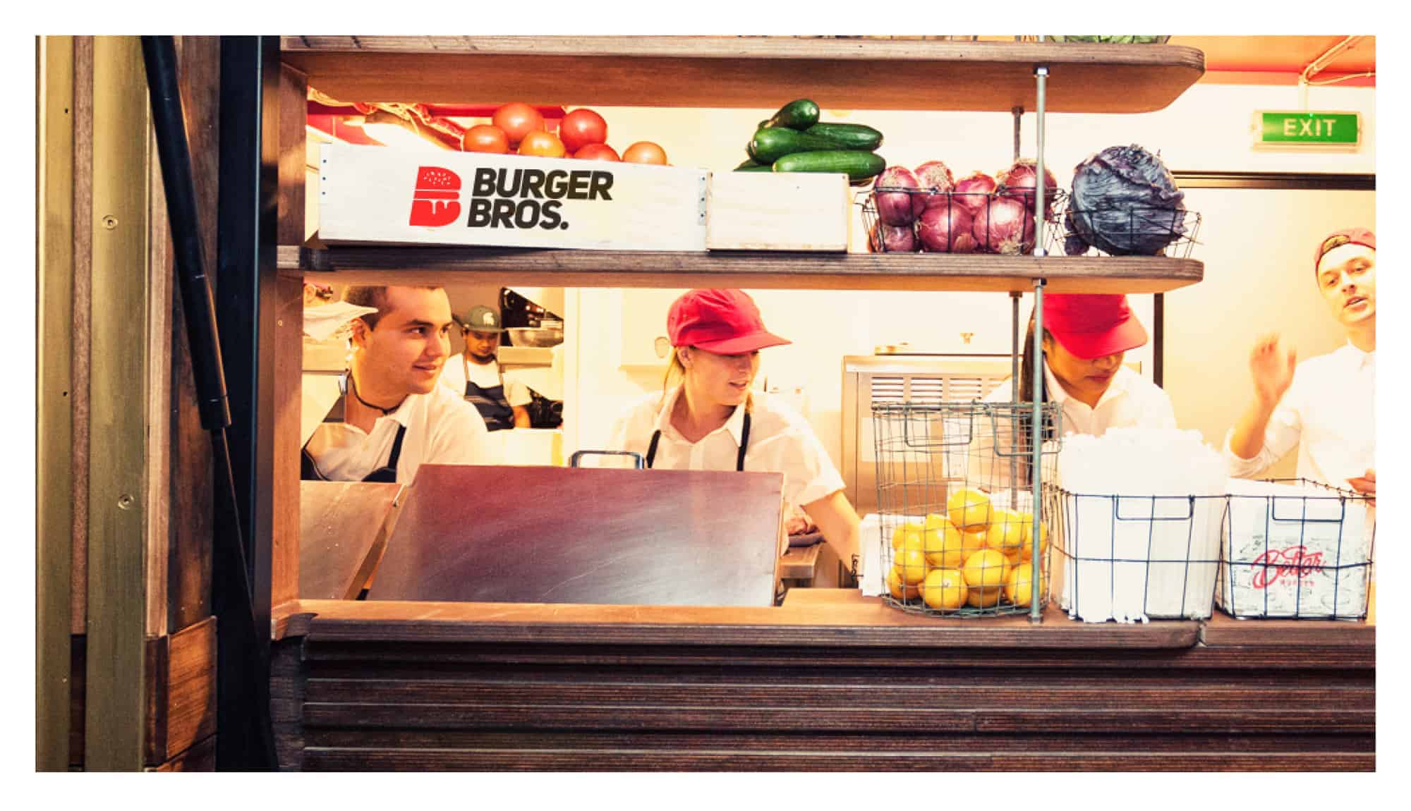
Burger Bros

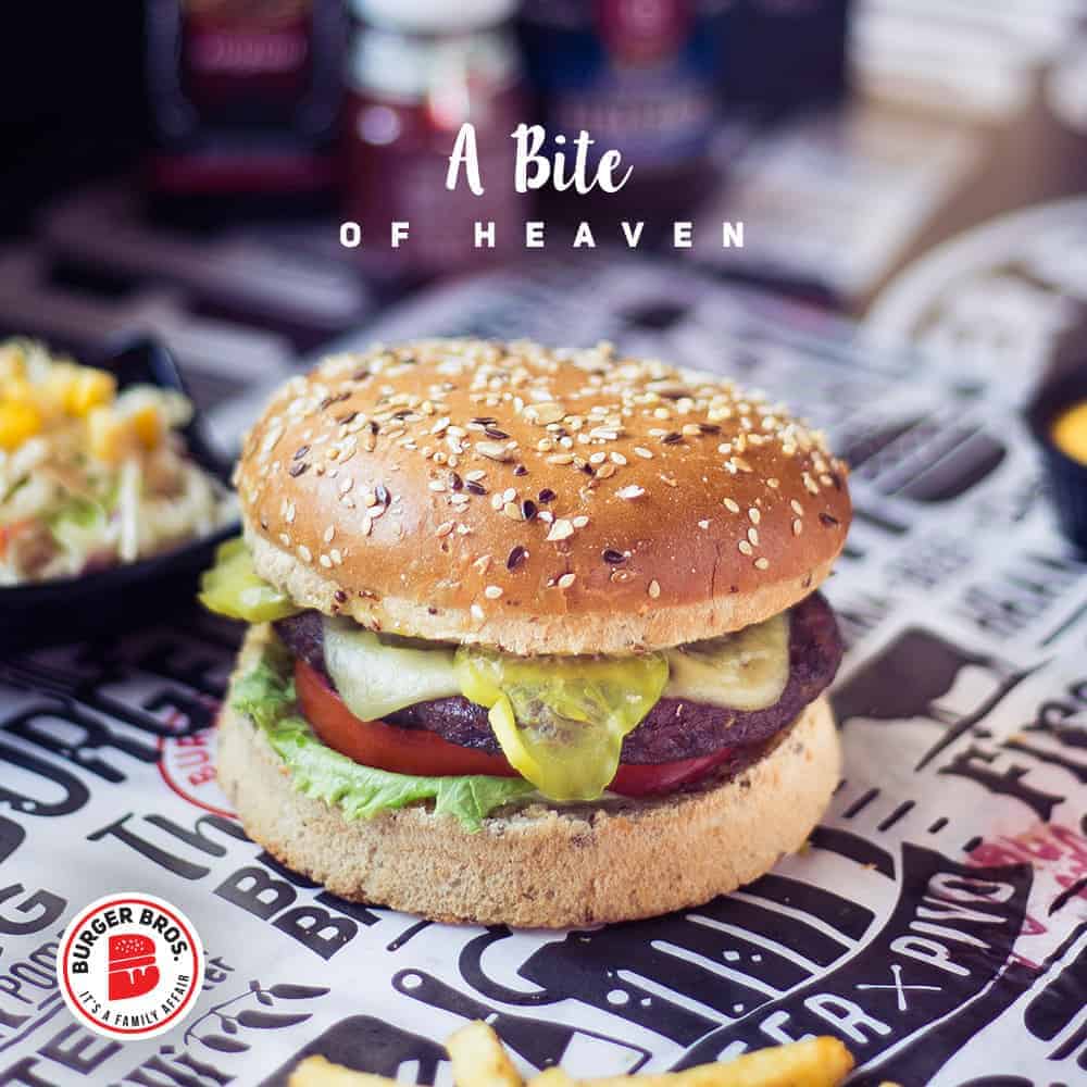
Burger Bros is the new burger joint created by two brothers with a love for food and special, tasty recipes. Burger Bros. goes beyond the regular burger joint and flies over to a whole new area of expertise: the true love of culinary art.
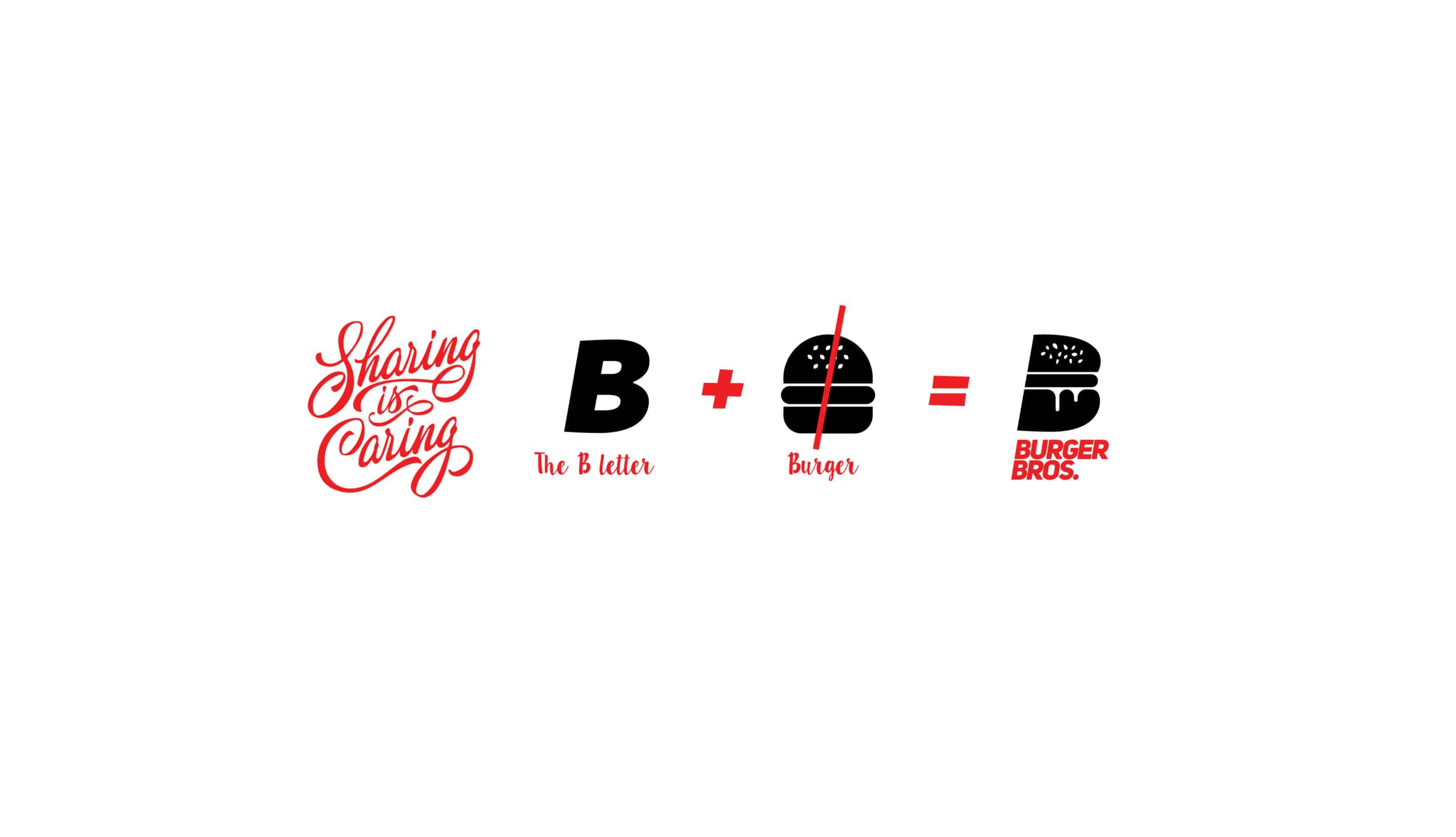
The logo is neat, clear but with many messages:
The half sliced burger is also the letter «B» which represents Burgers and Bros.
The half sliced burger represents sharing.
Two half slices make one whole burger which represent 2 brothers, who together created the new burger joint.
The layers in the burger portray a special taste and a one of a kind customized recipe.
I used Adobe Tool such as ADOBE ILLUSTRATOR and PHOTOSHOP to complete this Job,
it was challenging creating a merge between the B and the Burger but finally Impossible is nothing ?
so i create a full Burger design then we split it into 2 to create the shape and to combine the B with the half burger ( so we have the concept of Sharing Is caring).
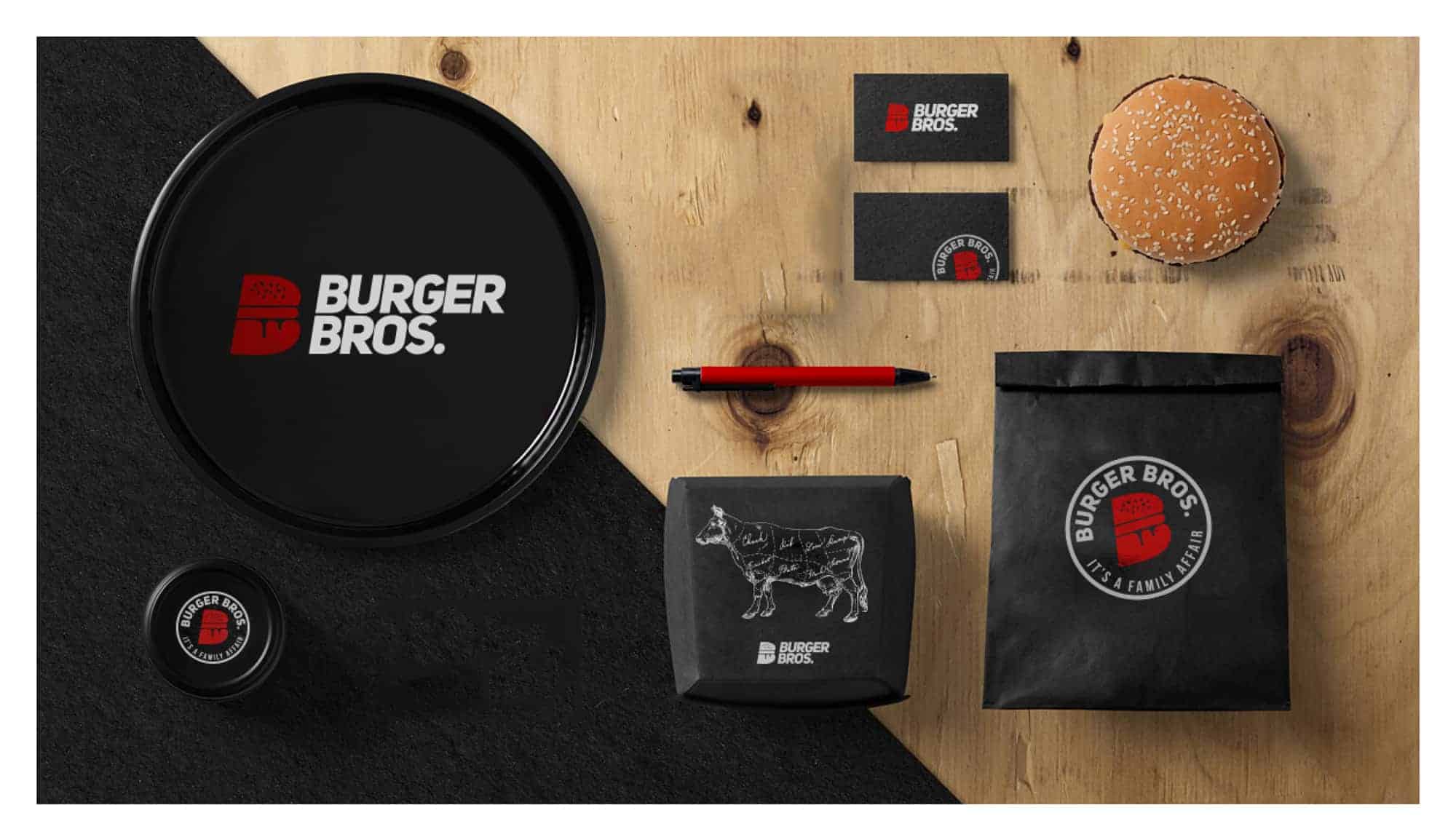
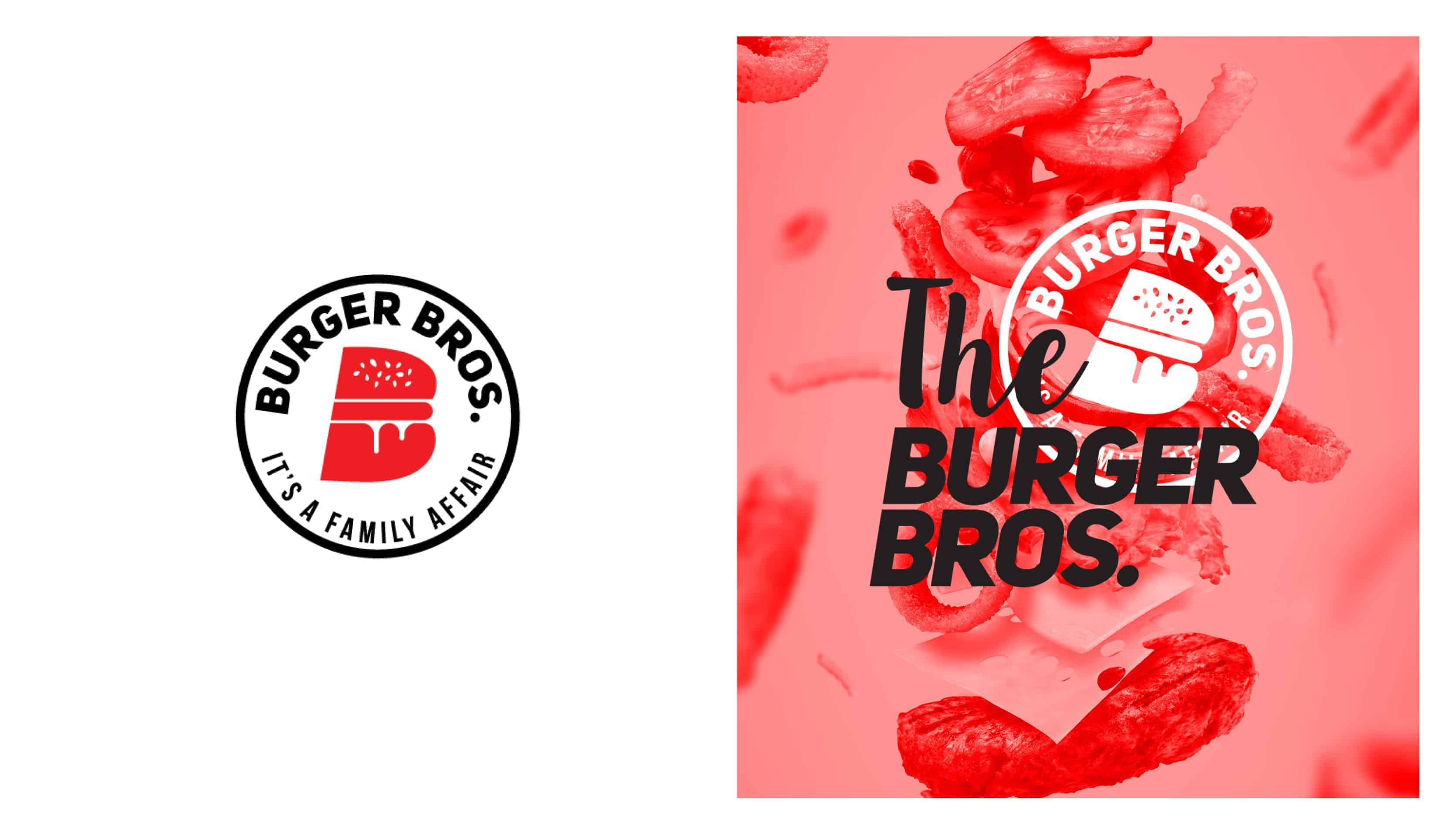
«it's a family affair» represents the fact the best food is always whipped up in the kitchen with family because the secret recipe is always a little love. So with two brothers, we can guarantee a touch of soul food, as well as a mouth watering recipe to keep you craving for more!
Awesome! This is a great project - the colors are perfect for the brand.