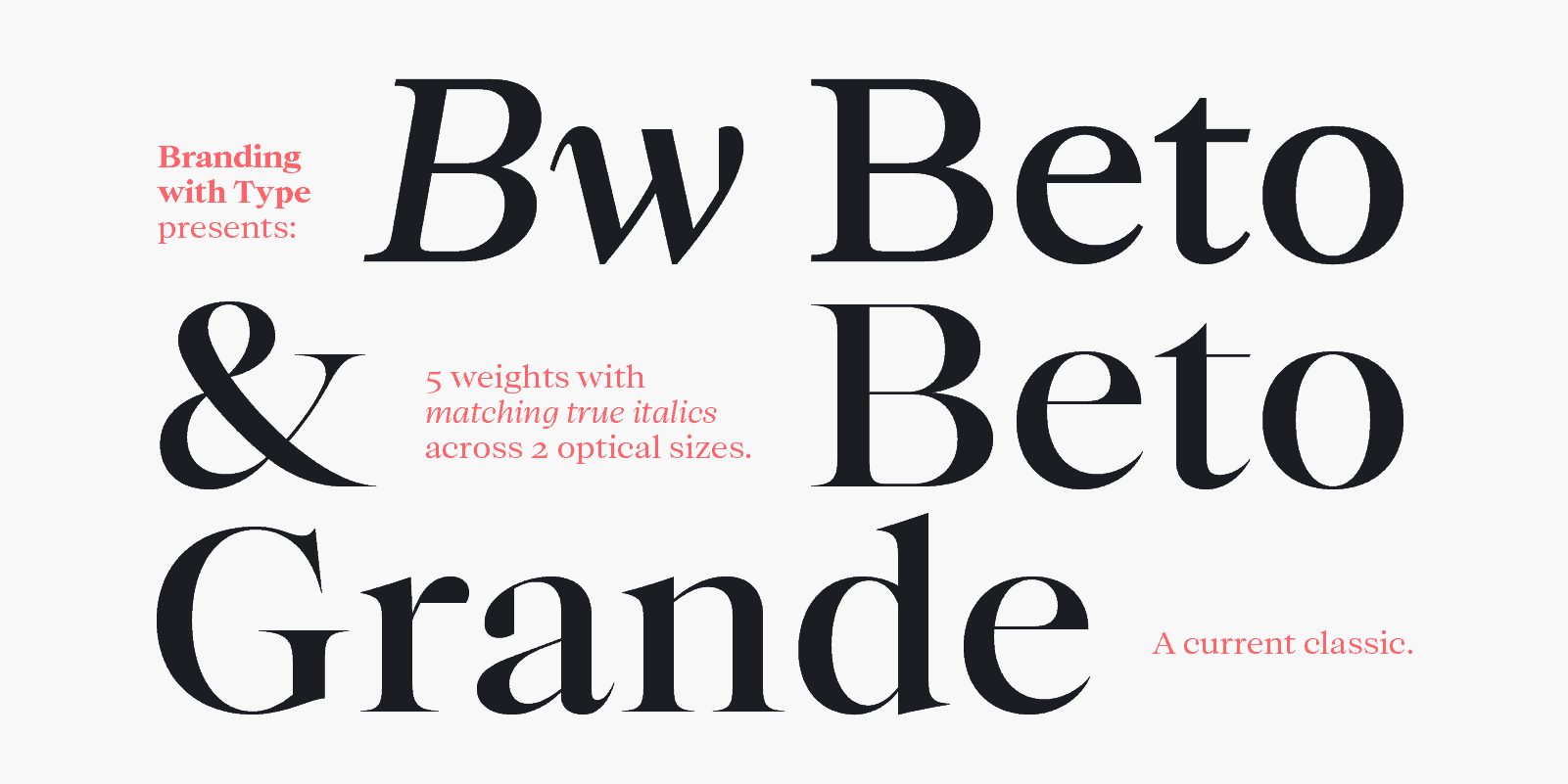
Bw Beto font family

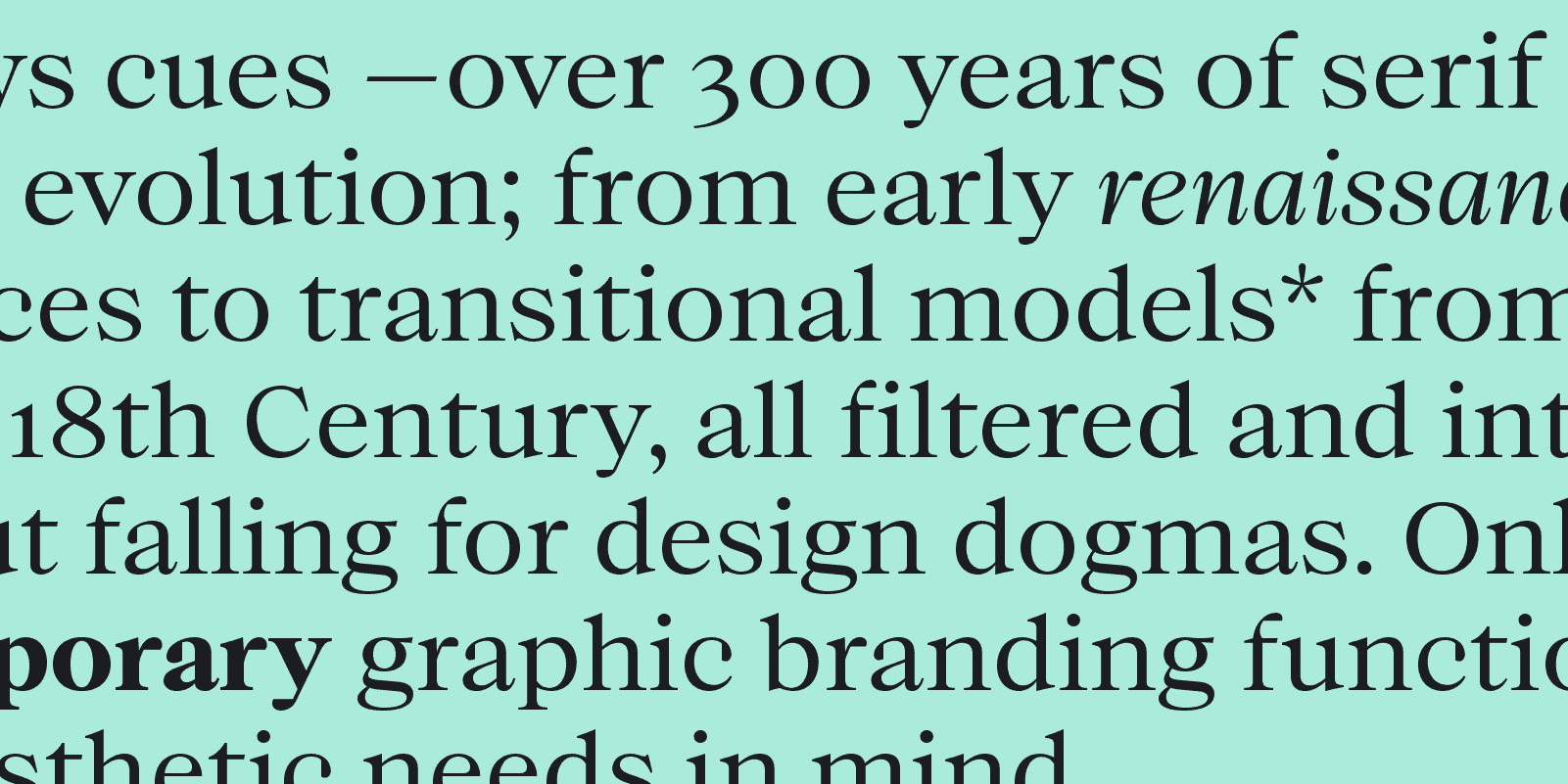
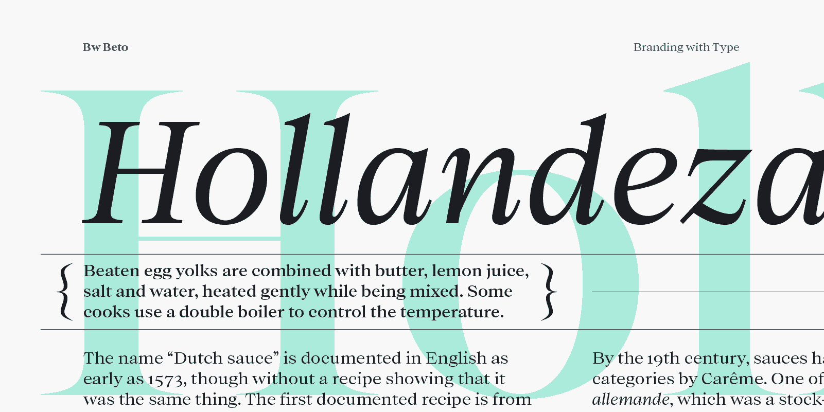
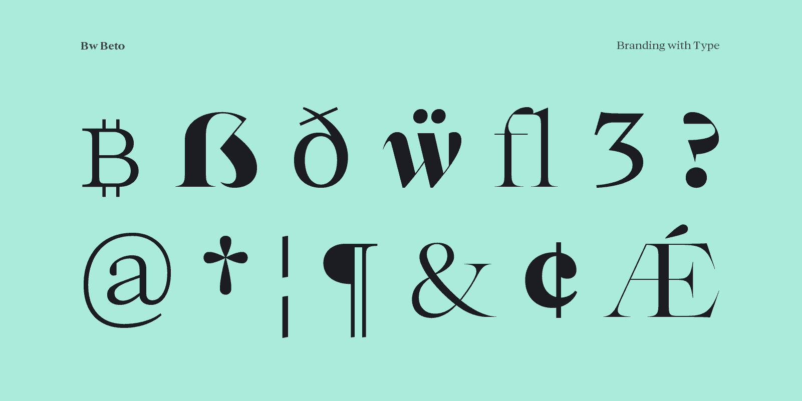
Designed by Alberto Romanos, Bw Beto borrows cues from over 300 years of serif design evolution; from early renaissance typefaces to transitional models from the 18th Century, all filtered and interpreted without falling for design dogmas. Only with contemporary graphic branding functional and aesthetic needs in mind.
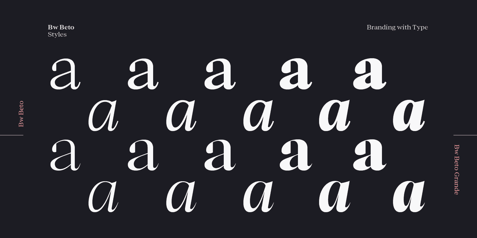
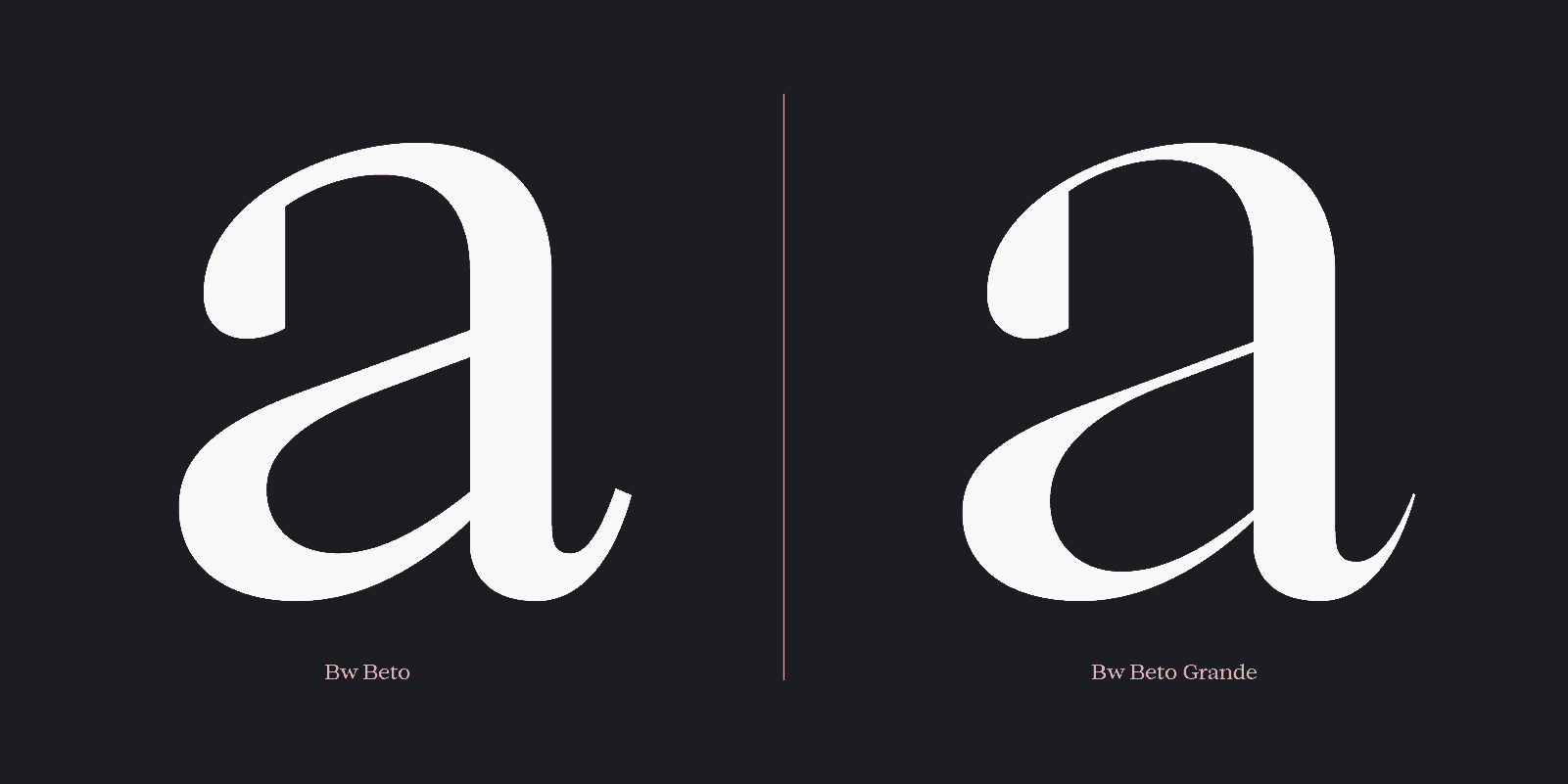
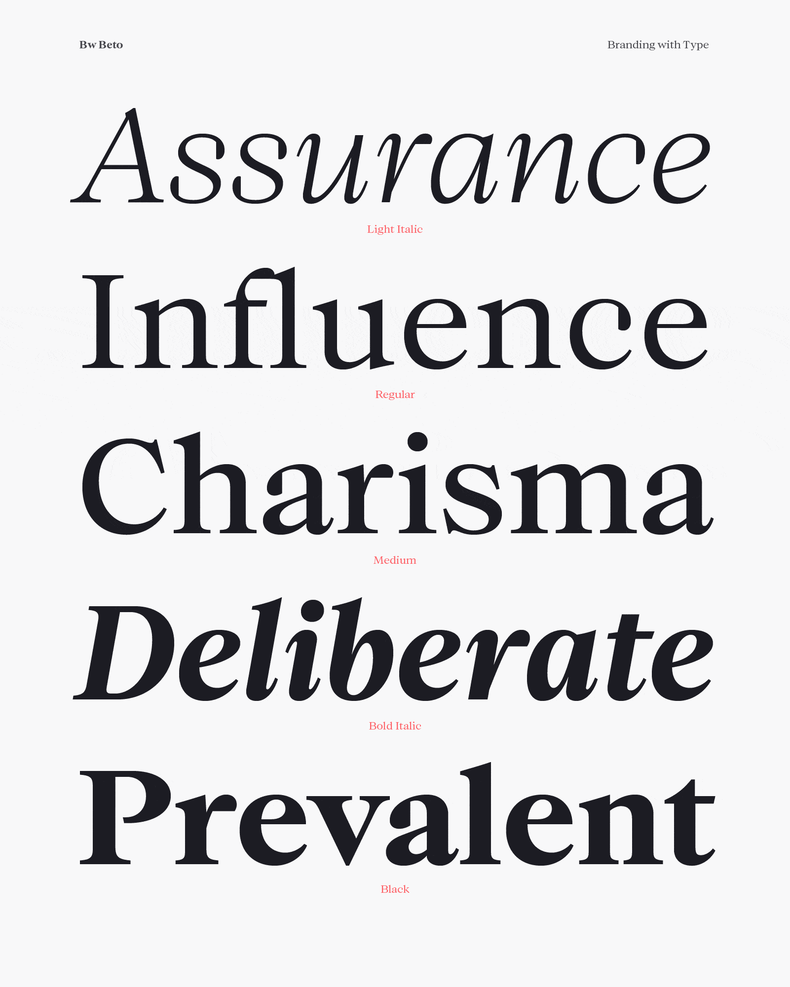
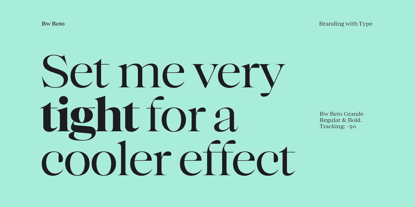
Bw Beto is available in 2 optical sizes containing 5 weights with matching true italics each. Bw Beto Grande is best suited for display purposes, taking the contrast one step further and bringing a more elegant feel, but maintaining the same metrics and proportions as its sturdier sibling.
It was about time! When I started sketching it we had more than 10 font families already published, out of which only 2 were serifs: a slab and a wedge serif; none of them had the classic feel we wanted to achieved with Bw Beto.
I mostly draw sans serif typefaces, they come more natural to me so jumping on a serif design is always a challenge: with a traditional serif you have to be more compliant with the influence of a broad nib pen, which gives you a very specific shape language that you have to replicate using bezier curves.
Also, they are very well documented and categorised in different styles that developed in different parts of Europe throughout centuries, almost giving you a timeline of type design evolution. Right from the beginning I wanted to move away from siloing the design in a particular period. The plan was to design a traditional looking serif without feeling stale or old-fashioned; it should feel designed today, not 400 years ago.
It has been cooking for more than a year.
On Bw Beto there's a lot of stuff that was already in the back of my mind about how this type of serif should feel like but when I was getting stuck I looked for references from all periods from the 1500s to the industrial revolution: Venetians, Garlades, Transitionals and everything in between, somehow curating the best solutions for specific issues.
The process has been quite standard: Most of the work has been done using Glyphs and there's always spare sheets on the desk for rough-sketching. It started with a handful of lowercase characters until we got it right, then expanded into more characters going back and forward, fixing, fine-tuning,... with a lot of printing and screen-testing along the way.
In terms of response it's early days as the typeface was released only a couple of weeks ago but so far feedback has been encouraging. A lot of designers are showing their appreciation on social media and hopefully we'll start seeing Bw Beto in use on branding and editorial projects very soon.
Bw Beto licenses are available at half price until the end of July.
Very nice font! Simple and usable!