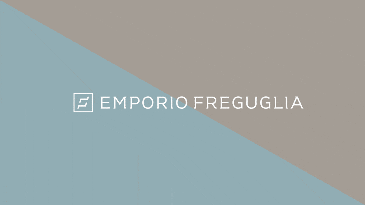
Emporio Freguglia
Born after several years of sofa beds, beds and mattresses manufacturing, Emporio Freguglia is a point of sale for a company, the purpose of which is to guarantee the highest quality of relax.
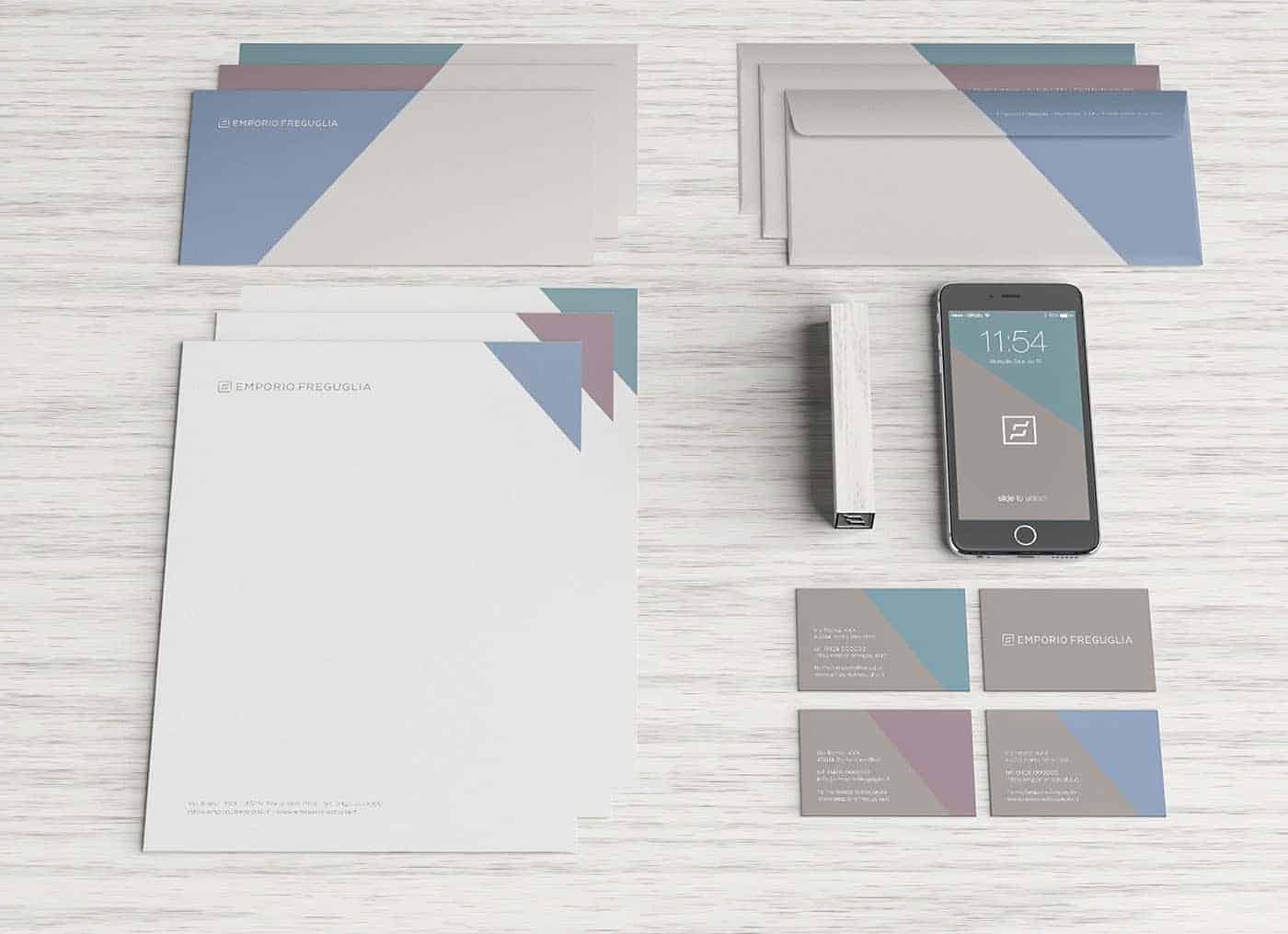
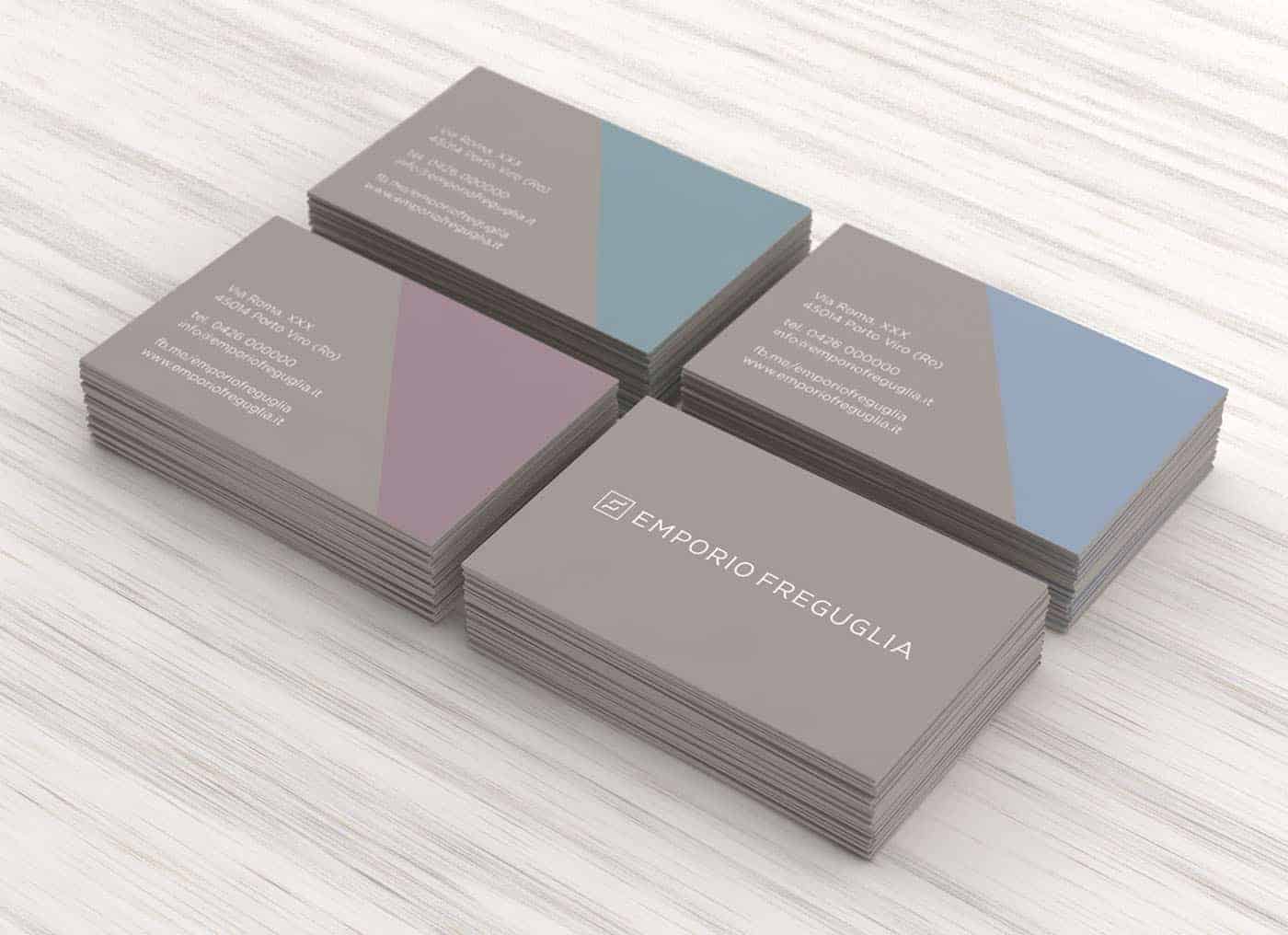
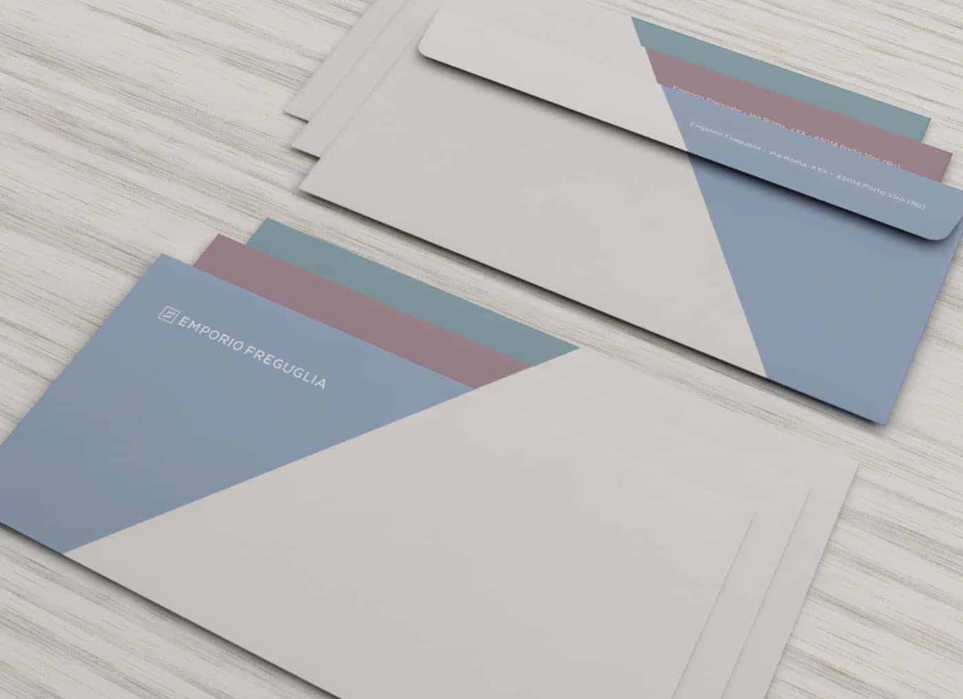
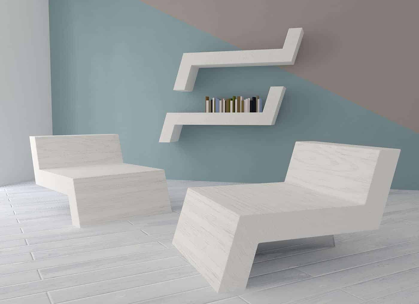
They asked us a minimal, modern and sober style, able to make customers understand the high level of the company.

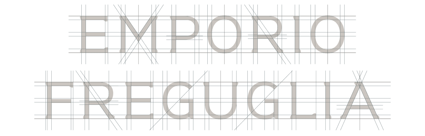
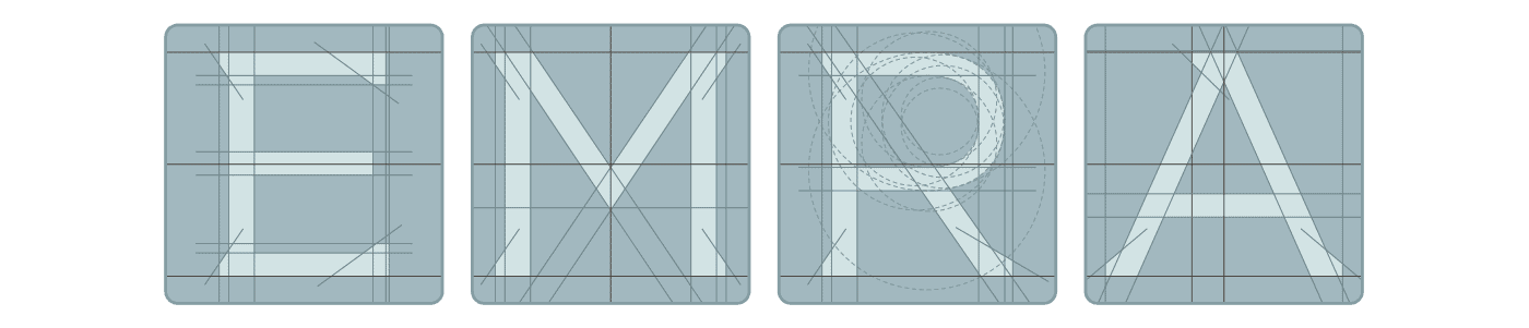
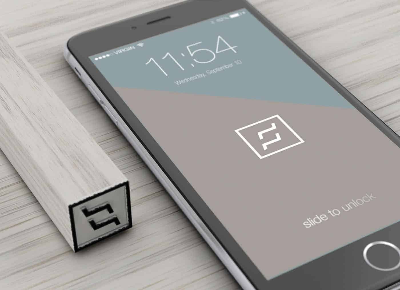
For the logo design we started from the concept of relax and, using two shapes resembling a bed or a seat, we obtained the "F", that is the initial letter of Freguglia. After that, we designed a logotype whit a custom typeface, a slab serif with a modern and elegant look.

After some sketches on paper, we chose the best concept to work on.
When we found the right synthesis of the symbol, we used Adobe Illustrator to vectorize logo and typeface.
We used Pantone colors to have the maximum precision and reproducibility of the color palette.
Finally, we used Maxon Cinema 4D for 3D simulation of the logo applications.
This was the first project proposed to the client and he liked it very much!
After having published this project we got very good feedback from other graphic designer and this helped us to improve ourselves.
If you want to see the entire project you can visit our portfolio on Behance: www.behance.net/concreate
Thank you for watching.
Concreate Studio
www.concreate.it
It's great that you are getting ideas from this paragraph as well as from our argument made at this place.
Thank you :)