Epione Juice Branding

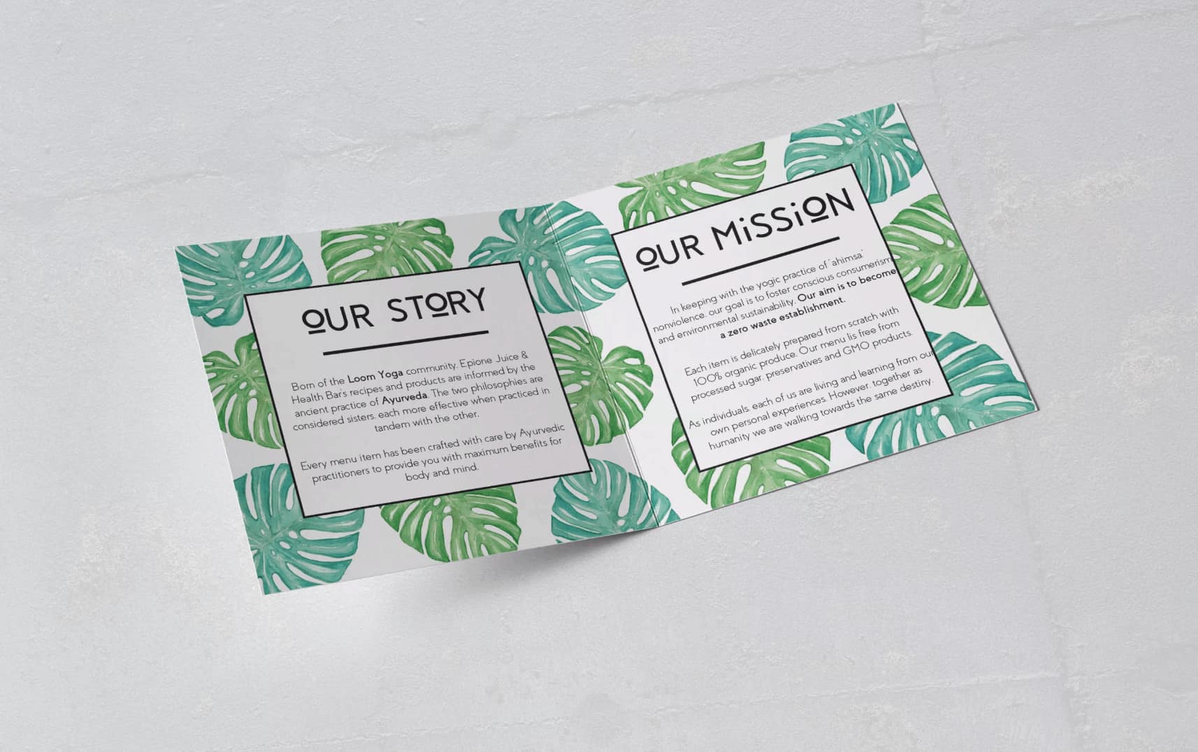
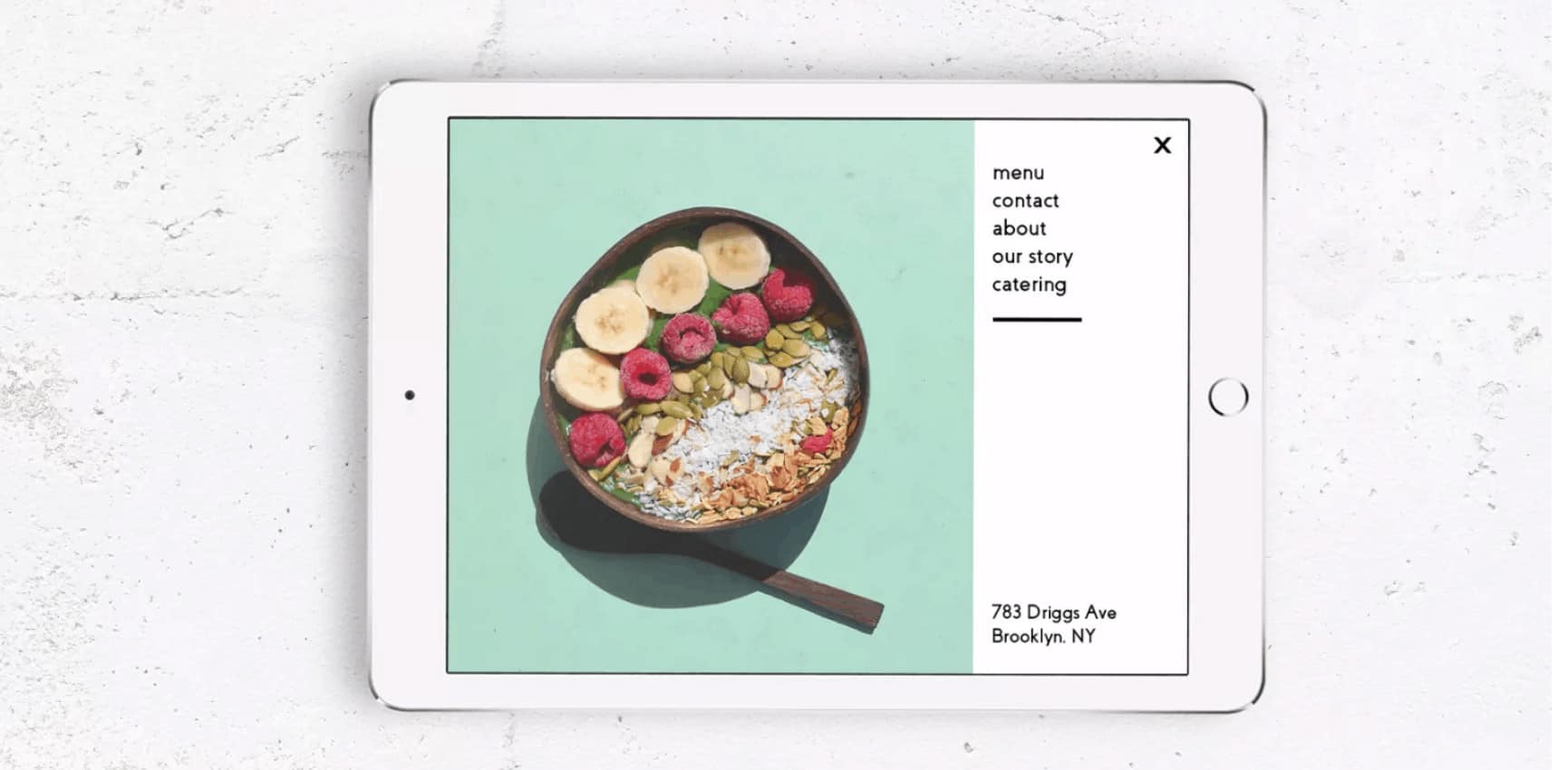
Graphic Design and Art Direction for Epione Juice and Health Bar, an organic vegan and ayurvedic juice bar, located in Williamsburg, Brooklyn. Williamsburg is known for its trendy yoga studios and Juice bars, and Epione focuses on quality to stand out. All the items from the menu are entirely free from processed sugar, dairy, gluten, soy, preservatives and GMO products. Born of the Loom Yoga community, Epione Juice & Health Bar’s recipes and products are informed by the ancient practice of Ayurveda. The two philosophies are considered sisters, each more effective when practiced in tandem with the other. Epione provides an easy way to incorporate Ayurveda into your daily routine.
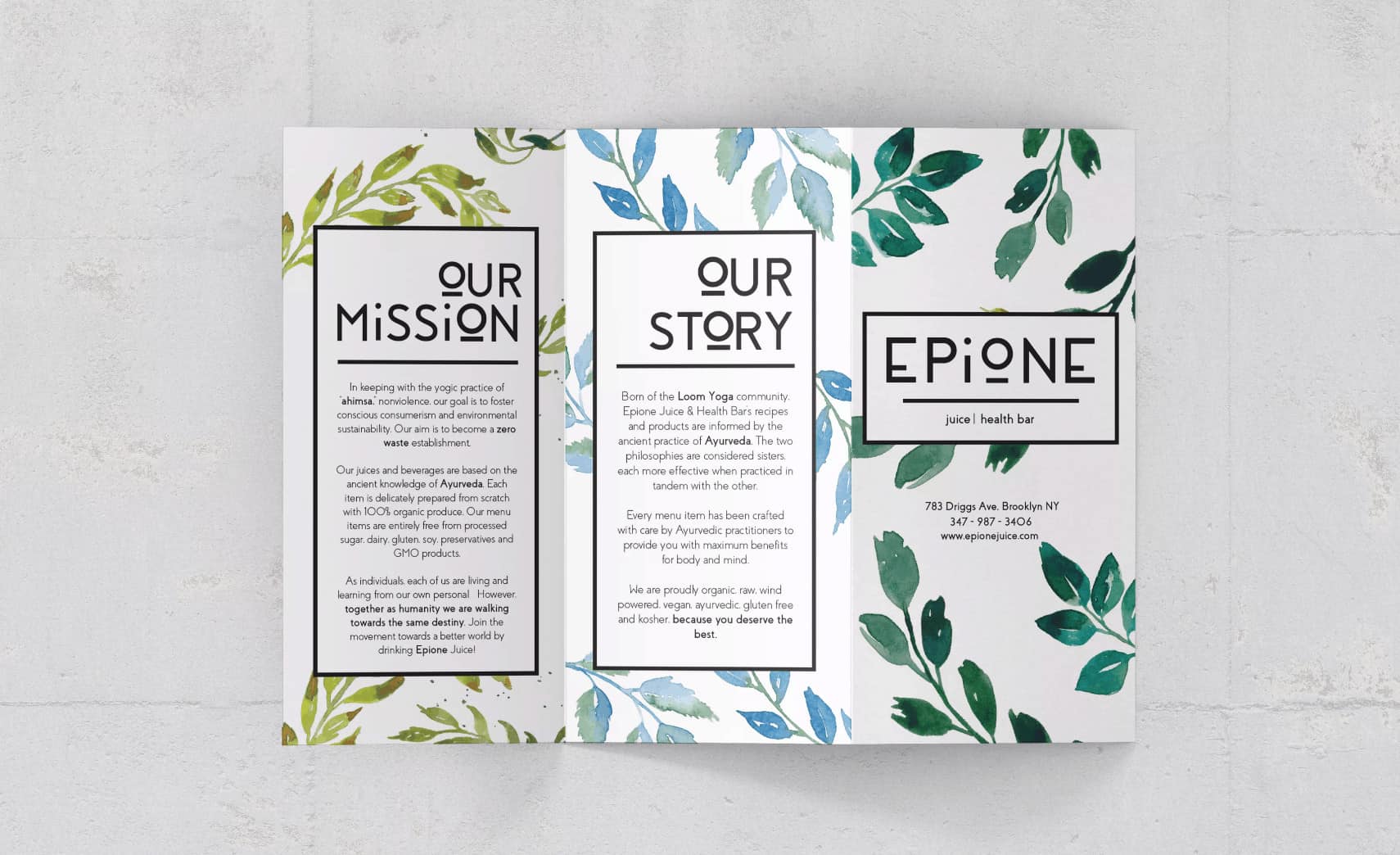
I met the owner of Epione through my local yoga studio in Brooklyn. We had a vision for Epione to be more of a community instead of just another juice bar in Brooklyn. And that's why we decided to keep the yogic practice of "ahimsa" (nonviolence) and foster a community that is walking towards conscious consumerism and environmental sustainability. The ultimate goal with Epione is to become a ZERO WASTE establishment.
Designing Epione's identity was fun because all the packages and materials are sustainable and environmental friendly. All the labels were printed in post consumer fiber paper, and the juices come in mason jars. We also had the idea to make the juices cheaper to people that bring the mason jars back.
The juices and beverages are based on the ancient knowledge of Ayurveda. Each item is delicately prepared from scratch with 100% organic produce.
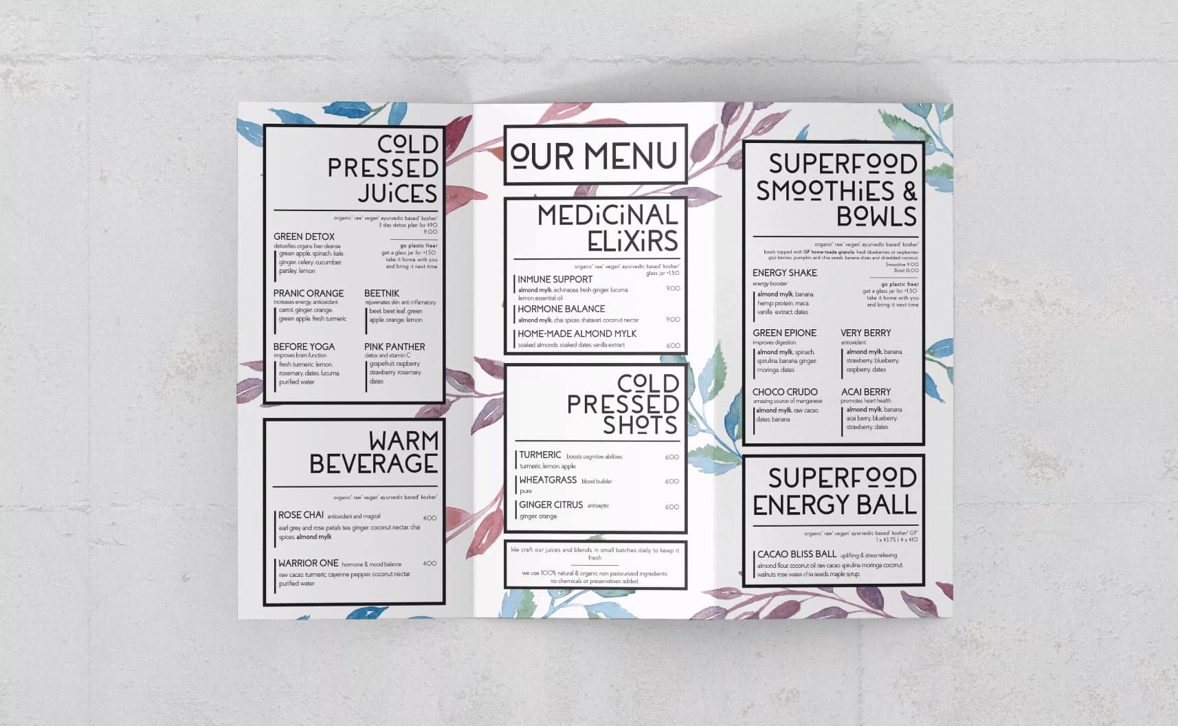
The reason why I designed different menu for each day of the week, is because Ayurveda demands that we give our body the most organic nutrition. Epione buys their produce from a local market, and since the market also has a schedule, it makes sense to craft different juices every day according to the farmers schedule. The items are entirely free from processed sugar, dairy, gluten, soy, preservatives and GMO products.
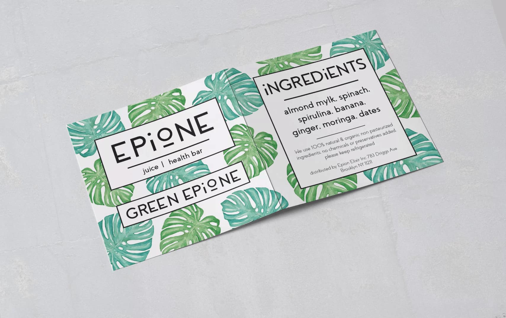
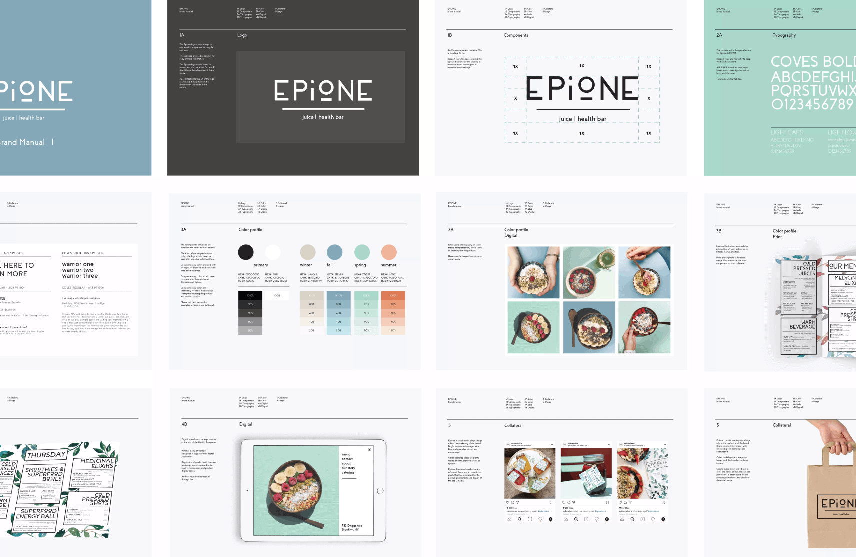
Since I gave it such a minimal approach, the type selection plays a huge role in this project. The letters e, i and o are modified; the stem of the i is smaller, the bowl of the o rounder with a slab on the bottom, and the bar of the e is lower as well.
Typography is such a fun way to brand a project if colors and graphics are kept minimal, and I felt like this was the perfect project to do so.
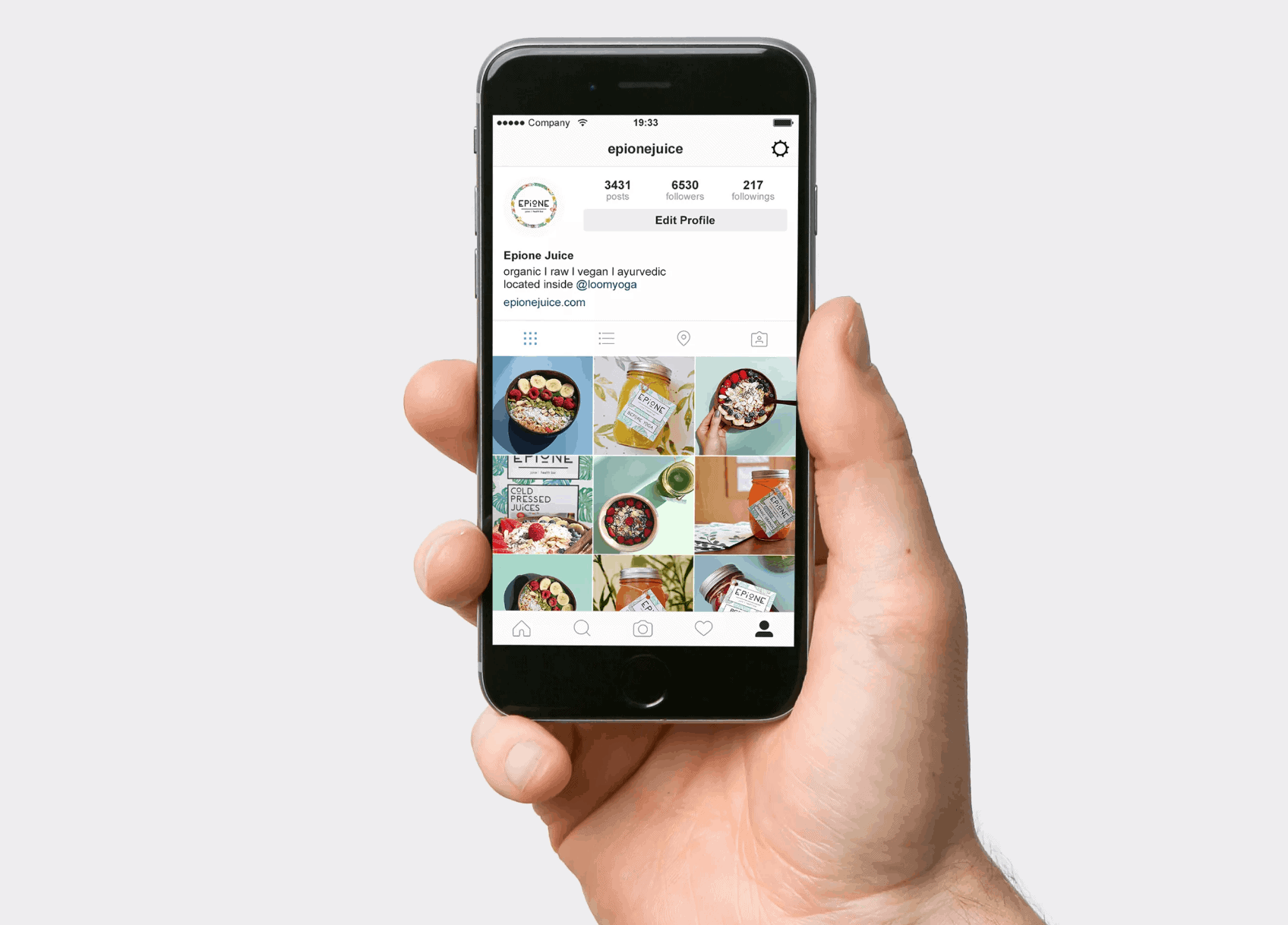
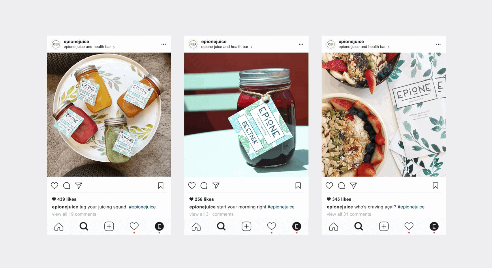
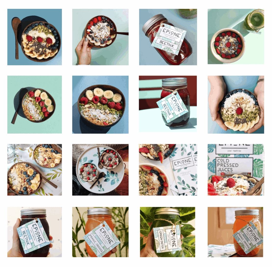
I see people on instagram tagging Epione with their beautiful branded mason jars and it makes me so happy for the environment that people are choosing jars over plastic.
It's easier to convey a message through graphics, a picture says more than a thousand words, so graphic design always plays a huge role when engaging people to become more eco conscious.
As Graphic Designers, I believe that it our responsibility to work with our clients to create a sustainable printing mentality and reduce the carbon footprint via green choices.
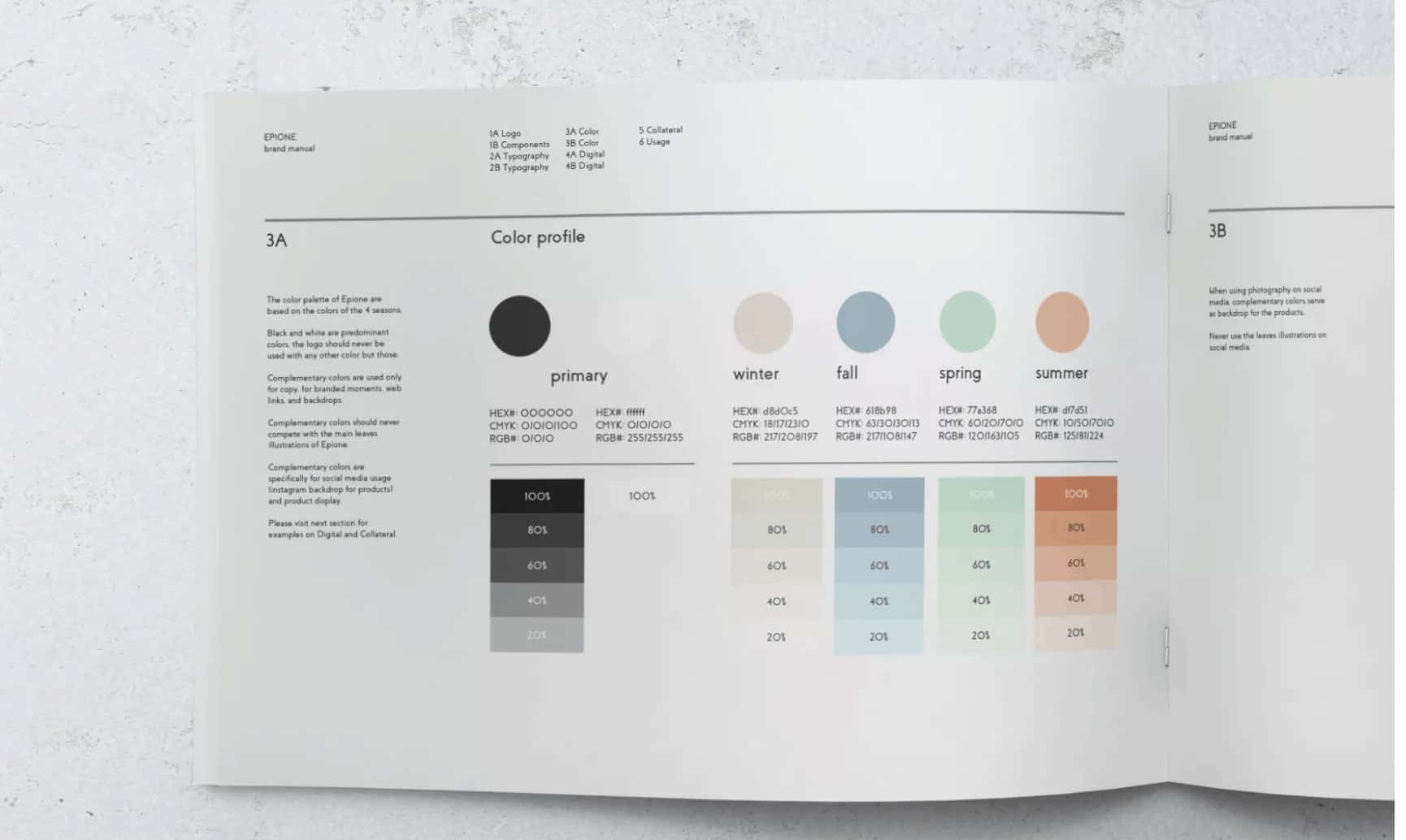
I love the color analysis~