Four Cups / Packaging design

Packaging design for drinks.
The main idea is to create a packaging for drinks that quickly deteriorate after opening.
We often don't have time to finish the drinks before they spoil. So I decided to design a package with separate, airtight compartments.
For example, even ultra-pasteurized milk after opening is stored for no more than two days.
For people who use milk rarely and in small quantities, this is a problem.
As a result, we are forced to buy more than the amount that we consume.
At the same time, in closed form, ultra-pasteurized milk is stored for up to 180 days.
If you do not use milk daily, like me, such packaging will help save time and money.
In addition, you will always know that you always have fresh milk at home.
![]()
This is my personal project of packaging for drinks.
The main idea is to create a packaging for drinks that quickly deteriorate after opening.
We often don't have time to finish the drinks before they spoil, so I decided to design a package with separate, airtight compartments.
For example, even ultra-pasteurized milk after opening is stored for no more than two days. For people who use milk rarely and in small quantities, this is a problem. often milk spoils faster than we drink it.
As a result, we are forced to buy more than the amount that we consume. At the same time, in closed form, ultra-pasteurized milk is stored for up to 180 days.
If you don't use milk daily, like me, such packaging will help save time and money. In addition, you will always know that you always have fresh milk at home.
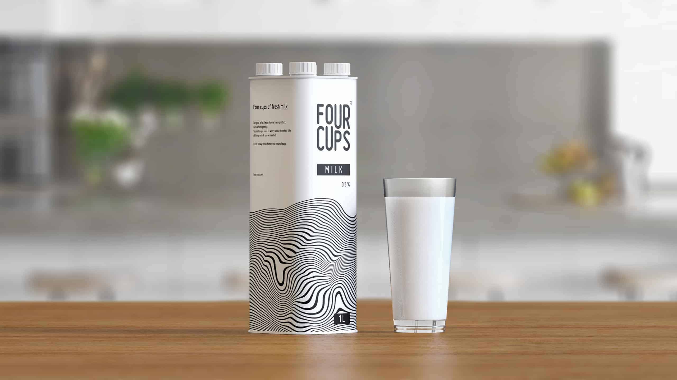
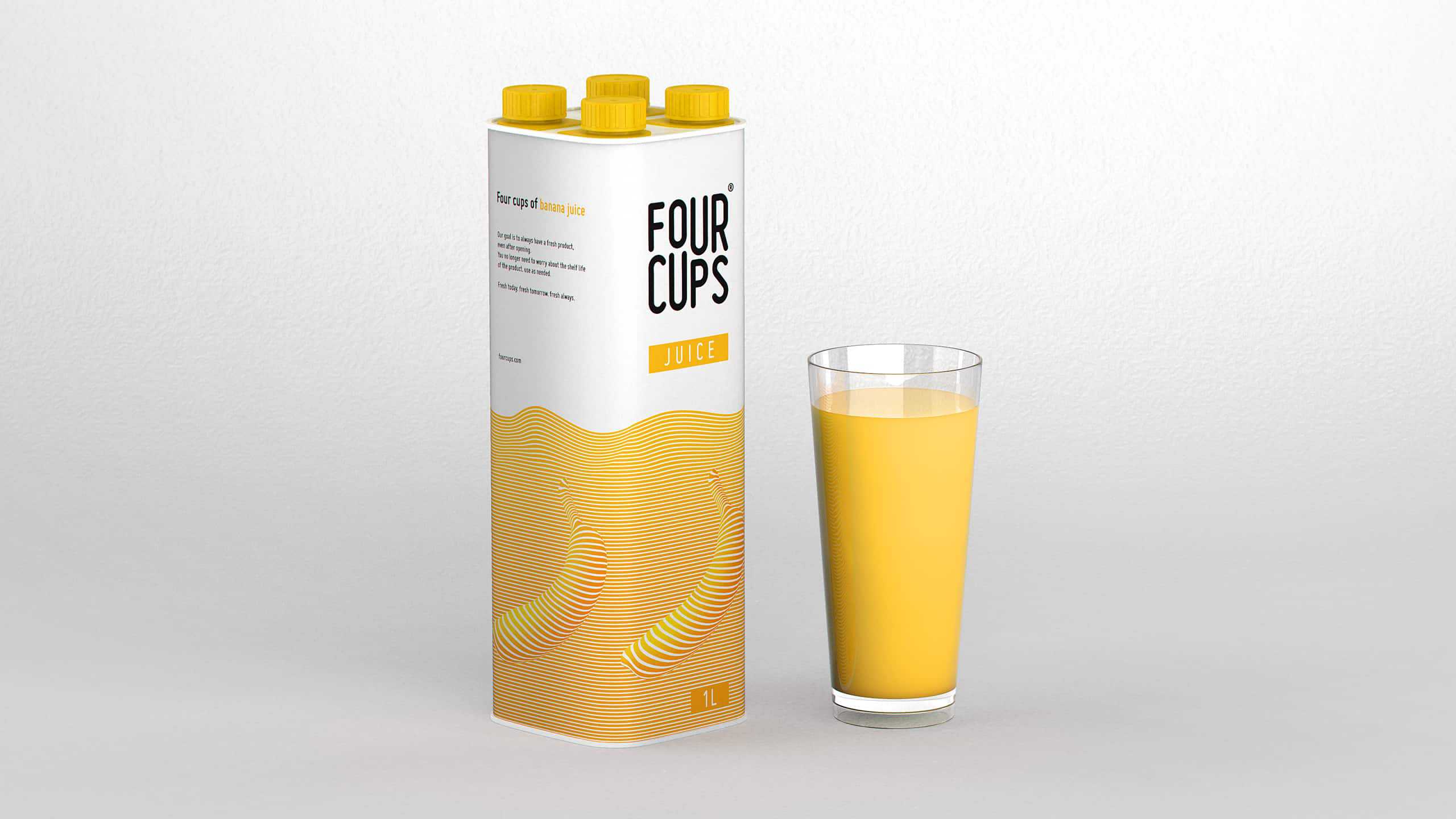
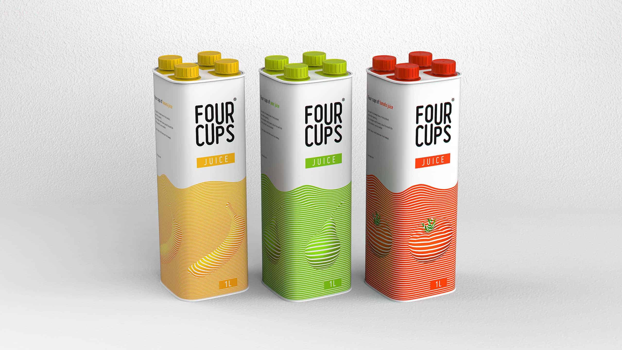
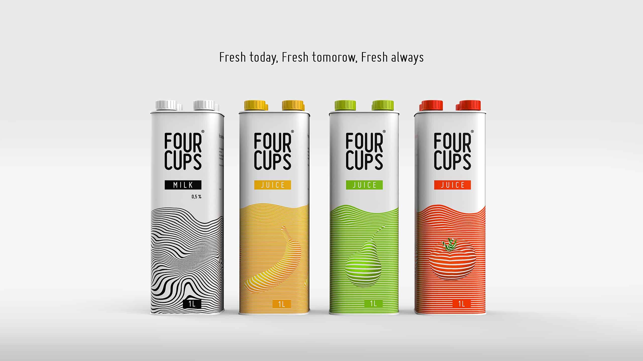
Also this packaging is suitable for juices.
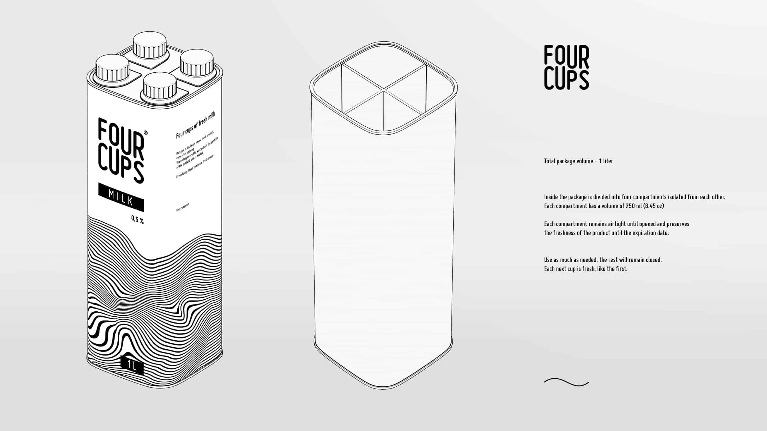
First of all, I started with the design of the shape of the container. It was important to understand how the existing user and industry experience can be used to solve the selected problem.
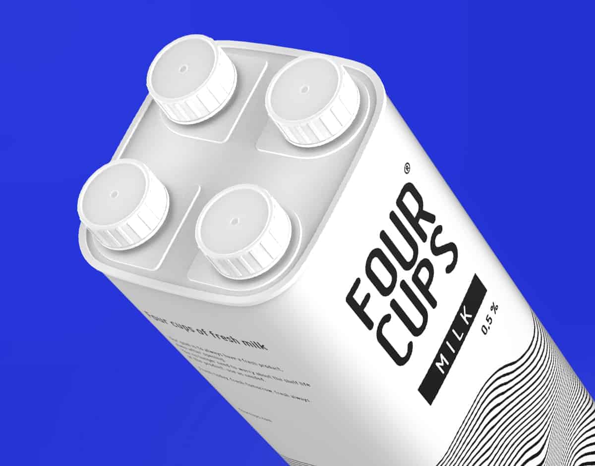
There were a lot of ideas. starting from tear-off stickers, instead of caps, ending with four separate containers inside one package.
In the end, I came to four covers, as this is the most affordable solution for the consumer to understand and use.
Without even knowing about the product itself, the viewer immediately understands what he is talking about due to the appearance of the package.
Having concentrated on this idea, I made a 3D packaging model to see how it will look from all sides.
Next, I started developing the name and logo.
The name "four cups" describes the idea well from all sides.
Following him, the slogan of the product “fresh today, fresh tomorrow, fresh always” was immediately born.
In the design of the logo, I strove for the shape of a square, and in order to prevent "dry statics" from creating, I broke the horizontal symmetry, creating a wave-like rhythm.
To maintain the dynamics of the logo, I created illustrations based on lines lying on volumes.
For milk, I chose the fluid form, and for juices, specific ingredients.
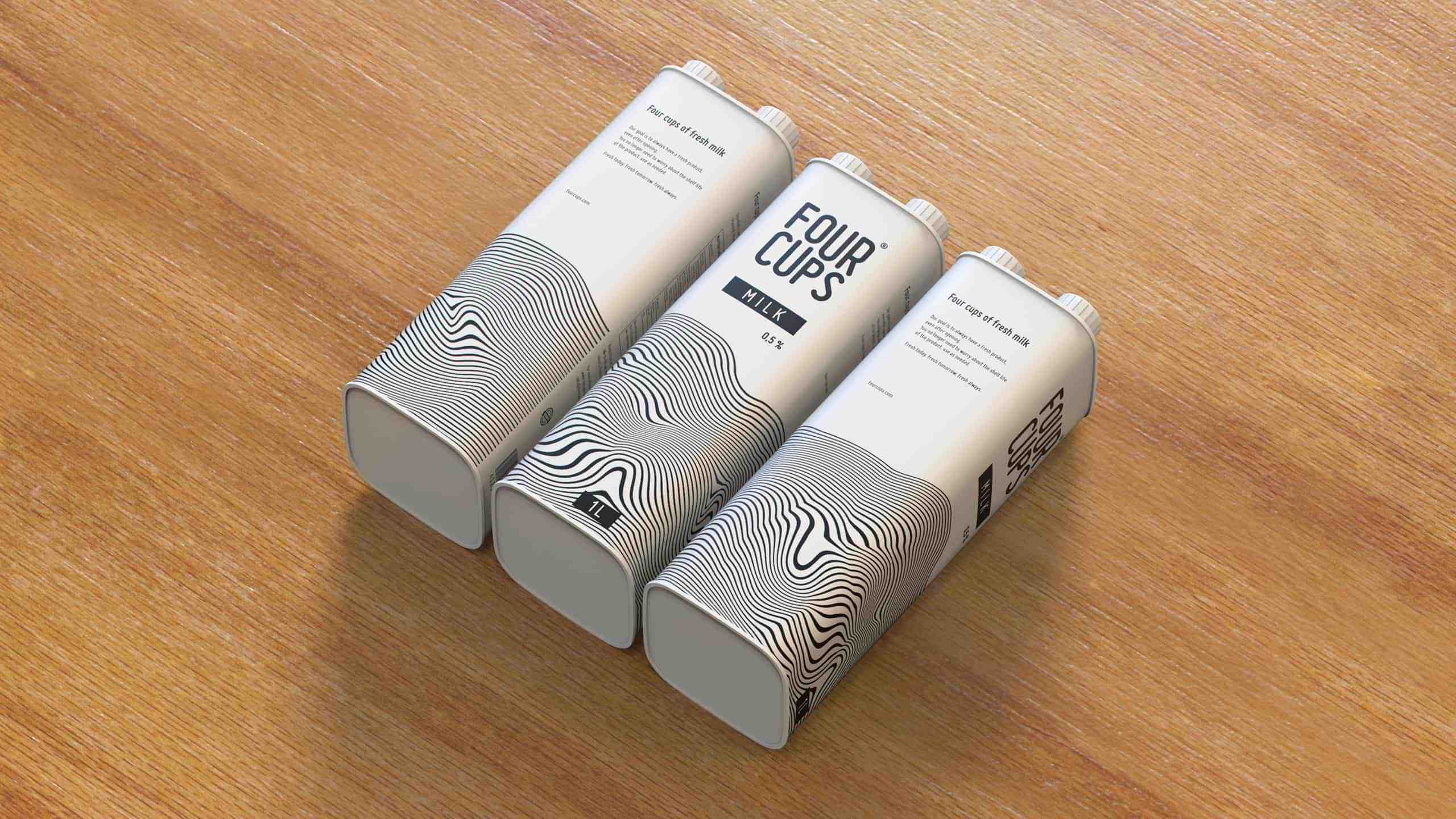
This graphic is located on three of the four sides of the package.
On the last side I put information about the product and composition.
Usually people react positively when they see this project.
It turned out that the problem of perishable drinks does not concern me alone.
Sometimes, in order to avoid this problem, people buy small packaging with drinks.
Approximately 0.5 liters (17.63 oz)
But they are expensive.
Hope you liked it guys ! Any questions or critics you are welcome ?
Stay fresh always !
Thank you !