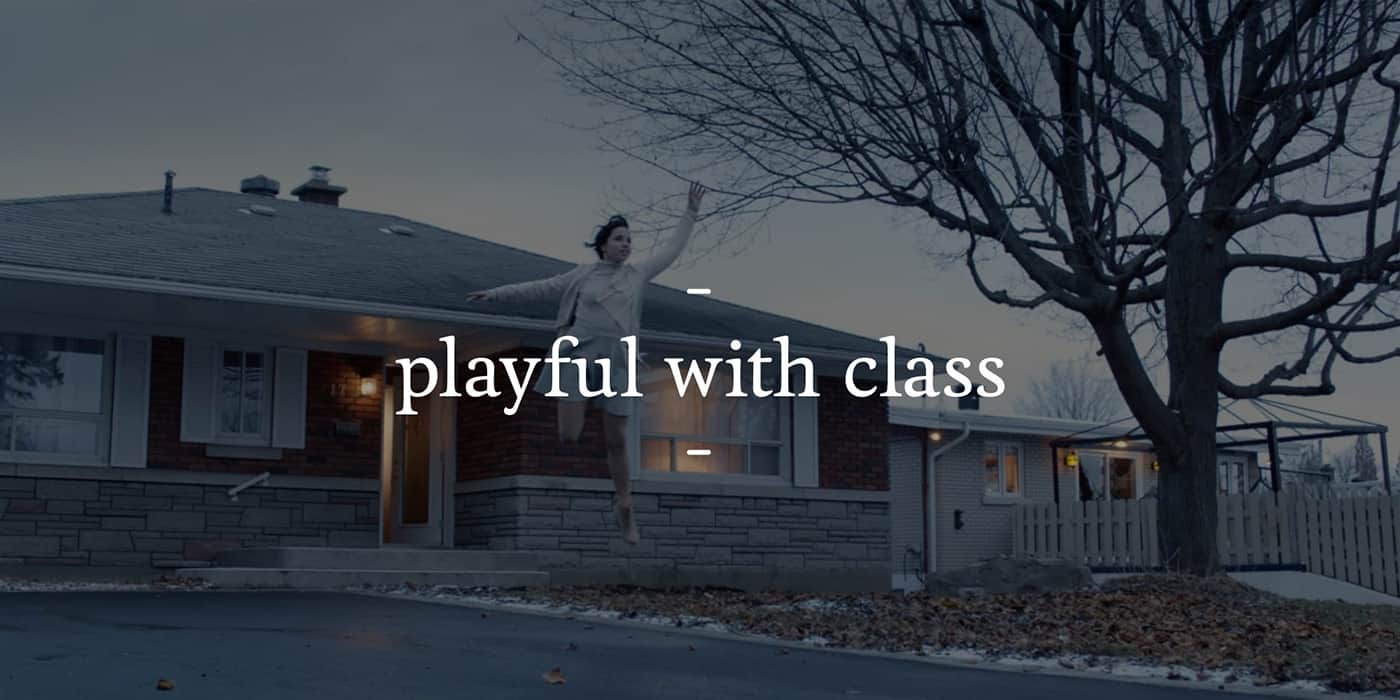
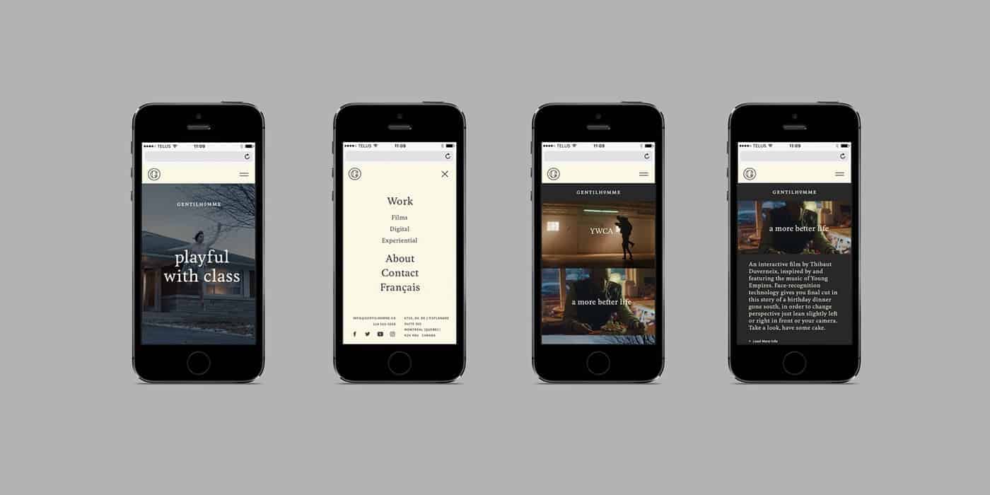
Gentilhomme
Identity for the studio Gentilhomme (gentleman in french). The studio, experts in creation and production of films, interactive experiences, installations and shows, has called on us to distinguish itself in its industry. Worthy of a gentleman, this distinction is already naturally due to the high quality of their achievements. And always worthy of a gentleman, their visual identity had to be equal to their talent: chic, a little dandy, sharp, the capital G stands elegantly by a set of circles meticulously calculated. The color palette, the serif typography or the printing processes chosen, nothing is left to chance to make this identity of high class.
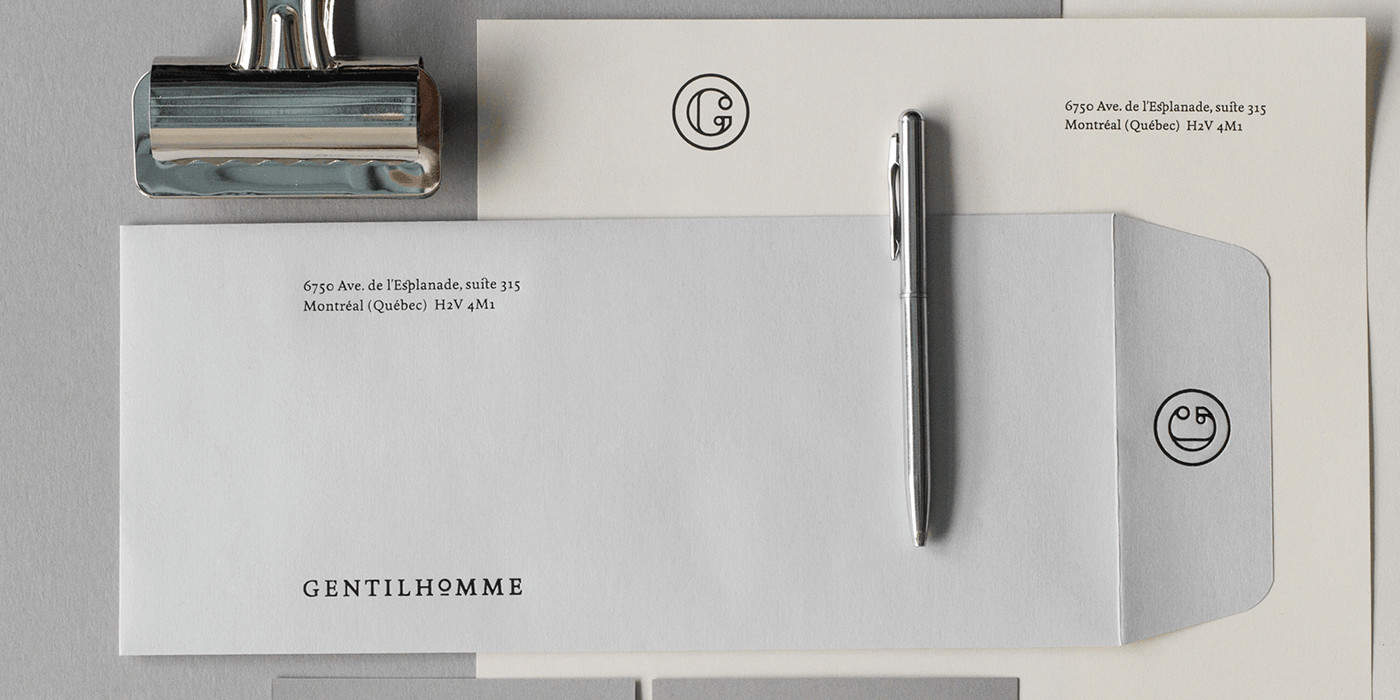
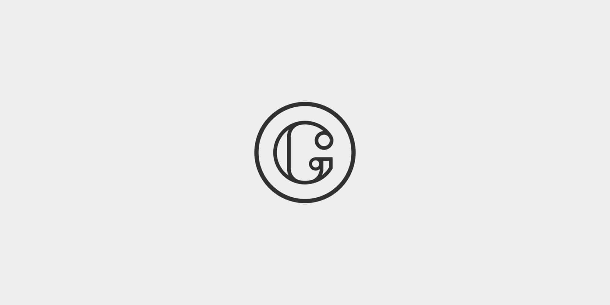
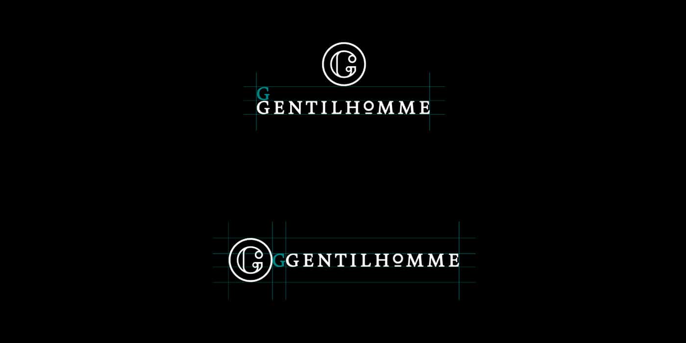
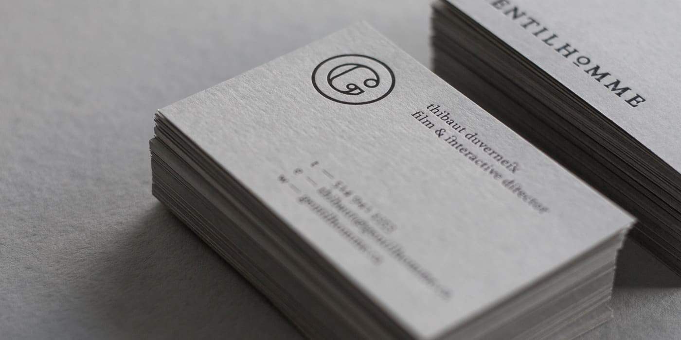
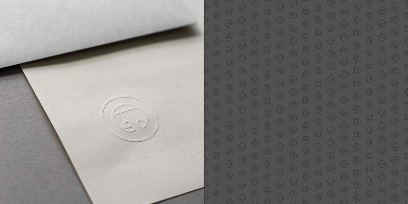
It all started with the idea of a monocle, object that represents well a gentleman in the old days. So we created a very rounded monogram with the letter G. We had the idea to incorporate that monocle in the wordmark. Choosing the colors and the paper was a bit challenging. We did not want something loud nor vibrant so shades of grey was a good option. We've added a bit of cream which brings a bit of warmth in the color scheme. Black glossy foil was used for the printing process bringing a "chic" side to the project.
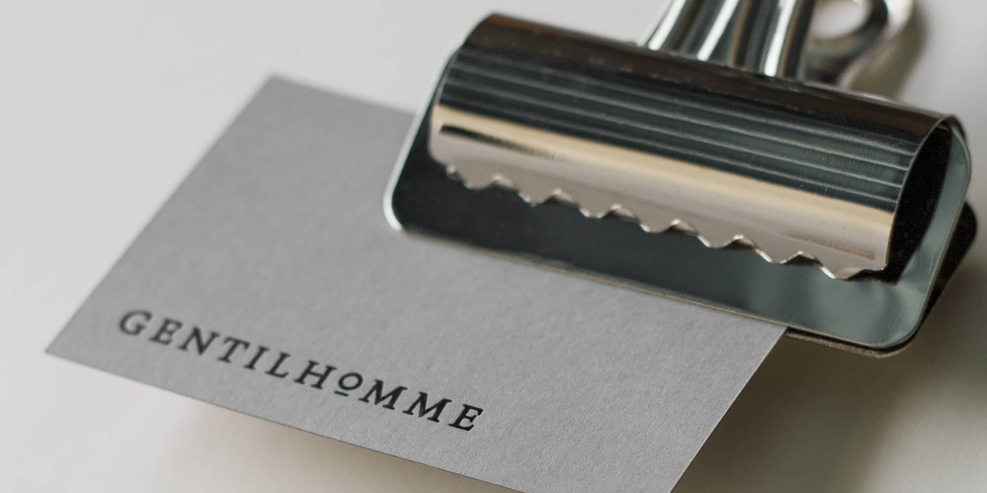
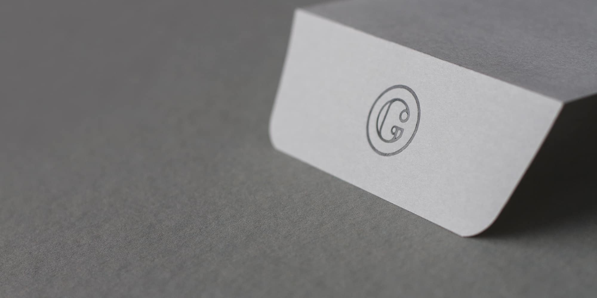
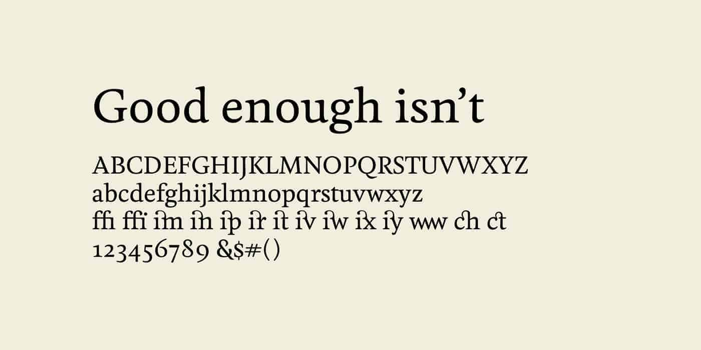
It was all done in Adobe Illustrator CS6. The monogram was all created from circles. The typography for the wordmark was redrawn a bit from the font Fiejoa Medium. We love those ligatures glyphs in that font that brings "dandyness".
Very good response from the client and also from their and our peers. Very proud of the results. We've learn that an identity does not need to represent the company services but more their values, their DNA, their essence. In this case, the identity matches the company name, or course.
I love it, it looks very clean and professional.