Konsou Branding

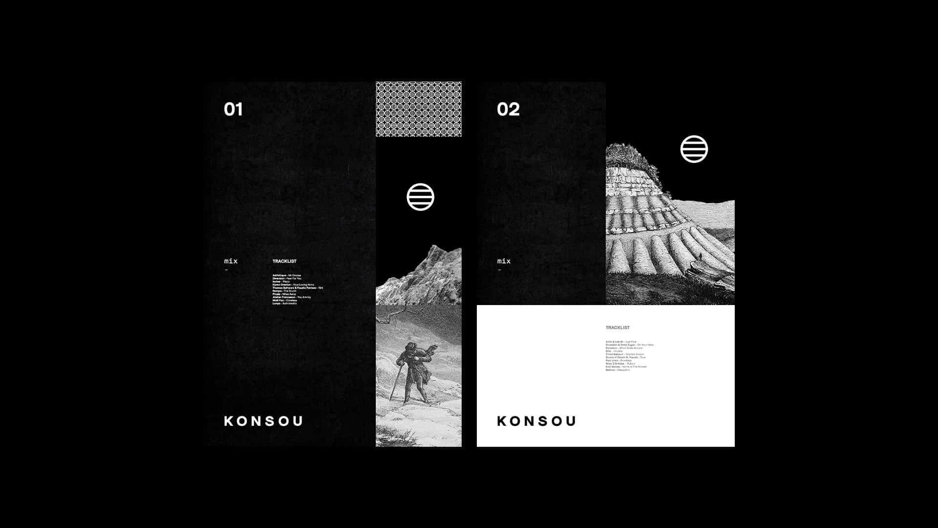
I've recently started creating music mixes again and began to think about releasing some for free. This basic idea spawned Konsou and this design project charts the journey of branding all things Konsou.
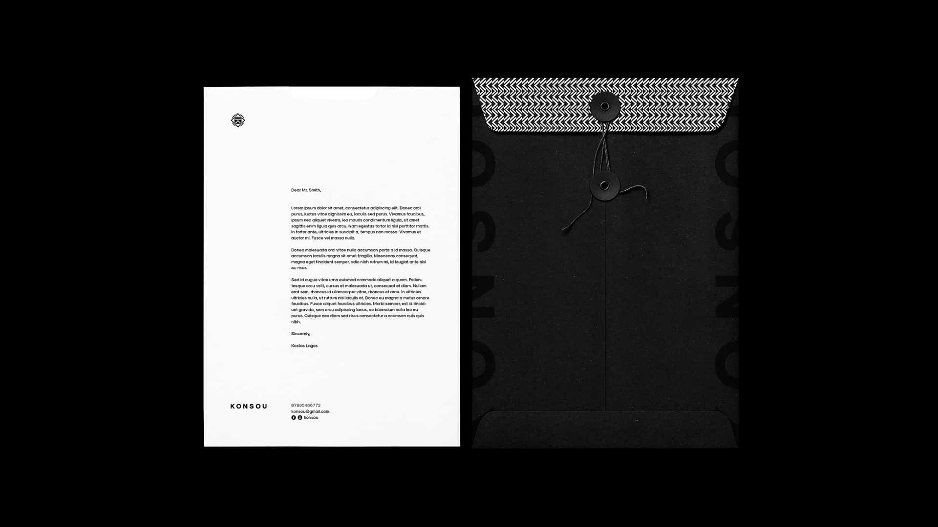
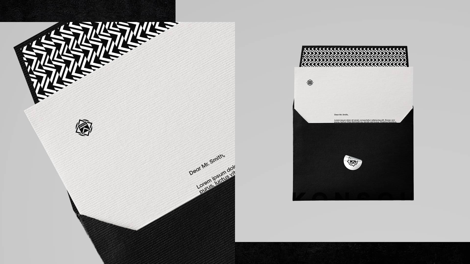
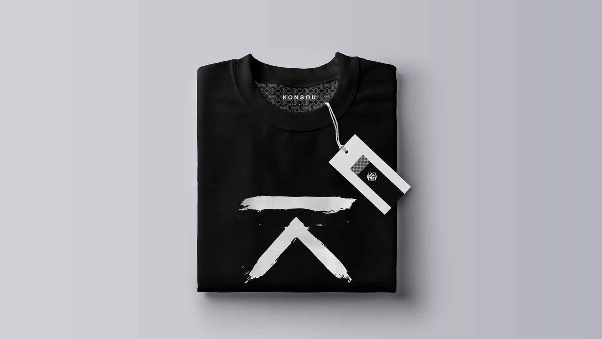
It blends elements that are fully usable today (i,e logo, symbols, stationary and posters) with others that are more speculative and would be dependent on the future size of the company (merchandise, CD compilations).
Simply put Konsou = my platform for releasing music mixes.
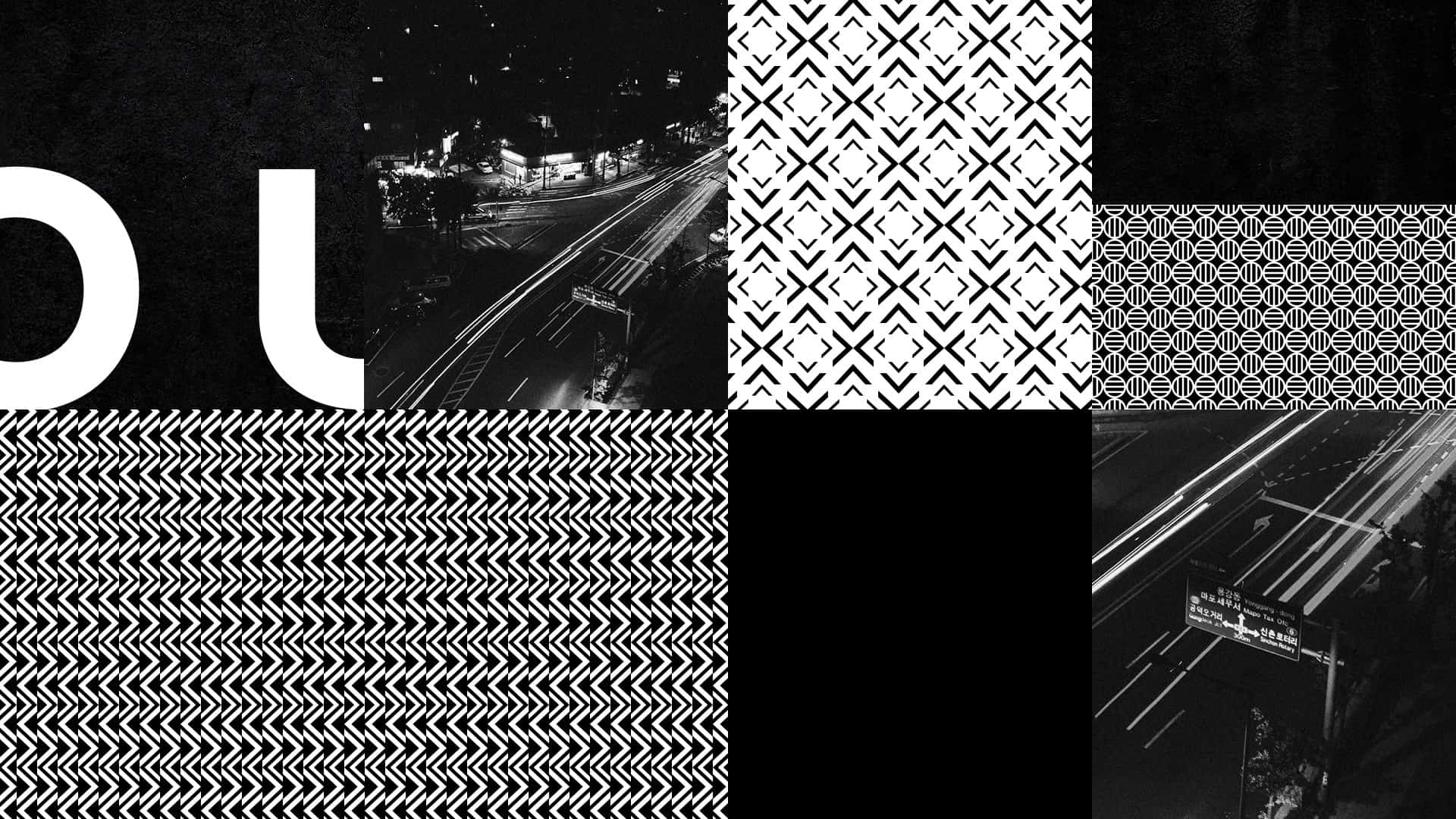
The project starts in its most basic form with specific imagery that I had pictured, for when and where I would listen to a mix of this nature. It revolves around night travelling - racing along a dark highway or speeding through a city on a train. A journey, both physically and through the music.
I chose the name Konsou as an altered form of Khonsu - the ancient Egyptian god of the moon. Of all the descriptions I found, "thought to watch over those who travel at night" resonated with the project and established a solid base.
With the branding I've married old with new. The ancient concept of one watching over the night traveller, within the modern day context of 21st century journeys.
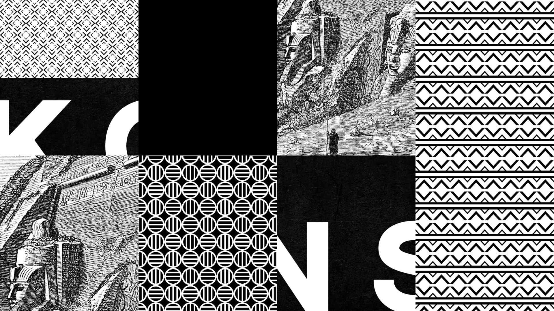
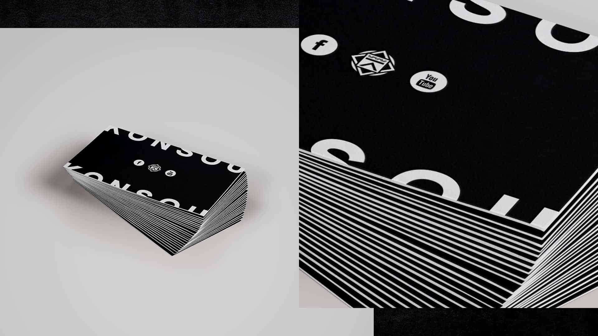
Branding imagery includes old illustrations of lone travellers as well as symbols and patterns inspired by hieroglyphics. I decided to keep the colour scheme strictly black and white. The black of the night and the white of the moon.
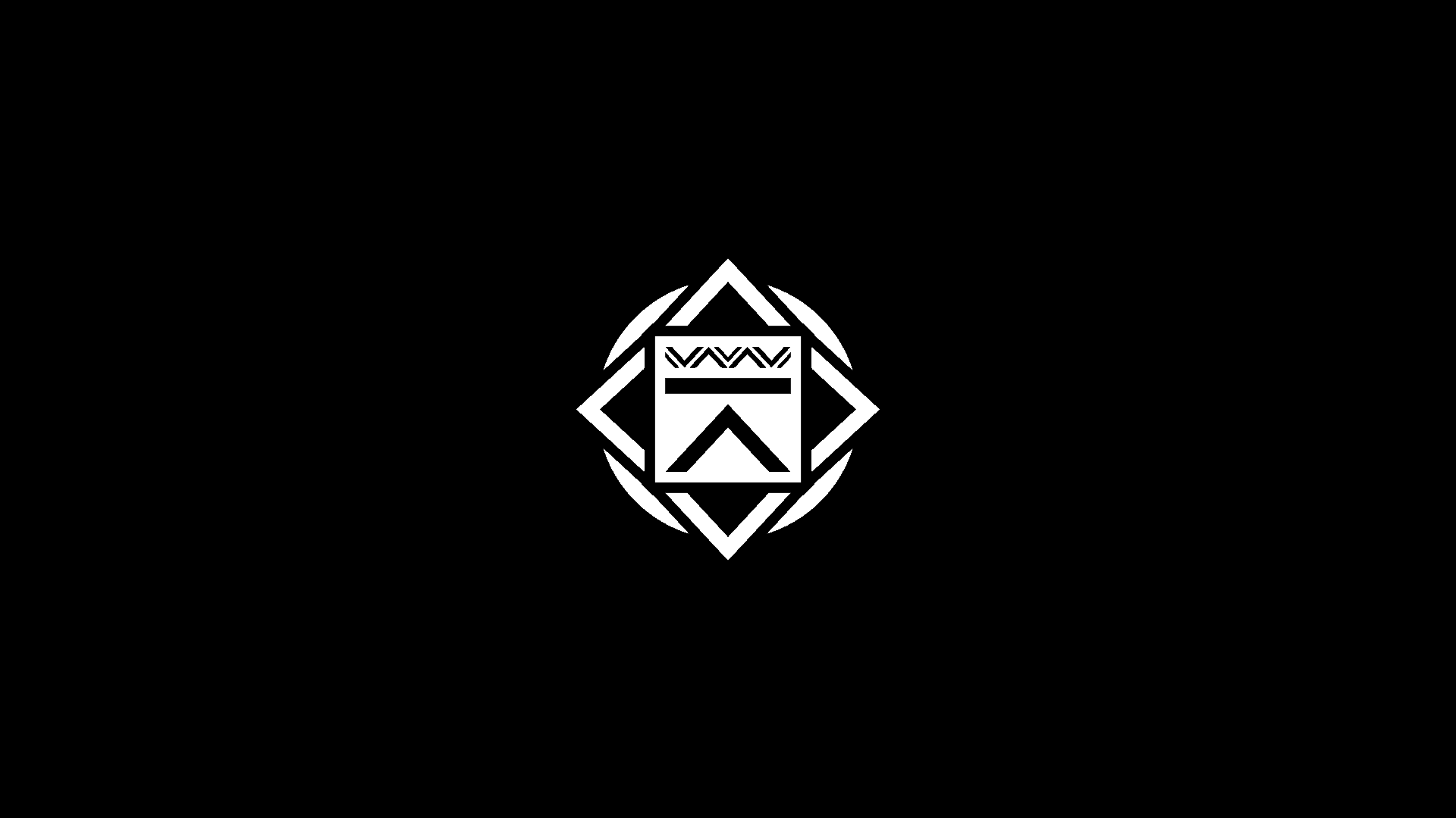
I wanted symbology to be a big part of the aesthetic and created a set of symbols that could be used independently as well as coming together as a whole to form the main logo.
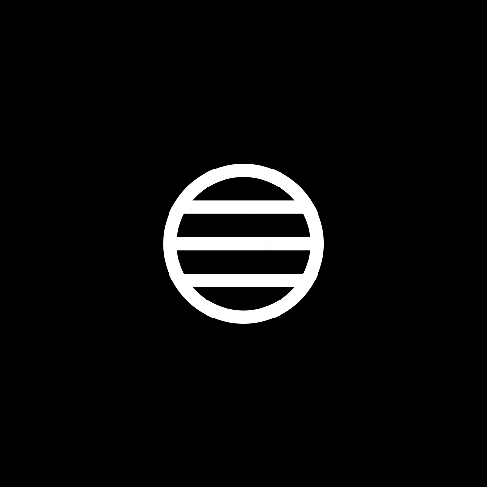
I started by brainstorming each symbol using simple pencil and paper. A "K" for Konsou rotated 90° to create more of an impression of "watching over". The second symbol is inspired by the Ancient Egyptian moon disk hieroglyph. The third symbol represents travellers (through the night/night driving) and journeys (through the mixes) and is influenced by directions and the points of a compass. It uses the same lower element from the K. The final symbol uses abstract sound waves mixing into each other to represent the audio/sound aspect of DJ mixing. It is also made up of the lower K element.
I then created each symbol in Adobe Illustrator as well as the final logo. I also used Illustrator to create vector patterns of each symbol. I created hand painted versions of the symbols to further their usage using acrylic and paper.
Photoshop was used for the stationary and posters as well as enhancing the artwork.
The response has been positive which is very pleasing as it is always a nice feeling to inspire others with your own hard work.
It has been a very fun experience to take a concept in its most basic form and see it expand into something I'm very proud of. This project has enhanced something that I learnt early on - the importance of a strong initial idea and your belief in it, as well as striking the right balance of meaningful creativity alongside it.
Thank you for taking the time to look through this project. You can see more images at https://www.behance.net/gallery/47556037/Konsou-Branding