Marlowe Hotel Identity

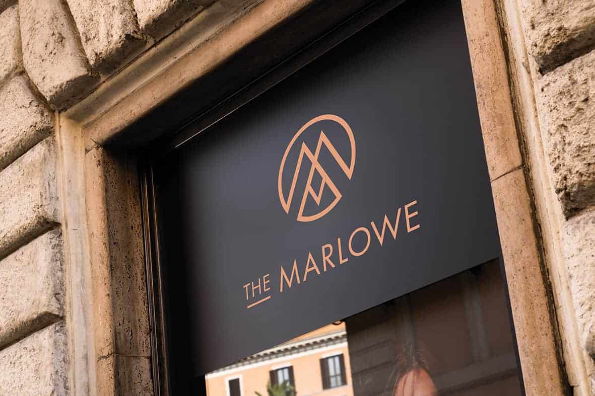
A new luxury hotel was opening in Wynard, Sydney situated within a reburbished 1920’s building that features Art Deco inspired architectural motifs and fixtures. The client wished to continue this style throughout while retaining class, elegance and a modern-sleek finish. The requirements for this brief was to establish a strong visual identity that conveyed the unique personality of the hotel. A combination mark logo was requested to communicate the brand across mutliple contexts.
![]()
![]()
Thoroughout my research and benchmarking, I decided upon a concept of ‘copper tradition’. Copper being a contemporary metal showcased in current luxury furnishings and a deep navy which is seen as traditional, trustworthy and noble colour. The symbol used in the logo is a glorified ‘M’ which came about after many sketches of the letter. This could also be used alone on promotional items if required. I used Futura as the logo type as it holds a solid and sharp appearance with symmetry similar to the style of Art Deco.
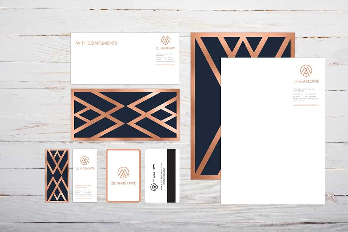
I sketched numerous geometrical and symmetrical patterns with the letter 'M' centred and contained. Using felt it pens, rulers and grid paper made this easier. After deciding upon a design it was easy to recreate it in Illustrator using the shape and line tools. Finally I was able to expand the symbol and the type and create it as a compound path which I then used as a clipping mask after I embedded a copper texture into Illustrator.
Many people were able to pick up on the Art Deco appearance of the branding. The only thing I would do next time is make the support graphic seen on the back of the stationary a bit more delicate. It's a bit bulky on the back of the letterhead.