PESSA

PESSA is a creative studio that creates concepts and materializes ambiences, scenography, sculptures, wardrobes and so many other forms of artistic expression that start in stories. Stories that are outlined, in the ideas that take shape and that are the main pieces for cementing all the work.
The challenge started with choosing the brand’s name. In this studio, the entire creative process is worked on, until its artistic materialization. In this process, in which ideas and art are working side by side, we needed a name that would allow us to address everything they do, in an innovative and bold way, without seeming meaningless. So, we thought of an element that is common to everything they do. Then came the name PESSA (in portuguese, phonetically, “PESSA” is similar to “peça”, wich means “piece”) as an association to both the unique and author pieces produced by the studio and to creative work - which produces key parts in the concept and in the scenic composition. PESSA (piece) is the unique and dynamic form that shapes concepts, scenarios and pieces.
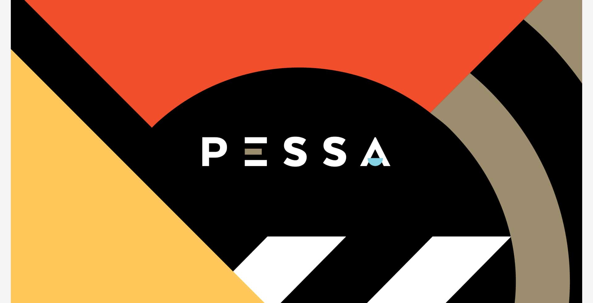
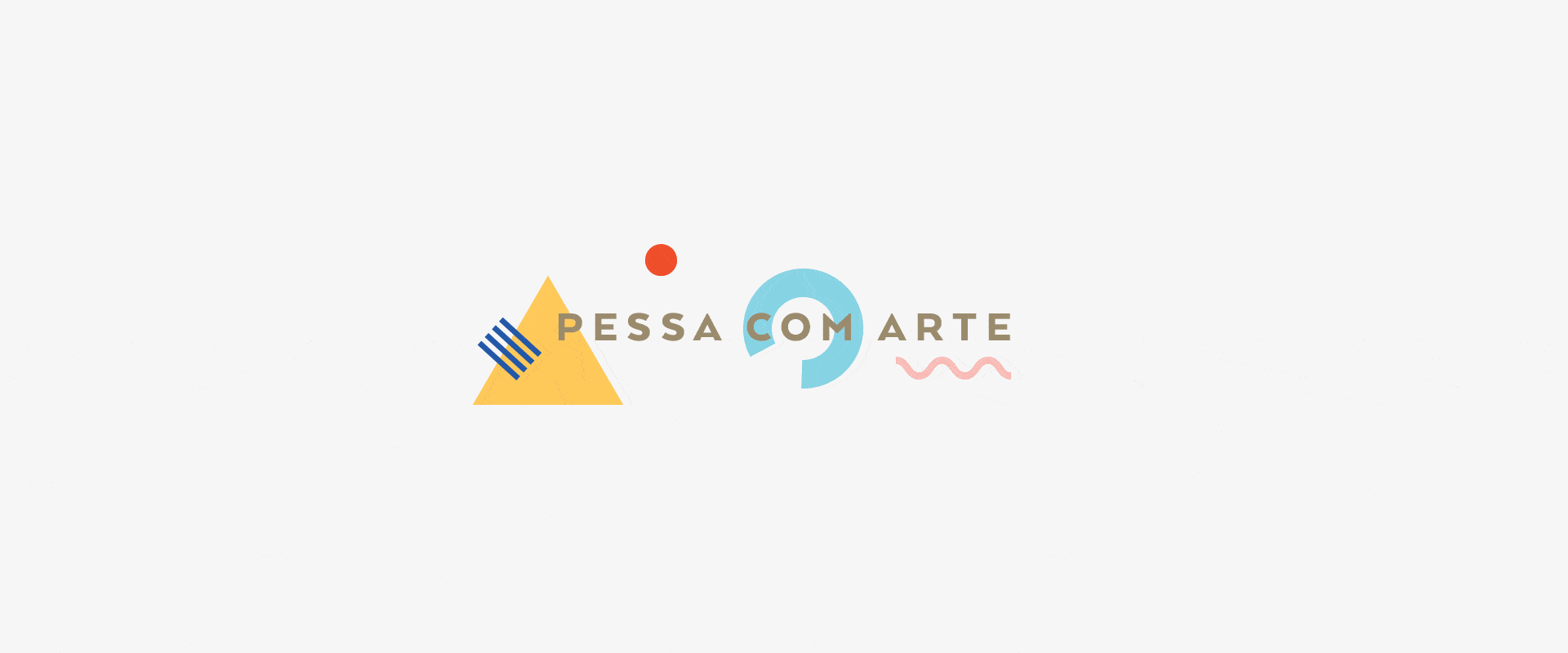
This is a brand that challenges closed concepts and aims for out-of-the-box ideias and authenticity. Therefore, all these concepts had to be transferred to the visual identity. We wanted to create a dynamic brand, in which PESSA was transformed from project to project, service to service. A mutable PESSA, who gained color, shape and is part of a whole.
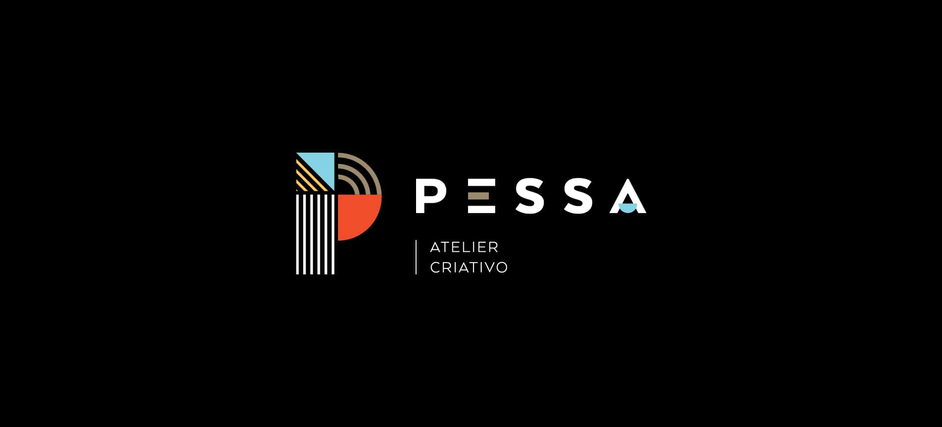

We then arrived at a key symbol, by using the “P” of PESSA. This "P" is not just a letter, it is a piece built by several pieces. Forms that are transformed making the symbol unique, unrepeatable. Alongside the symbol we have the lettering that was adapted for the brand with a distinctive imprint in some characters, always based on geometric shapes to connect to the imagery of the piece, pieces that connect, almost as if it were a children's game, in which there are these basic forms and that we can make the constructions we want, creatively.
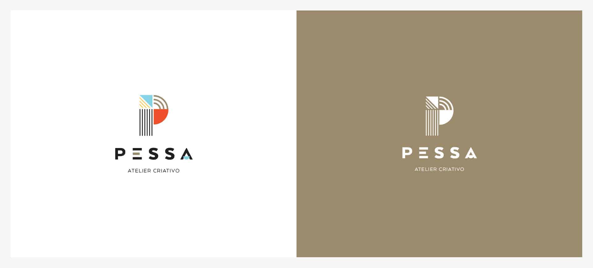
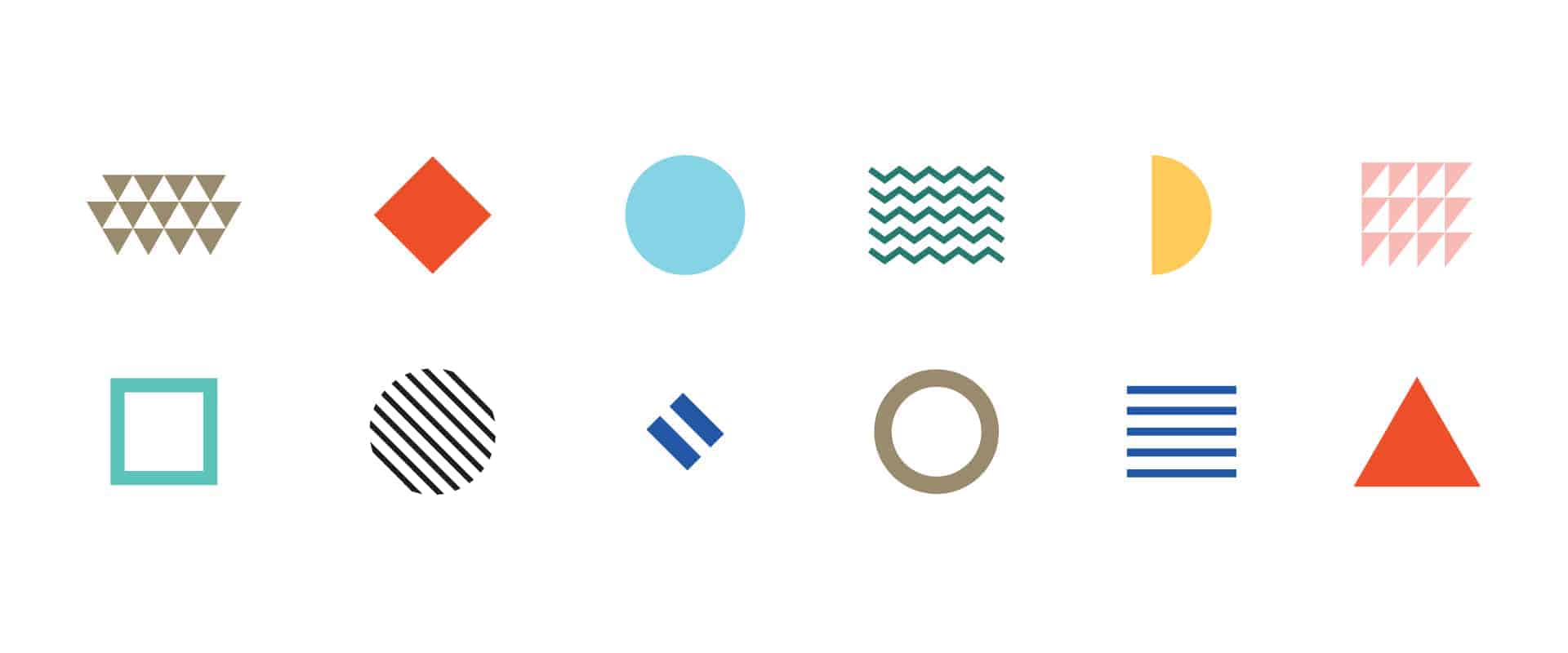
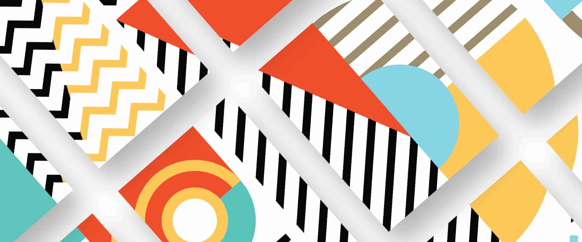
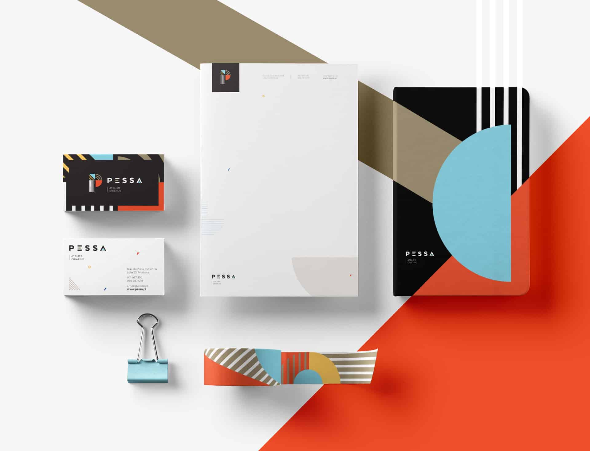
As a link to the typology of projects that the studio develops, a colorful identity was created, which conveyed a youthful spirit, joy and dynamic, that is dimmed down by the blacks, whites and golds, paving ground to their most serious and professional aspect. In this way, we achieved a visual identity that conveys what the brand really is at its core. An image that is as subjective as art, as unique as the studio.
The design of this project was developed by me, the naming by my colleague Diana Melo (linkedin.com/in/diana-melo-a3400111) in a professional context, at the agency where we work LOBA.cx (www.loba.pt)
I love the design!