Se.Re

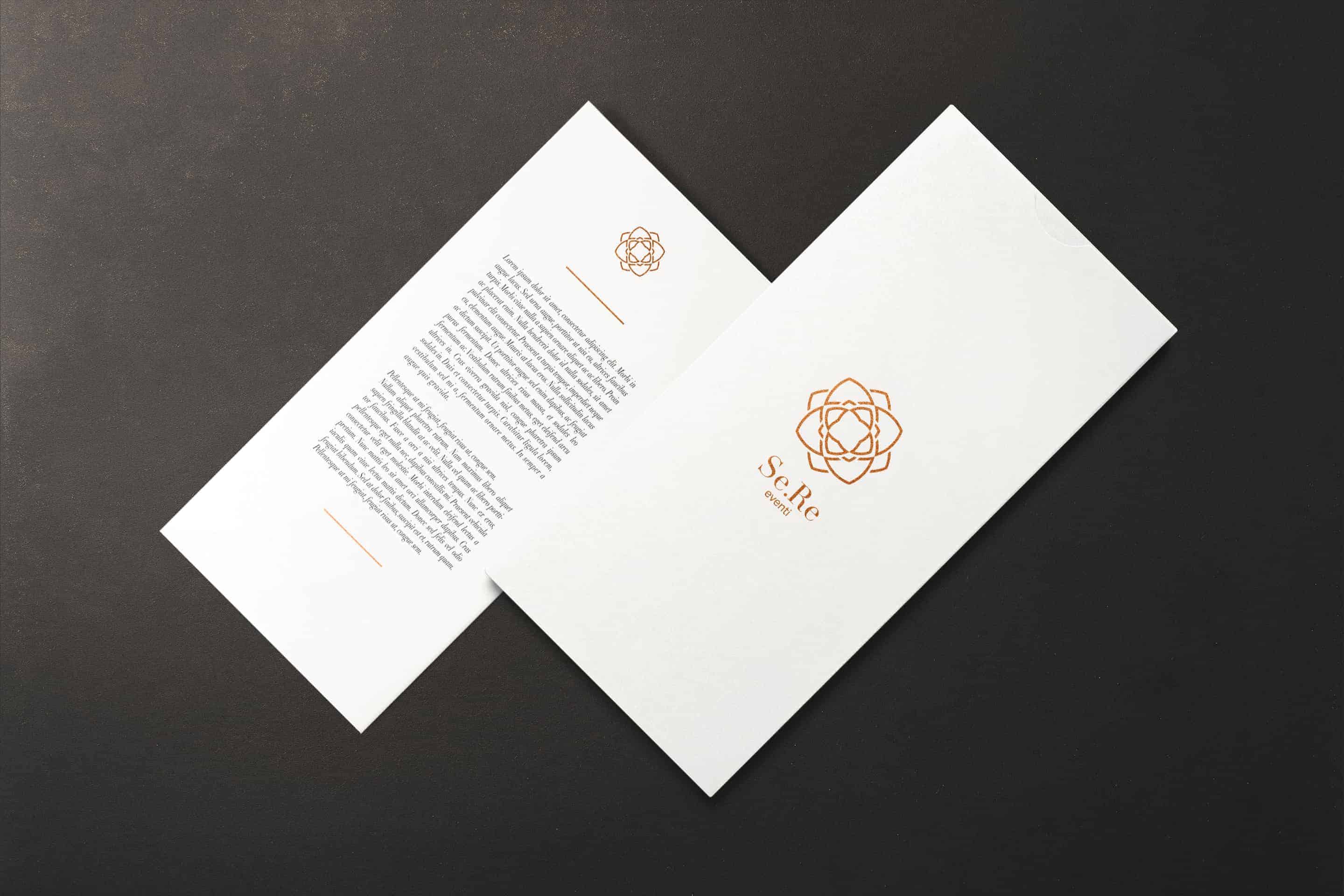
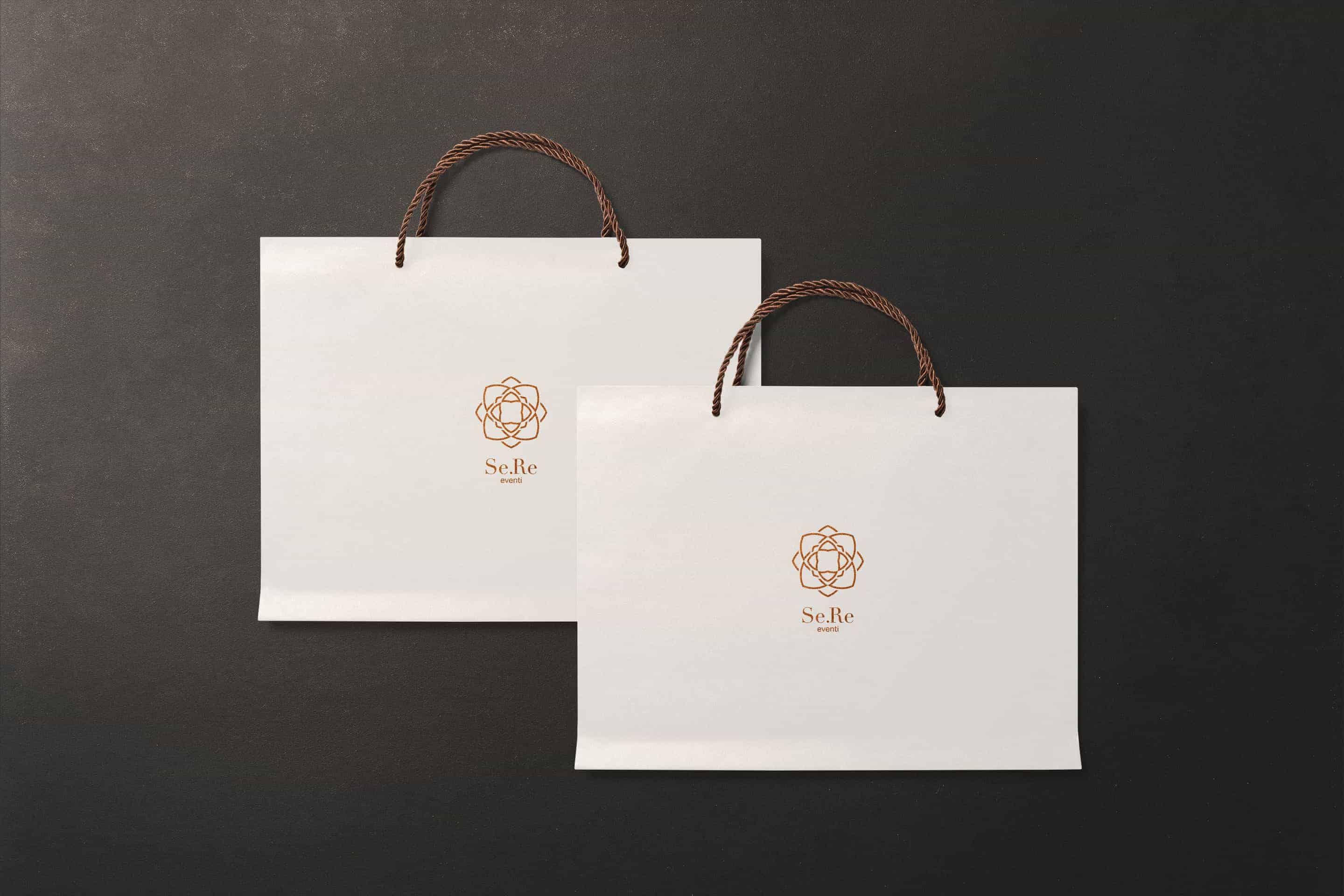
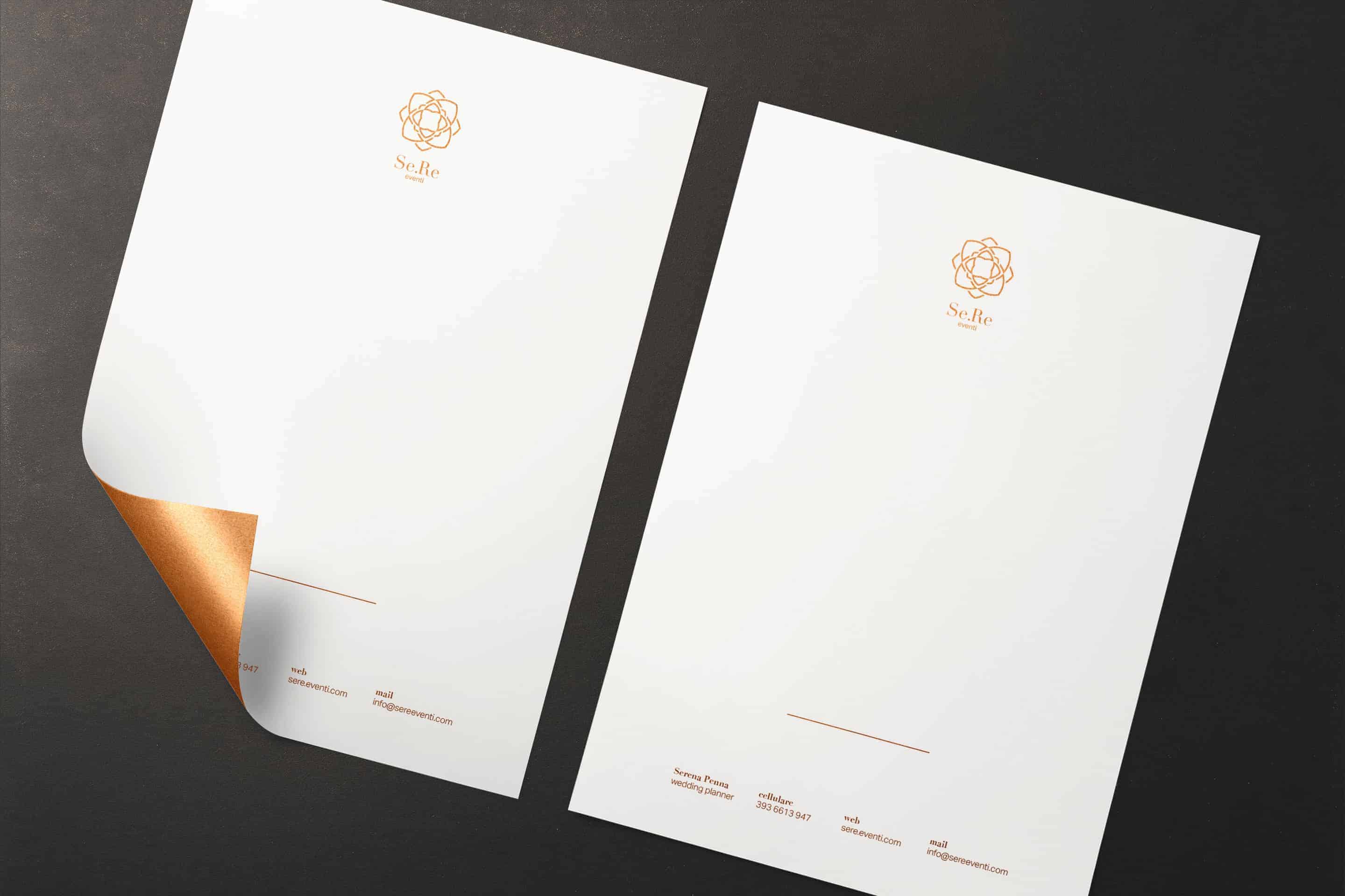
Serena Penna is a wedding planner. Se.Re eventi is the name chosen by Serena for her agency. She asked me to make a simple and elegant logo that recalls the luxury and simplicity. I was inspired by peony to design the logo and after obtaining the final result I decided to use only the foil stamping for the realization of the corporate.
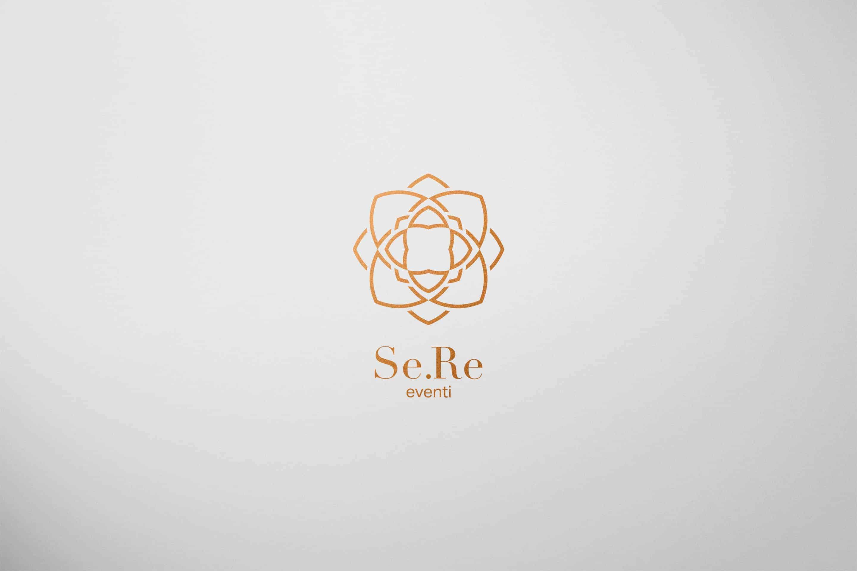
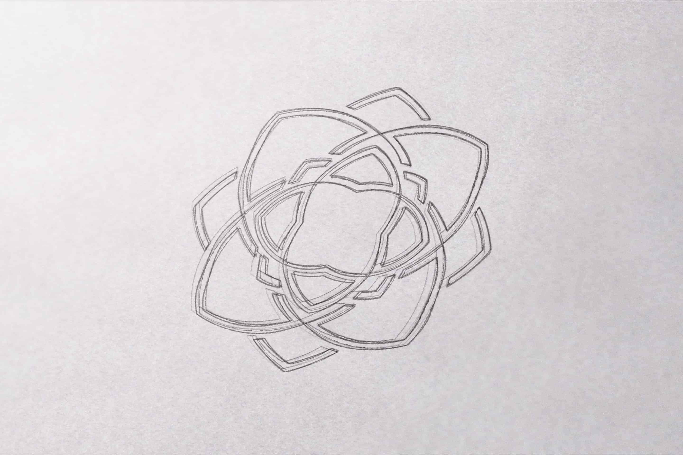
I was inspired by peonies, I made many sketches to try to stylize as possible the figure of the peony. After many drafts I got a clean, elegant and easily reproducible symbol, I chose the Didot as the official font and I created the logo. Serena asked me to make a simple and elegant product, so I decided to use the foil print to design the corporate.
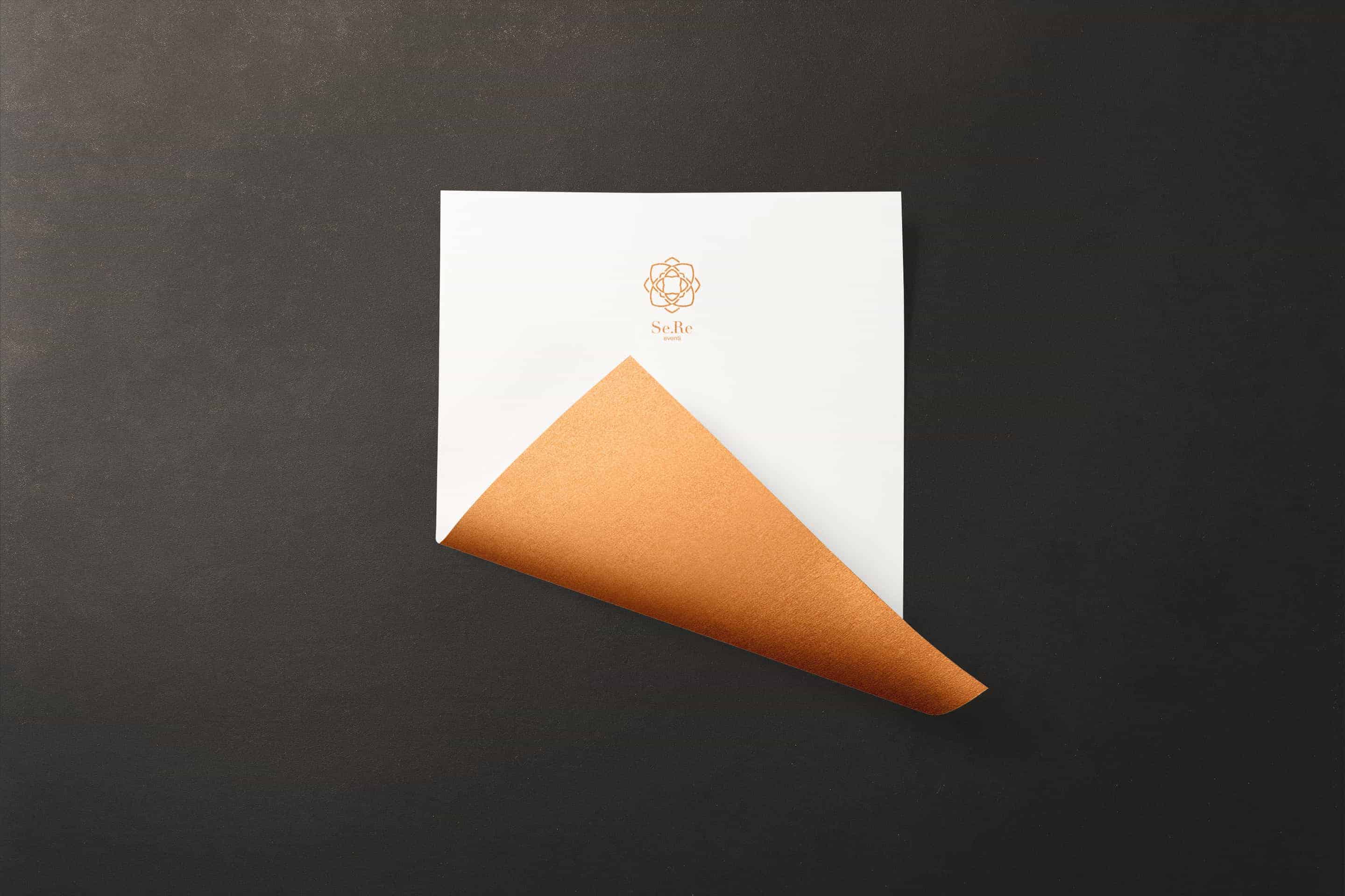
I used pen and paper to get the first symbol, then I completed the work using Adobe Illustrator to design the logo and Adobe InDesign to design the company. First I designed the logo in black and white and I made several color tests, only after I have chosen to use the foil printing.
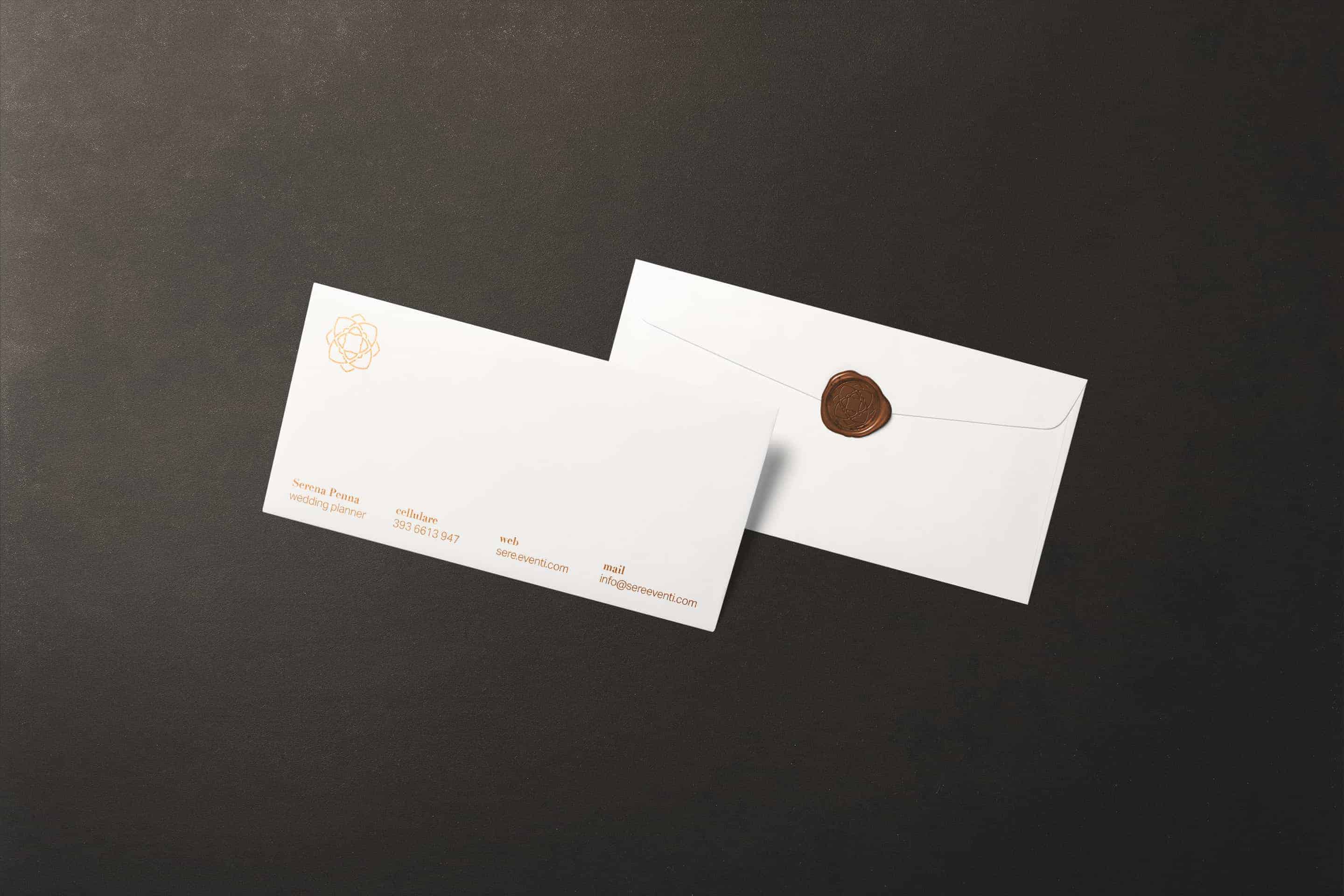
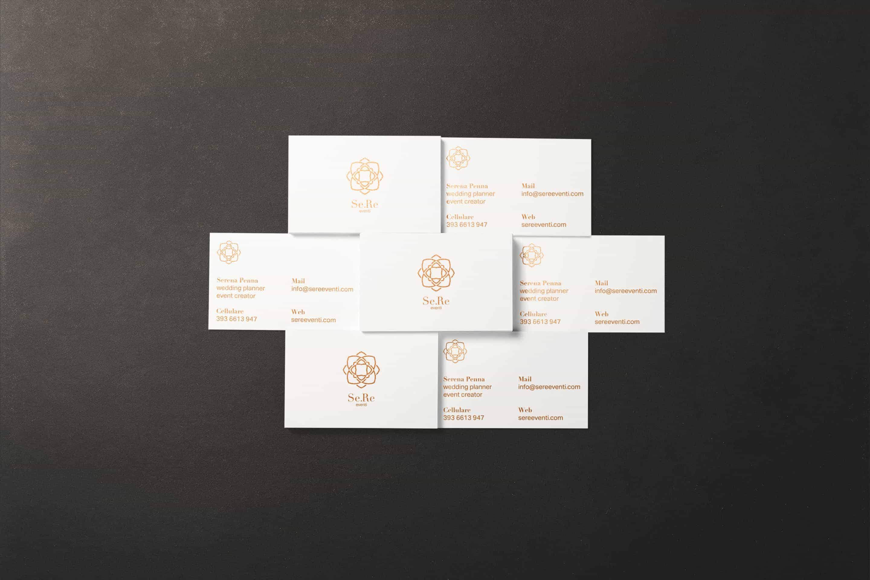
I showed the project to different people and they all told me that the logo expresses luxury and elegance. I received many appreciations for this project, but the most important thing is that Serena is very satisfied with my work and has already printed and distributed business cards.
Nice.
Thanks ;)