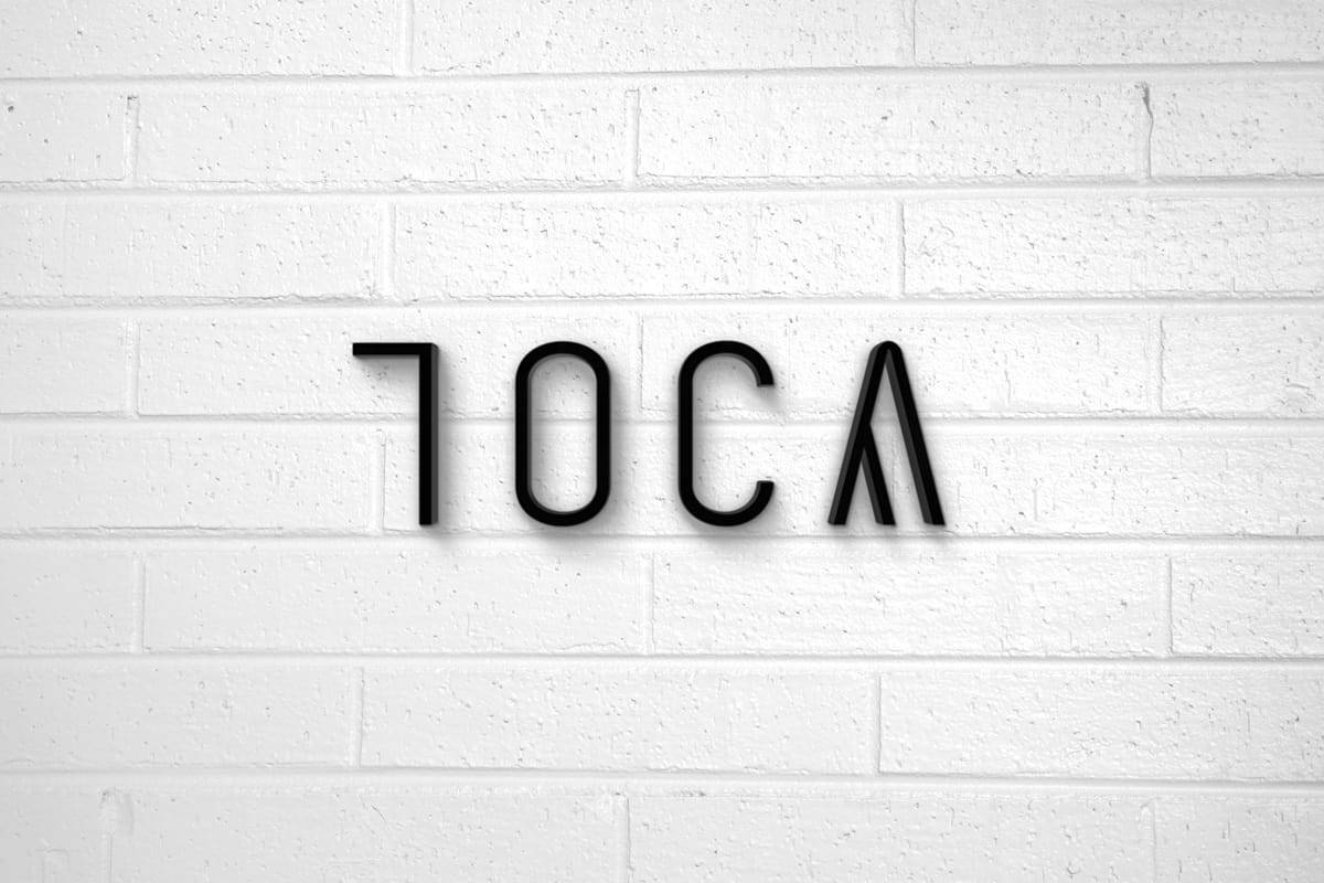
TOCA

Besides being an architecture studio, TOCA is also a vision and concept. Two architects share the same goals and purpose, so they got together to develop their projects and hired me to create their image. Their style is sophisticated, so they needed an identity that translated who they truly are.

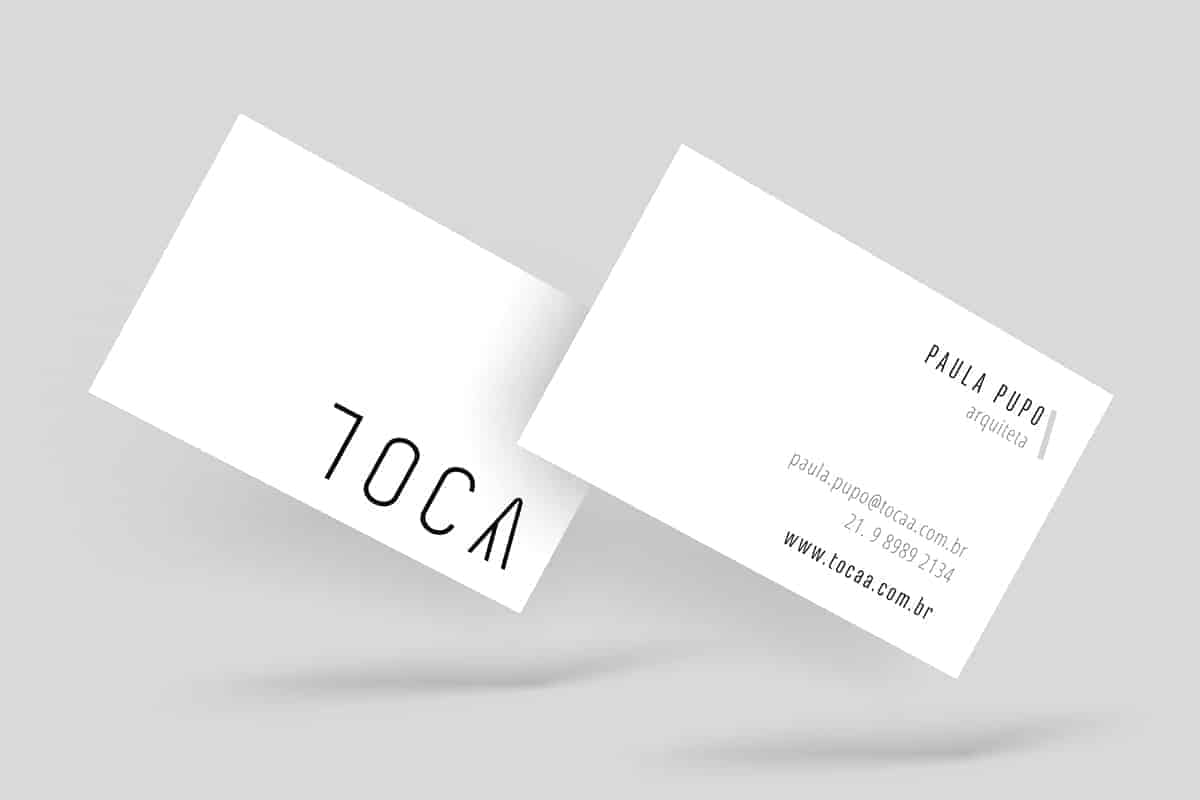
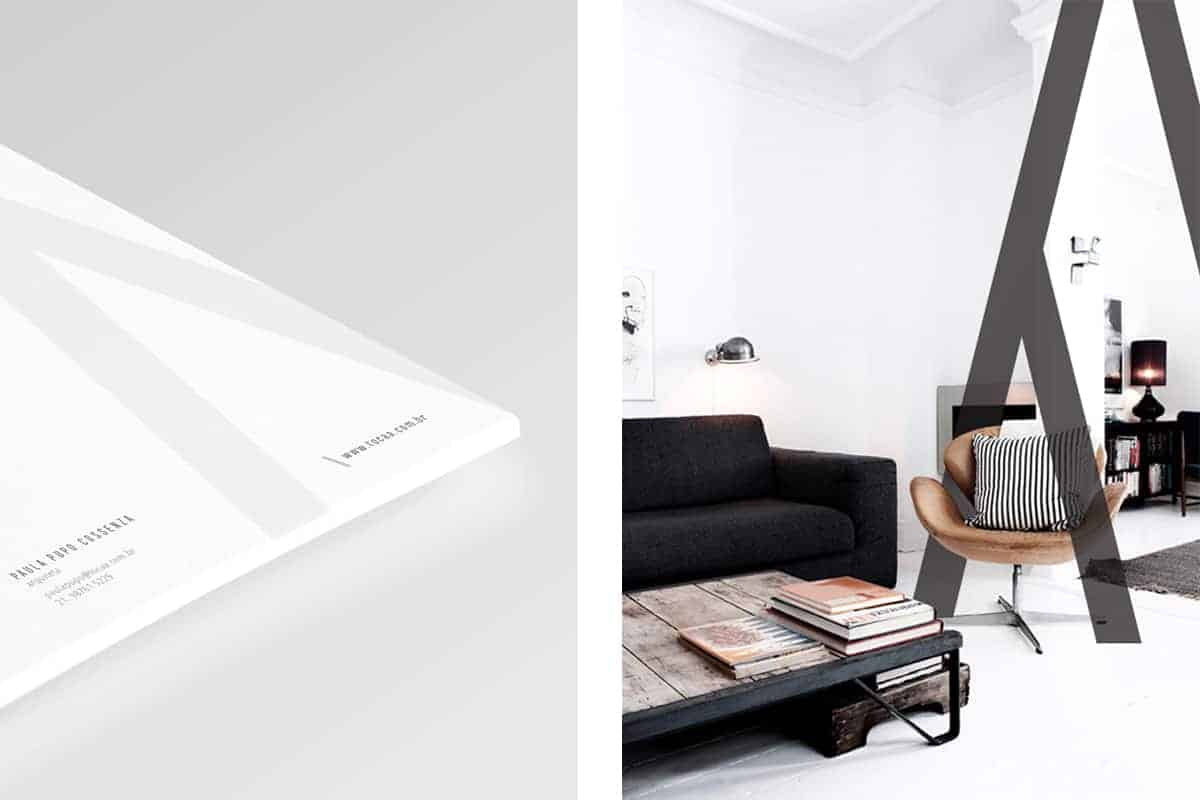
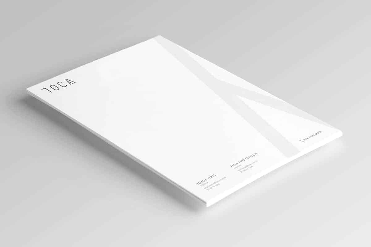
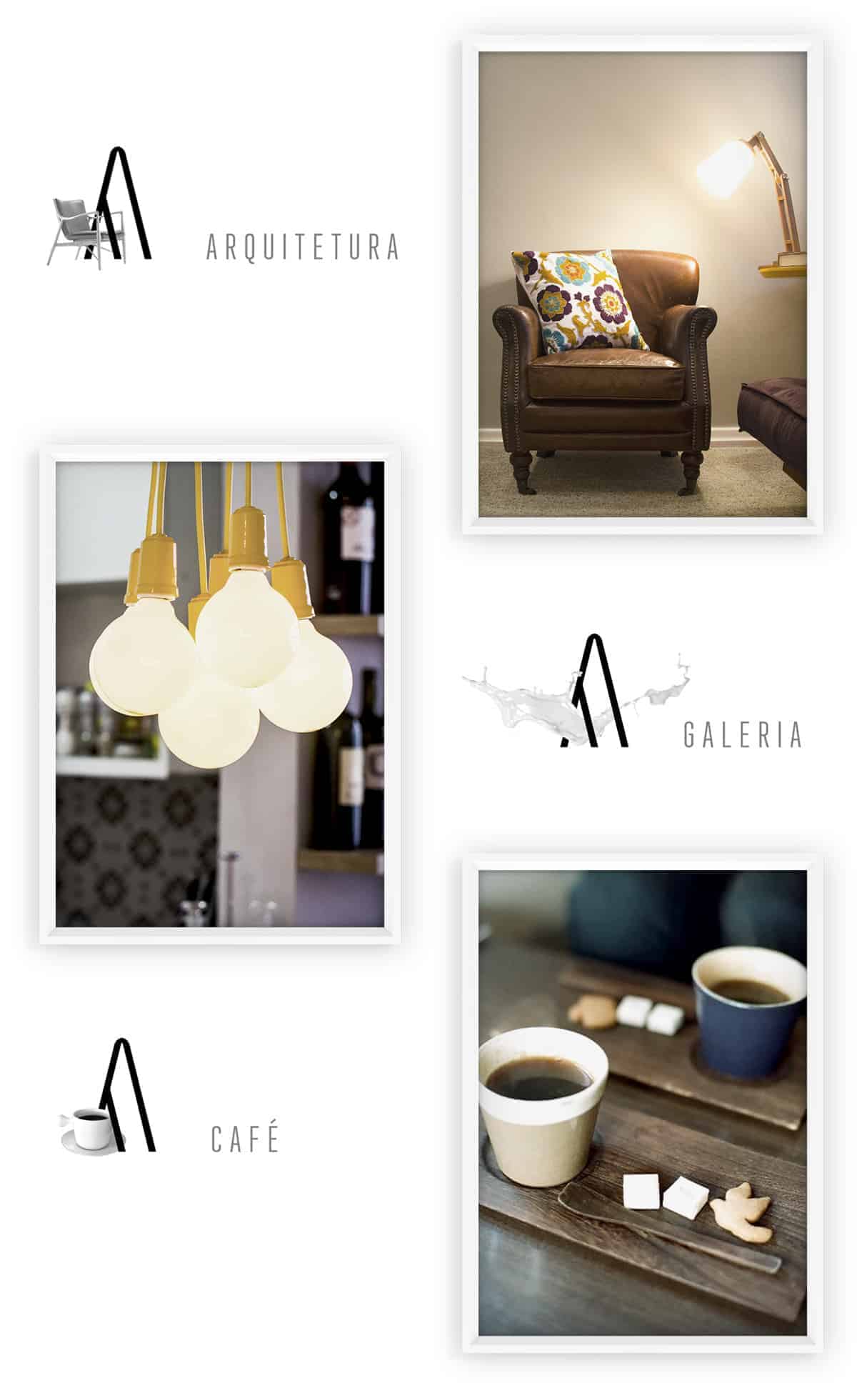
TOCA was born from the idea of two architects to create not only a studio, but an inviting space that would bring together everything that architecture is about: projects, design, art and experience. They already had a name; in portuguese, "toca" means lodge. The concept is represented on the typography, where the letter "A" is this "toca"/lodge.
It's clean and sophisticated, so as the architects work and personalities. The thin logotype and the color palette (black, white and grey) follow those directions.
On my creation process, I feel that it's important to start from sketches on paper, so all the beginning ideas can come out. The process involves concepts, key words and drawing. After some experimentation, it's possible to have an idea of what works and choose which options to develop. Then, I basically use Adobe Illustrator to refine and finalize.
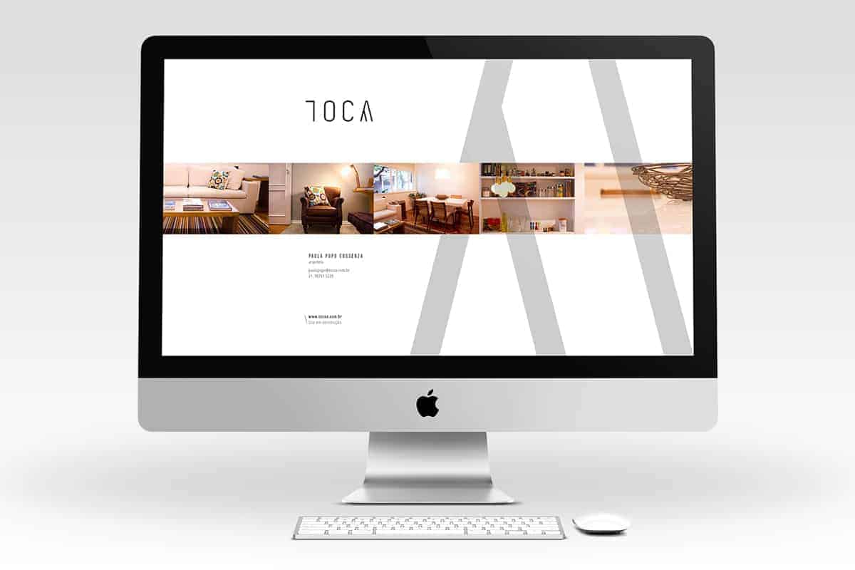
Once the project was presented, both architects already felt very represented by the identity. Their feedback was completely positive. Since they loved everything, they also requested the creation of their stationery, temporary website page and a presentation of their portfolio.
This project is part of the work I do for NORTHWEST, a design collective of which I'm one half. Please, visit our page to learn more about our work! be.net/nthwst