Global Fluid Branding

Project developed in 2017, where it was requested to redo the identity of brand, branding and communication of a Design Company of Industrial Mechanical Seals. The brand previously had a very old logo and with many problems of readability and pregnancy.
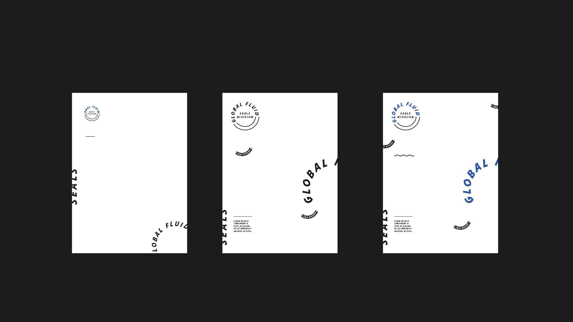
Conceptually, it is inspired by the shape and features of mechanical seals.
My client had the idea of refreshing his company, and from his old logo, he just wanted to keep his colors but get a much more modern proposal of his brand. The style is born from the visualization of the features of mechanical seals, and I wanted to represent them through modern typography but with aggressive or hard endings or finishing, as are generally the tools and accessories of the industrial world. Finally, the brand is typographically constructed within a closed circle to conceptualize the shape of a mechanical seal.
For this project I mainly used Adobe Illustrator and Indesign. First I made a study of the shapes and the main features of the mechanical seals, I photographed details of these stamps and based on these photos I made a search of graphic elements and typographies that are coherent with this market segment.
I always ask for feedback before presenting a project, and many people saw it very well projected, and the change of image generated a very large visual distance from the old brand.
Always do projects from different markets gives you learnings about this market, I did not know anything about the mechanical seals, it is something a little unknown, but now I think I am very well informed about this world.