Yoshimori Teppanyaki

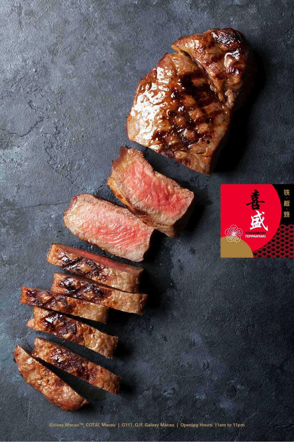
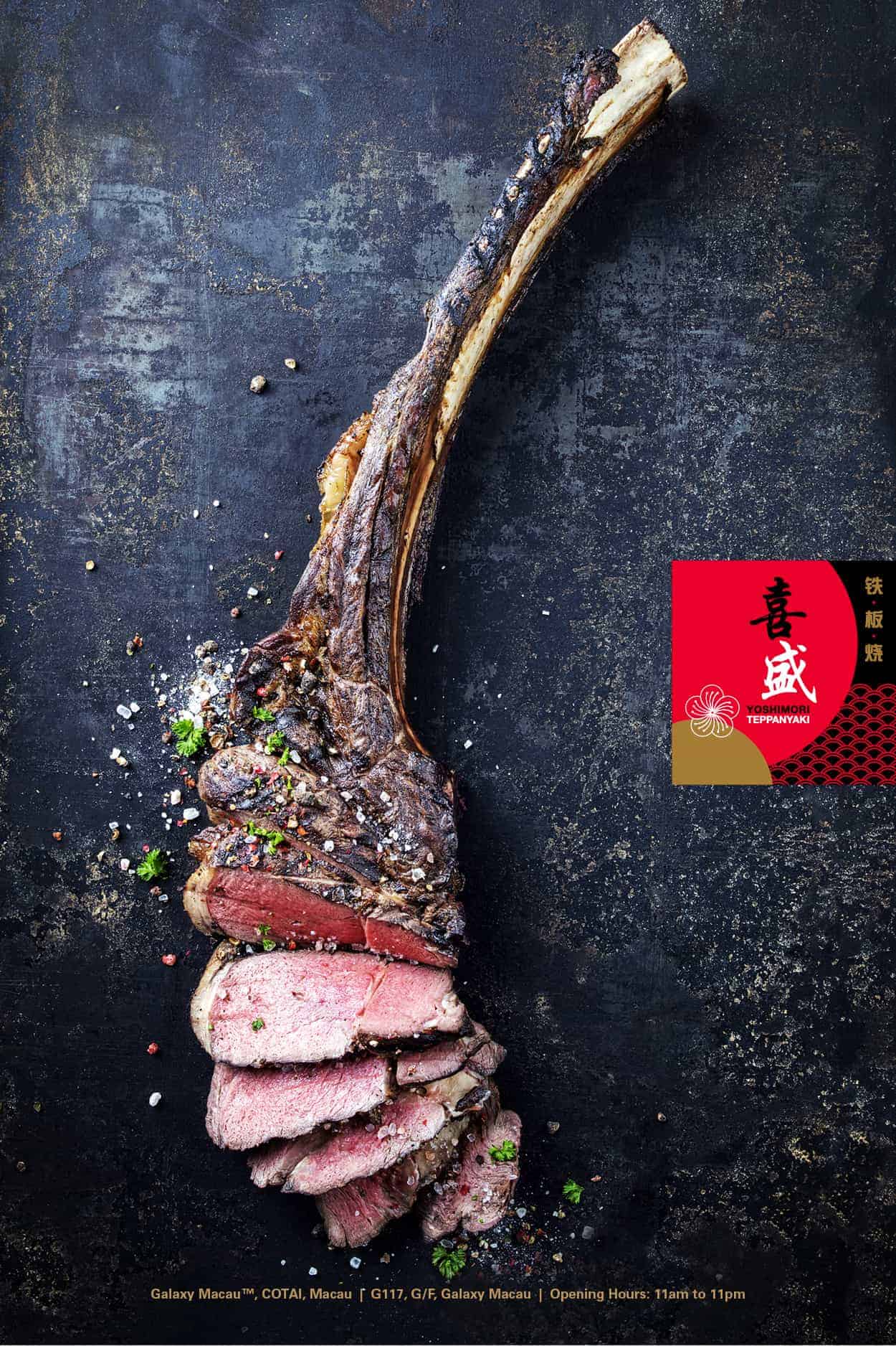
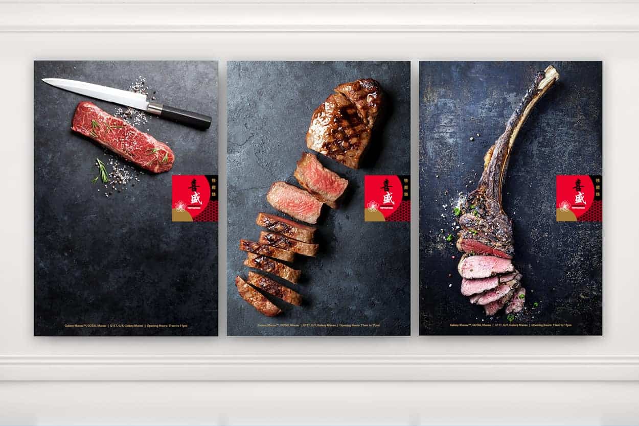
Yoshimori Teppanyaki aims to be a space which provides a lively and casual dining atmosphere that appeals to the mass market. The chefs in the restaurant use only fresh ingredients to create a variety of exquisite, value-for-money culinary dishes. Be it a tourist who hunts for new food experiences alone or a local who loves to explores new dining places with loved ones, Yoshimori Teppanyaki caters to them all.
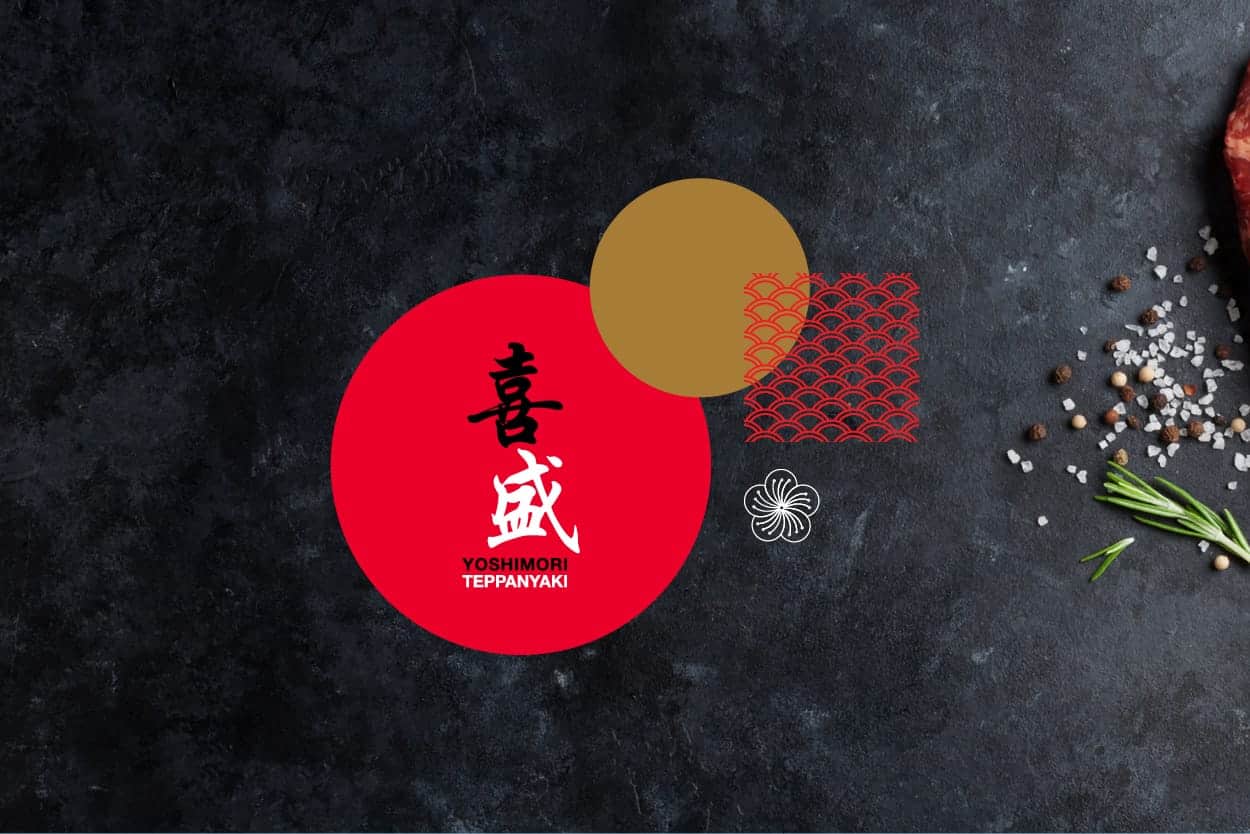
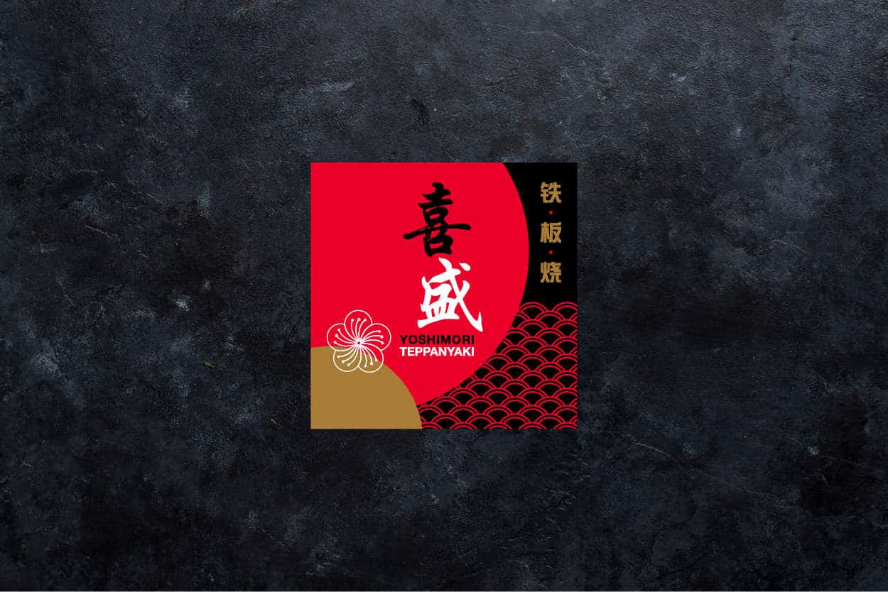
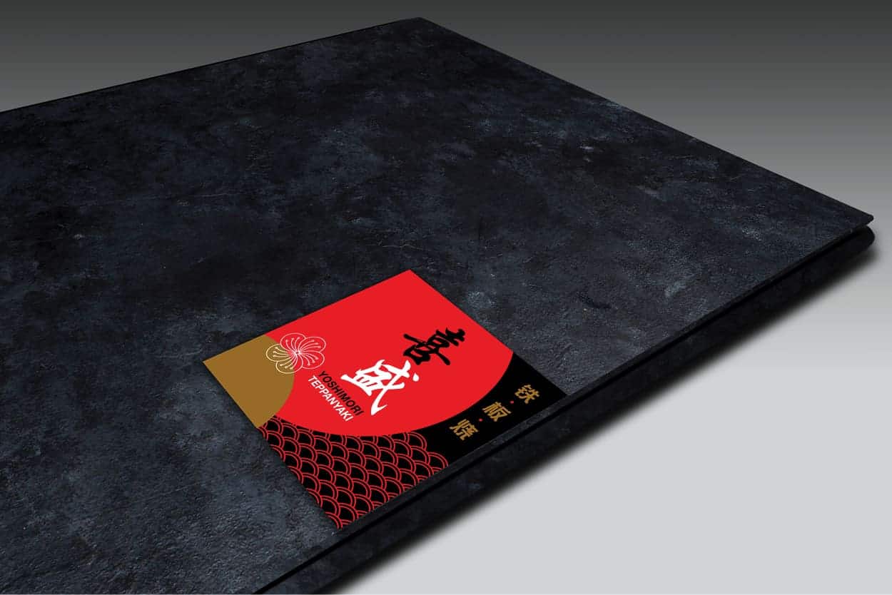
I wanted the new brand to have a feminine touch because the restaurant only engages female chefs — thus, the use of a sakura flower as part of the logo. To give off an authentic cultural feel, I have combined other familiar Japanese elements including the "Rising Sun" as well as Seigaiha* (or blue ocean waves).
*Seigaiha originates from an ancient court dance and is often used in auspicious events as a symbol of peace, good luck and good fortune.
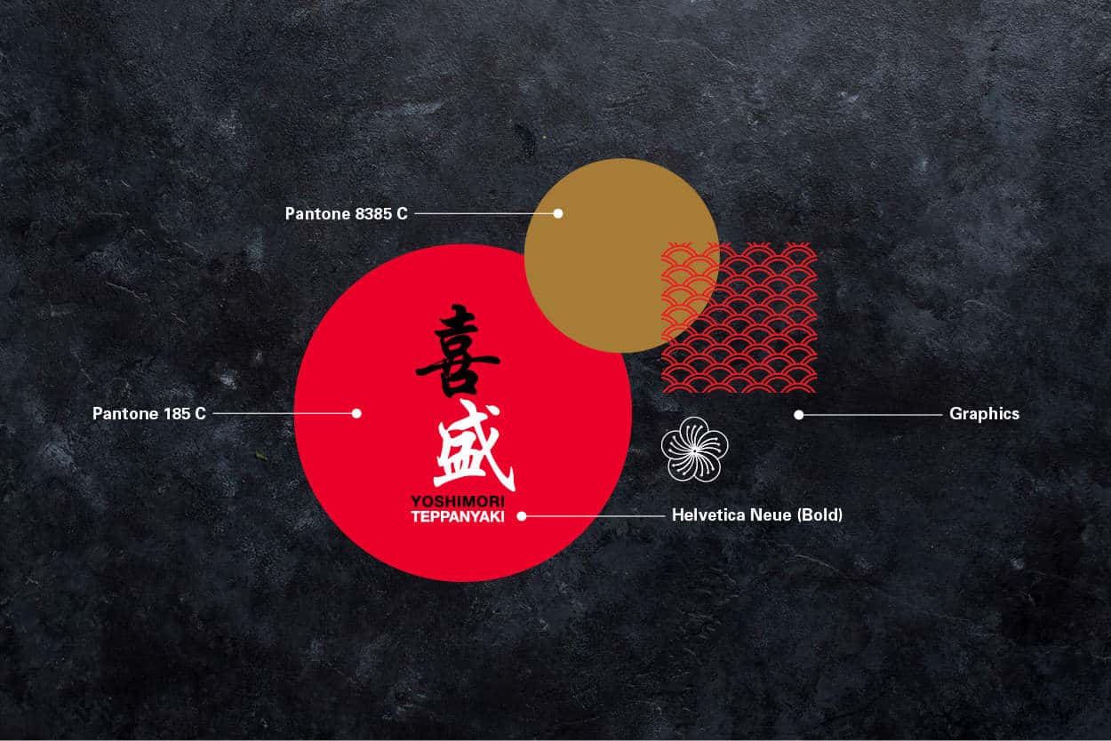
The design process was relatively smooth. I proposed a few options and the final outcome was my most preferred option. However, this is not the final colour palette due to Client's personal preference. Like most projects, there were a lot of back and forth involved to ensure that both the clients and myself share the same vision.
The brand just launched recently, so it’s hard to evaluate public’s response at the moment. As for takeaway learning experiences of the project – be prepared for anything and everything to happen. Finally, the feedbacks in near future will be important in order to implement the identity and evolve the brand.
Credits
Client: Yoshimori Teppanyaki
Agency: Galaxy Entertainment Group (Macau)
Designer: Vivian Ng
Project Management: Nicole Choi
Traffic Management: Blythe Lei & Katrina Cheok