Black Palace by Omar Aqil

Typography is the art and technique of arranging type to make written language readable, appealing, and legible when displayed. Our artist, Omar, has been doing this technique for years and we are in for a treat!
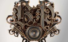
The Black Palace project is for electronic music production group (Black Palace). I designed a crest and the whole name ‘Black Palace’ for them. They want a classic typography with dark touch for their brand.
-Omar Aqil
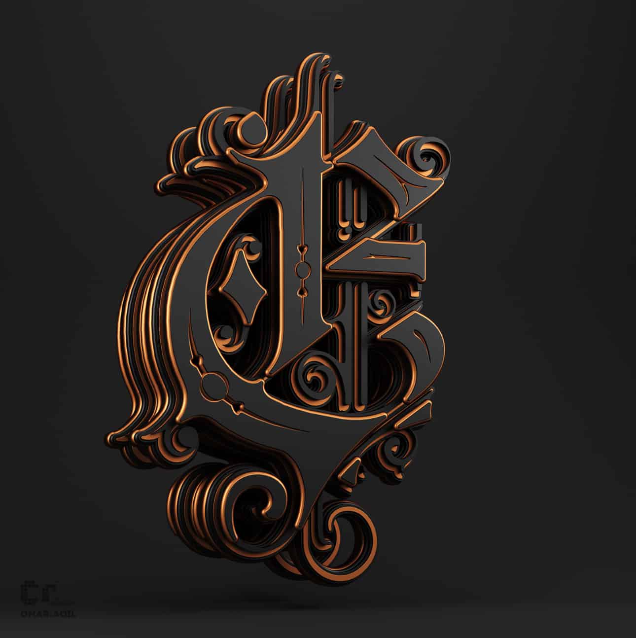
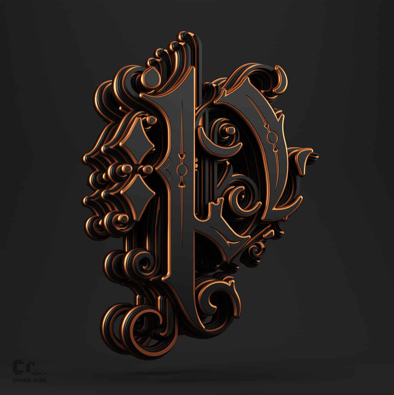
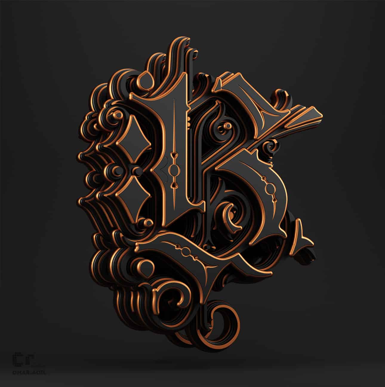
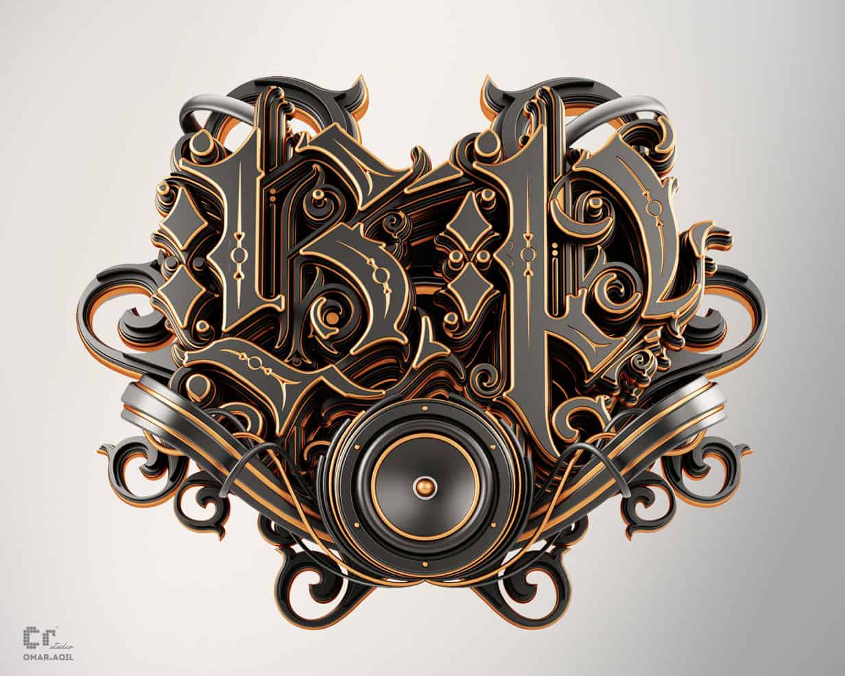
The thought was to create a classic typography with a contemporary feel and add details in 3D. I start with considering the brief from the client and selected the core priorities, then I start the sketching for execution.
-Omar Aqil
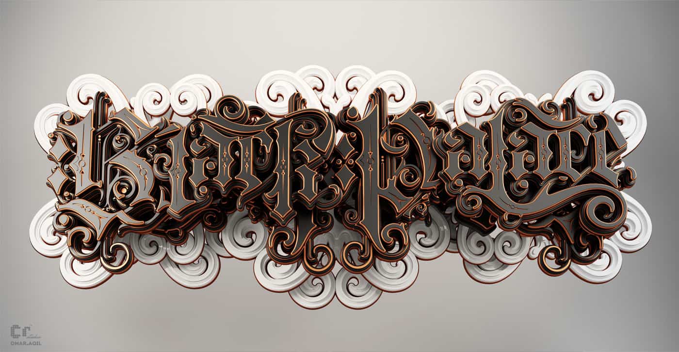
It took almost 3 weeks and I really enjoyed doing this project. I used Cinema 4D, Adobe Illustrator and Adobe Photoshop to make it more dramatic.
-Omar Aqil
ABOUT OMAR AQIL
Omar Aqil has been working as a Graphic Designer, Typographer, and Illustrator for over 7 years in the advertising industry. He had his Master’s Degree in Communication Design from PUCAD (Punjab University College of Art & Design), in Lahore Pakistan in 2008. He majorly worked in graphic design and typography. Typography being his most favorite medium to play with. He is trying to do more and more experiments in different mediums and trying to explore new techniques - our creative artist has never bound himself to a particular medium or technique.
See more of his artworks in Behance.
Amazing detailing sense of scale and proportions. perfect!
compositions are worth watching. good luck for your career...
Amazing!
Amazing type! Love the curves, the style and the color. Good job!
That is one wicked looking type. I love the way Black Palace looks on the bottom there. It is so deep and 3D like, I cannot get enough of it.
Keep doing what you do, you're definitely good at it!
AAAAAAAAAAAAHhhhhhhhhh this is outstanding ... great project :)