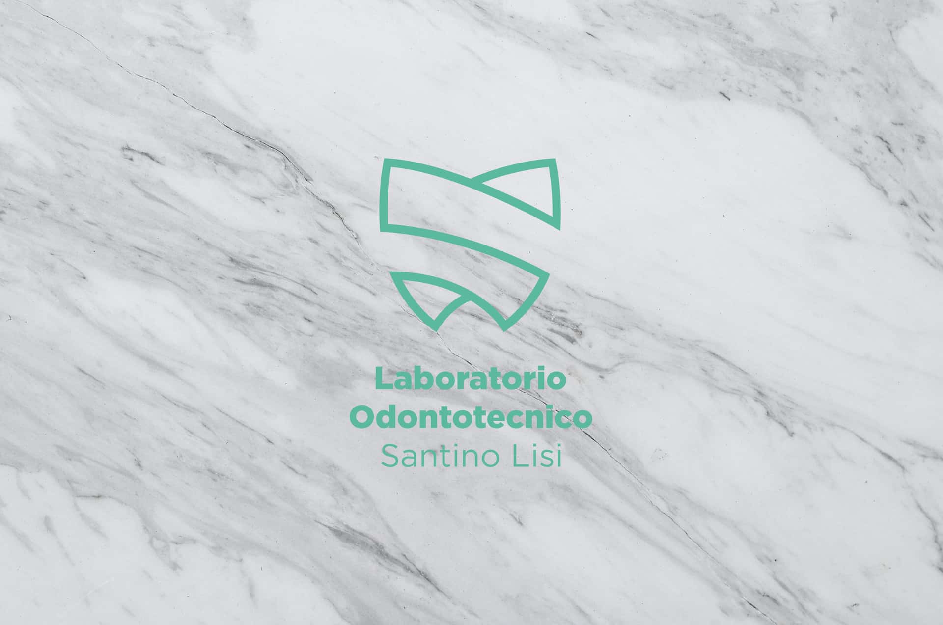
Brand Identity / Santino Lisi

Santino Lisi is a renowned dental technician with great experience. Its strength is to be able to blend new technologies with a great craftsmanship.
The purpose of the project was to create a brand identity that was distinct from those we are used to seeing in the usual way and that it could unite modern and traditional.

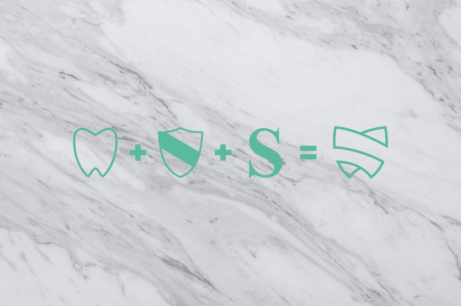
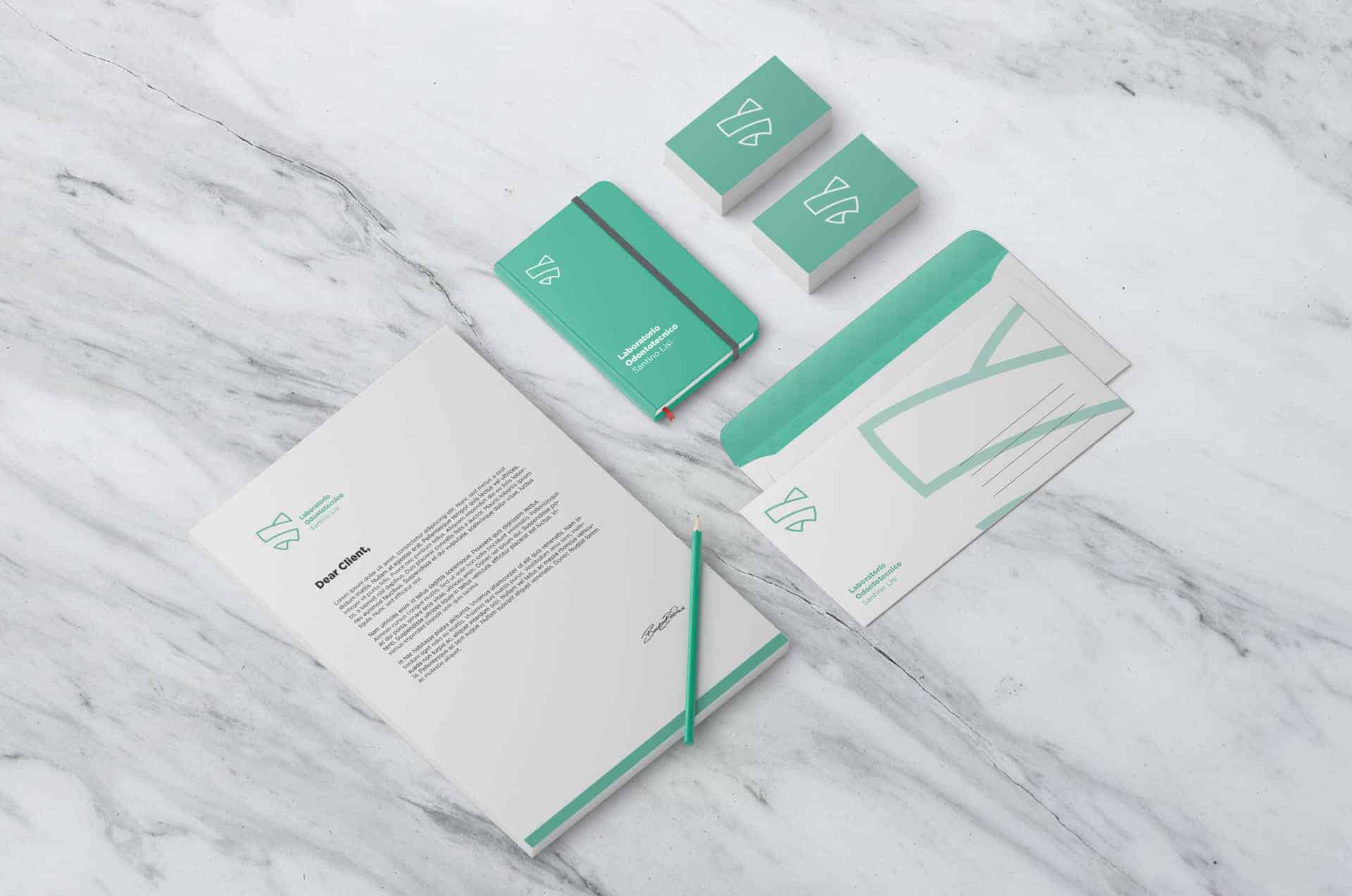
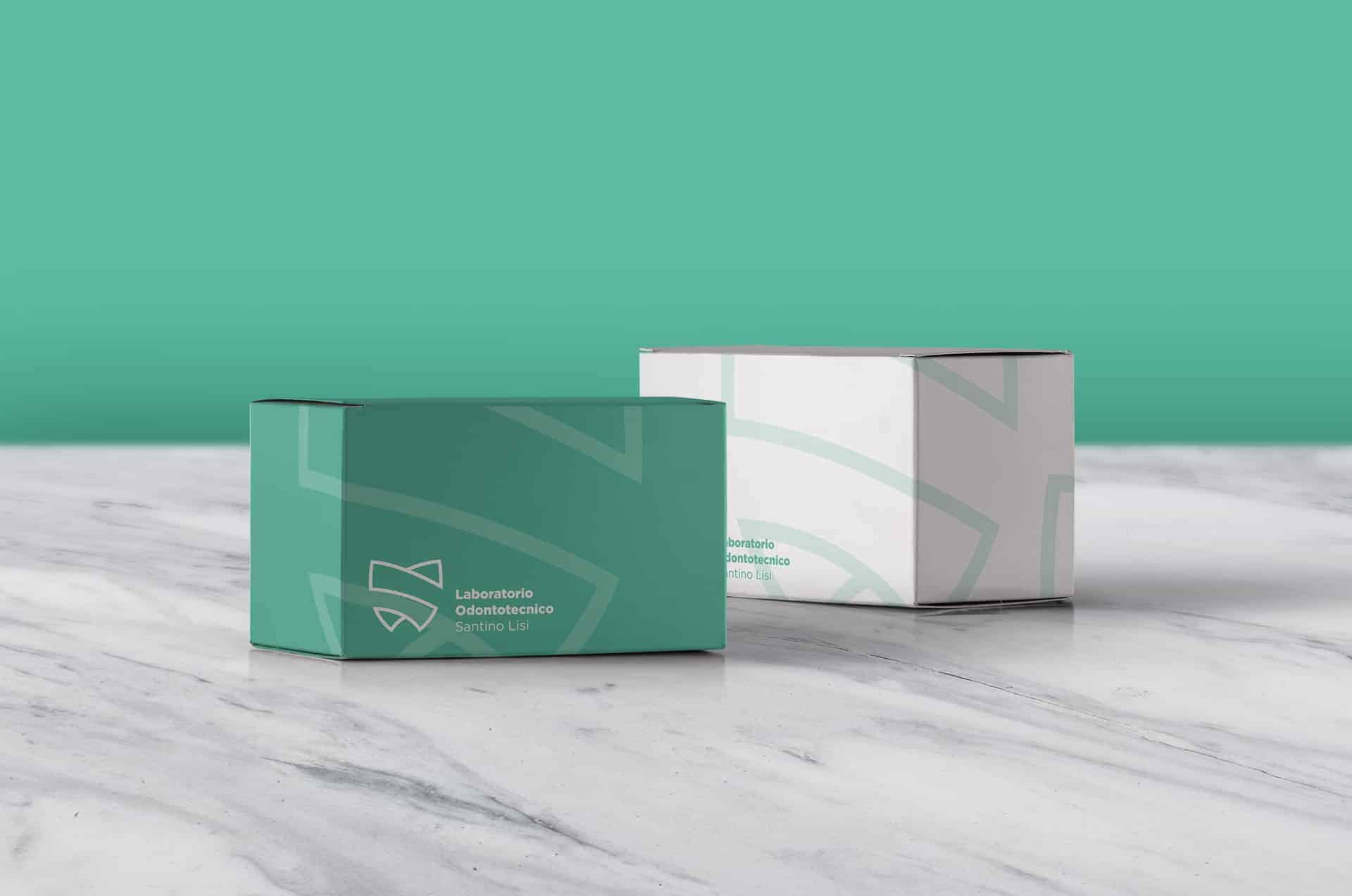
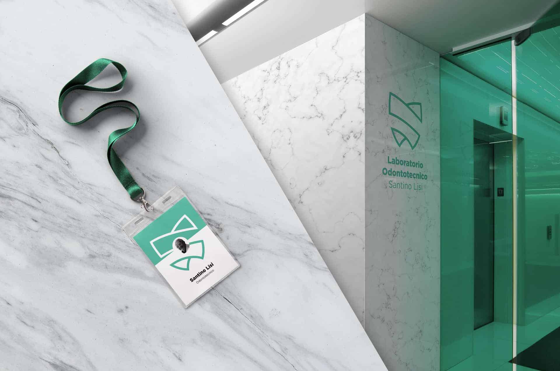
For the creation of the logo I wanted to combine the shape of the tooth, with reference to the area of expertise, the shape of a shield, to represent the protection against the customer and his smile, and the letter "s", referring to customer name (Santino).
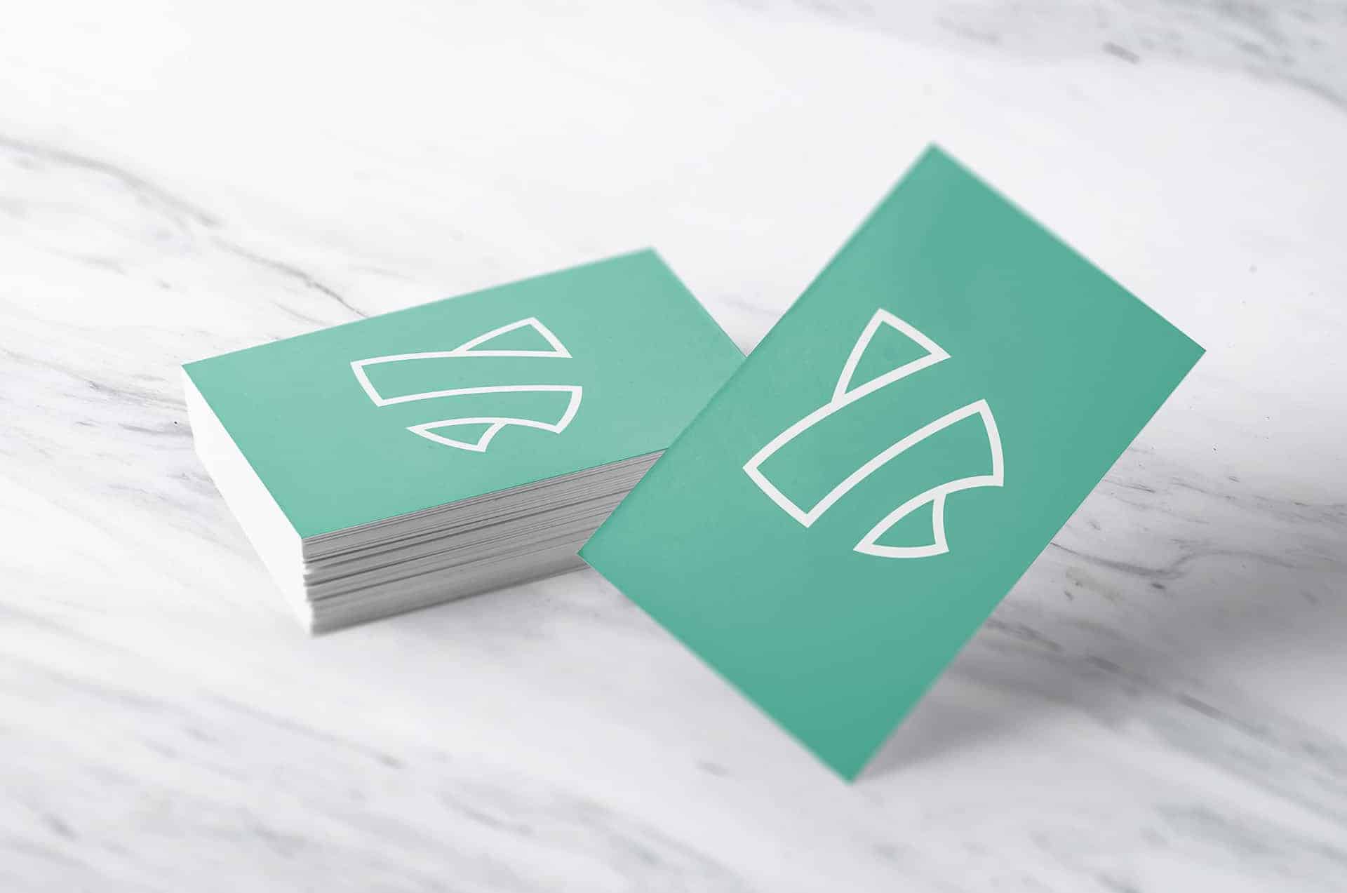
The green / blue color is a reference to the medical (blue) and wellness (green) world, while white serves to lighten the various compositions, giving it a minimalist and professional look.
For the realization of the project I started from a sketching stage in which I pulled out numerous different ideas and concepts.
Once you've chosen the concept to be developed, I've gone to realization using Adobe Illustrator software.
In the end, I used Adobe Photoshop software to make the presentation.


I noticed with pleasure that people welcomed my work with pleasure.
After the development of this project I received many compliments and as many proposals of work and collaboration.
I have learned a lot from this project both as a person and as a professional.
TO VIEW THIS AND OTHER PROJECT---> https://goo.gl/ek4FRh