CAP (Centro Auditivo Pediátrico)

CAP is an organization that helps children with hearing problems, it is currently the only specialized pediatric hearing care center for children in Central America. The logo of the pediatric hearing center "cap" is the essence that encloses and it characterizes the institution. It is based on mixing a longitudinal wave which graphically represents the sound; and adding the acronym of the institution. So I created a logo that is simple, direct, dynamic, readable, memorable and representative with the features that distinguish the brand's personality.

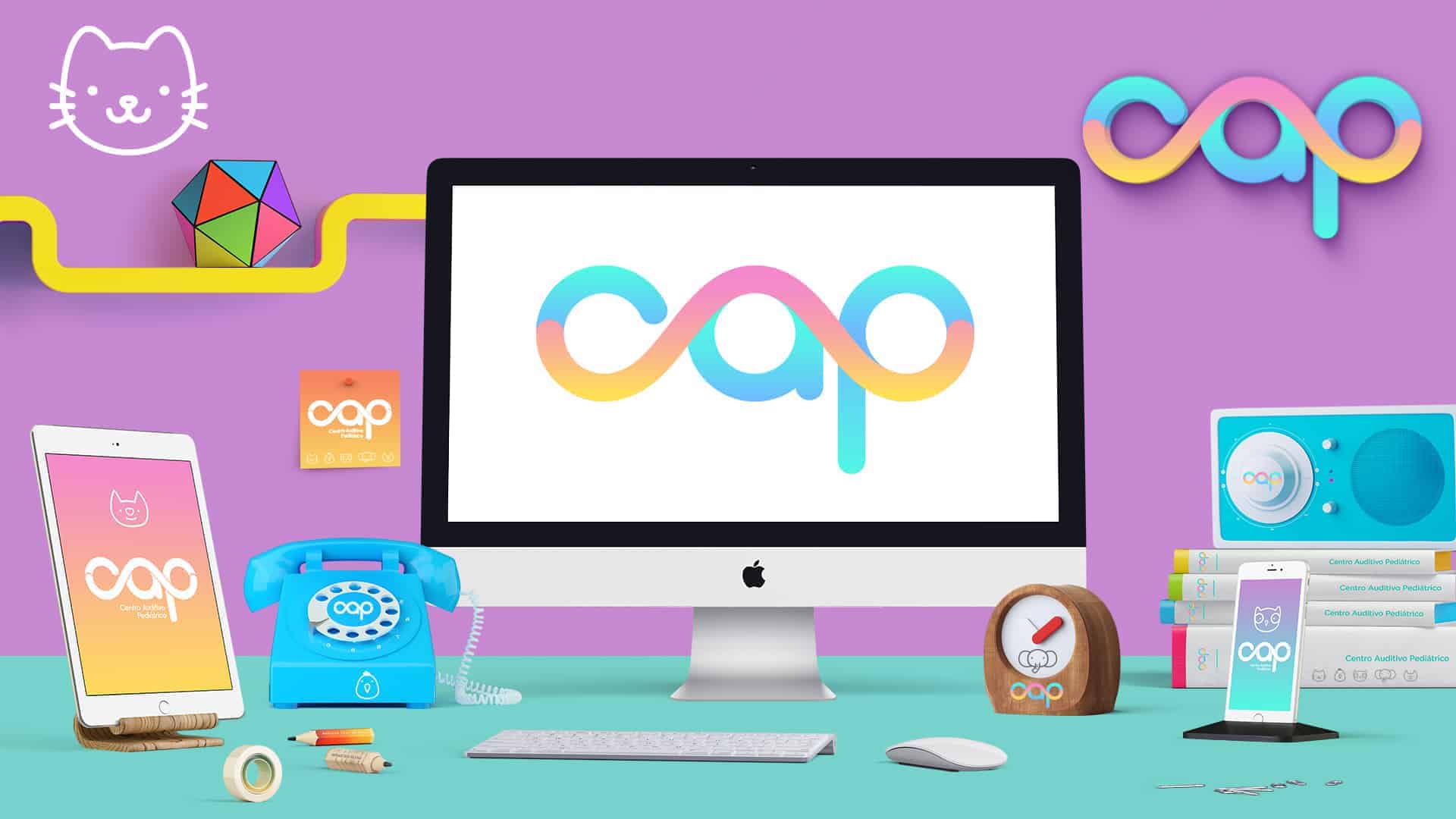
Cap is a center that helps children.. therefore develop materials had to be commensurate to the public, so the colors were bright and childish but at the same time transmit a modern touch to the design that were chosen. The logo is the representation of a sound wave that forms the initials of therefore represents exactly what was sought and even had movement.
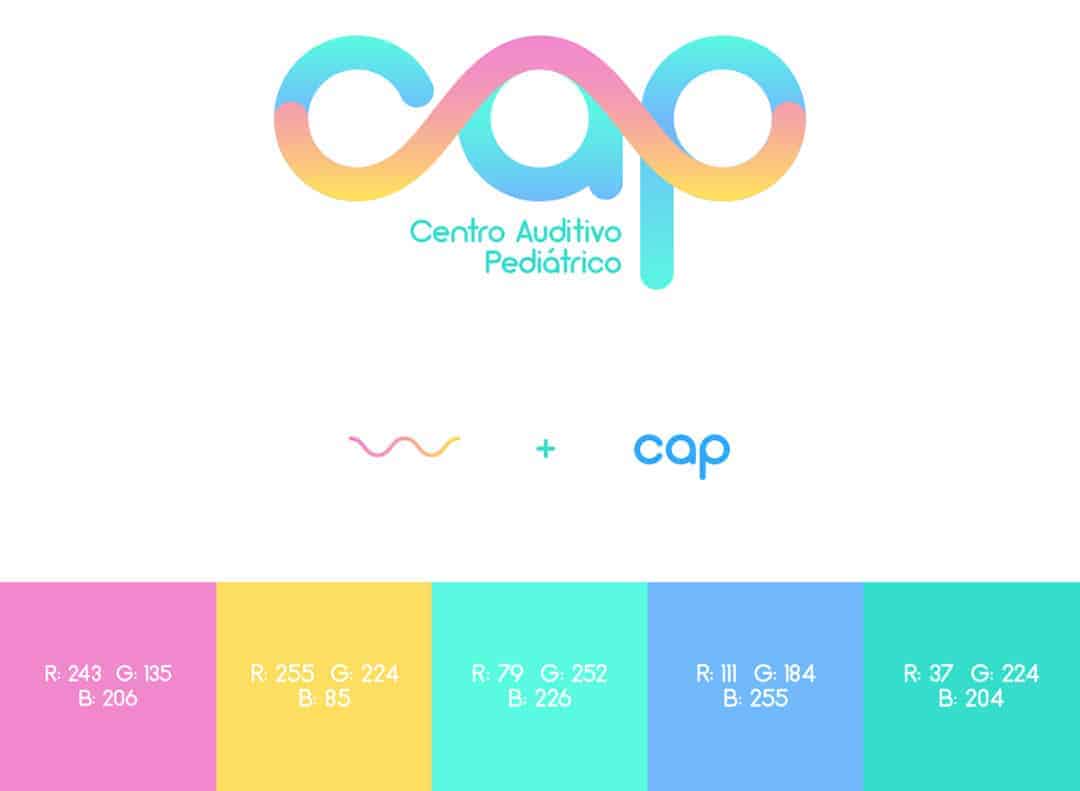
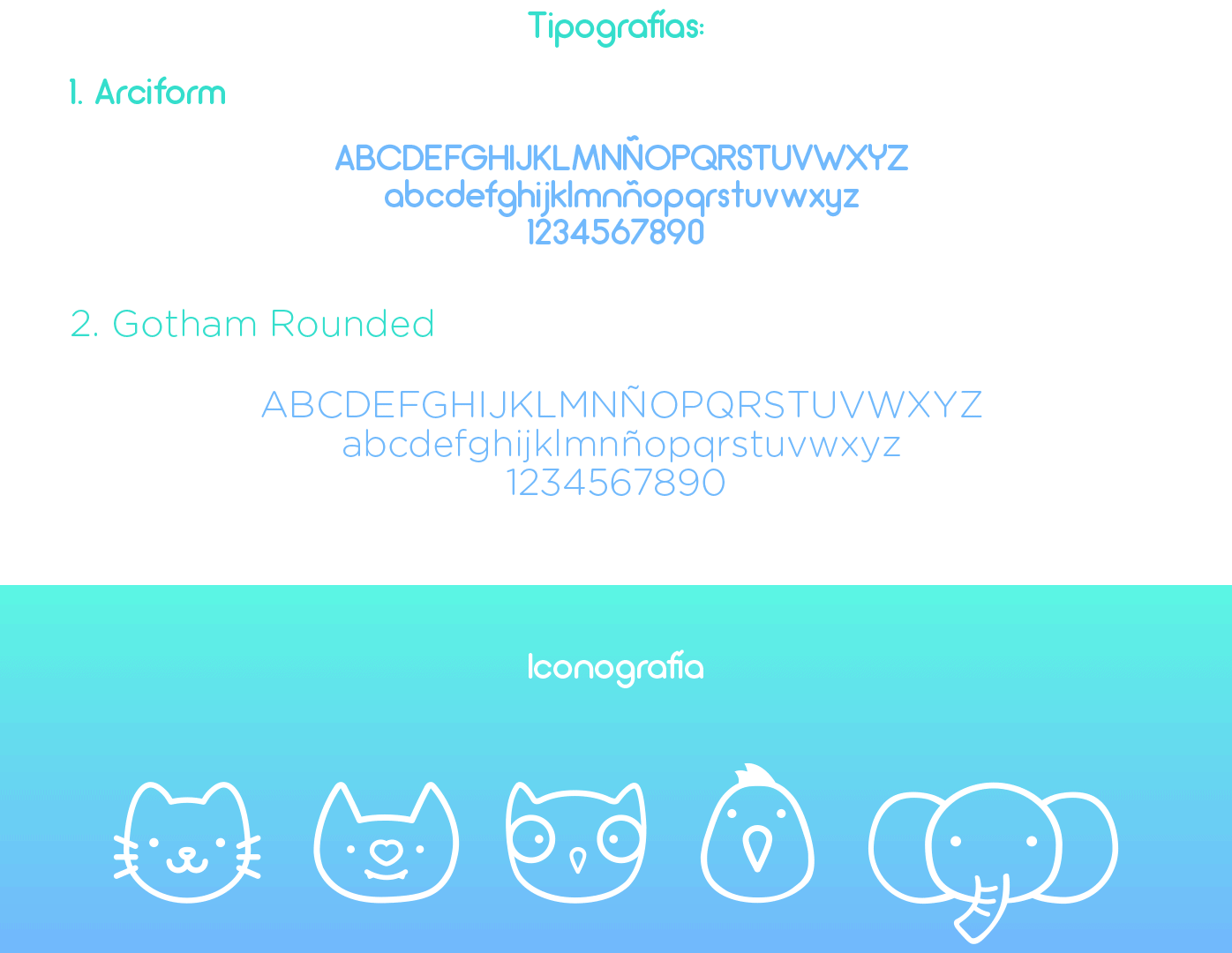
For the project, it was initially used as a base Adobe Illustrator to create the logo and materials. To add a touch of movement in Adobe Photoshop gif was created, it was also used for the presentation of materials and creating mockups.

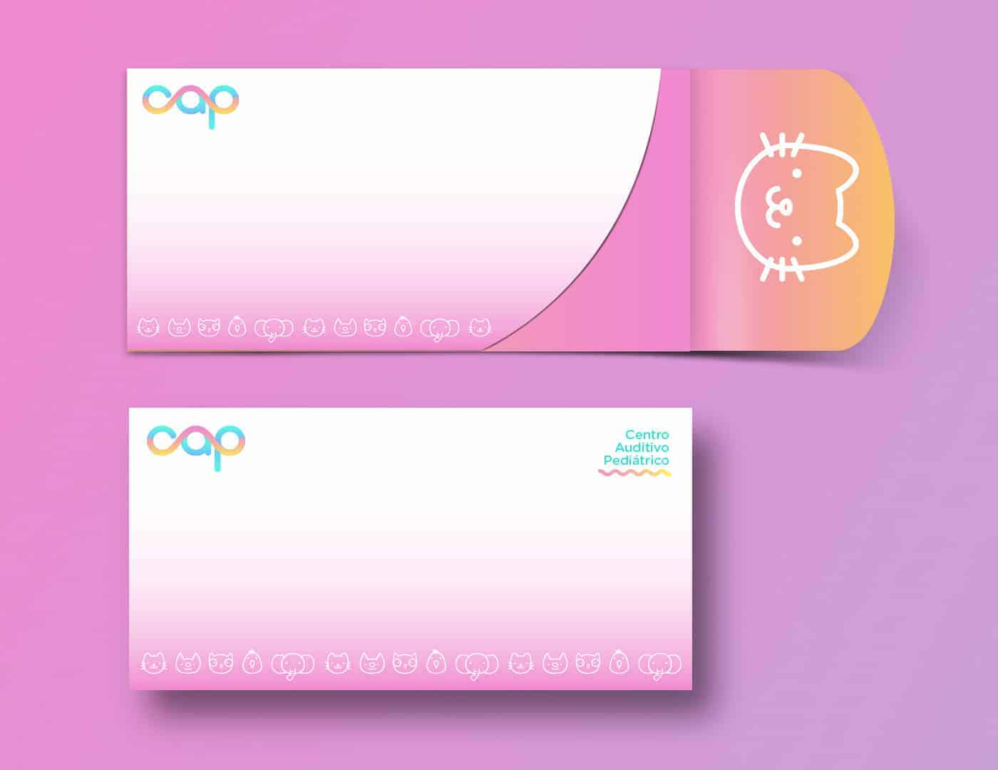

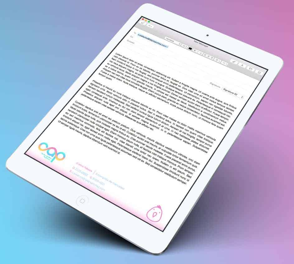

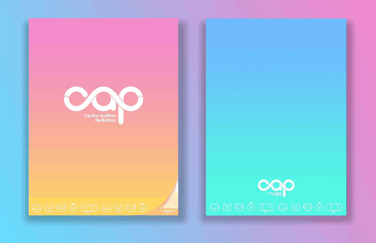
We aim to create a positive impact by creating a brand image of an auditory center that was presented so striking and modern way, so that people came to speak of it positively. We achieved even greater interaction in social networks and in person at the center.
The colors are spot on, keep up the good work!