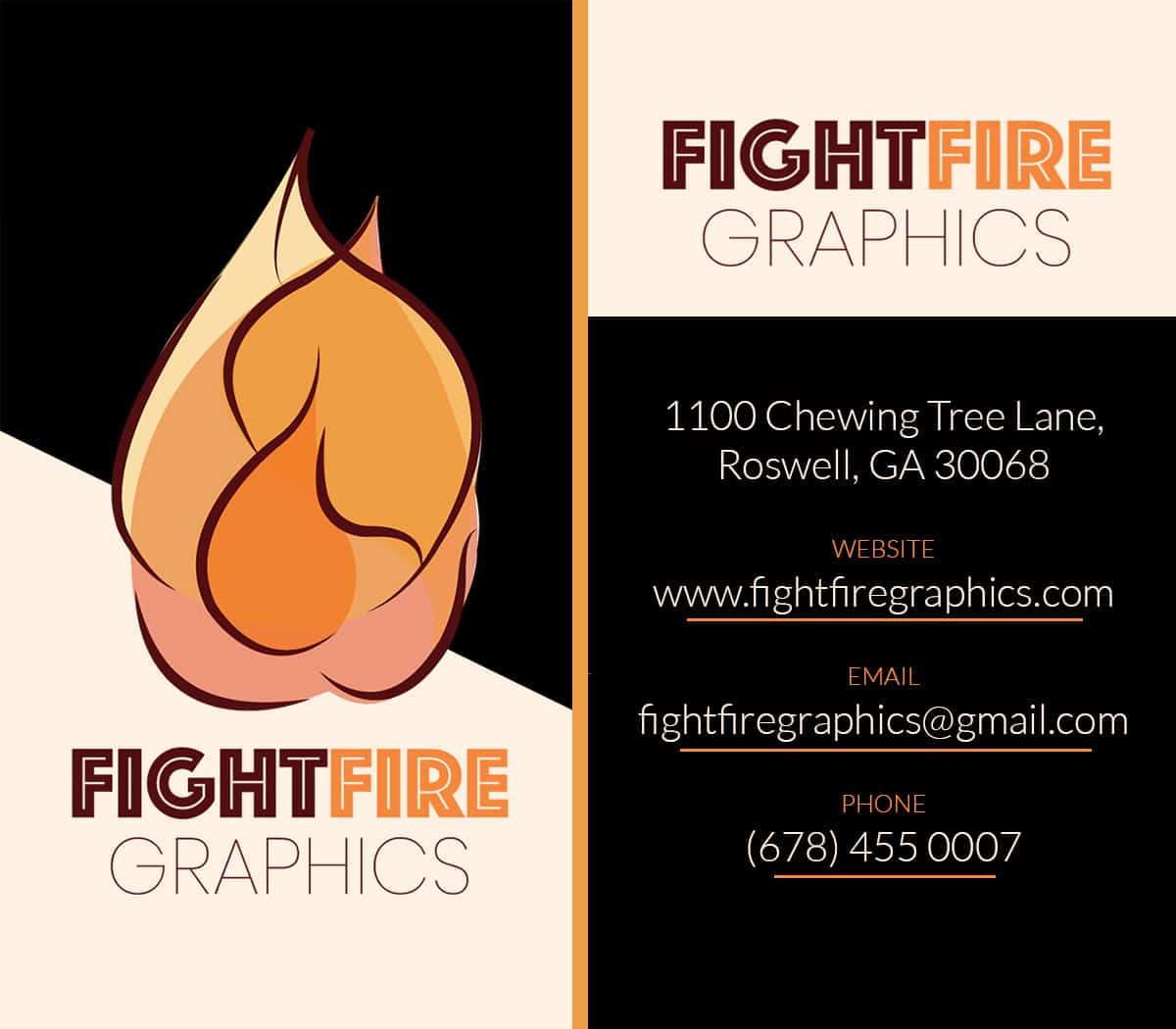
Fight Fire Graphics: Logo and Business Cards

A new local publishing company hired me to craft them a custom logo and business cards to fit their unique brand. For their logo, they requested something that would be memorable for customers and eye-catching for someone who hadn't seen their logo before. Since they are a publishing company, their logo will appear on the spines of any books they eventually publish once their company is fully up and running. This meant that it was imperative that their logo still be dynamic at the size of a nickel. As for their business cards, they asked for something that would be unique and complement the logo I had already designed for them.
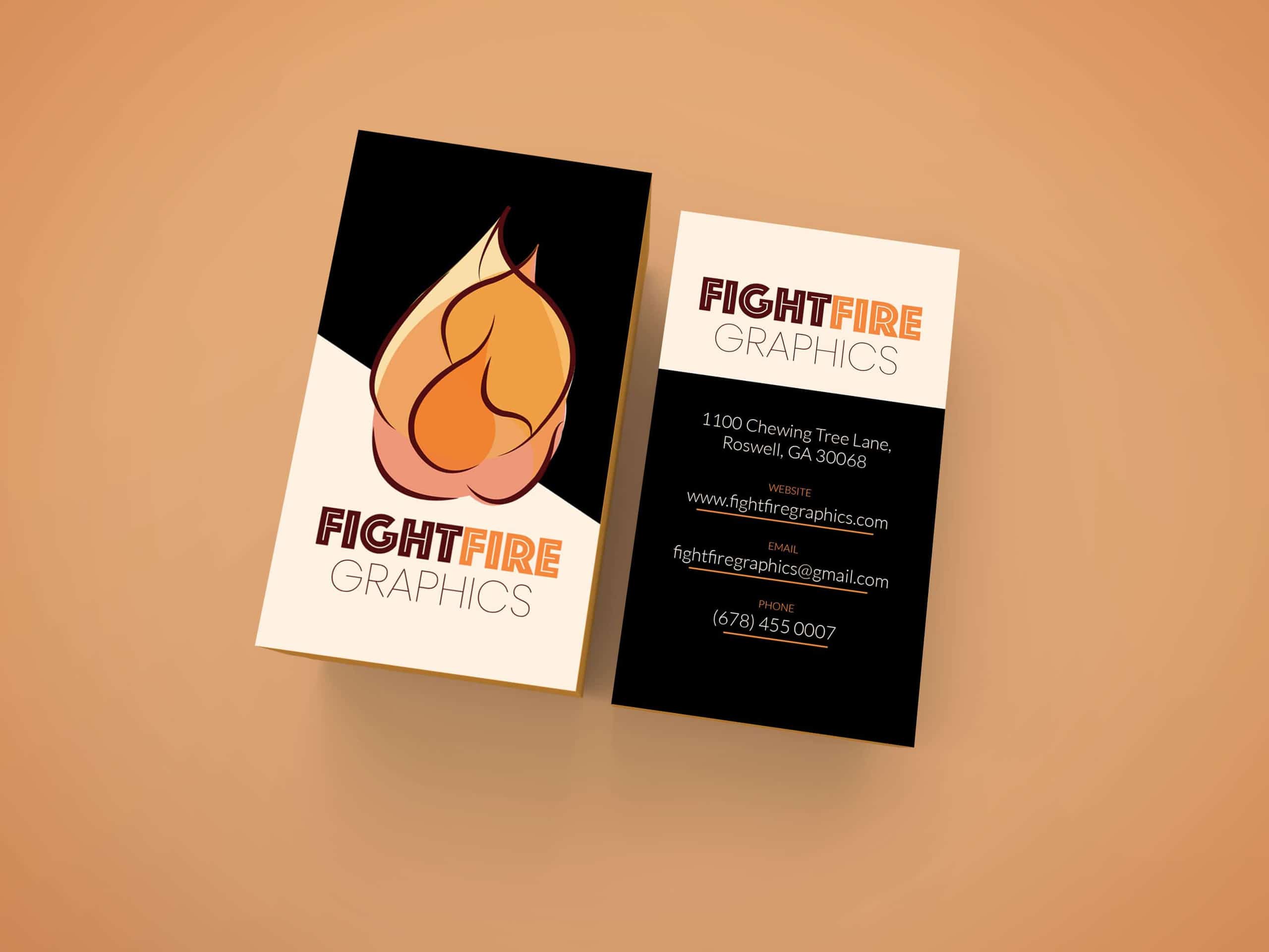
I was really inspired by the name of the company: Fight Fire Graphics. It sounds almost like something straight out of a spy movie. It left me wanting to create something impactful and a little mysterious. The name also easily inspired my warm color palette and the flame that became their icon. My biggest obligation going into the design however, was simplicity. While I typically work in more fully rendered illustration styles, I knew that for this particular client, legibility at a small size was going to be vital.
Icon: The first thing I did was sketch with a pencil and paper. I messed around with a few thumbnails before I took a picture of my favorite and sent it to my computer. From there, I created a new canvas on Adobe Illustrator and traced the lines of my design using the pen tool. Next, I created a layer underneath those lines that would become the orange flesh of the flame. With my basis down, I played around with a few different color options before I came to rest on the set in the final product. Lastly, after adding my chosen colors to the design, I lowered the opacity of the pieces of the orange flame.
Text: After designing the flame, I wanted to implement text that would compliment it. I chose the fonts in the final design after careful consideration and changed the color and the size until it fit what I thought would best represent the company.
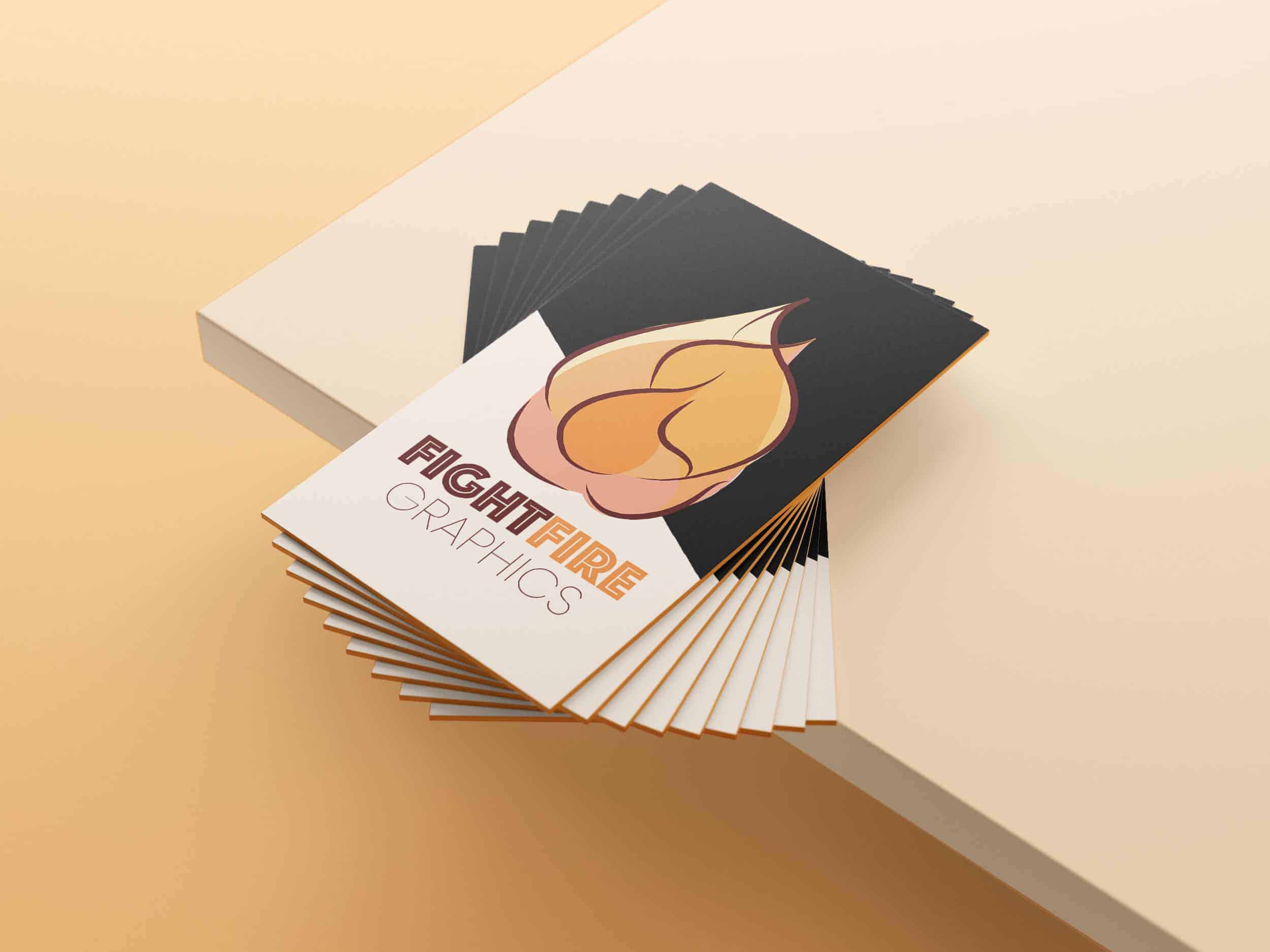
Business Cards: With my logo already created, I started with a set of standard business cards. Given that the logo is vertical, I chose to create vertical cards. After laying out a very standard set of cards with the logo on the front and the service information on the back, I gave each piece of contact information its own title and line underneath. Then I took stock of the whole card and chose a split two tone background to give the design more impact.

My client really loved his logo and cards, but the business is not officially up and running yet and won't be for a few more months. I did receive some very positive feedback on the design on Behance though, which lead me to posting here.
This project taught me more about designing logos that appear in small spaces, which has been very enlightening.