Google Rebrand by Jenna Law

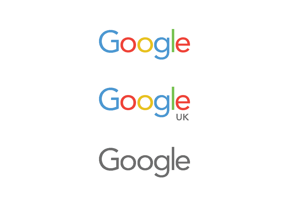
You've probably seen the new Google Logo, I mean who hasn't? Coincidentally, UI/UX Designer Jenna Law envisioned this design way way back. Her project has been a huge success with overwhelmingly positive feedback from the design community. The self-initiated project evolved out of a mission statement: "Imagine a world where Google's logo and homepage was as simple, flexible and up to date as the rest of the company." The designs were created back in March 2013 and of course in September 2015 Google updated its logo to reflect changes and evolution within the organisation. Although there are differences in the typography between her concept and theirs, at the core, the principles of both redesigns are very much aligned.
One day I was looking at the Google homepage, which I am not sure people often do. I mean everyone visits it everyday but how often to people actually look at it (apart from the Doodles of course). It struck me that for such a progressive and forward thinking organisation their logo seemed to be a little behind the times. Some would argue- 'if its not broken don't fix it' but I would argue that although it wasn't necessarily broken - It felt their was a disconnect between what the company stands for, where it was heading and what it was actually conveying.
-Jenna Law
![]()
The colour choice of the logo has always intrigued me. The elementary palette suggests an honest, friendly, functional, and a 'no fuss attitude'. There is also an element of 'play' evoked and the old typography seemed to jar with these themes. Moving to a sans serif font was a natural evolution. It removed unnecessary clutter and allowed the type to render better across multiple touchpoints such as mobile.
Companies that are at the epicentre of change often reflect a common theme of simplicity. This famous design quote is always an inspiration in my work:
"A designer knows he has achieved perfection not when there is nothing left to add, but when there is nothing left to take away." -- Antoine de Saint-Exupery
-Jenna Law
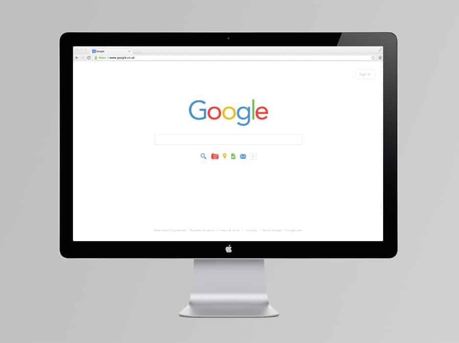
Arguably, for the leading company of innovation in my lifetime, the elegance of Google's logo had to align to this ethos. It had to be fundamentally transparent to those both aware and unaware of design cues. The solution, like the company, should be for everyone and for everything. One way this manifested itself in my design was on the personalised homepage, which allowed users to customise their search result formats upfront.
-Jenna Law
![]()
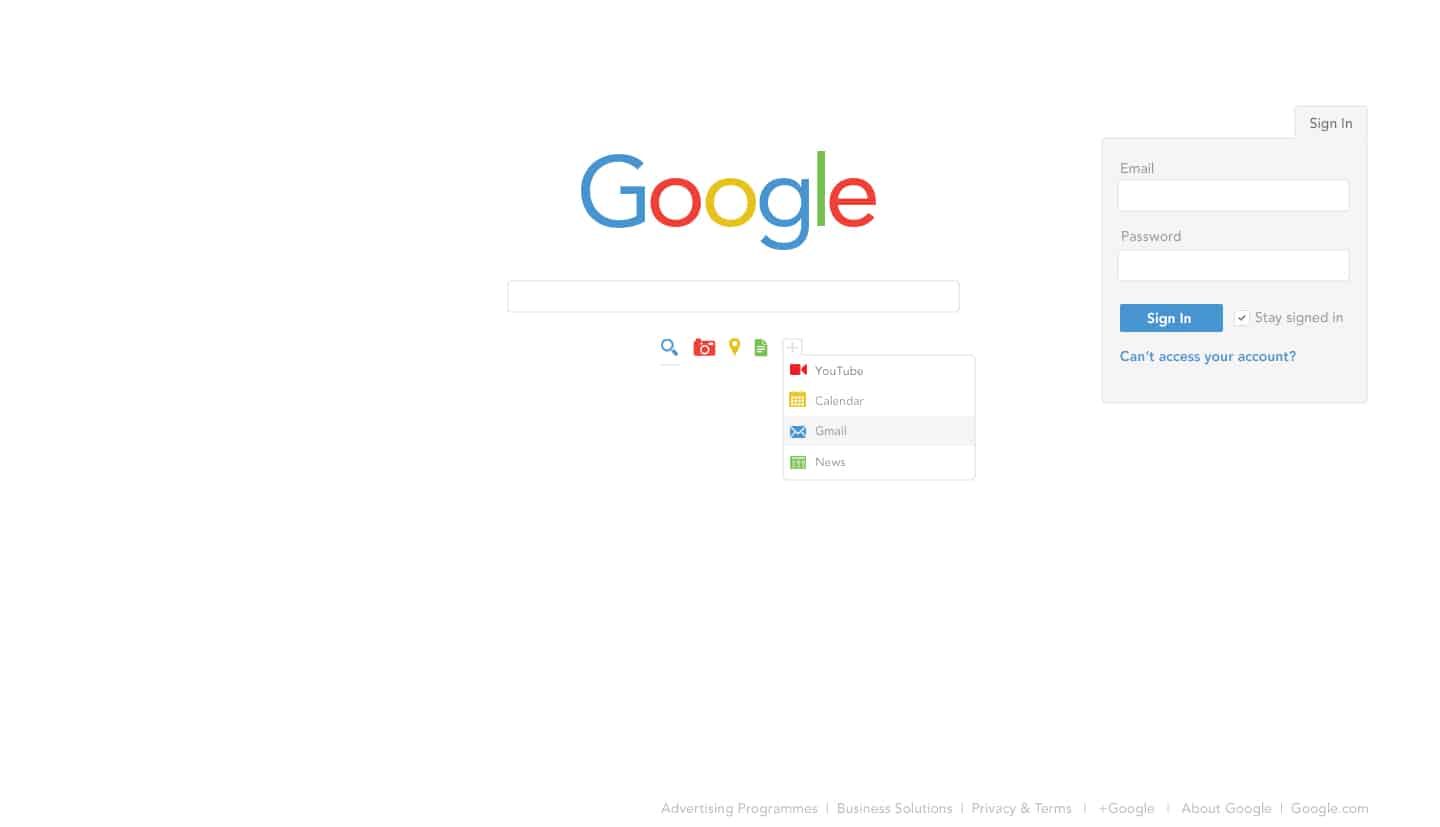
I always put the user / customer at the forefront of my designs. What are their needs? What are their pain points? What problems are we trying to solve? Never underestimate the importance of research and answering basic questions before even starting to go near software. Feedback on the old logo met with words such as 'traditional', 'old fashioned', 'banal '. Speaking to users, it became clear the objective was to convey Google as a company that is dynamic, flexible and personable.
-Jenna Law
![]()
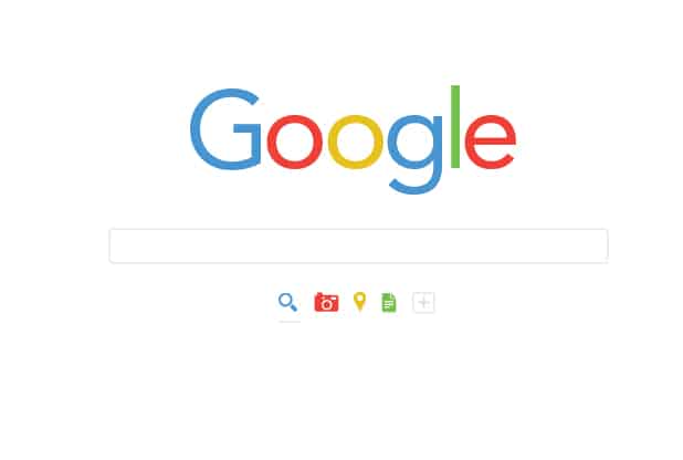
My company motto is "Bringing Thinking to Design & Design to Thinking" so I guess my style is not necessarily just aesthetic, but my style fundamentally lies more in my approach to design problem solving: to design an effective solution that works for both users/customers and the business. Aesthetically I admire and respect themes of elegance, simplicity and minimalism.
-Jenna Law
Inspiration is key and can be found in many places. When I look to hire, I am always interested in meeting genuine, authentic people who are inspired beyond just the design and tech industry and who have passions in all walks of life: philosophy, nature, travel etc. I think IDEO's recent hire of Barbara Knickerbocker-Beskind at 90 years old is an inspiration in itself. It is a clear indication of just how much the industry values life experience and how forward thinking we need to be as thought leaders as well as designers.
-Jenna Law
About Jenna Law
Jenna Law is a London based UX, UI & Brand designer. She has worked with clients such as Jaguar Land Rover, Microsoft, Citi Private Bank, Lacoste, Audi, & Budweiser to name a few. Her work has been featured across industry leading publications, books & magazines. She has a huge passion for clean, modern design with a strong focus on engaging user experiences. View more of her work on her company website Plexus Design, Behance and Dribbble. She also runs CircleCircle a collection of circle inspired design, art and photography, where some of her own designs can be purchased at the Circle Circle Shop.
Personally, I think a more simpler lowercase g would have looked better.
I heard some people expressing a distaste for Google's new logo, but I really like it. It gives it a more modern, clean feel. Not to mention that there is not a lot to dislike seeing as the difference is just slightly noticeable. To each their own, I guess, but I like it!