
Greece Branding by Alecx Stasko

What would you do if you were tasked to brand a country? Graphic designer, Alecx Stasko was tasked just like that. For this project they were presented with a relatively small task of re branding an entire country. The country Alecx worked with was Greece. With Greece's current economic struggles a new branding and marketing approach could benefit the country tremendously. The main objective was to brand the country to reach a different demographic than they are currently hitting.
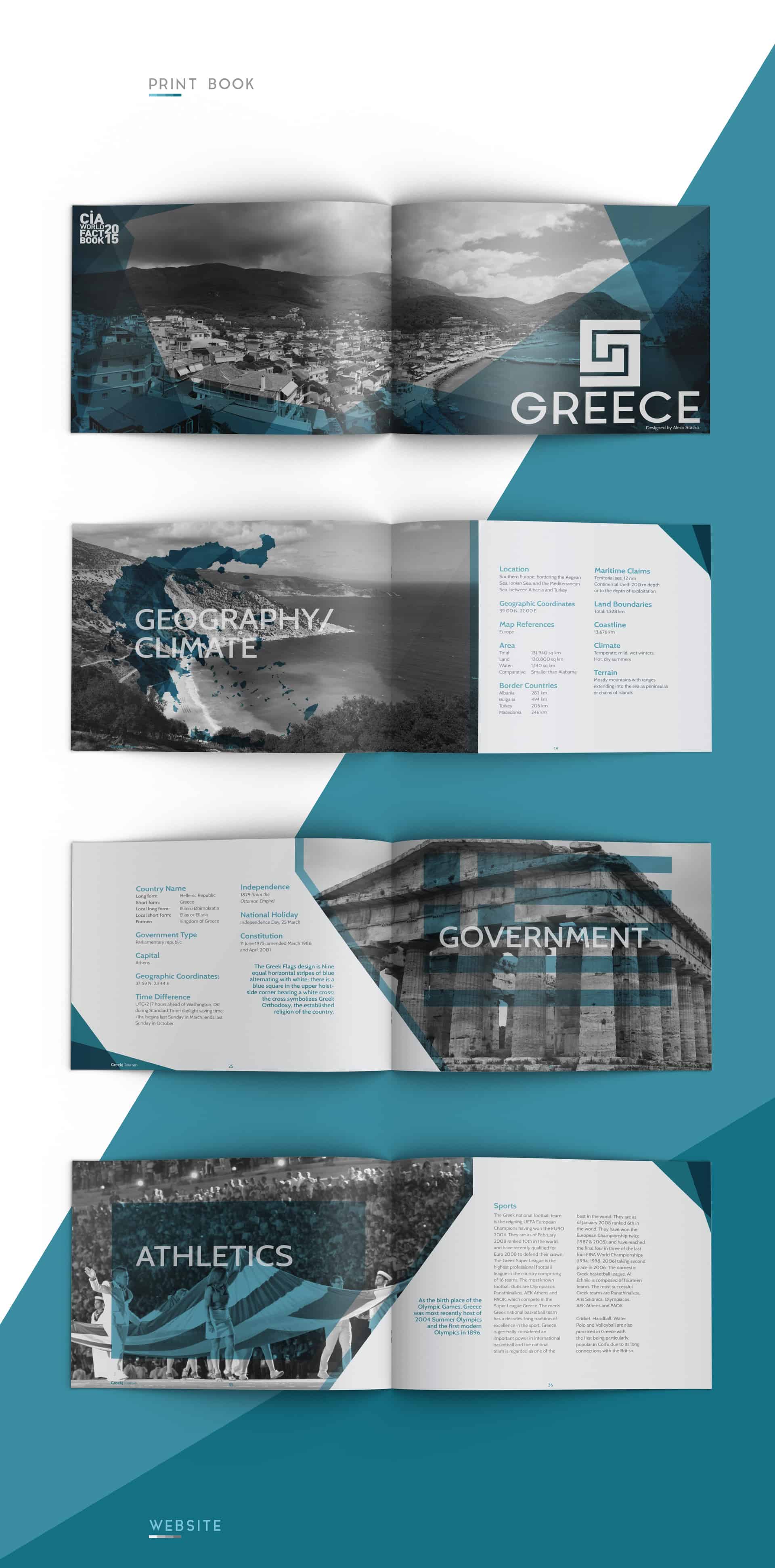
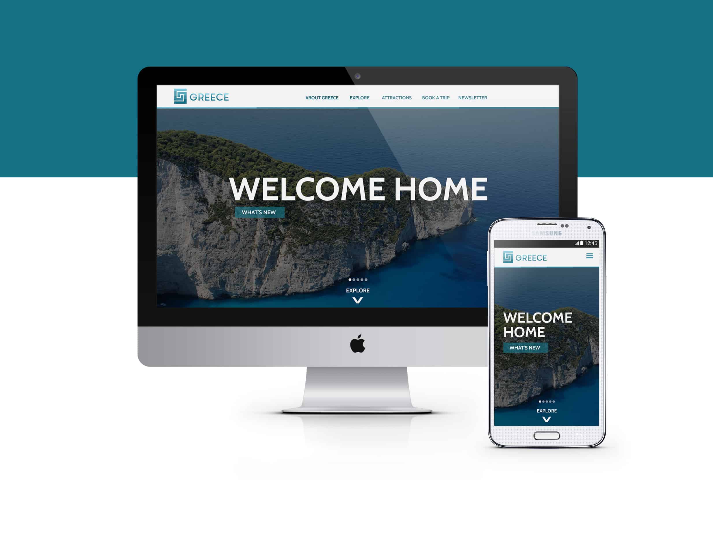
Greece is always associated with its culturally rich history and antiquity. However modern Greece is a country that offers all of that and more; with scenic destinations and a culturally unique experience that is unrivaled. I wanted to pay homage to both its history and modern appeal so I designed a brand that captured the essence of both. We had to do a comprehensive branding campaign that included a wide varieties of deliverable assets. I designed a cohesive brand that includes a new updated logo, established strong typography, branding guidelines, a 3D printed product and finally 35 spread book detailing facts from the CIA World Fact-book.
-Alecx Stasko
![]()
I developed this brand by doing extensive research on both of the main facets of Greek tourism. For the logo design I tied in elements of both its history and its scenic destinations. I researched ancient Greek patterning that is found in Greek textiles, red-figure and black-figure jars and ultimately used that pattern aesthetic for my logo. I utilized a cooler color palette that was reminiscent of Greek culture and life while also promoting the idea of home and relaxation through soothing tones. I used the many shades of blue to reference the beautiful surrounding ocean that embraces Greece. Finally I played off of the negative and positive space of the logo to showcase the letter "G" that ties the entire concept back together.
-Alecx Stasko
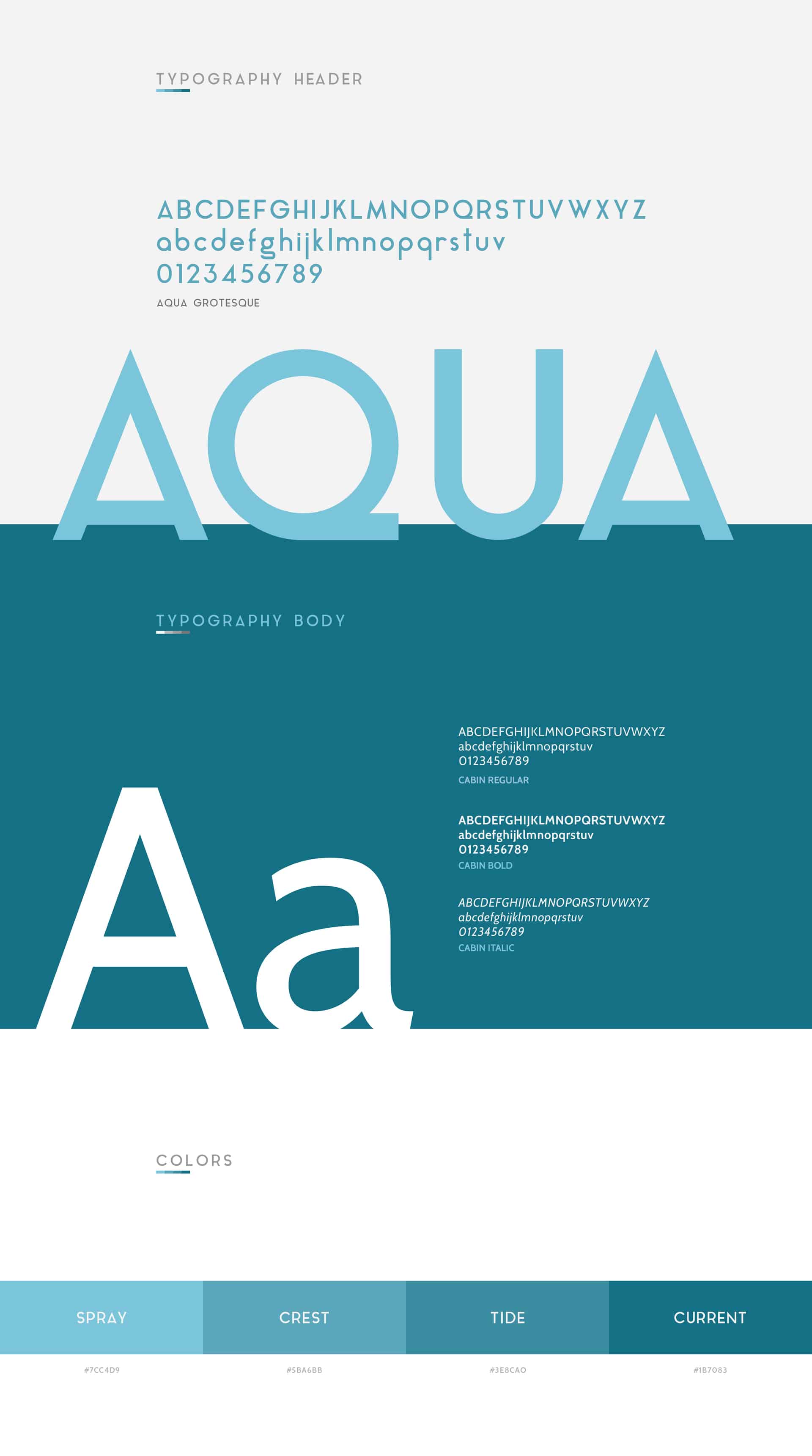
The typography I chose was to get away from the angular text that is usually associated with Greece. I used sans-serif fonts to give it more modern feel and aesthetic. The main header font "Aqua Grotesque" is more angular so it is reminiscent of the old Greek lettering however it is more refined for the modern culture. The book was developed under the idea of the blue tones giving life and color to the colorless world. Also people think of the past in black in white so having this color bleed through gives the sensation of even though its the past it can still be in your present world.
-Alecx Stasko
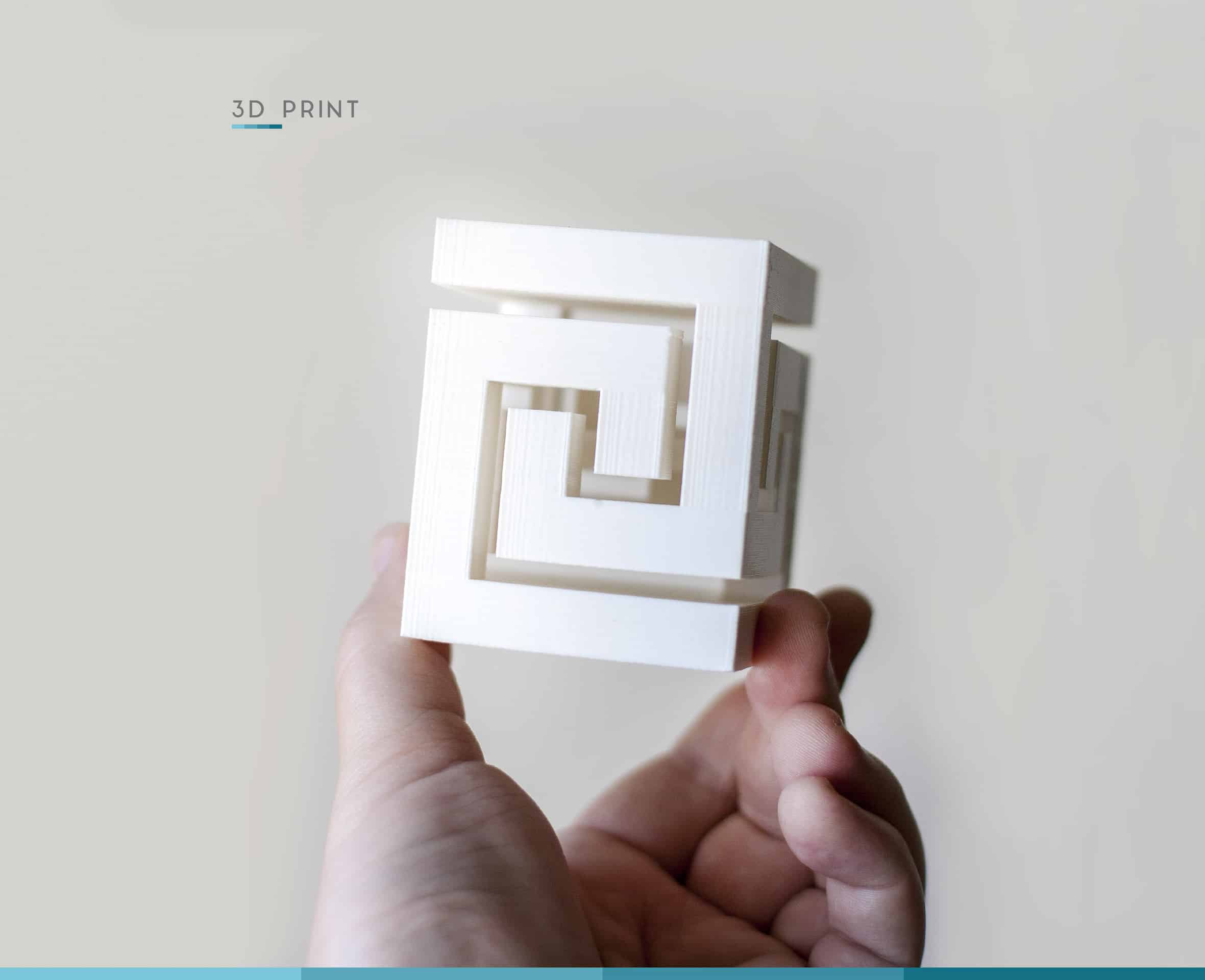
Finally the 3D print was derived from the goal of making something unique to each countries branding. The shape of the logo works well to be repeated so I played with the idea of making a 3D print. The final shape of being a cube was decided because I wanted to show of the idea of Greece always being present in all of humanities history so no matter what side you turn the cube the logo and its presence is always seen.
-Alecx Stasko
My main inspiration was looking at ancient patterning and Greeks extensive history. The country has such a rich and colorful past I didn't want to forget it and throw it away. However I wanted to make it have a more approachable feel. The ultimate goal was to capture both audiences and showcase both the ancient antiquity and how Greece is today.
-Alecx Stasko
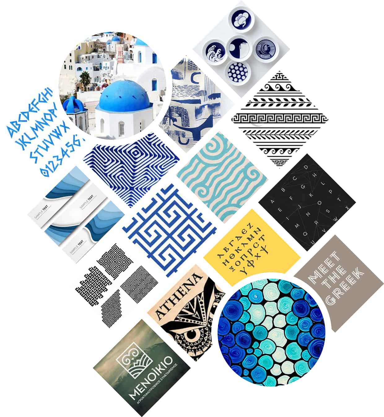
My initial inspiration boards for the Logo and branding
My initial inspiration boards for the Logo and branding
My style is definitely more Swedish in nature and clean with my designs. I utilize a lot of vector based illustrations, bright contrasting colors & photography. I love the idea of simple, clever design that leaves a lasting impression on the viewer. I love negative space and playing with the viewers mind to achieve unique designs. I tend to over complicate things early on and then have to reign my designs back in. I push deep conceptual thought and reasoning behind each design decision so if my brain ever wavers I have the reasoning to solidify my decisions. My main design inspirations are Stephen Sagmesiter, Saul Bass, Paul Rand & Aaron Draplin.
-Alecx Stasko
About Alecx Stasko
Alecx Stasko with a "c". He knows its weird, you can blame his mother :) He's a Columbus, OH born and bred Graphic Designer, Photographer & Advertiser. Alecx is a purveyor of good food, better music and amazing design. He's a junior currently studying Graphic Design and Advertising and at the Columbus College of Art and Design. His design strong suits are logo design, brand development, creative direction and visual communication. See more of his works on Behance.