Krčmar Musical Instruments
This visual identity was created for a (fictional) musical instrument manufacturing company with a long history, dating back to the 1830s. “Krčmar“ is both the surname of the family members and the place of their origin. Initially known for its traditional Serbian instruments, the company has grown into a world-famous firm, which produces all kinds of high-quality musical instruments.
It was a student project. The class were assigned by the professor to create visual identities for several different companies, all of them, however, bearing the same name – Krčmar. In order to facilitate the design process, interconnect miscellaneous projects and give my fellow students some background “information” which would serve as an incentive for their own creative work and brainstorming – I invented a story about the Krčmar family whose members own these companies.
The family comes from Veliko Krčmare, a village in Serbia where, in the 1830s, the family founder Anastas Krčmar, a wealthy and renowned man, owned a tavern. He had three sons (Blagoje, Stanoje and Vukoje) , whose name symbolically underline their dissimilar personalities, and hence – different life paths. Their descendants have moved to several parts of Serbia, all of them expanding the family business and even founding some new firms and events.
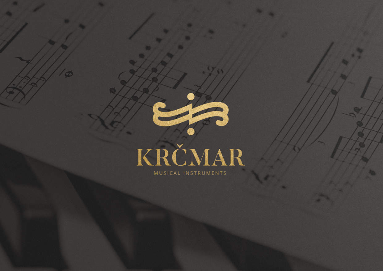
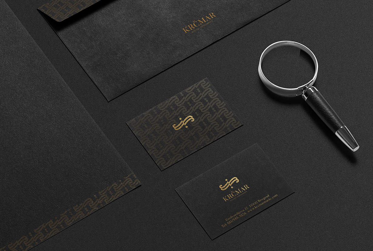
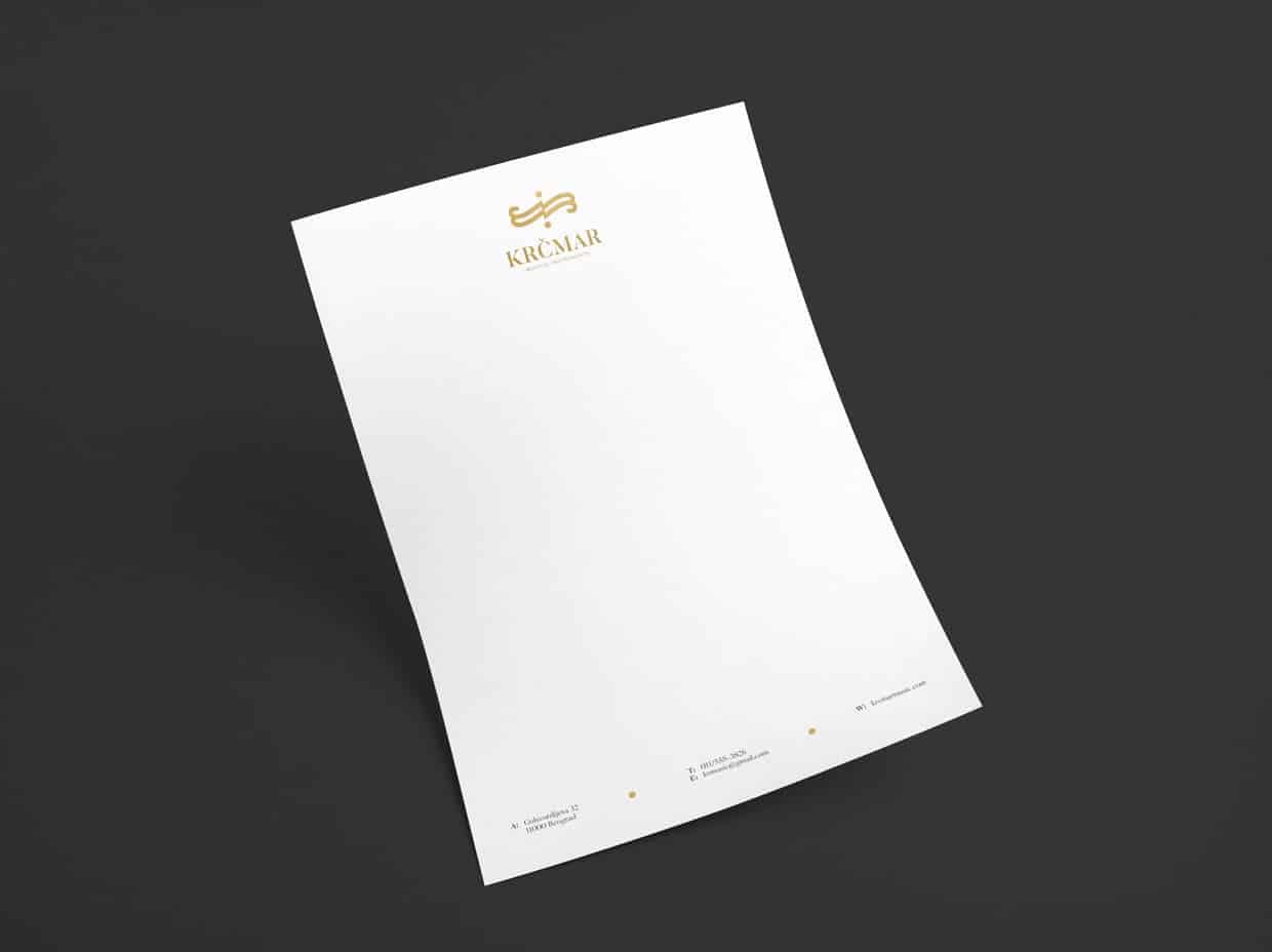
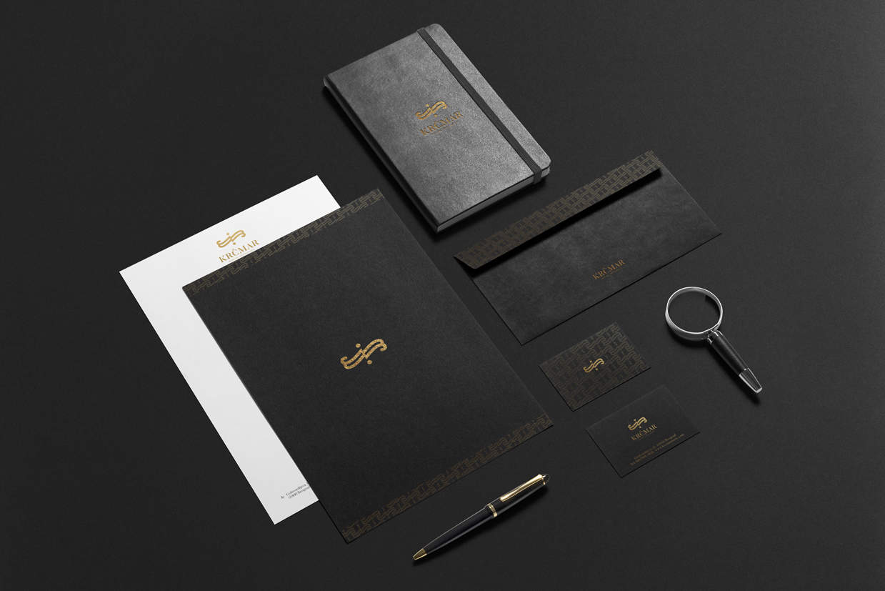
I was given the task of creating the visual identity for Krčmar Musical Instruments manufacturing company. While creating the logo I took inspiration in the very shape of musical instruments, particularly the F-hole on the string instruments. The logo is rather simple but the patterns and main typography have a retro feel to an extent, so the whole identity is a mixture of modern and retro styles.
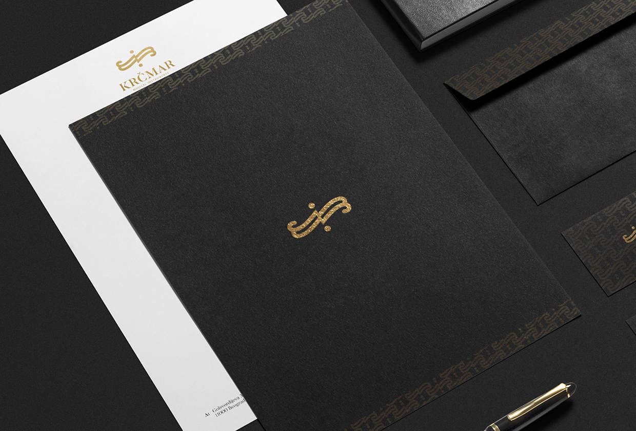
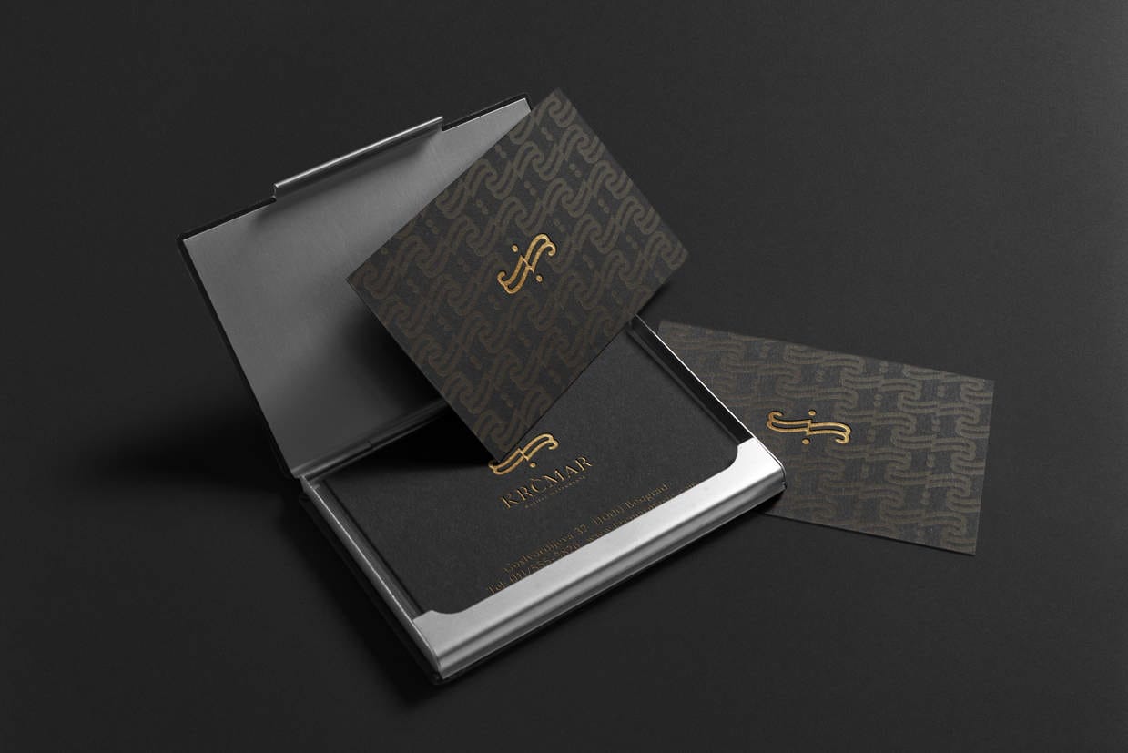
When it comes to the very design process, everything, beginning with the logo, through the stationery pattern to the envelope and business card – were done in Adobe Illustrator. Photoshop was used for the web presentation of the project, mock-ups etc.
Well, since the project is only a concept (a student project), it's not been realized. However, on the social networks and graphic design platforms such as Behance and Dribbble where my design can be seen, I have received mainly positive feedback.
Love the black and gold, the logo is simple and clean too.
Thank you, Jamel! :-)