TRI_WIND FARM COMPANY

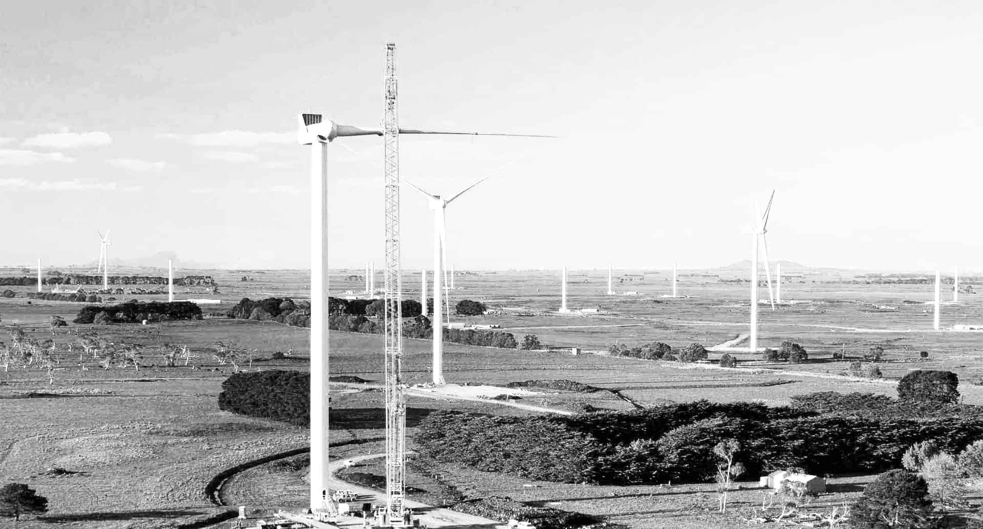
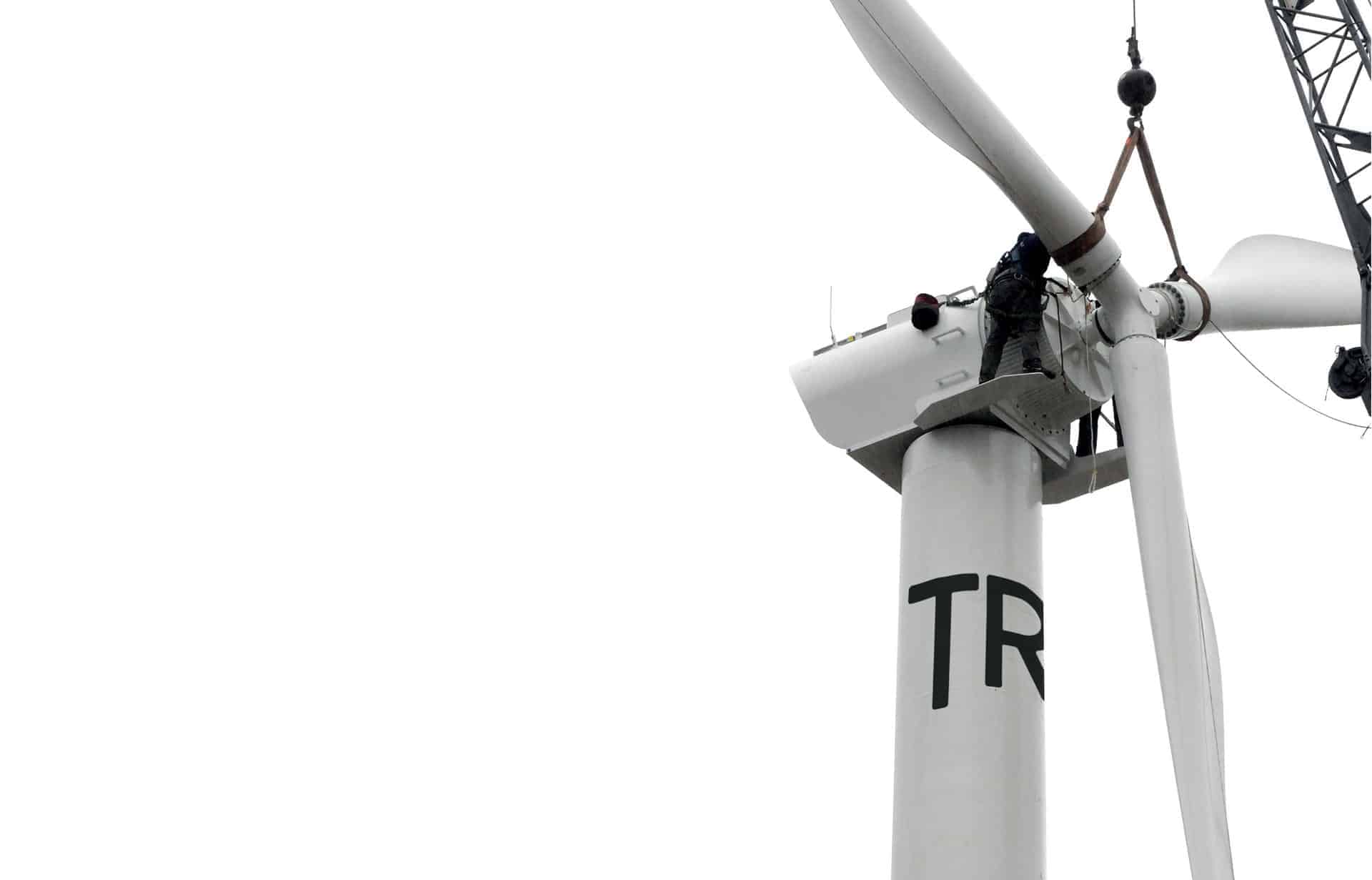
Naming and logo design for renewable wind farm company, TRI. I named this company as 'TRI' because 'TRI' is a numerical prefix meaning three. A wind turbine has three wings and TRI considers three values: wind, human, land. Also, 'TRI' pronounces same with 'TRY'. TRI tries to think symbiotic relationship between environment and human.
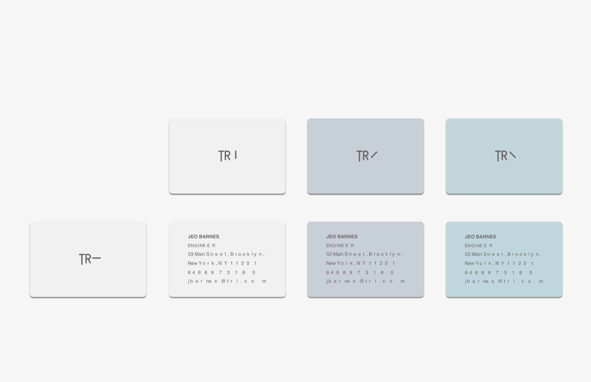
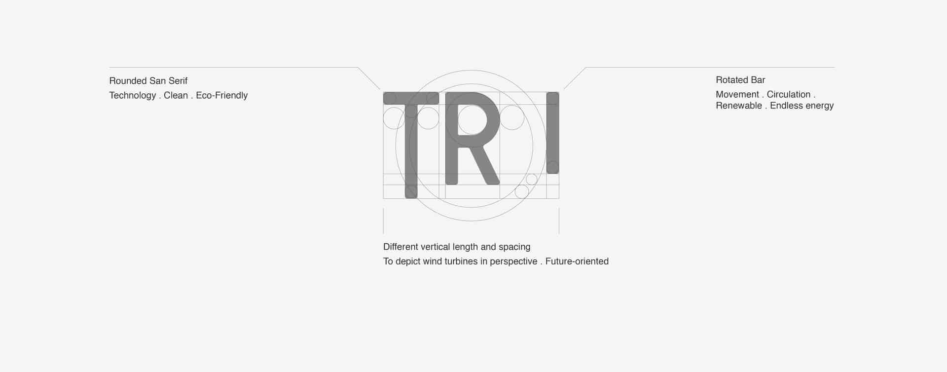
First of all, I chose bold san-serif typeface which is GT Pressura to show reliable company image. Moreover, this typeface has rounded corner so I thought that this is well matched for renewable wind farm company because wind is soft and flexible. Also, I rotated 'I' to express rotating wind turbine. This is because wind turbine is a significant identity of wind farm.

I usually use adobe illustrator to visualize my idea. After then, I use photoshop and after effects to develop my work. To be specific, I use photoshop to express several mockups and I sometimes make a gif files with after effects to express a design process.
I don't think design is just make something looks good. I thought design is a process to persuade others through communication. Through that process I always learned something from people around me. It helps me to develop my work better.