LONGER
Until quite recently, low-alcoholic beverages stably associated with the harmfulness and unnatural because of mass using of artificial flavors in LAB production. Healthy eating trend was reflected in the soft drinks market.
In 2013, the brand Longer has conducted loud re-launch, announcing itself as the first LAB in Ukraine based on natural juice.
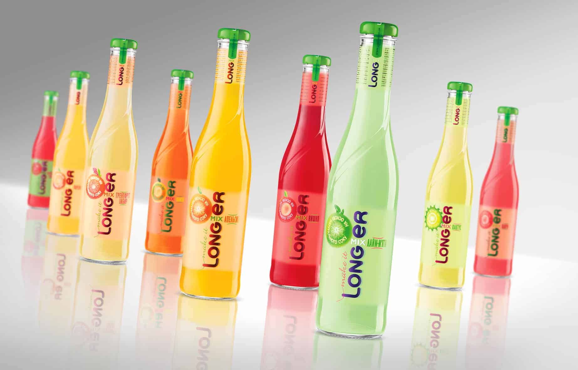
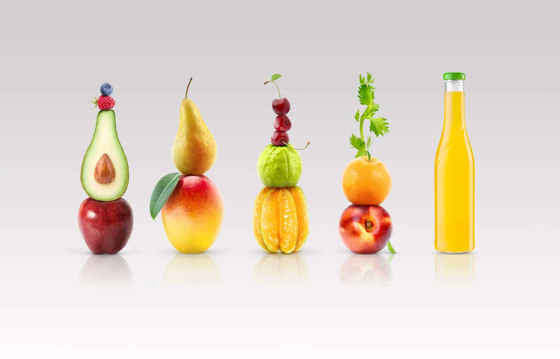
New product needed a new packaging. The main task of updated Longer was visual reflection of its naturalness.
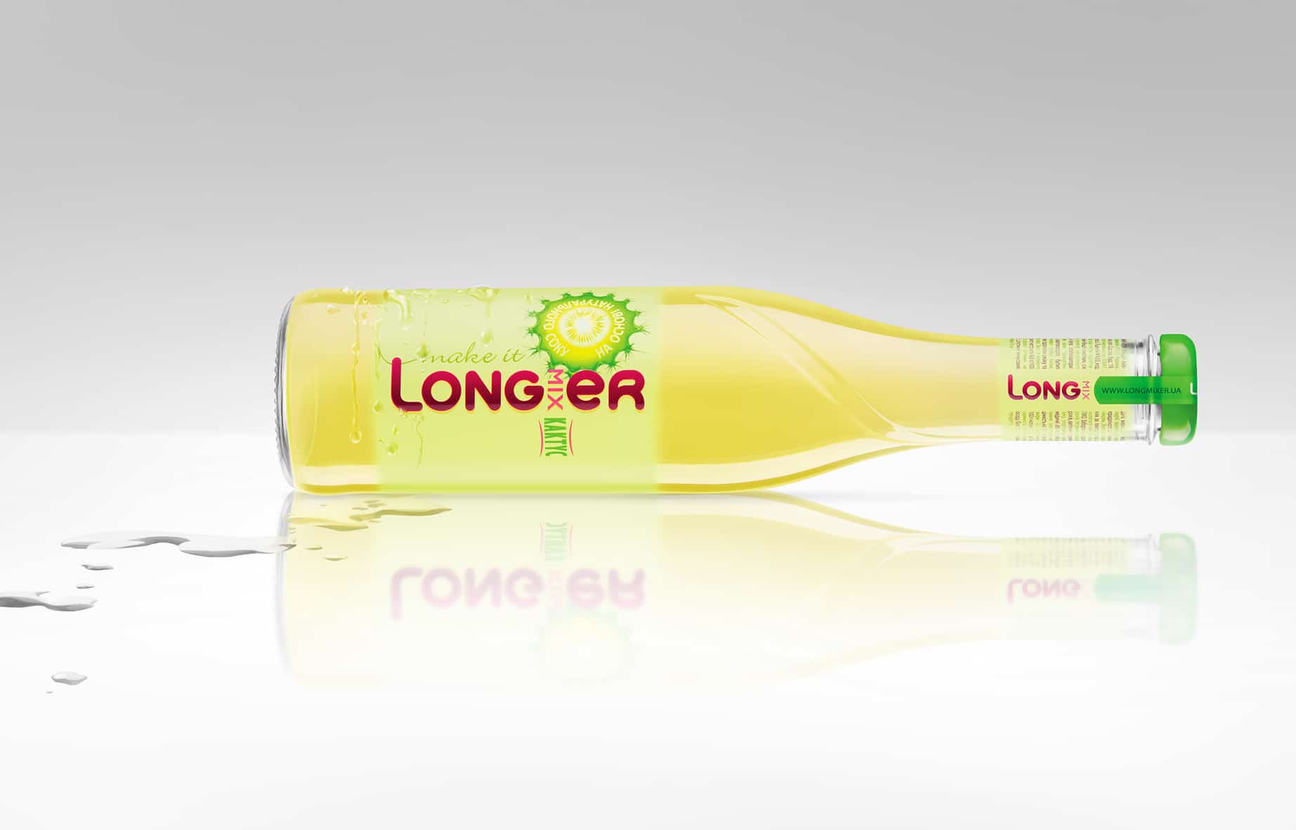
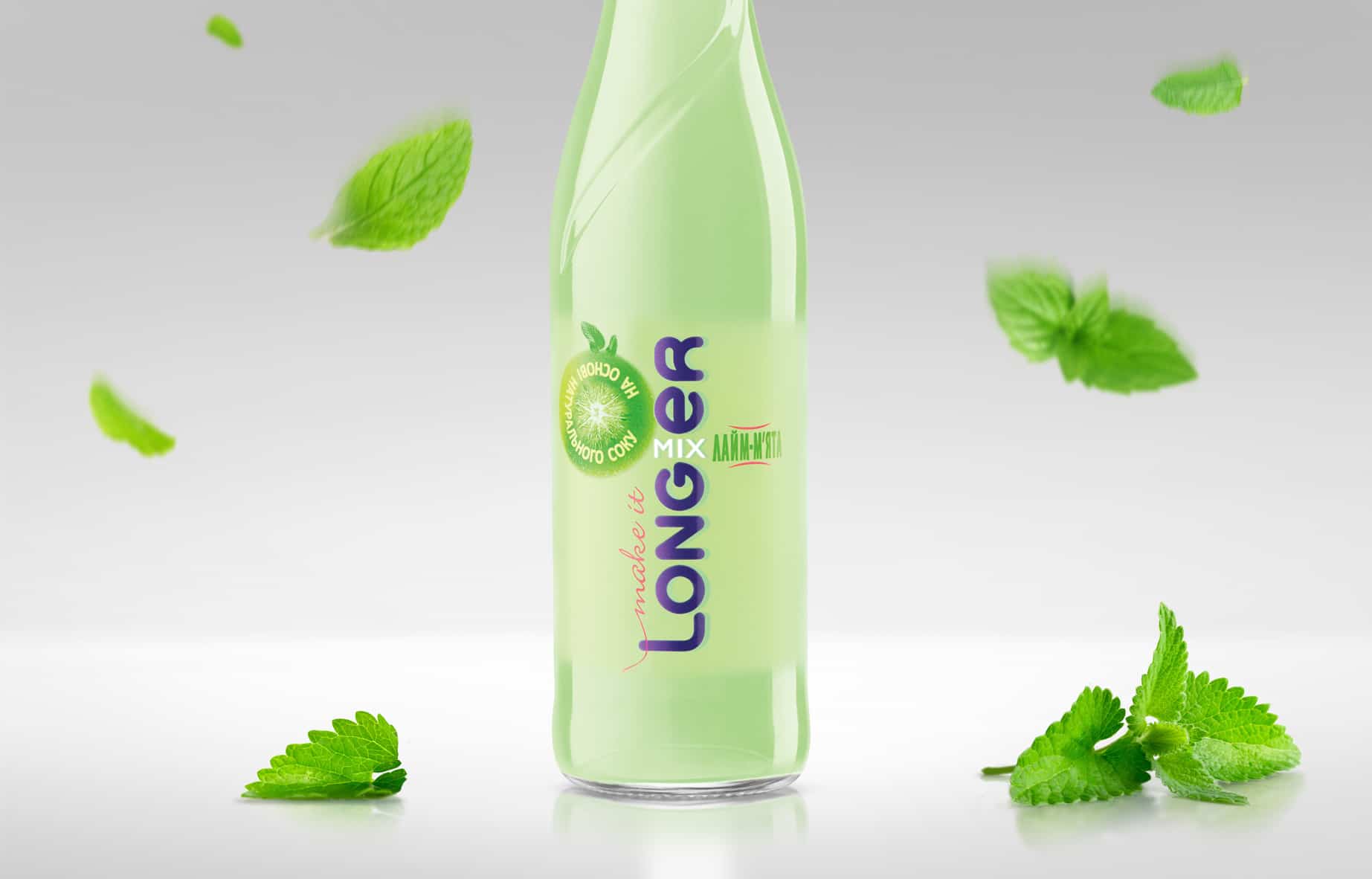
A new stylish bottle was developed for the brand. Its shape has become more ergonomic with deliberately soft contours and smooth relief pattern.
Tactile label coating soft touch imitating glass matting in combination with a glossy logotype and bright natural backgrounds formed the basis of design.
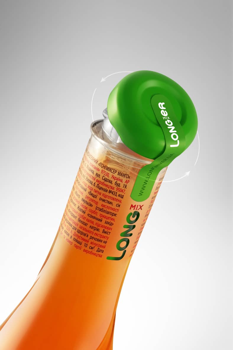
Longer has got the new unique cap. Our proposal became the innovation at the low-alcoholic beverages market, as previously such caps were used exceptionally for premium juices packaging. This allowed to ensure stable association with the naturalness of the product. The use of vertical tear tape at the neck of the bottle made the brand more recognizable and served as a safeguard against tampering.
We used the classical software for working with vector and raster graphics: Adobe Photoshop and Adobe Illustrator.For the work on the shape of the bottle we used SolidWorks. We are also very long time and enjoy working with a Wacom Tablet Styluses.
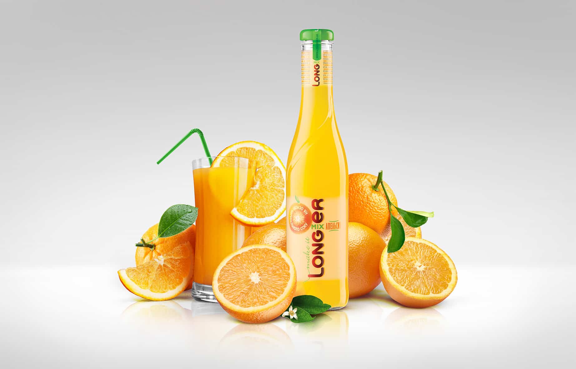
The objective to achieve a unique brand identity of the product has been reached. LONGER was taken its unique place on the Ukrainian low alcoholic beverage market. Brand awareness was increased. Product sales also were grew (at the client's data)
Graphic design: Aleksey Simanovych, Anna Demchenko
Photography: Anatoly Kasyan, Platon Ivantsov