OFFF UNMASKED by Marta Cerdà

This is Marta Cerdà's collaboration for the OFFF Unmasked book by the studio Vasava, a book celebrating the 15th anniversary of the OFFF Festival. In the words of Vasava: "OFFF Unmasked is a journey into a parallel world, portraying the OFFF community as a mysterious cult with its own legends and rituals. Readers must peer behind the layers of myth to discover the real story of OFFF, its founders and its early supporters."
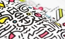
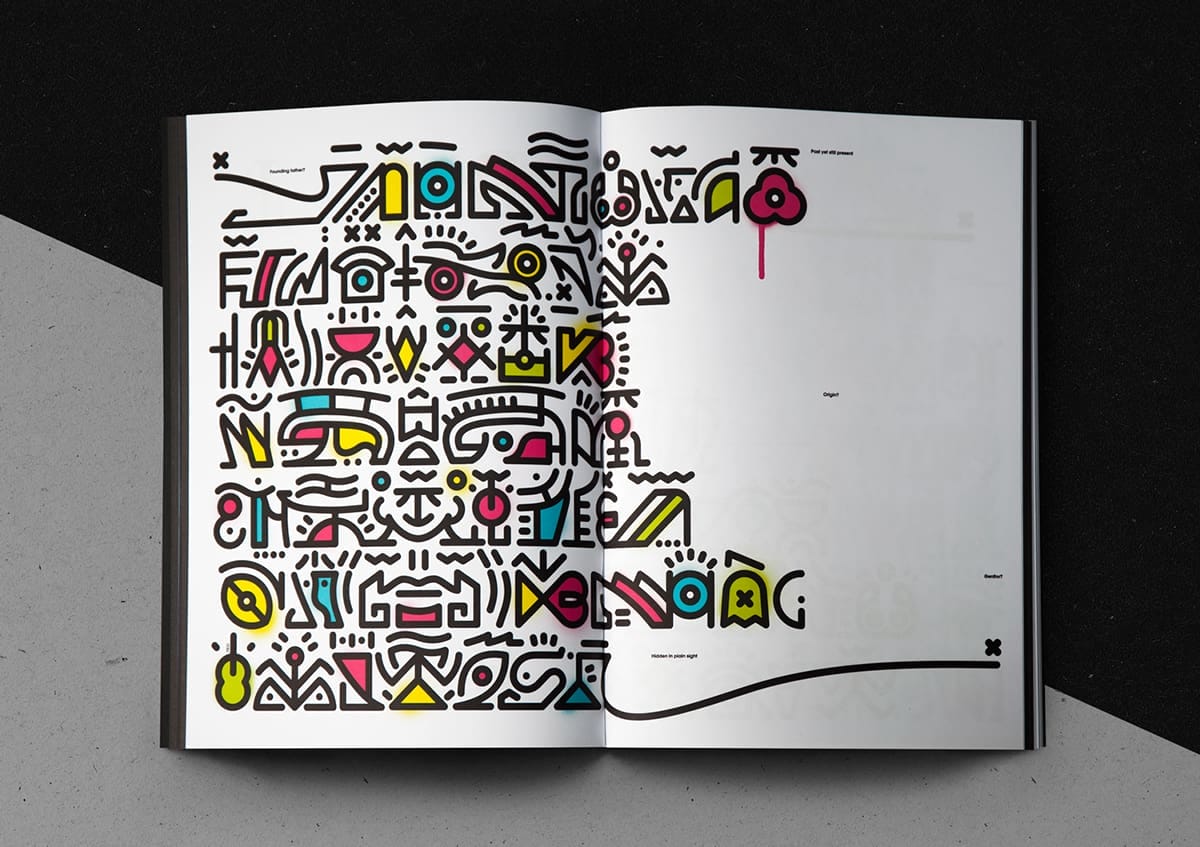
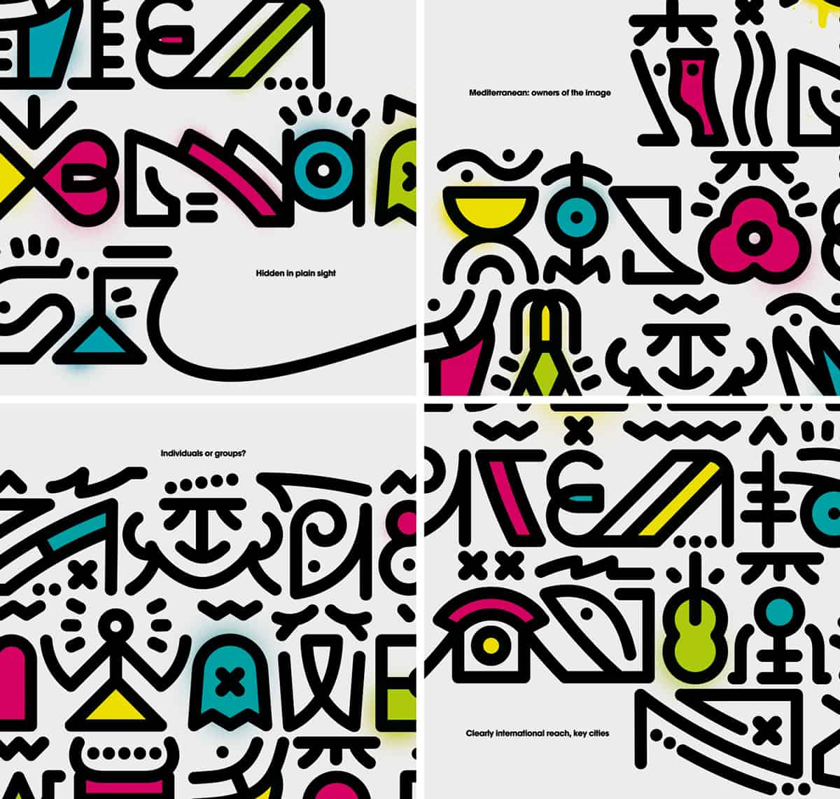
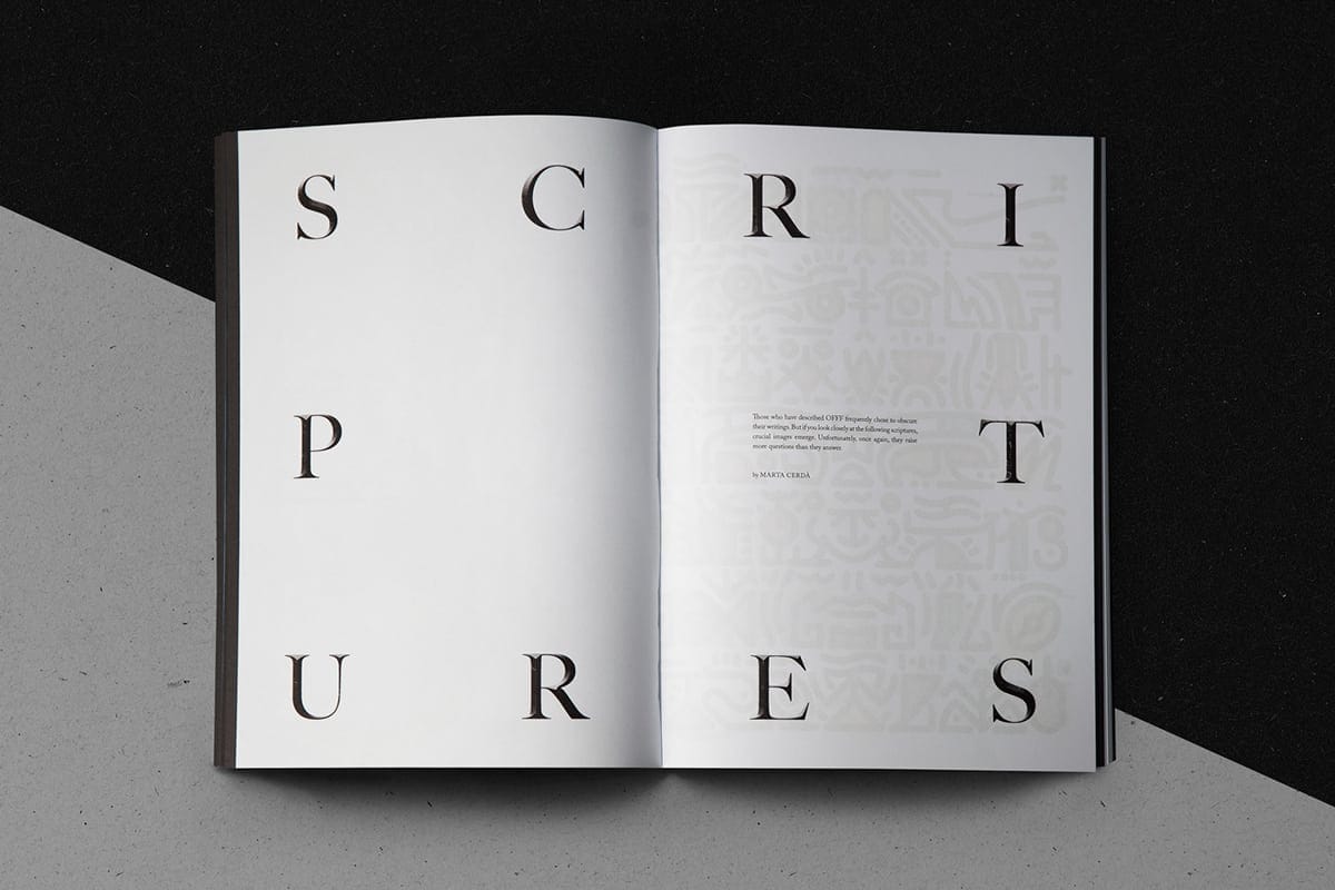
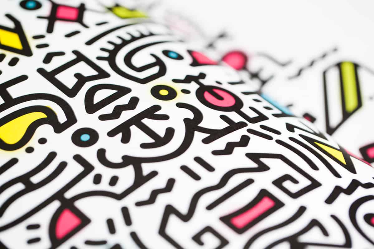
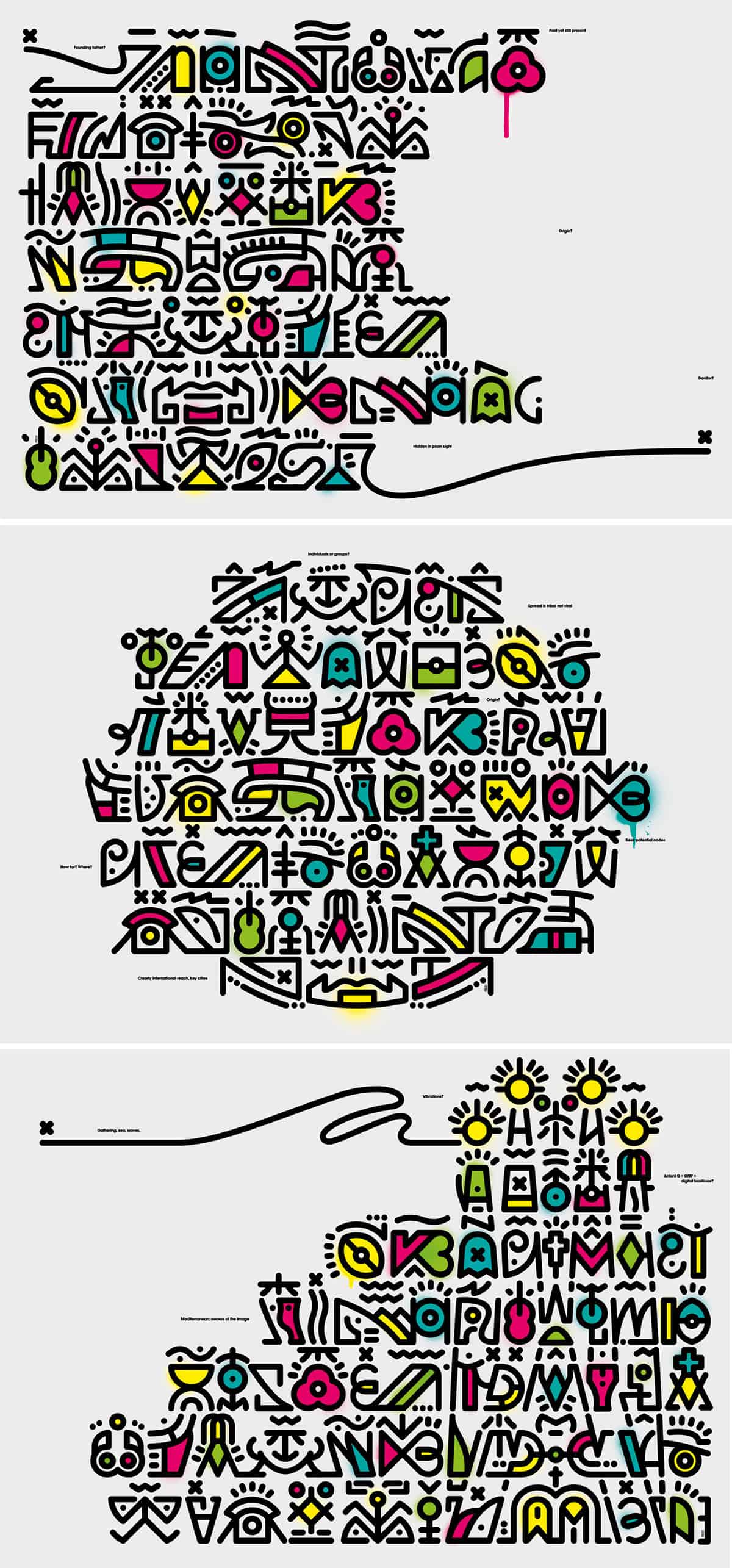
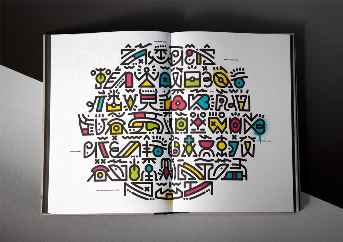
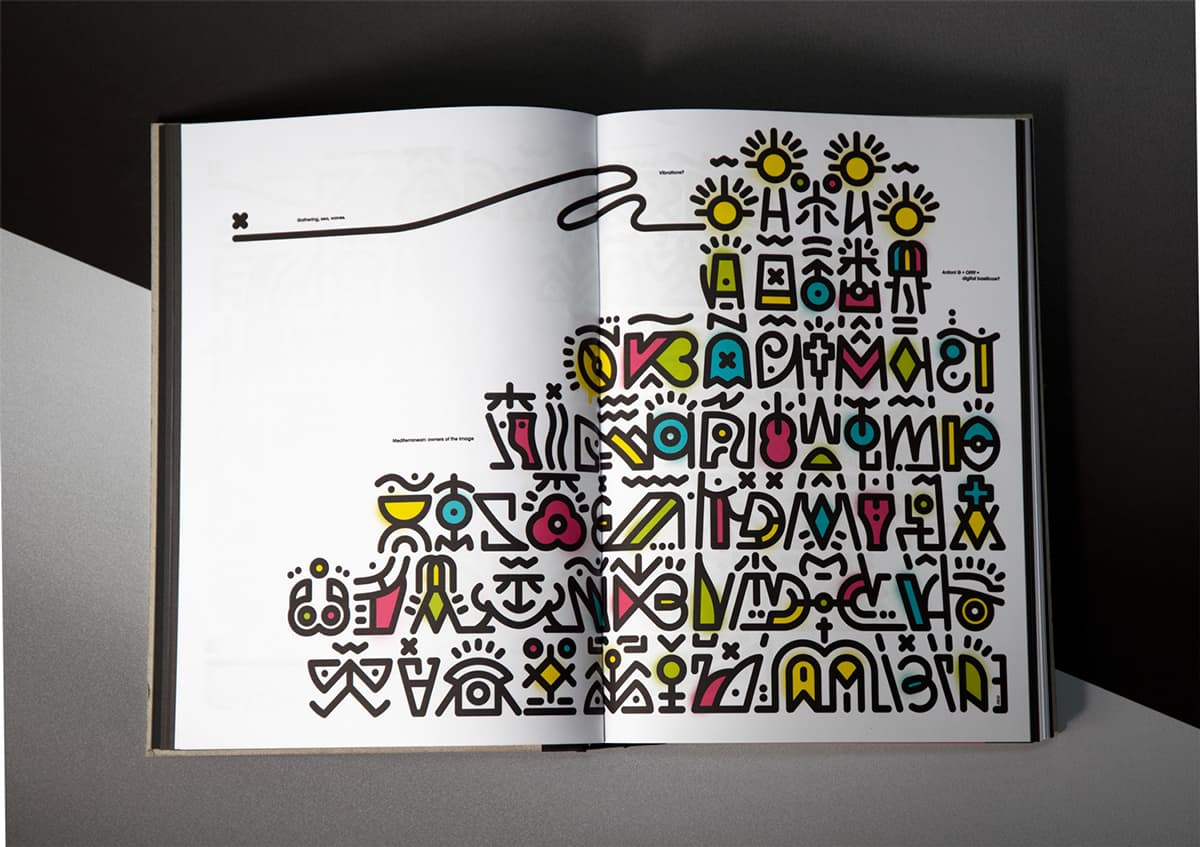
I was in charge of designing the secret scriptures, and I did it with an imaginary alphabet that is at the same time hiding images and information about the OFFF Festival. The idea was to create an alphabet that couldn’t be located in any particular historical period, and that would reveal specific facts about the OFFF Festival, such as its director Hector Ayuso, its hometown Barcelona, or its global approach.
-Marta Cerdà
About Marta Cerdà
Marta Cerdà is a Barcelona graphic designer whose main body of work is focussed on the boundaries between typography and illustration. At the end of 2008, after working in agencies and design studios between Barcelona, Düsseldorf and Munich, Marta won the ADC Young Guns and decided to found her own studio. Since then she has worked on global projects which call for Design, Illustration and Custom Typography for Arts, Culture and Advertising Clients. You can find more of her work on www.martacerda.com
I think it's some sort of secret typography. Amazing combination of various symbols and colors. I am sure that it took very long to build this create design, totally worth it.
Interesting! Nice work :)
Very nice images. I love how the colors is worked into the images which make it awesome.
I like the colors that are used here. They are very pleasing to my eyes. I also like the good balance between the type and the image the artist is trying to make.