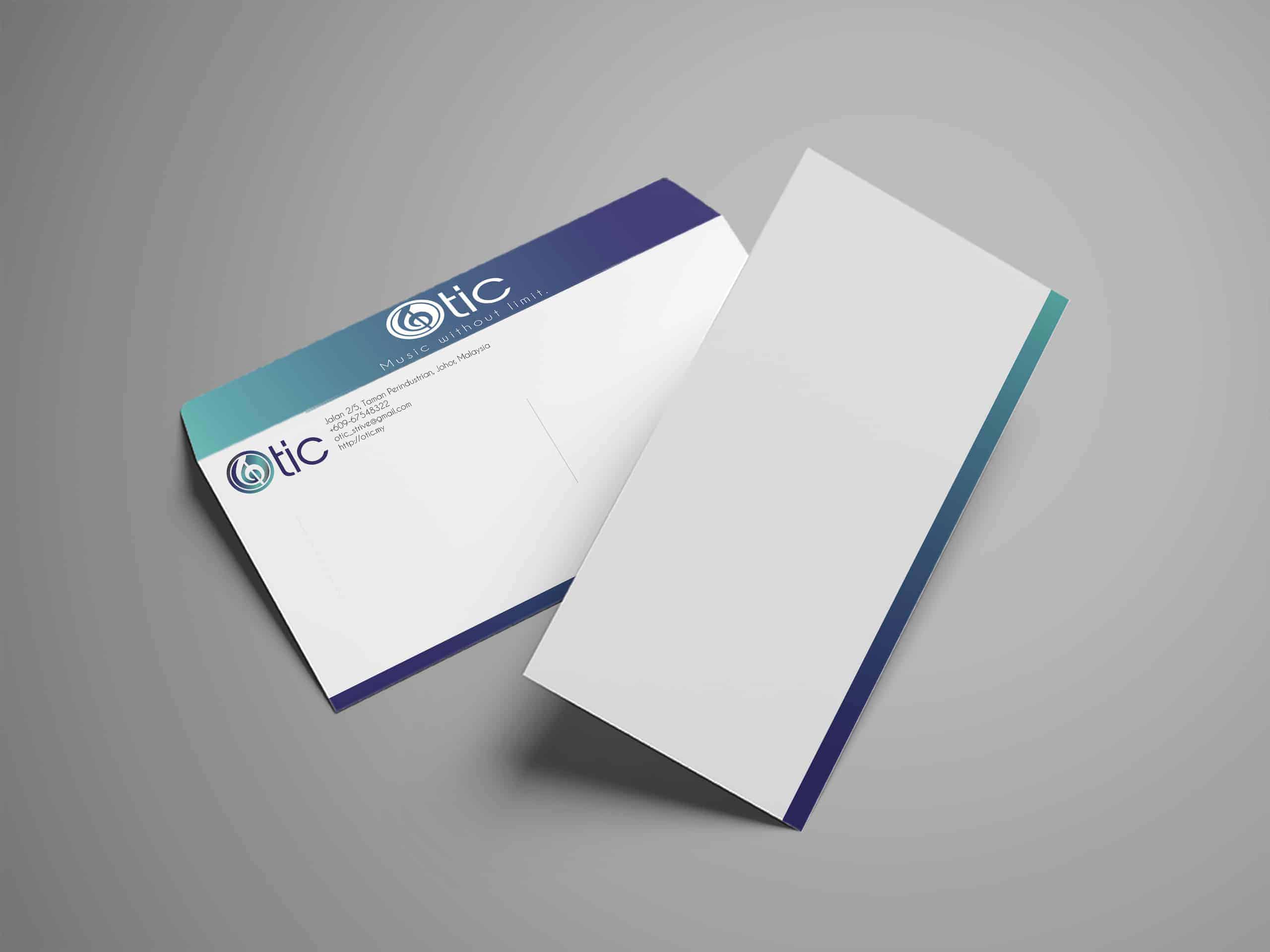
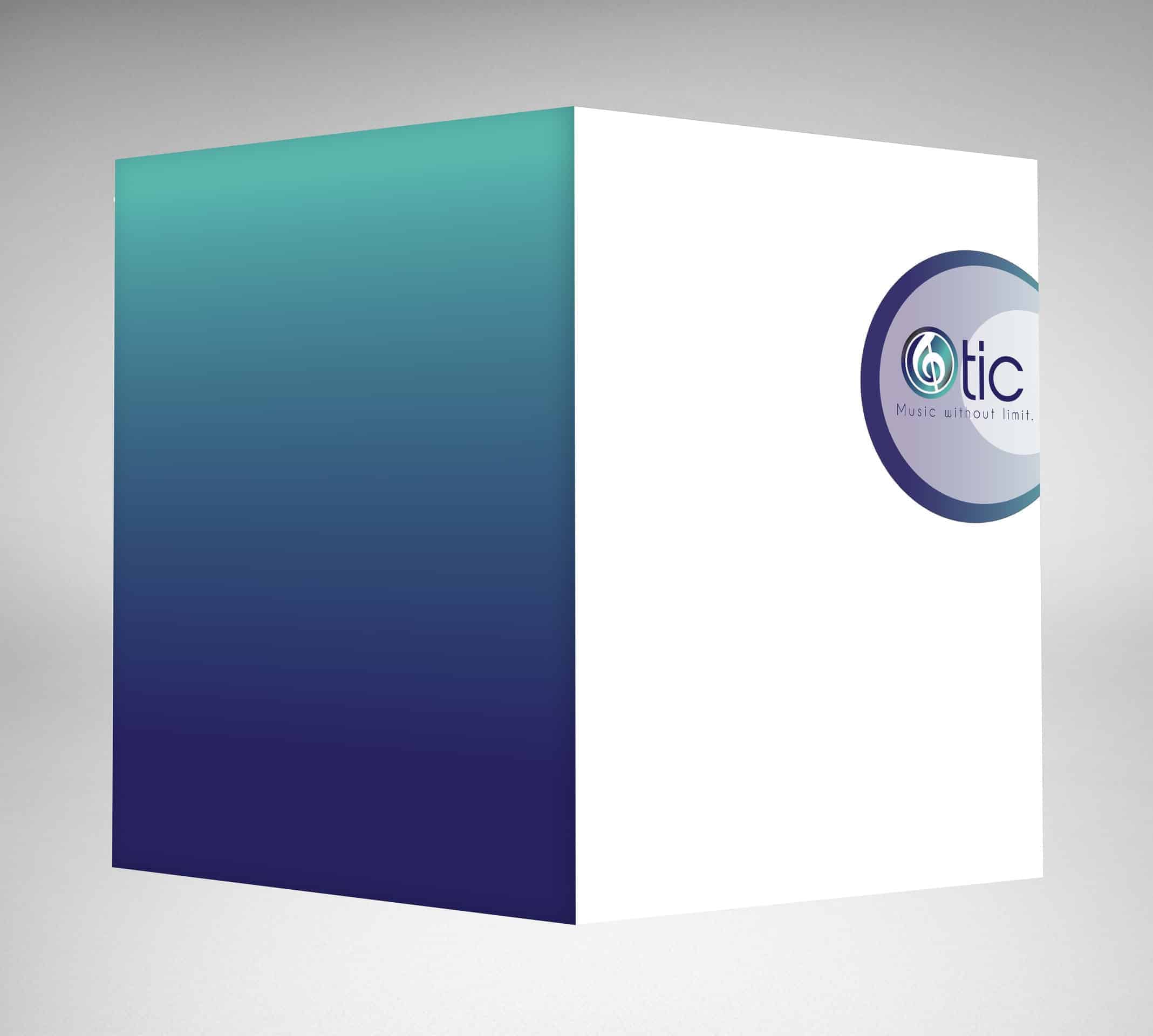
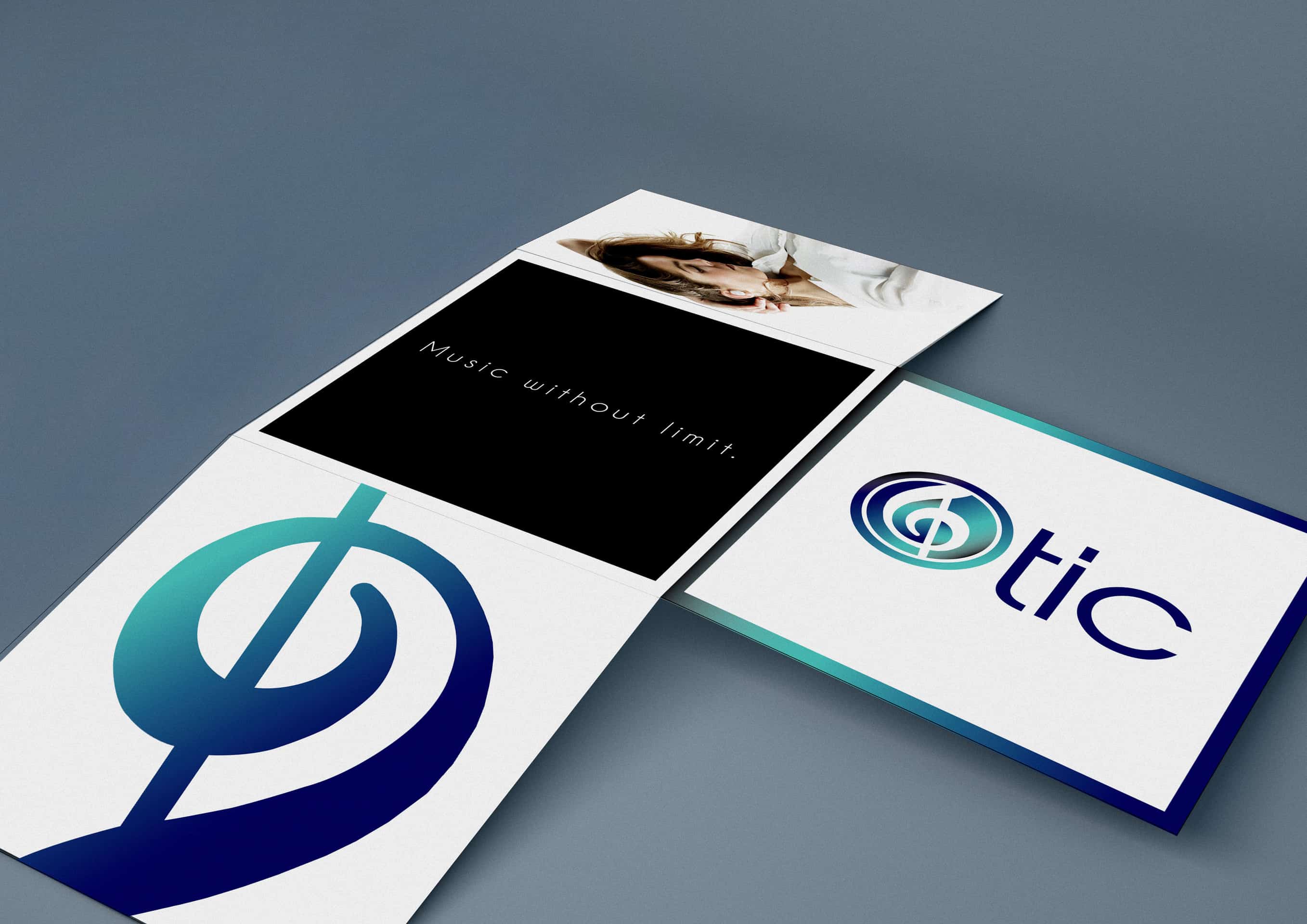
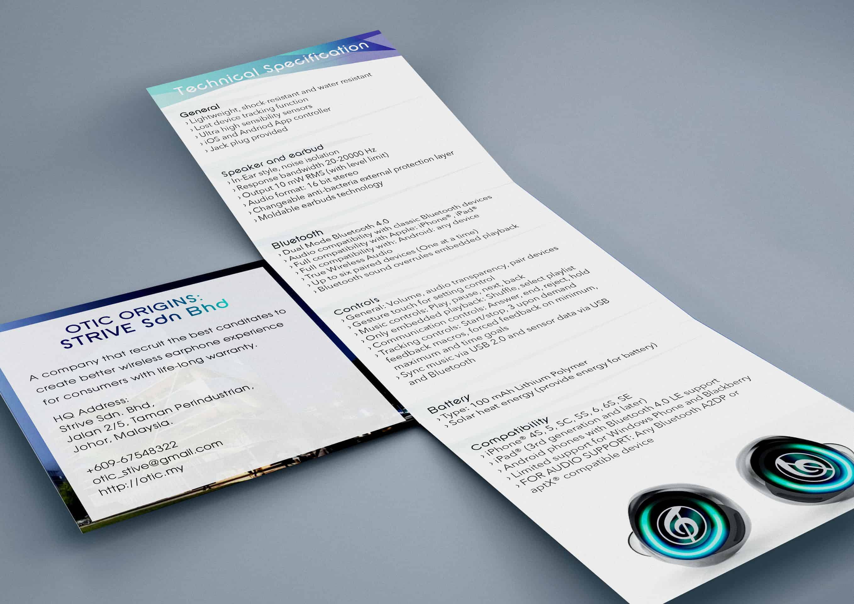
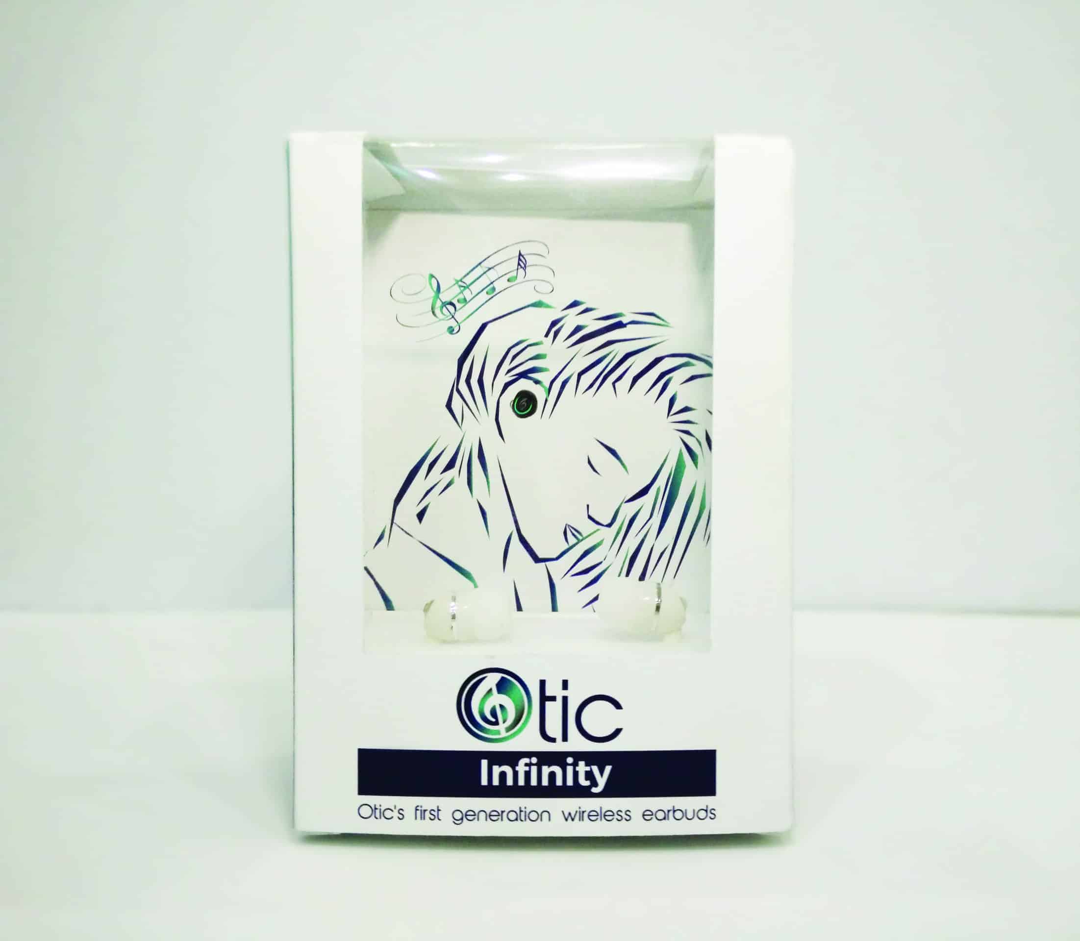
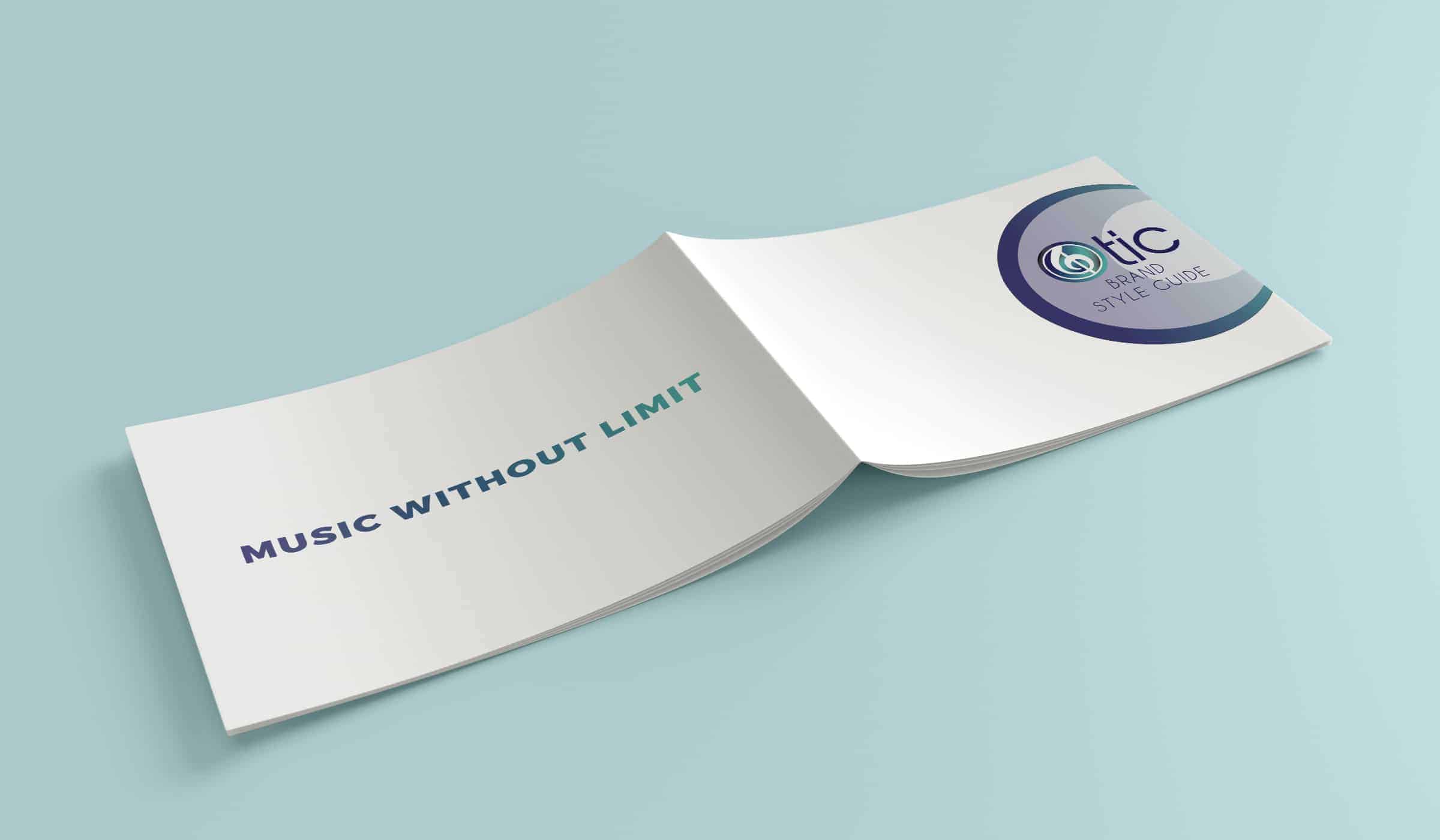
Otic Branding
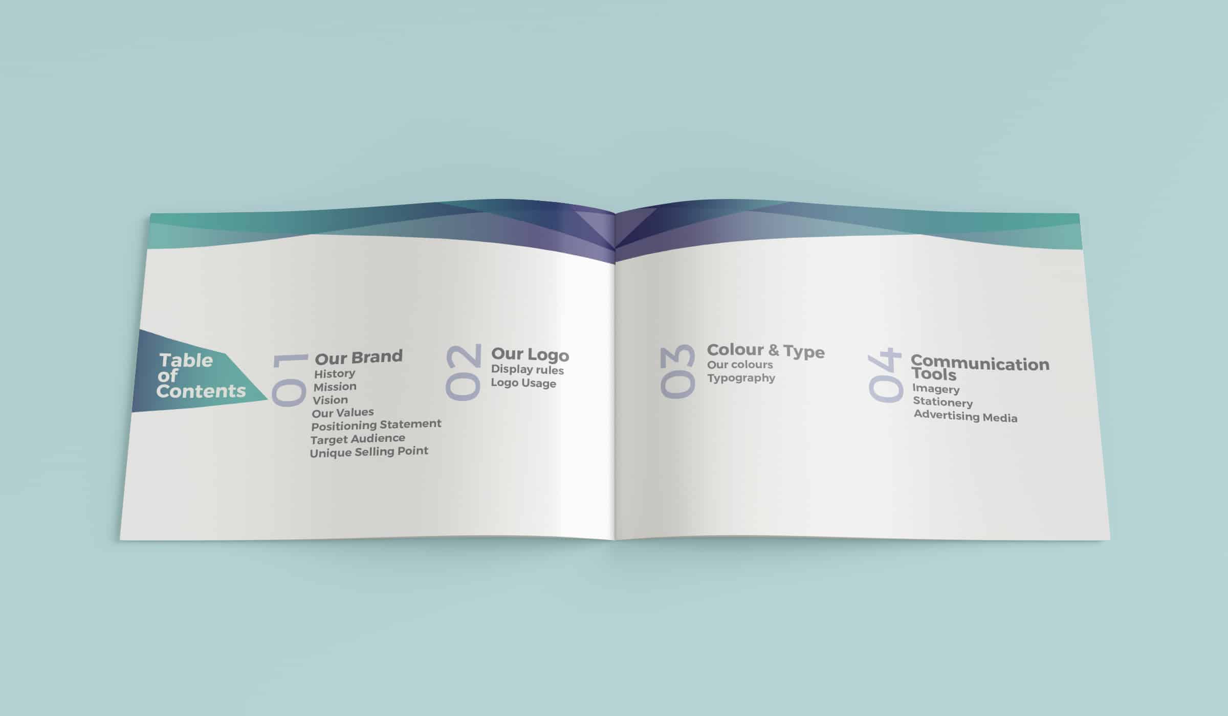
Branding project for an earphone company - Otic. Music note and metalic gradient are apply in the design to symbolize that music will continue it's existent towards the far future. Items included name card, letterhead, envelope, brochure, folder, paper bag and company style guide.
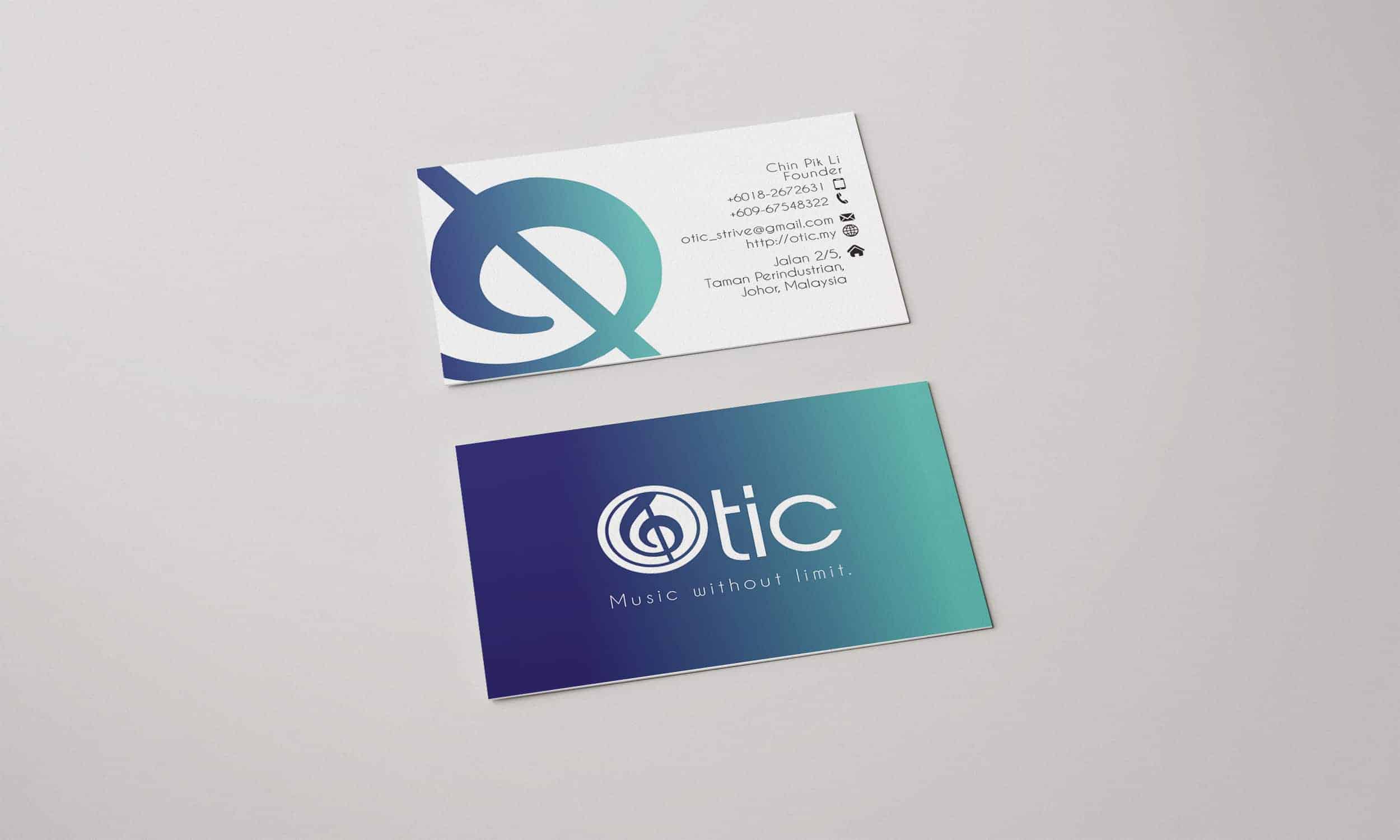
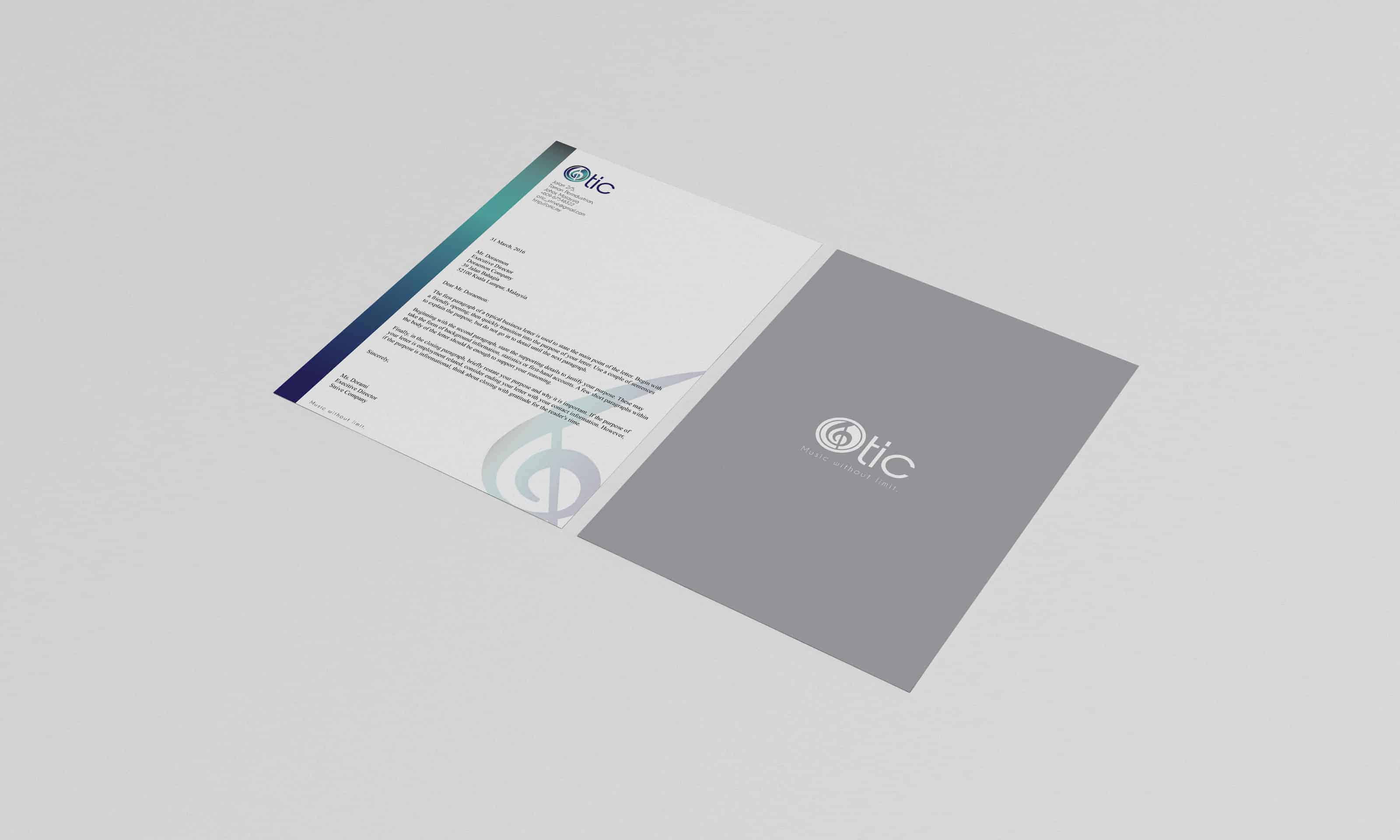
I wanted to create a look that does not get outdated over time. At the same time, I wanted to challege myself with futuristic look since I usually do not apply this style in my work. The main colour for this project is the combination of green with dark blue gradient. It emits a "metalic" feeling which I feel compliments well with the material that premium earphones usually have.
From sketching on drawing pad to putting them together using Adobe Illustrator, there are errors and trials until it reach the final outcome which you see infront of you. During the process, I tried out different colours until I was satisfied with this combination. All materials (papers) were all handpick by myself so it matches with the branding.

Overall, people like it. I learned to appreciate white space more after doing this project. Other than that, this project also taught me to be careful with papers that are too thick. This happened when I tried to fold my packaging and the surface of the paper started to tear off a little...
wish to see more good works from you!
I like the style of the illustration. Awesome!