Pastel wanderings

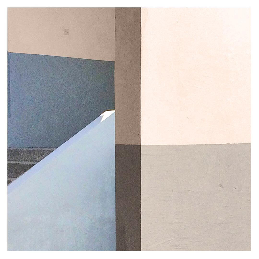
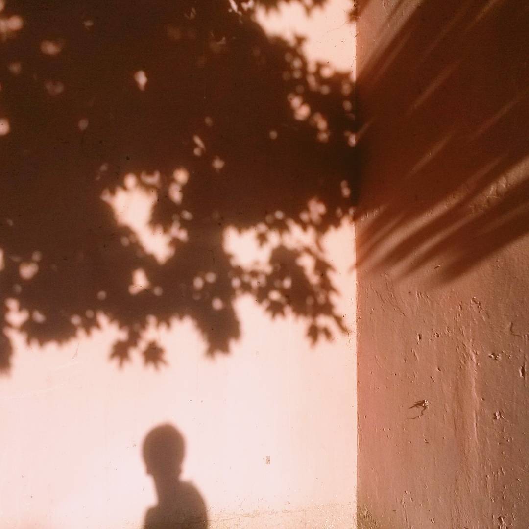
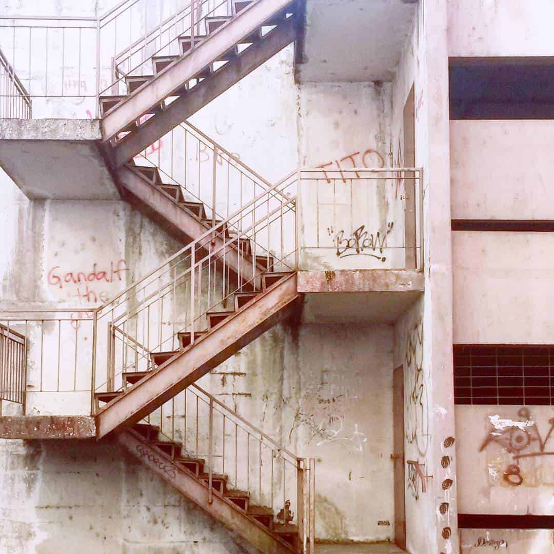
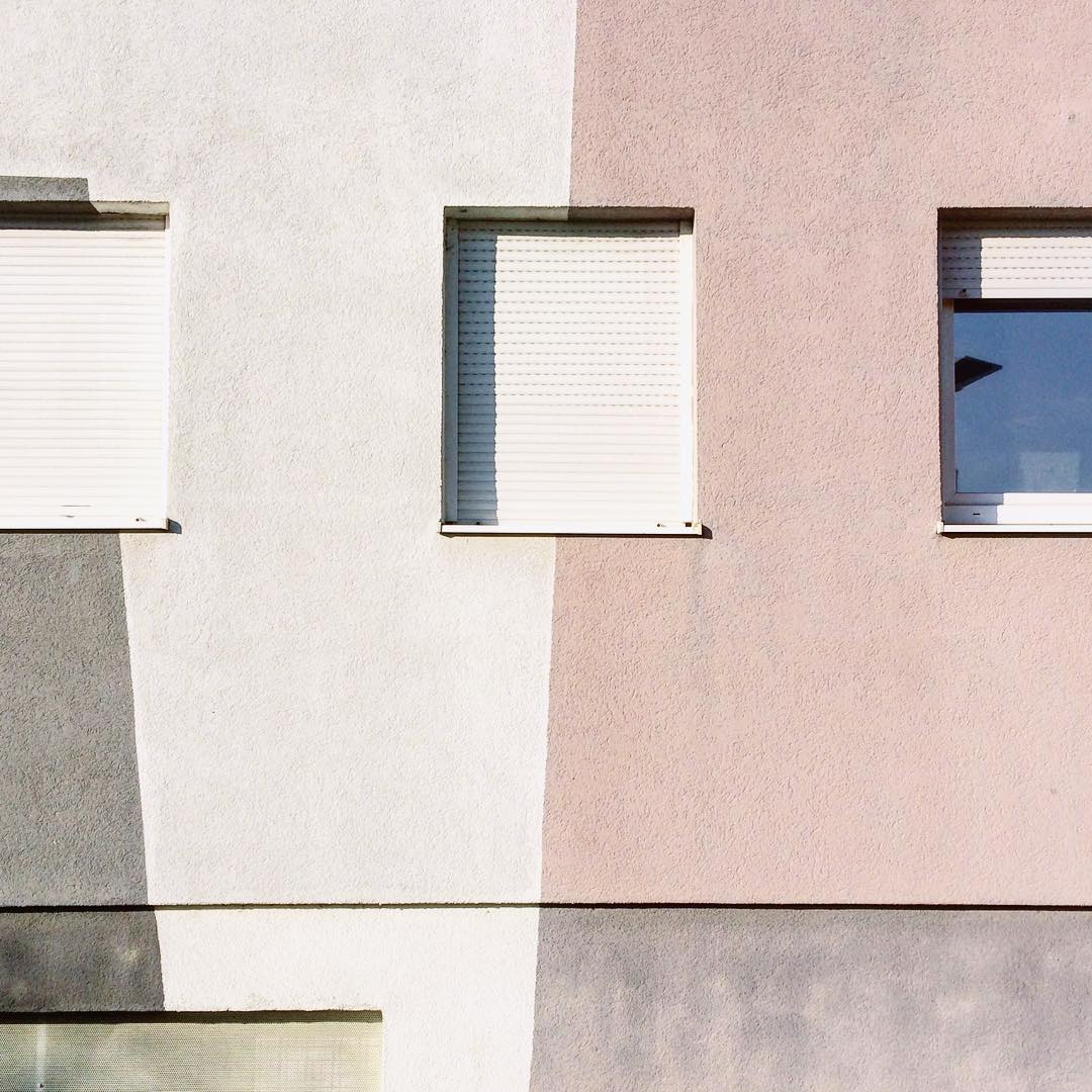
Pastel wanderings is a series of images showing building crops in pastel shades. Pictures were taken between 2016 – 2018 during my wandering times. The play of shapes, colors, lights and shadows allow me to look at geometrical compositions that form a random piece of concrete art I like to notice and capture. The project case could be found on Behance link: https://www.behance.net/gallery/62566443/Pastel-wanderings
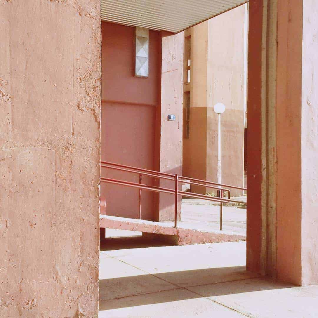
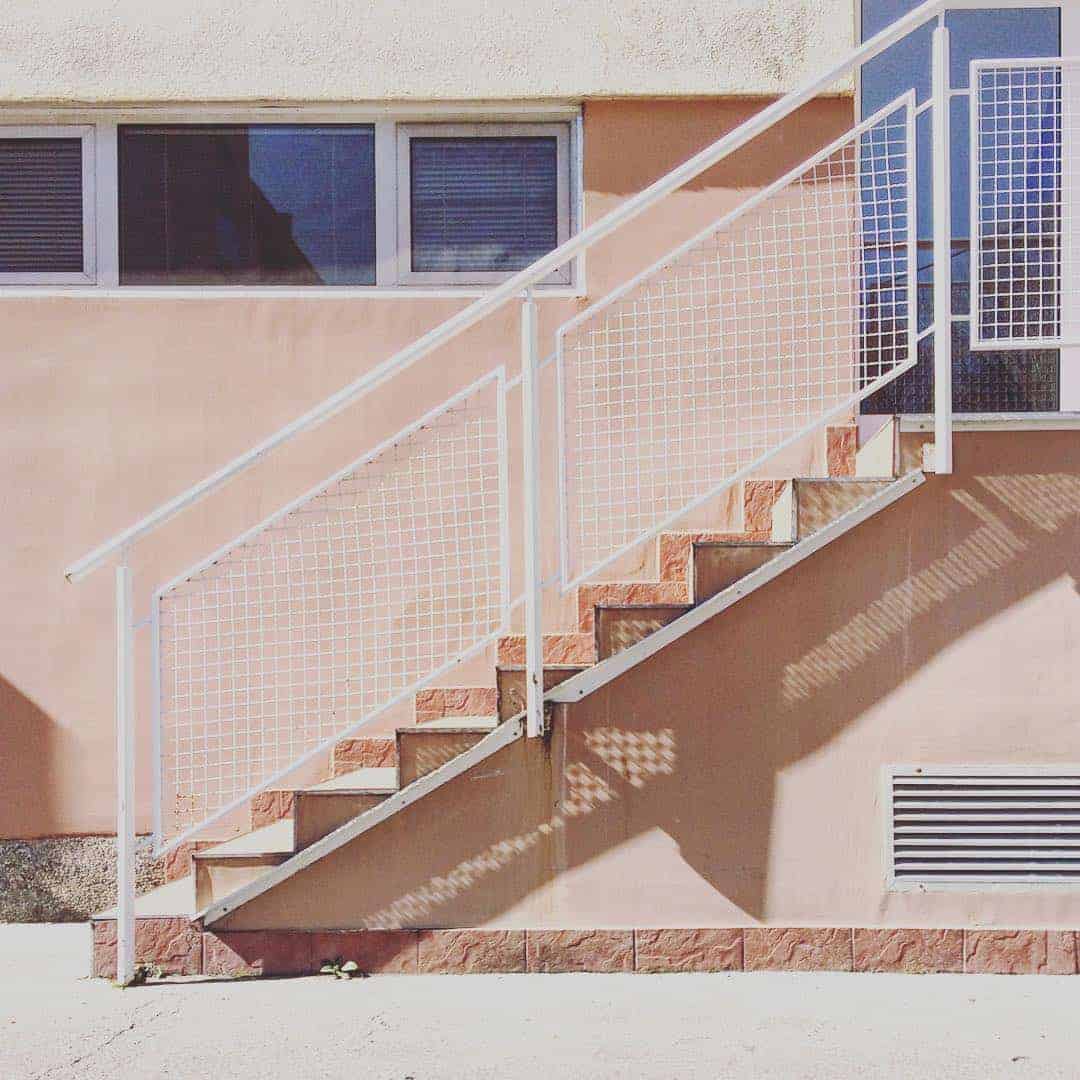
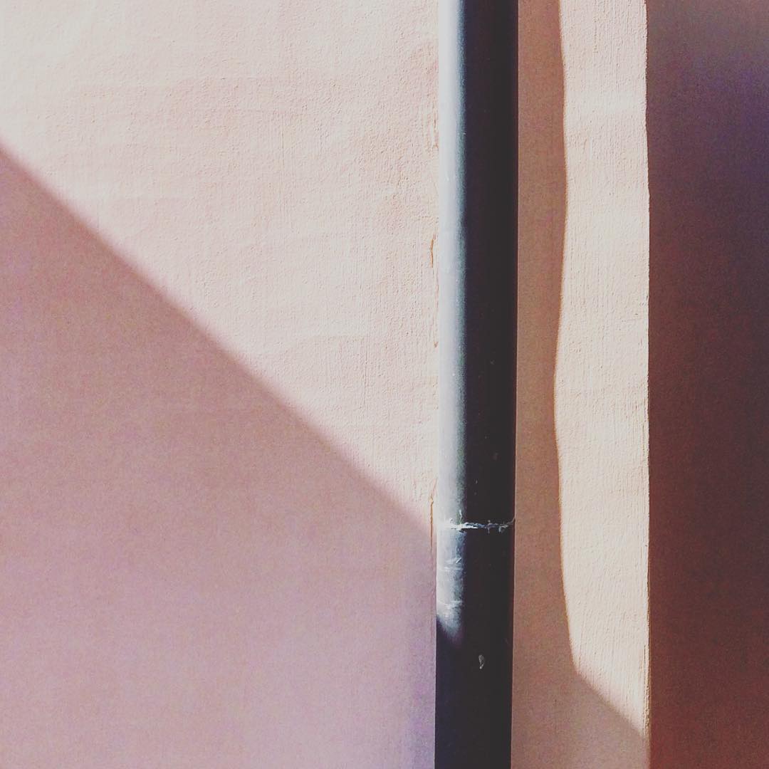
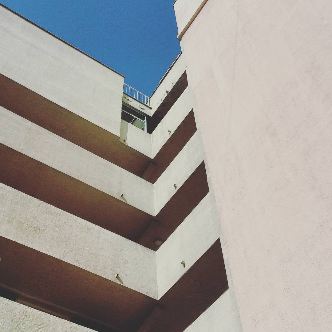
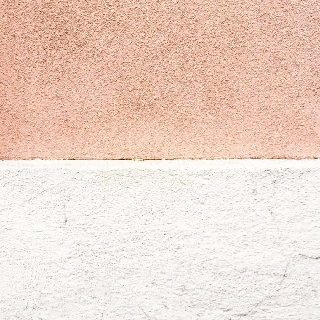
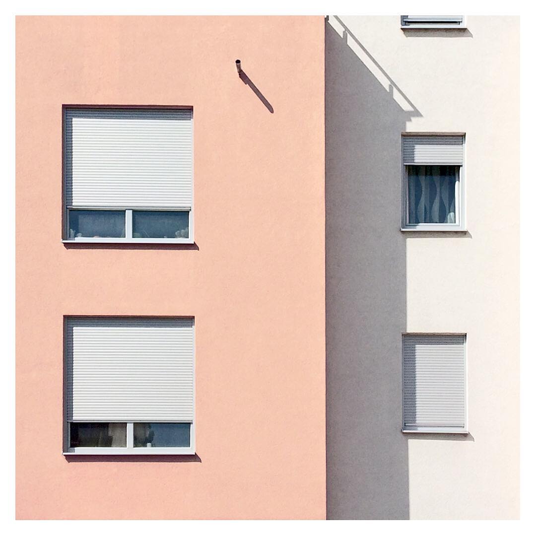
I enjoy long walks where I can let my mind be at ease and explore all the pretty details that surround me in our urbanistic residence. My inner thrive to search for the aesthetics and pleasing environments with a pastel feel make me look at these blocks of buildings as a canvas painted with my current view, my perspective and their static form. Pastel colours with their pink imperative tone provide a soft and gentle feel of this massive blocks.
I mainly use my phone to take this pictures, as I'm on the go. It is much easier like that as most of the time I need to be quick in capturing a certain shot. I usually take couple of images of a certain detail and then I go to post-production phase. If I want to do it right away I use basic Instagram filters, where I just play with brightness/contrast, shadows/highlights and adjustment part on Instagram to adjust the perspective as much as I can. However, if I have more time, I use Photoshop to play around more in depth. There, I can be more flexible with editing as I have more options and ways to manipulate an image. I work with perspective transformation, the selective colours to bring out a certain tone and I also play with brightness and contrast. Cropping is also an important part of editing, you want to have a clear focus and hierarchy of what you want to show, so I always take some time for that as well, until my detail is in it's right part of the image composition.
I didn't promote this anyhow specific, except sharing it on Behance and having this pastel vibe on my social media. My exposure is not big, but the people that know me are starting to associate certain shapes and pastel colours with me. Everything personal I make shares this visuals, and in a way I am forming my visual style. Having people recognising it differentiates me to an visually original individual which is a reward for itself.
This project is ongoing, as I continue capturing details that surround me wherever I go. This is a form of my expression and it could be used as an inspiration board. If other people find inspiration in it, it would make me really honoured.
I usually use Instagram to post these kind of images: https://www.instagram.com/ana_valjak/
I would like to note that for the title I used Shorlines script: https://www.dafont.com/shorelines-script.font on the Behance link of this project.