Pronto Light by Pedro Paulino

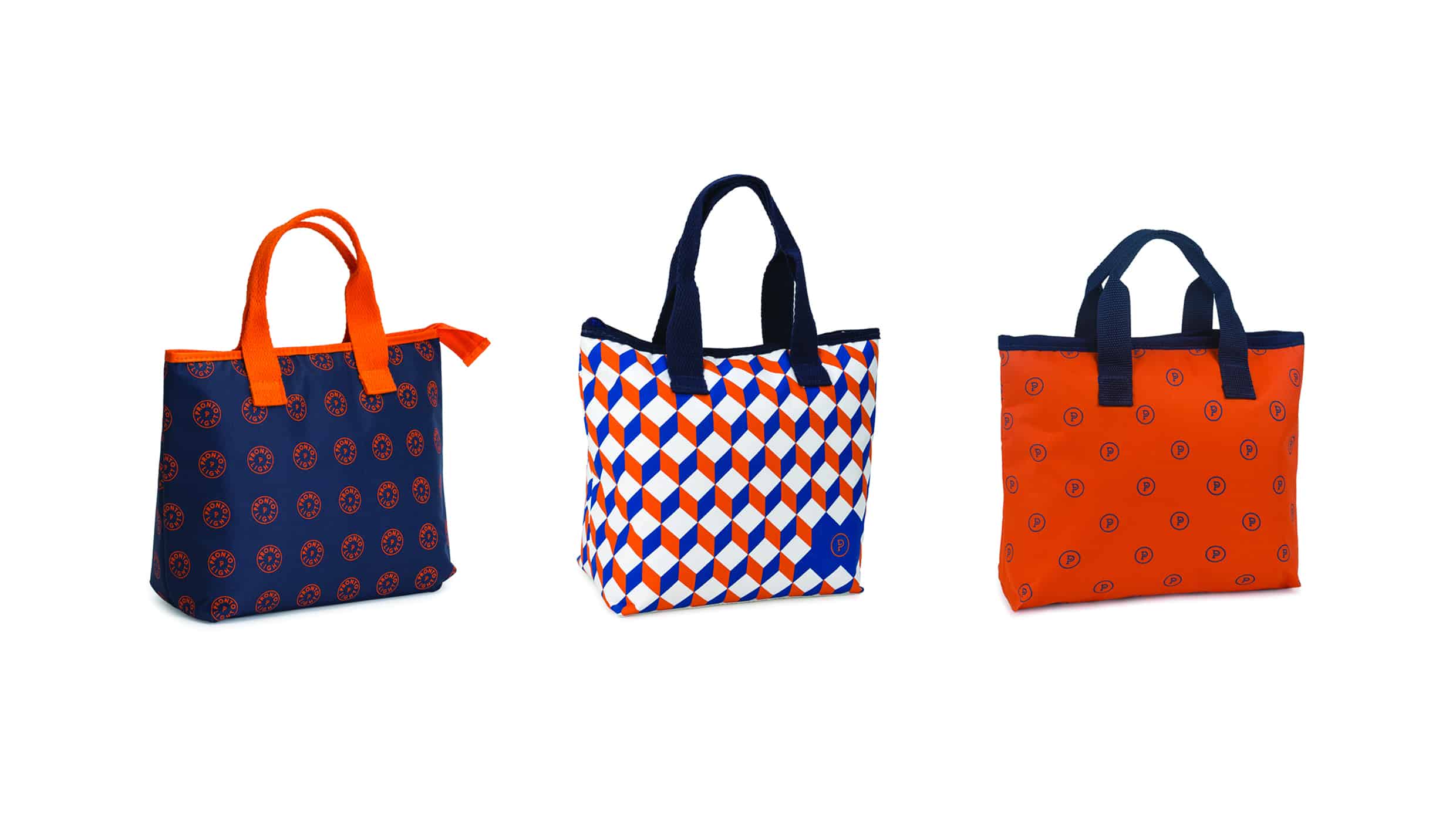
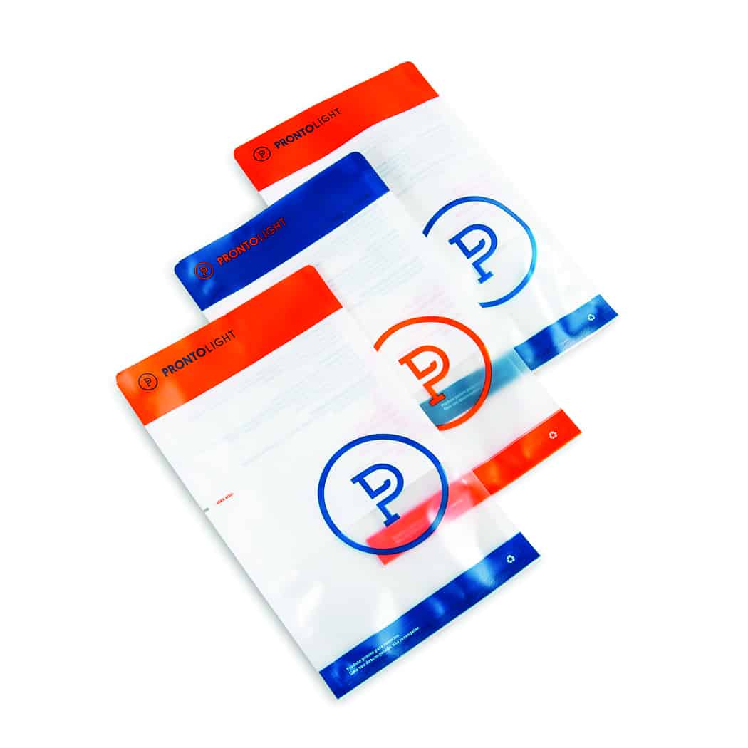
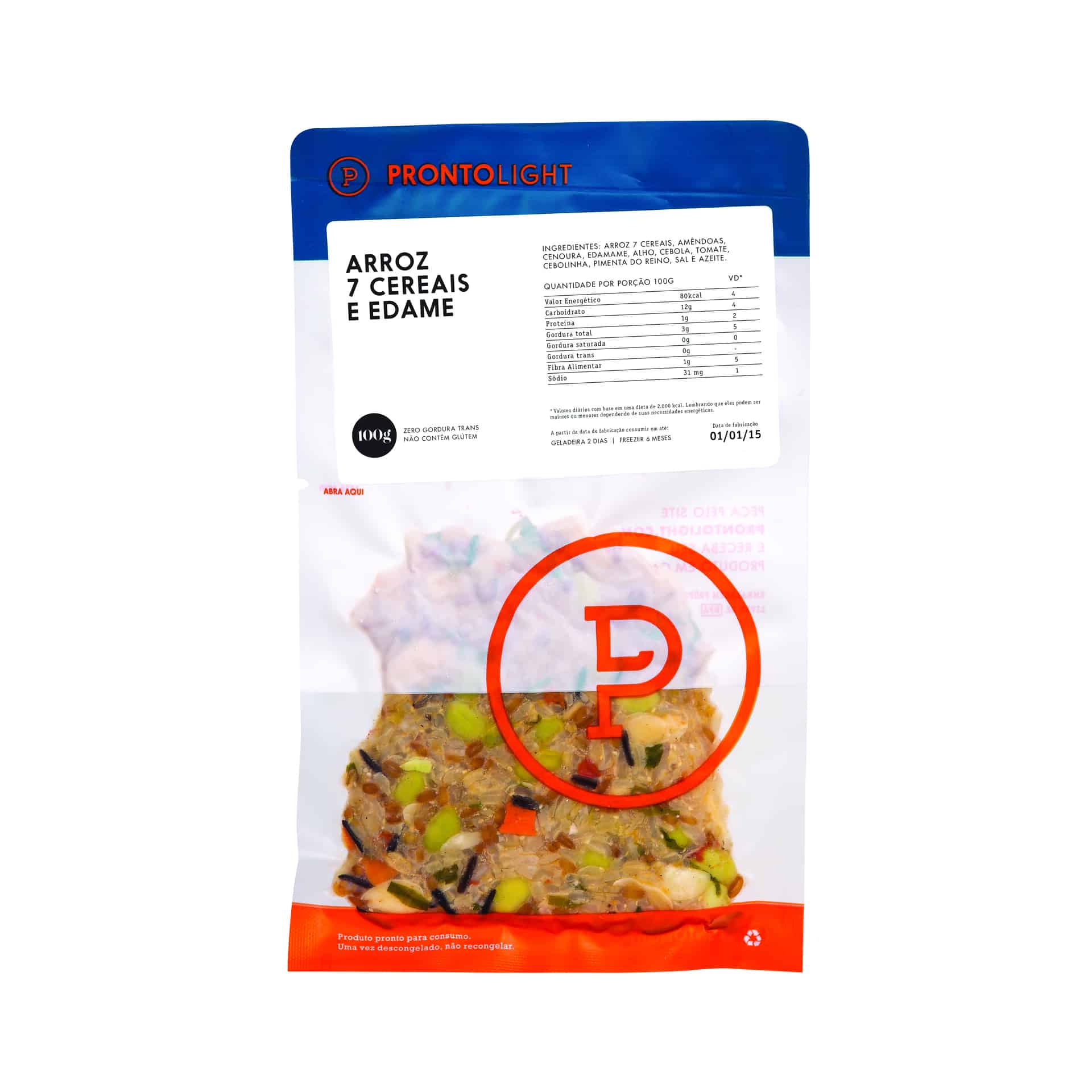
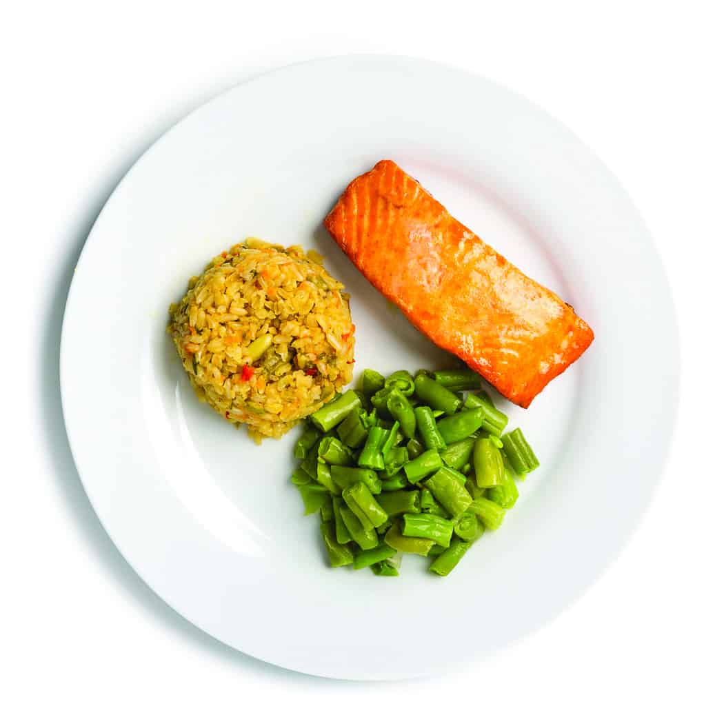
Pronto Light began selling its products in the gymnastics academies for people who were looking for a healthy and uncomplicated food. For the creation of the brand, the client would like to have an emblem with his initials. The combination of blue colors with the orange represents the process of preparation of the food by the time you consume them.
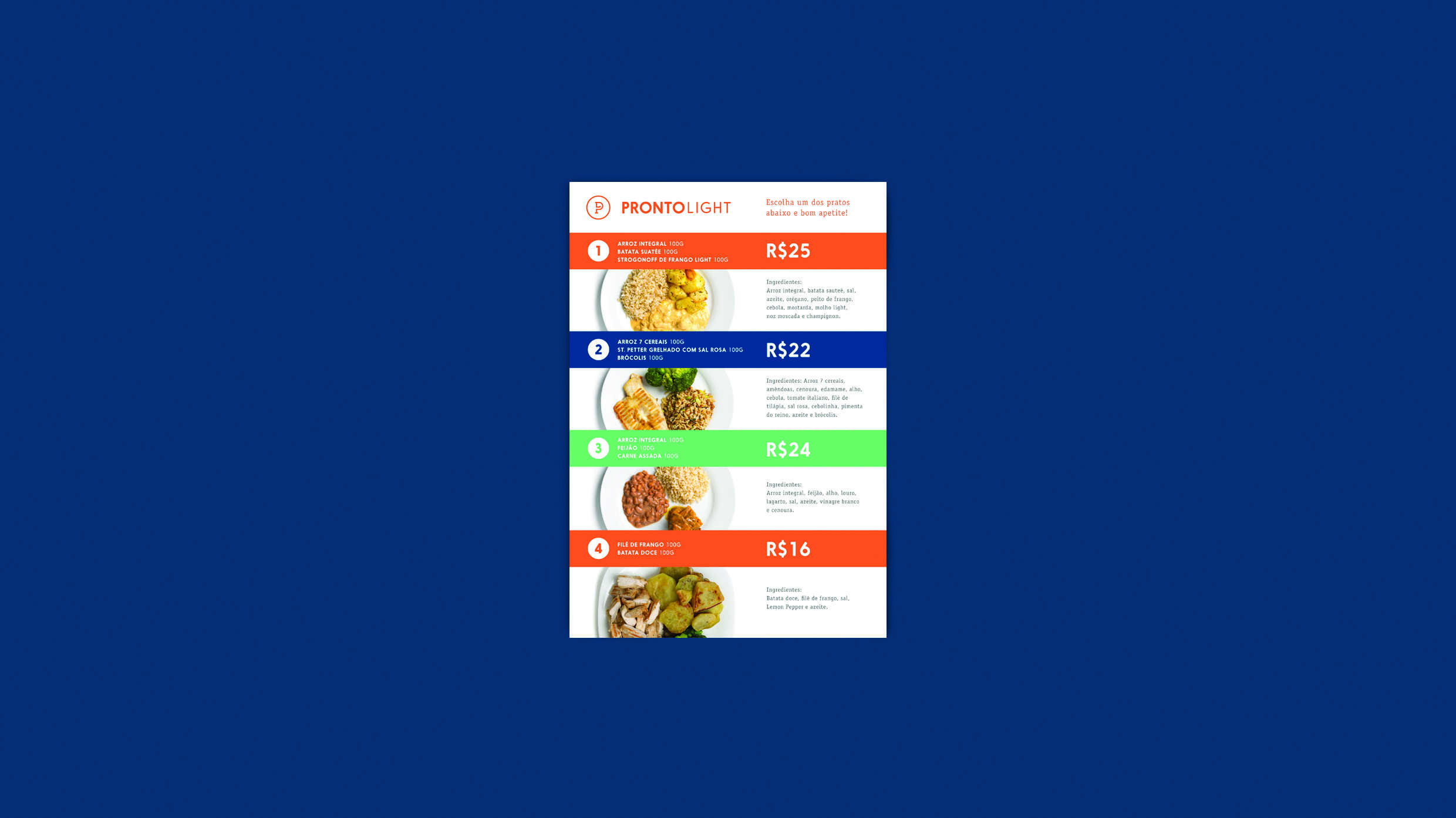
It all started when Eduardo Dimand, founder of the company, began practicing bodybuilding for sport. Their goal was to lose weight and gain muscle. Talking to experts, he learned that the formula for Results is the FOOD. "I needed food prepared in a healthy way, with adequate portions for my goal. In the absence of choice, I began to prepare. The idea of creating a company that would work as a "compounding pharmacy" food has become part of your daily thinking. "There are many people interested in losing weight and gaining quality of life." And to achieve this goal, the most efficient way is to adopt a healthy diet. To move from theory to practice, these people need from the guidance given by a nutritionist or physician, receive at home or at work, your properly balanced meals, custom and ready. PRONTO! The name was born.
- Pedro Paulino
After 3-year-old, developing products, packaging and concept in kitchen of his house, it was time to expand, it was no longer possible to meet the demand. "I felt alone, I could not fulfill my dream" - confessed Edu. Thus drew Fernando Negrao, Physical Educator and friend. To complete the team of members and formalize the deal came Pedro Pandolpho, manager, friend and client. Today the company has six years and is the largest following in the country. And do not stop growing.
- Pedro Paulino
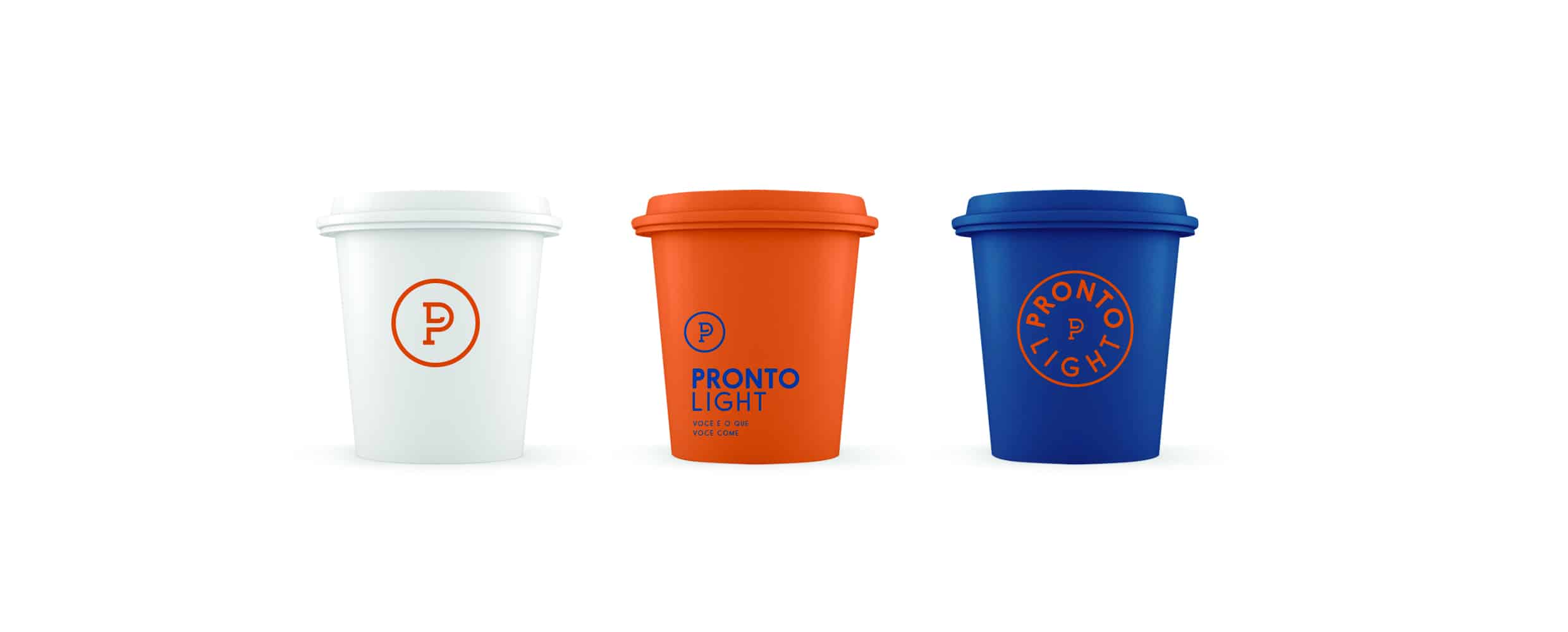
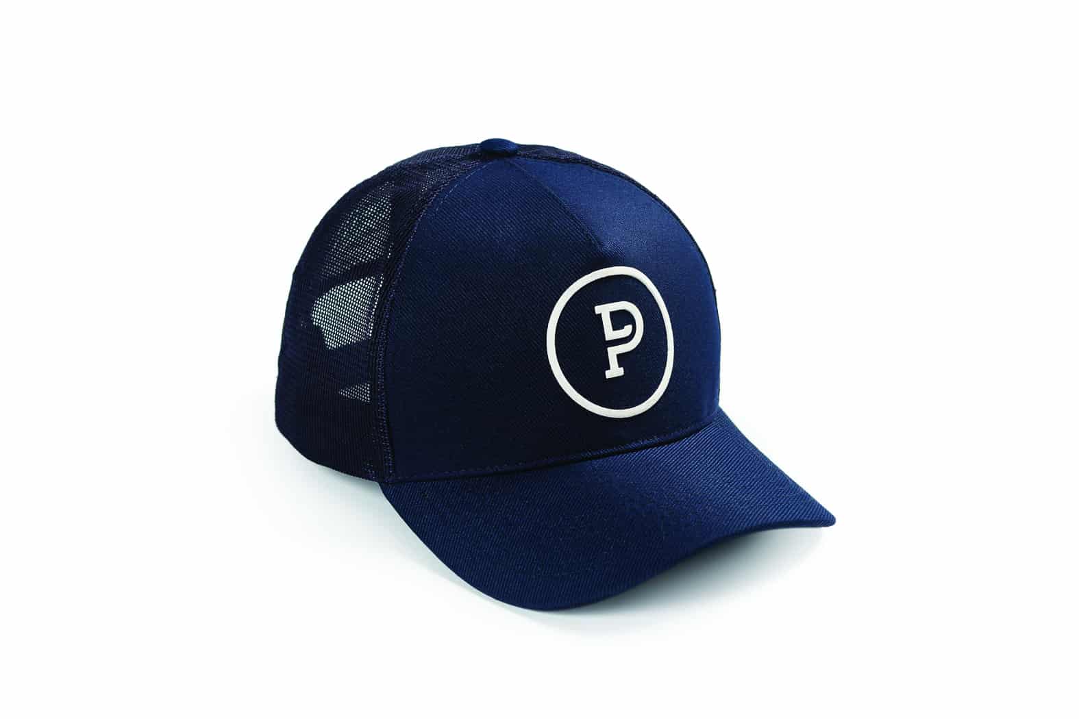
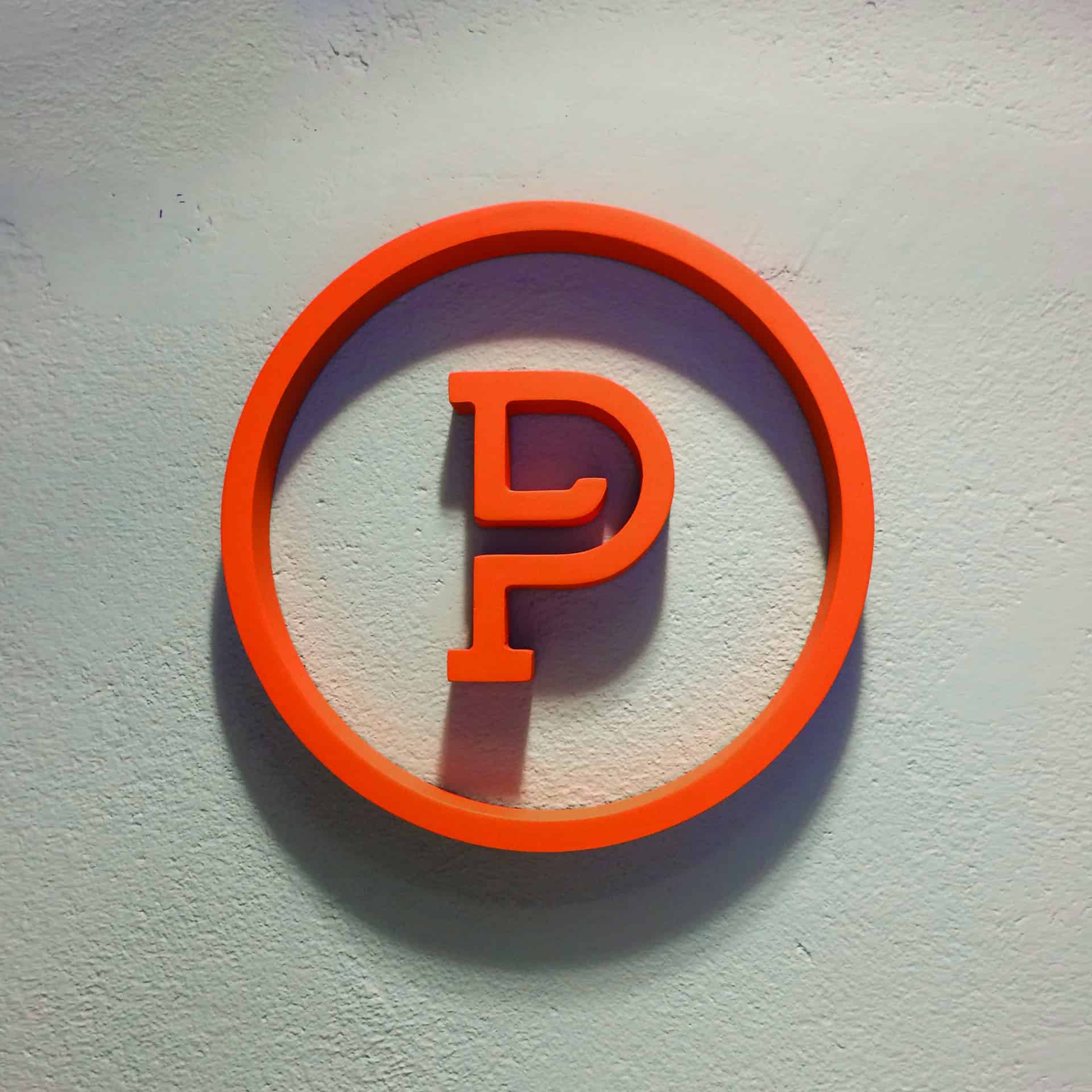
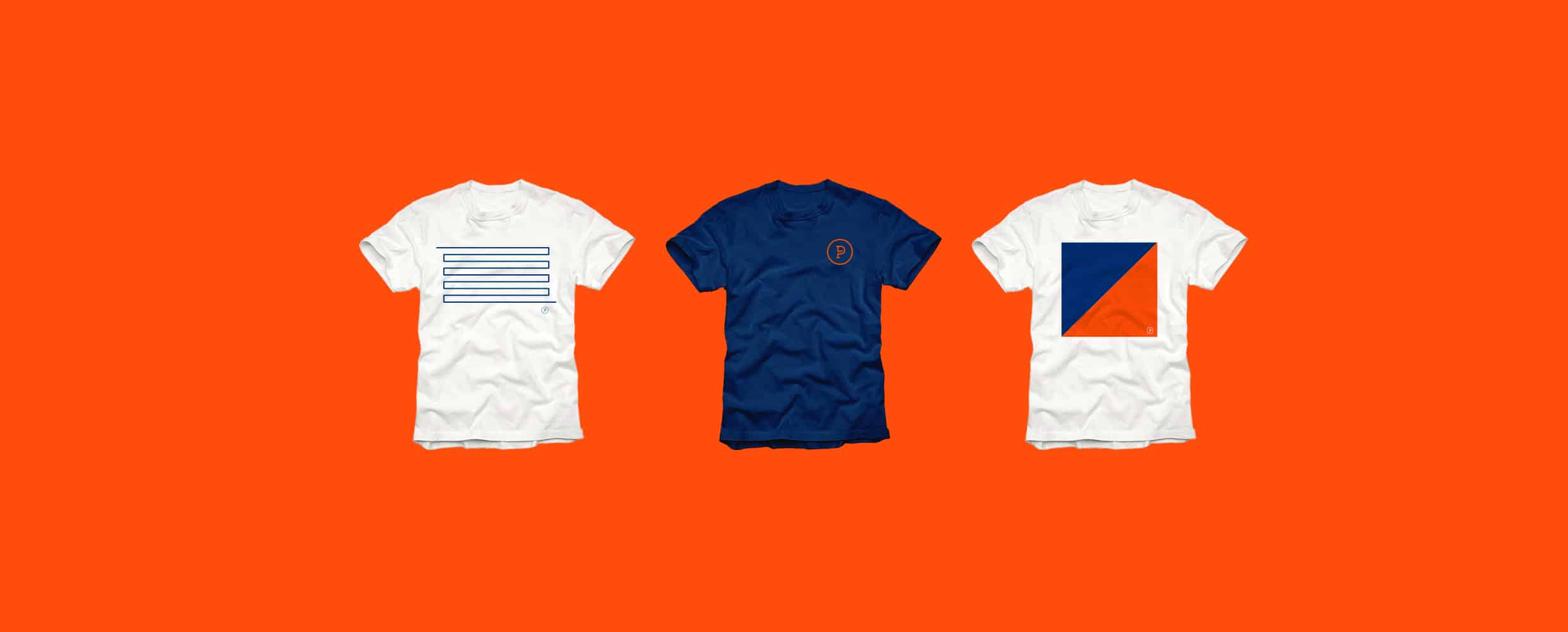
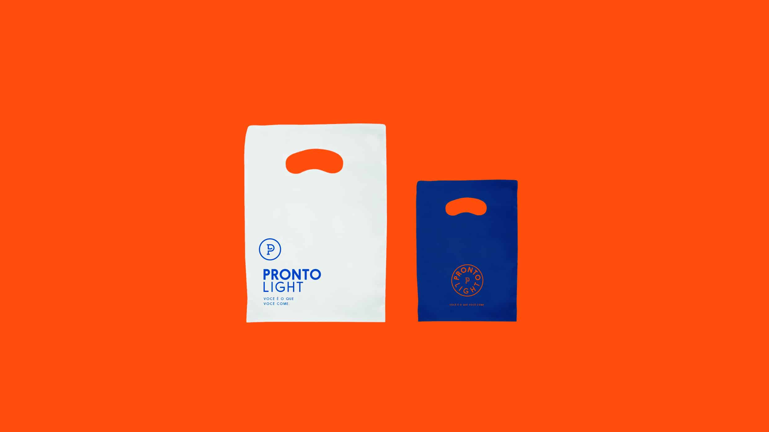
They would love to have an emblem with the brand and that's when the challenge began. Within the company they even call themselves PRONTO, so the emphasis on the letter P. The Bold font to PRONTO and the Thin to LIGHT accompanies the look of the old brand, continuing with the greatest emphasis on the word PRONTO. They wore a royal blue and yellow in the brand and would like to maintain similar palette with which it had been working. Thus arranged a darker blue, representing the frozen stage that the product has, next to orange, which symbolizes the same heating process. It was the perfect combination to break the institution that has the blue tone, with the brightness and very light orange has.
- Pedro Paulino
I searched many sporting references, from clothing to food. And of course some reference of frozen food products and vacuum packed. I believe this research helped me to merge these two universes, food + sport, bringing a different look for a healthy food focused on those seeking quality of life.
- Pedro Paulino
Adding the letters P and L to form an emblem was a big challenge. I made many sketches to get where I want. I believe it was the mark where more sketches made in my entire career. Glad to have found a simple way to merge those two letters and please customers. Today they come increasingly using the emblem alone, without applying next to it the word PRONTO Light.
- Pedro Paulino
Usually present 2-3 mark options when I go to a client and in this case, I ended up taking two developments. Believe it or not, the brand was first approved. The only work of revision was playing with color options that I had suggested the second option.That instead of blue and orange, it was green and orange.
- Pedro Paulino
About Pedro Paulino
Pedro Paulino was born in São Paulo and graduated in Industrial Design from FAAP. He started his career from some graphic Design Studios where he learned a lot about Editorial and Logotypes. Currently, he is running a P/P Studio focusing on Visual Identity. You can find more of his works on his Behance profile or website.
For some reason, I like the logo on the hat. But, the others are am not feeling it very much. I always had a thing for logos that snuck ALL of the letters from company name into them.
Everything looks awesome when you stack it a few times and 3D render it. I'm very impressed. Its like design porn, but I can't read it! lol