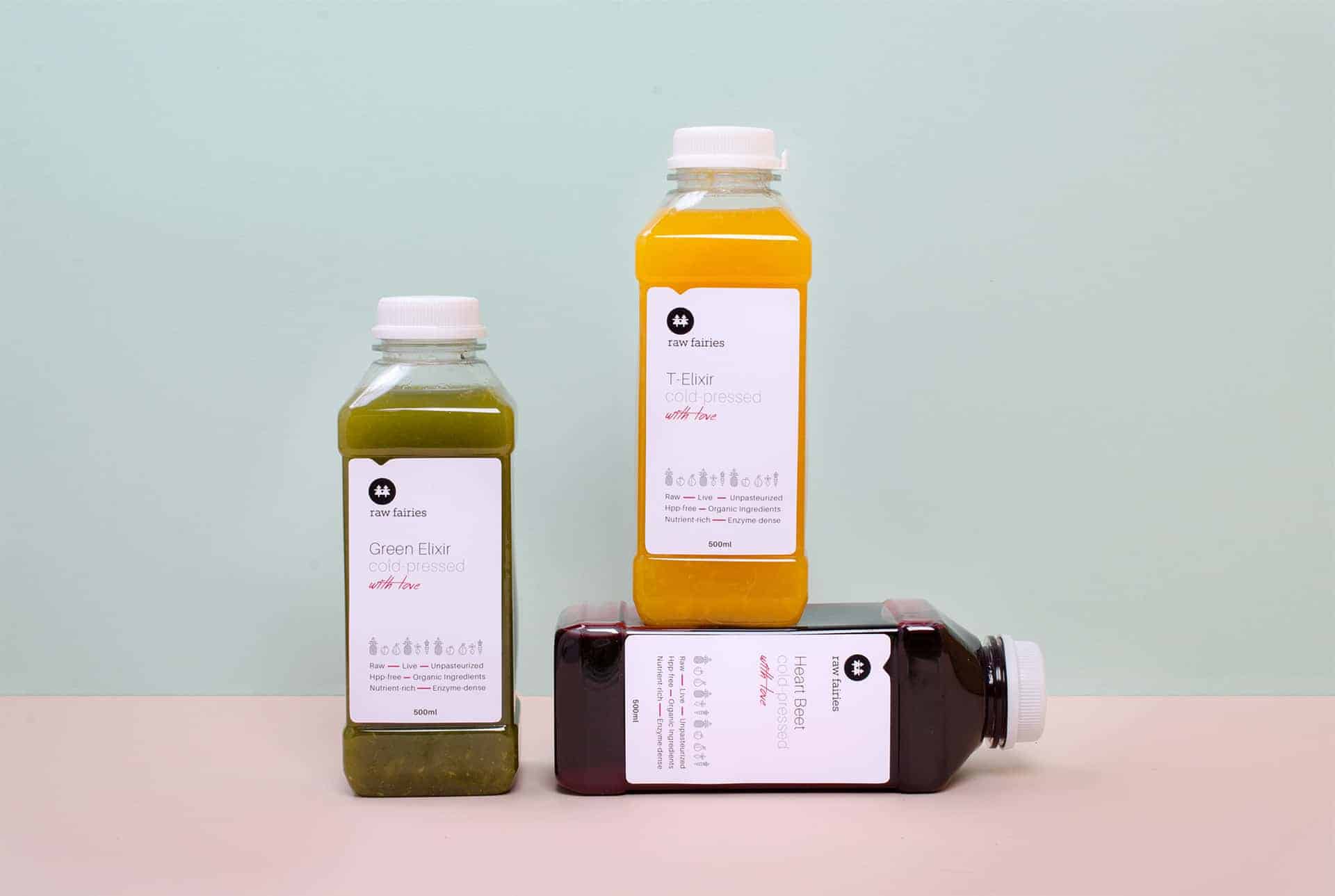
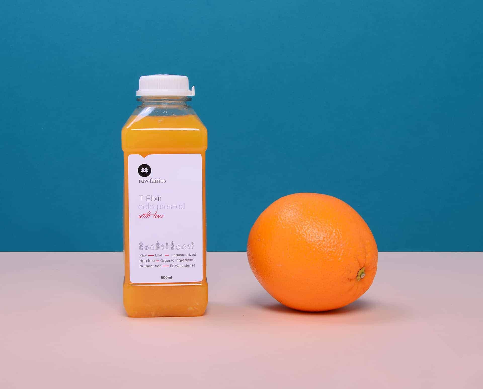
Raw Fairies

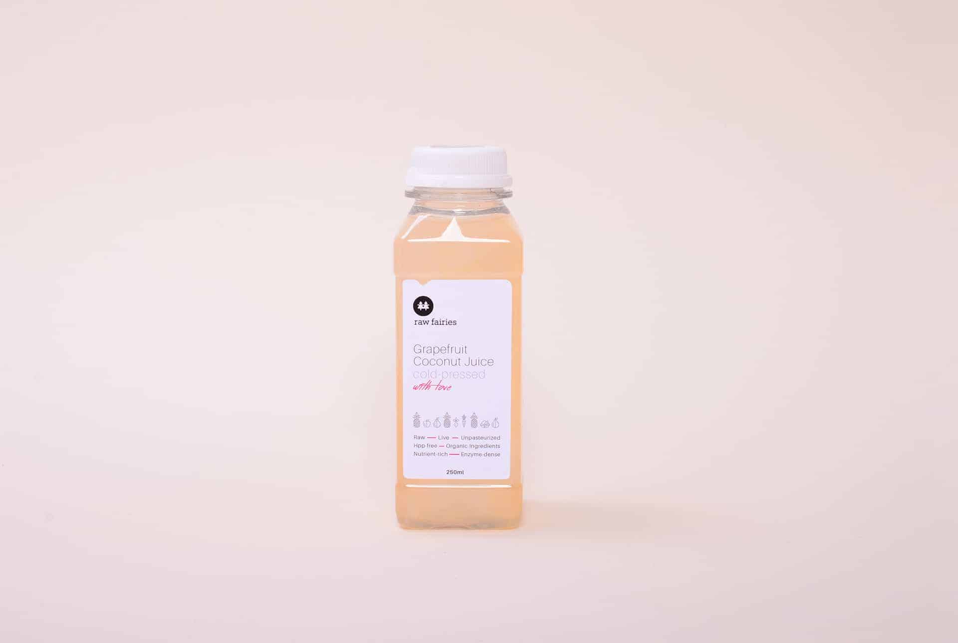
One of London's leading purest cleanse companies, "Raw Fairies" provide their customers with a selection of cleansing raw foods and juices. They create high quality products from organic, non-gm, pure ingredients, and deliver them on daily bases. The project includes refreshing their logotype and creating new labels and giving them brightness and lightness. That's why the main colors are so bright. The magenta color which always accompany to this brand gives warmth and emotion.
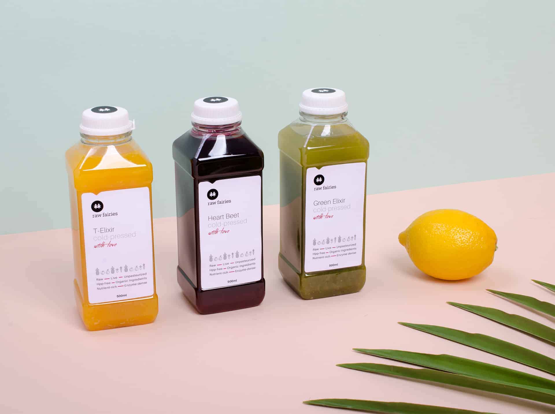
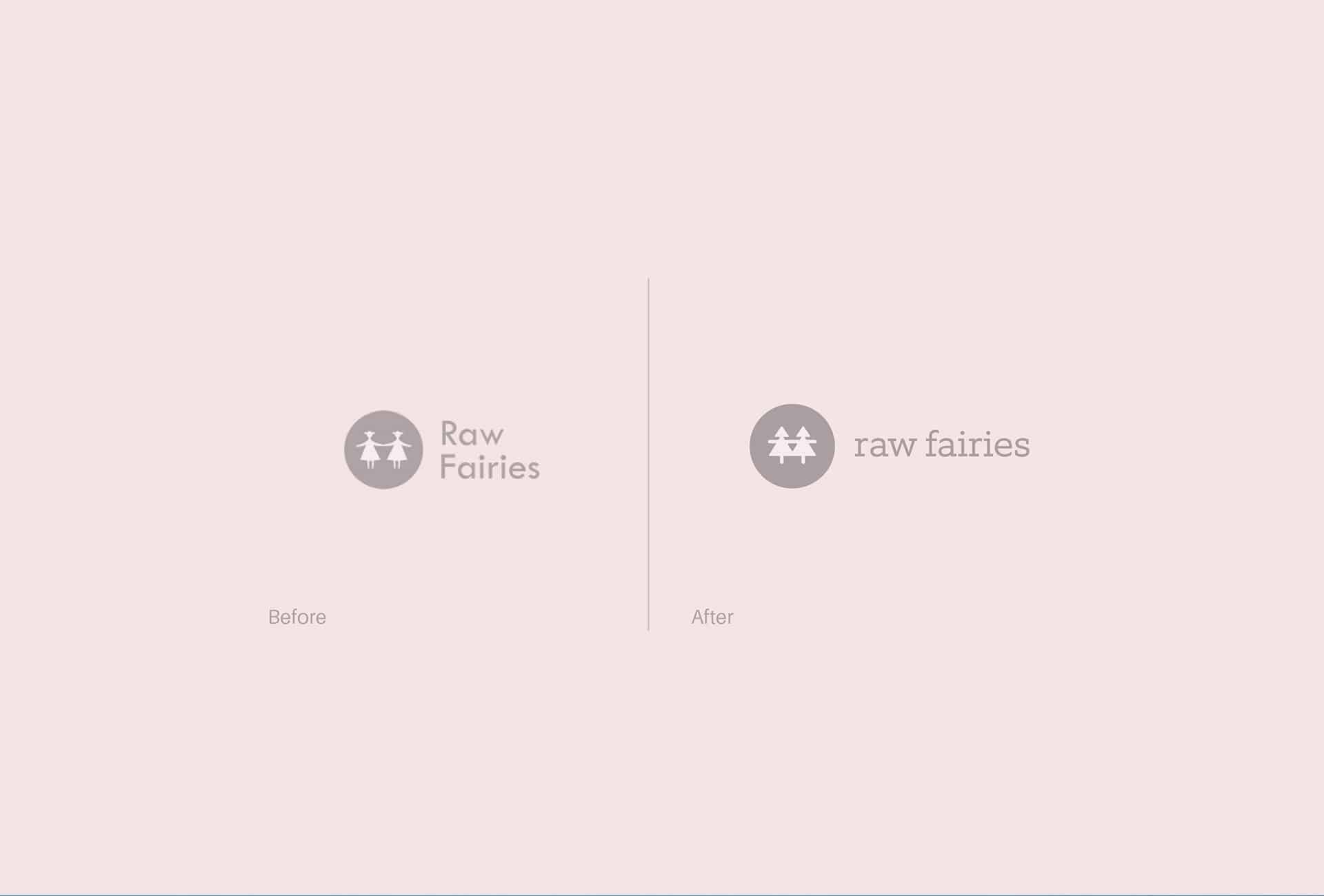
The important thing was to create some universal symbol, which will enrich the brand. That's why we decide to use fruit & vegetables pattern as a small classy element. The client was very aware and gives a lot of good ideas.
First step is always sketching, at the beginning on paper, and after that on computer. After a few initial designs we choose the direction with the client and after that we quickly moved on to the final project.
It was a very good cooperation.
In every project I learn something, in this case was increase knowledge in healthy eating. Before this project I didn't have too much knowledge about the phenomenon of raw food. That's one of the greatest things about this job. You need first understand the problem, learn something to find the right answers.
I like the branding style. Simple yet catchy!