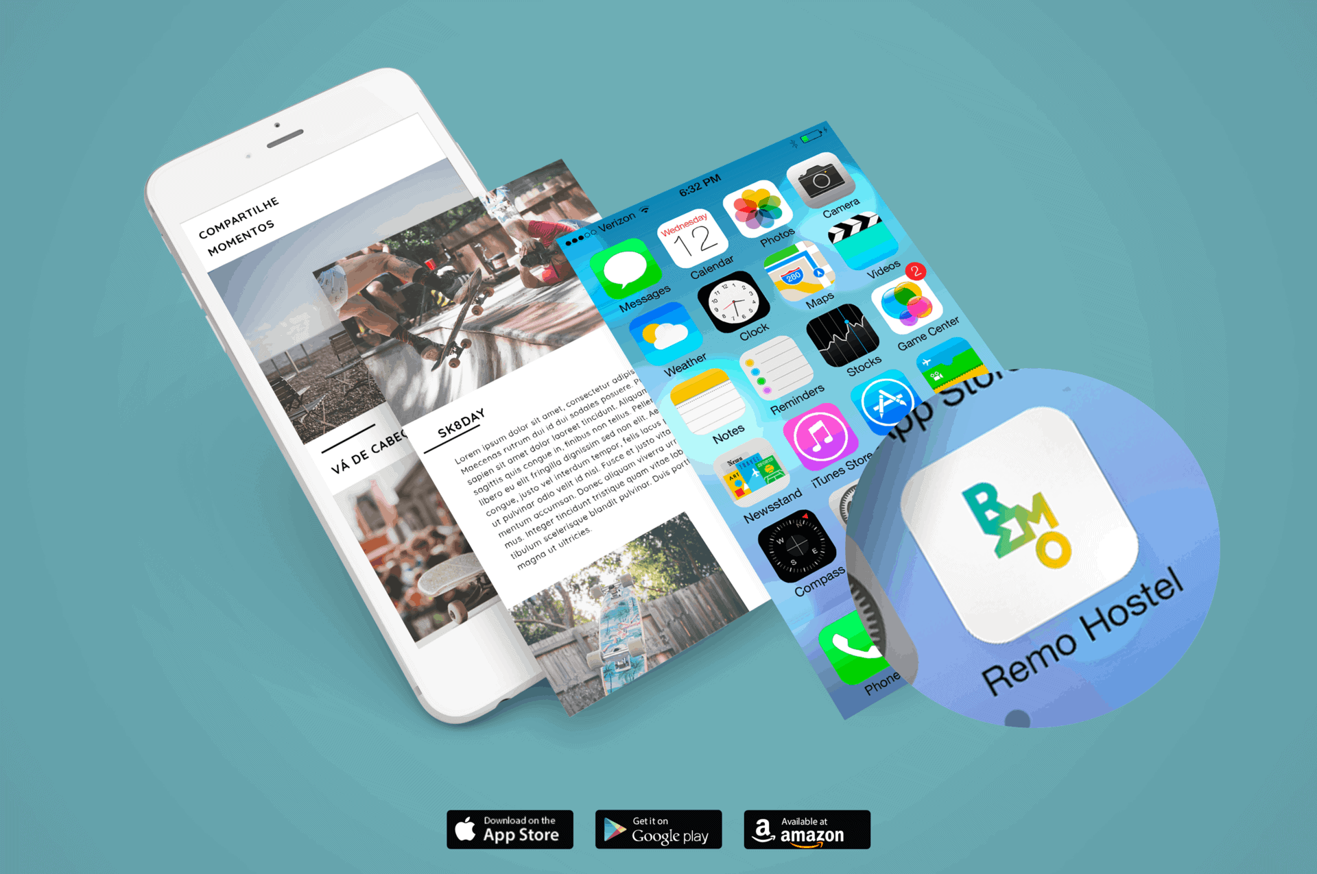
Remo Hostel

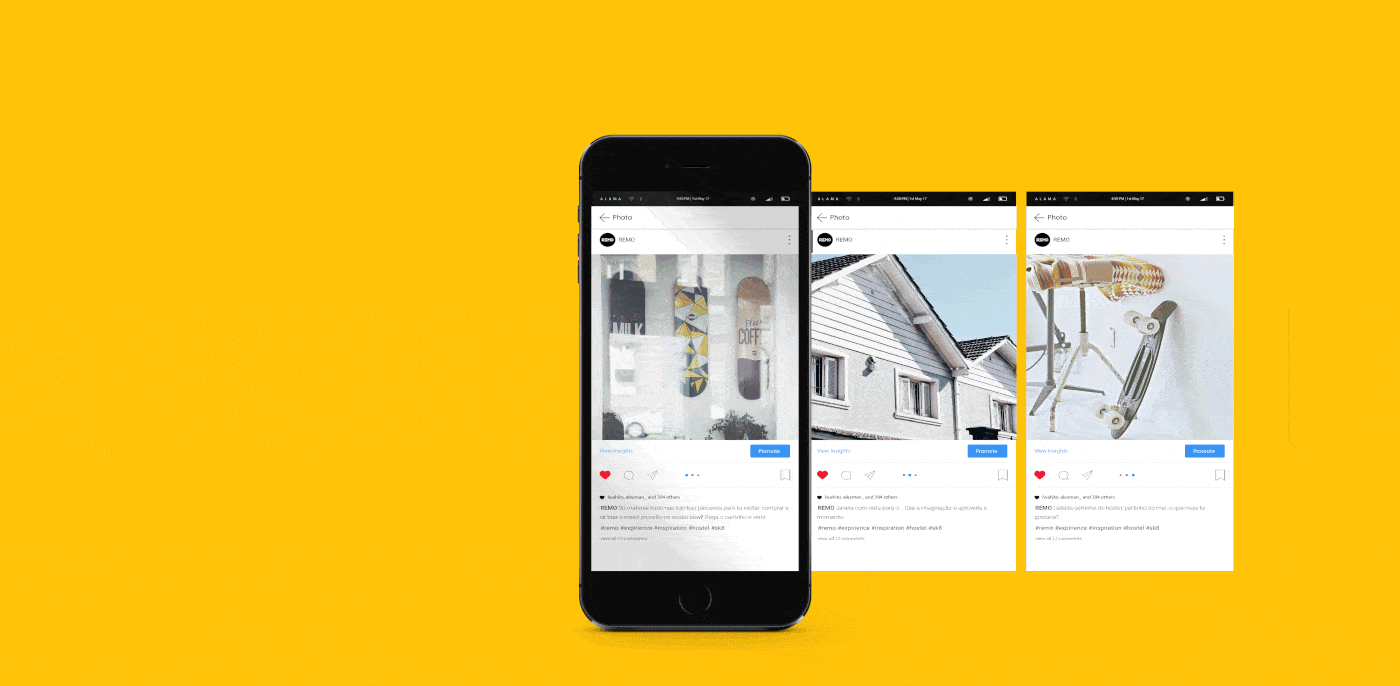
REMO is a collaborative and independent project initiated in 2016 from an idea of union between conscious consumption and shared economy. The brand operates in the hotel area, and brings fun and involvement from music, passion for skateboarding and surfing, seeking moviments and new experiences that, over time, will become unforgettable memories for its customers.
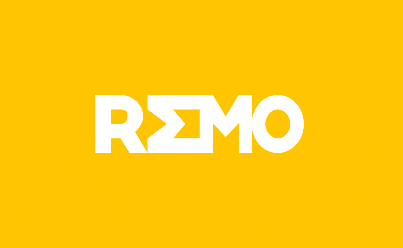
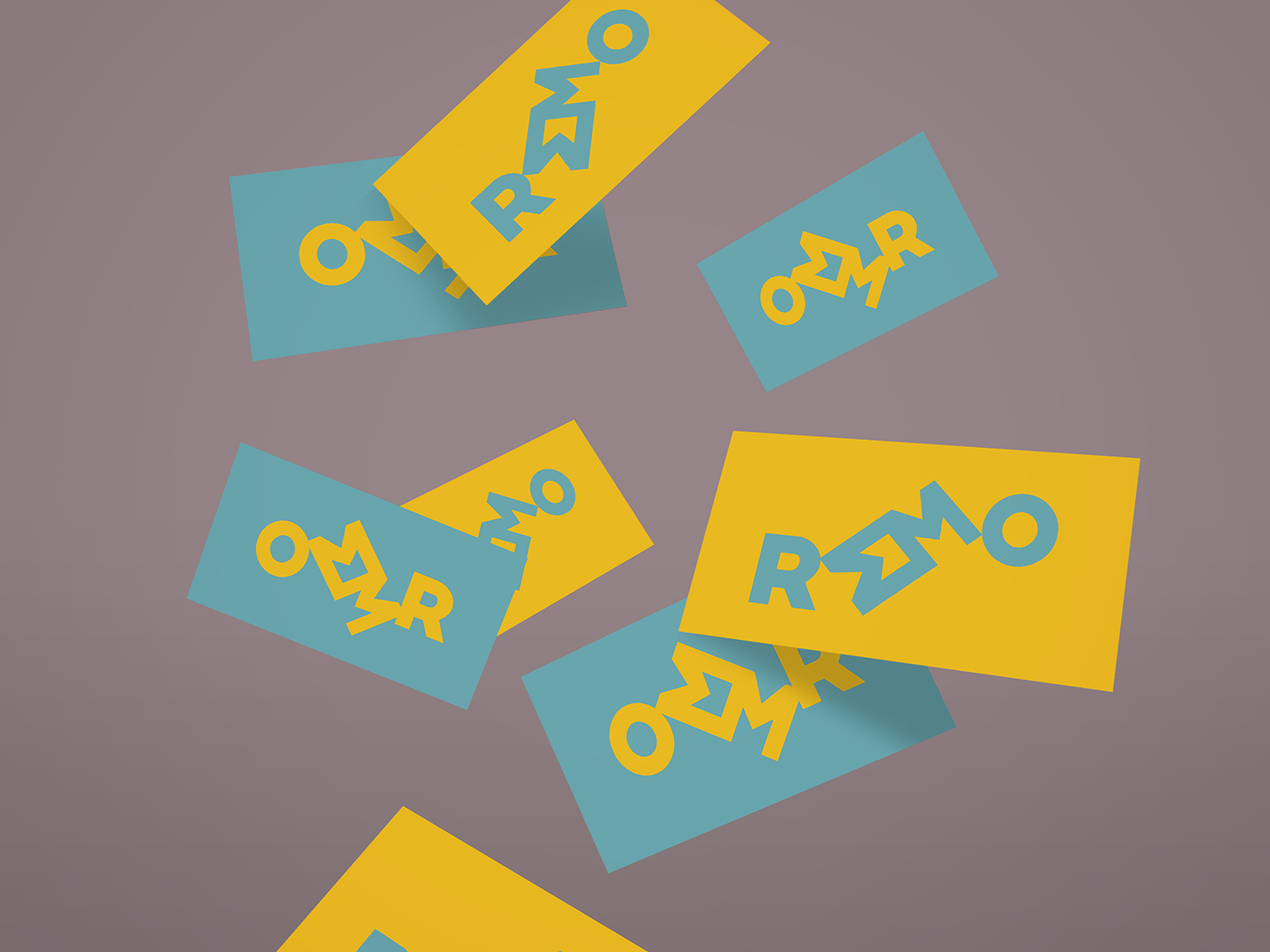
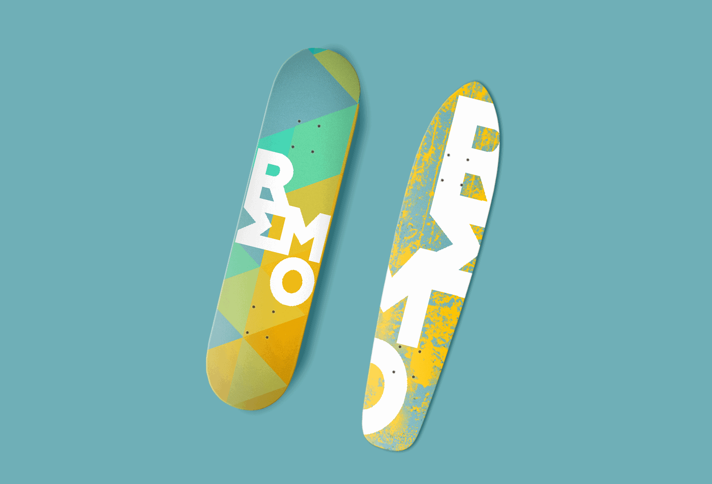
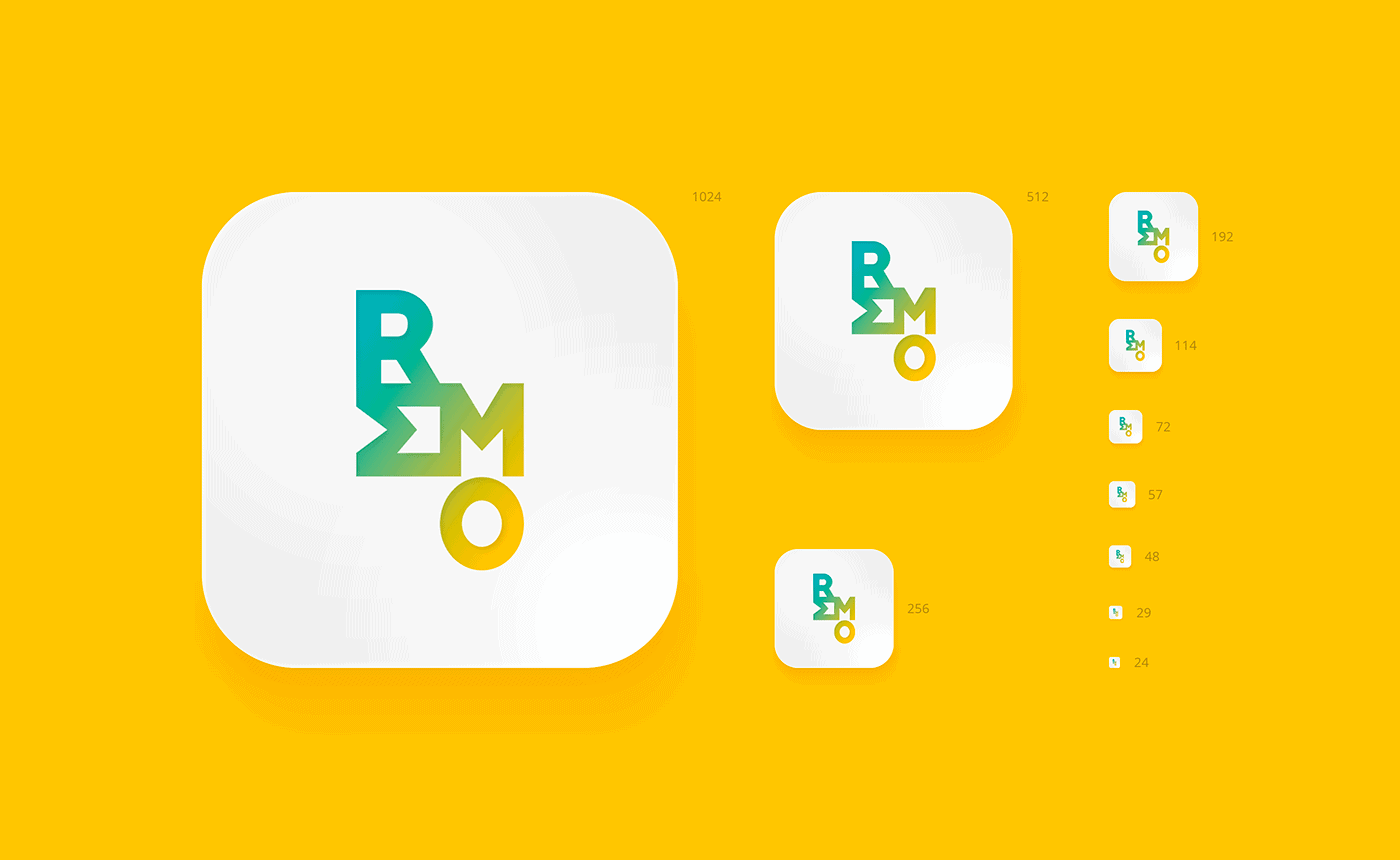
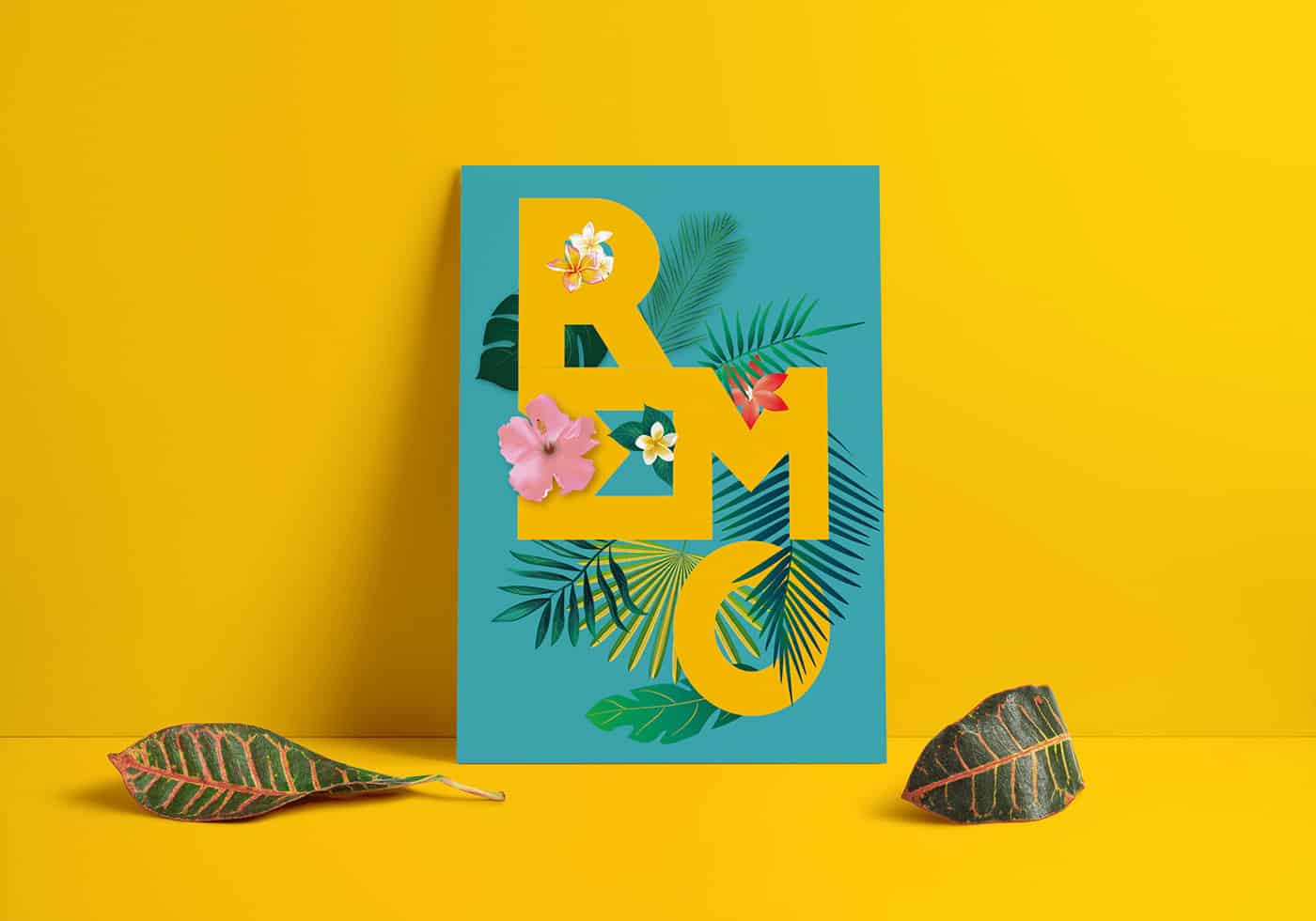
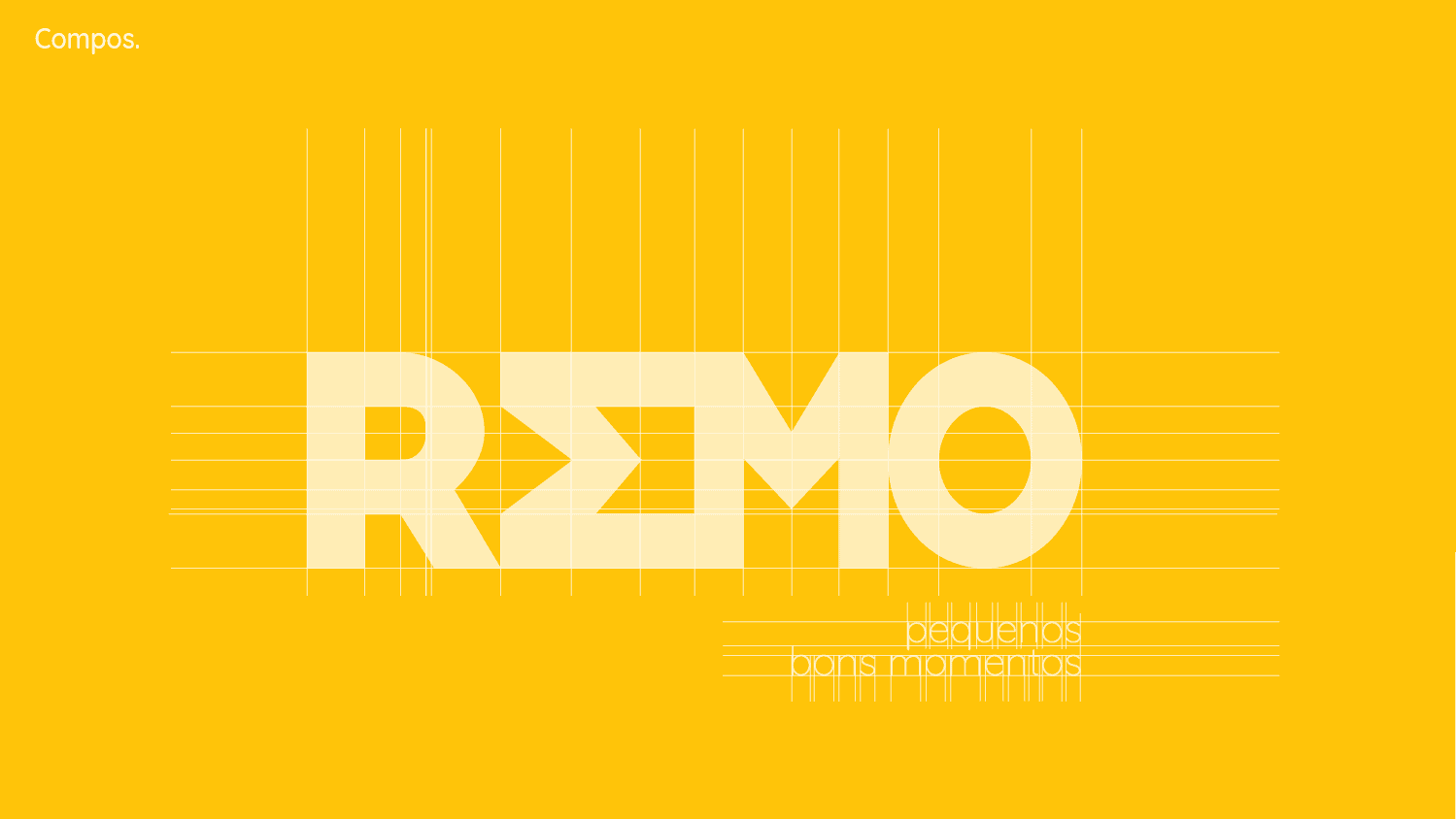
The palette is defined by the elements captured in the contemplation of the sun when being born in the ocean. The blue and magenta inspired by the colors that fill the open skies with a good climate of joy, and the yellow and orange that represent the sun and exhilarating warmth of the experiences and the sharing. The forms present in the letters EM represent two arrows, right and down, as reading direction and also a guide, and invitation to the hostel.
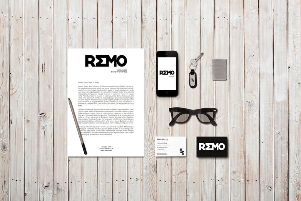
The project was developed with programs from the Adobe package (Illustrator, Photoshop), also Photoscape and Sketch. The lettering was created manually and then vectorized and organized in a manner harmonious with the typographic composition. The initial idea was to work the lyrics in a way that would give a bigger meaning to the hostel as an invitation.

The response to the project was positive, not only did branding make a good impression, but a united and collaborative initiative had a positive impact and an interesting effect on the people who had contact with the project. Not only was the reaction positive, but throughout the process, we shared the project with other professionals and viewers, who had constructive critical initiatives to help with small details.