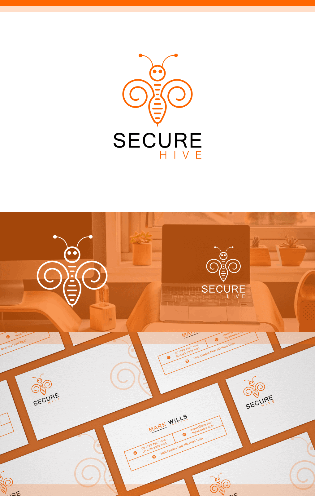
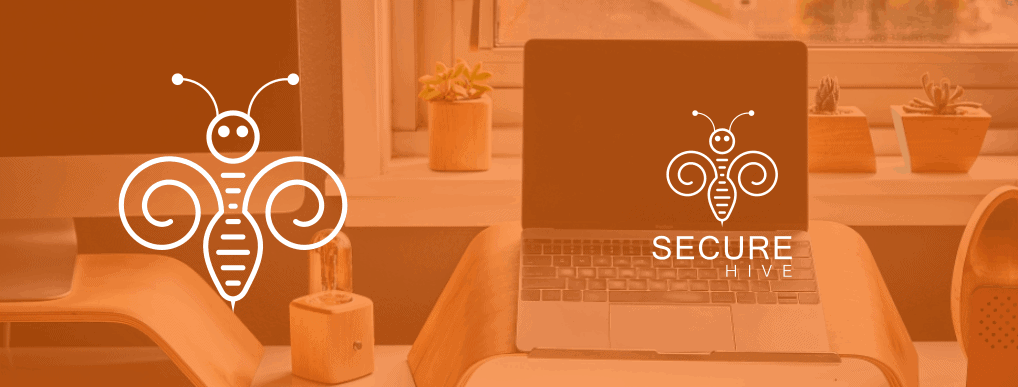
Secure Hive

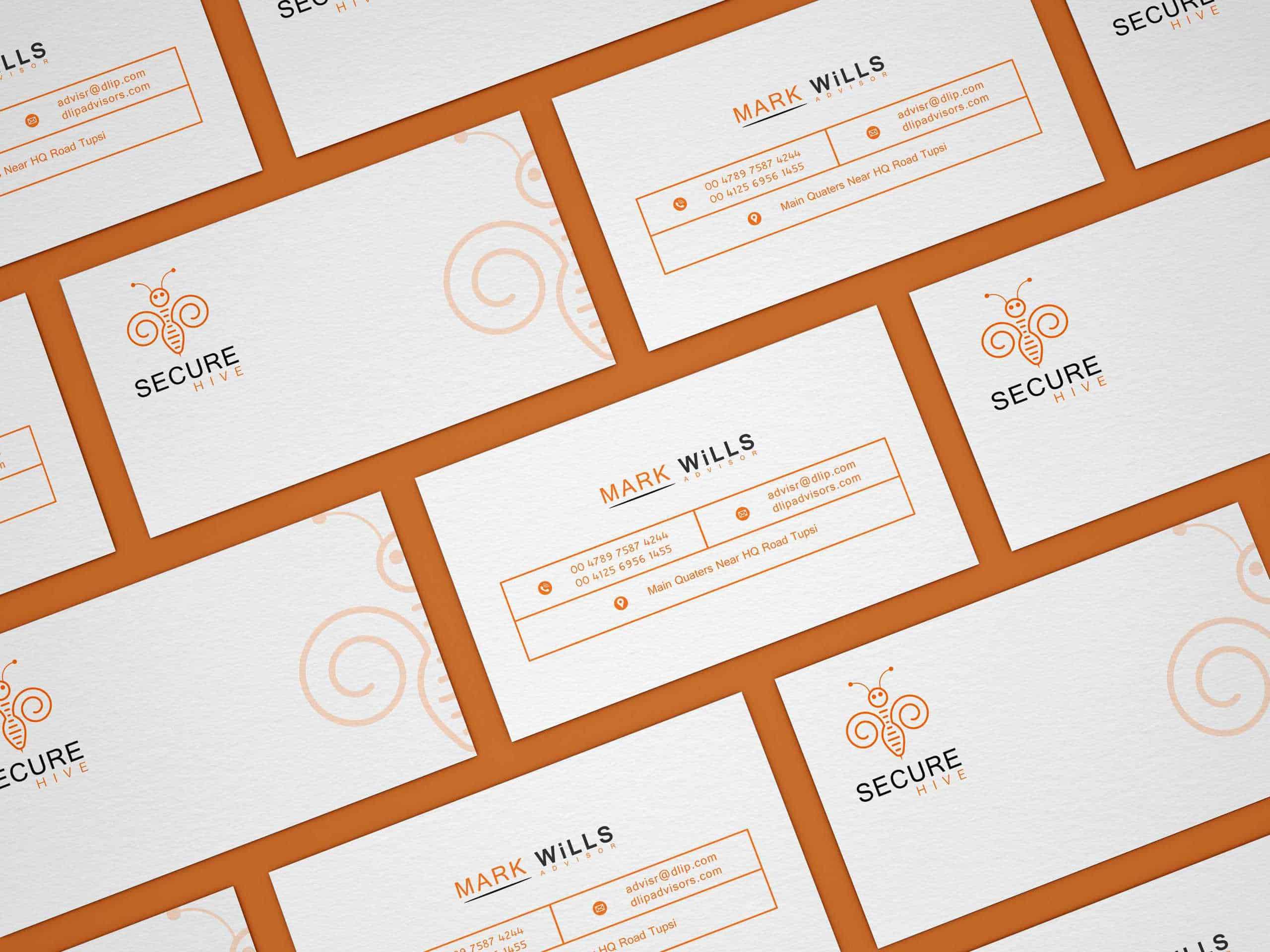
Logo design for an upcoming software named " SECURE HIVE". The basic purpose of software is to work as an antivirus. It stings the virus like a honey bee. This is what their basic tagline is. they want a simple and sleek design, that's why i avoid complexity.
The basic idea come from the name which suggest "HIVE" and from tagline "STINGS like a Honey Bee" First i start working with the initials "S" and "H". I want to show these initials as a bee shape. Thus i curled the words into a shape like wings of bee. But after making the design i didn't like it much. Therefore i turned the wings into a bee shape with some lines in the center. And i personally like the final results.
I used a vector based graphic software name as "INKSCAPE" to create this design. I started by using a took named as "CREATE SPIRALS". from this tool i made the basic shape of wings, from where i further continued my design process.
The client was happy with the final product. And after uploading the design on social media, other designers provide me with many useful instruction about the basic design, color and strokes. They asked me to change the colors of eyes to black and also change the lines color with alternate black and orange, not jut orange