SOXY Socks Packaging

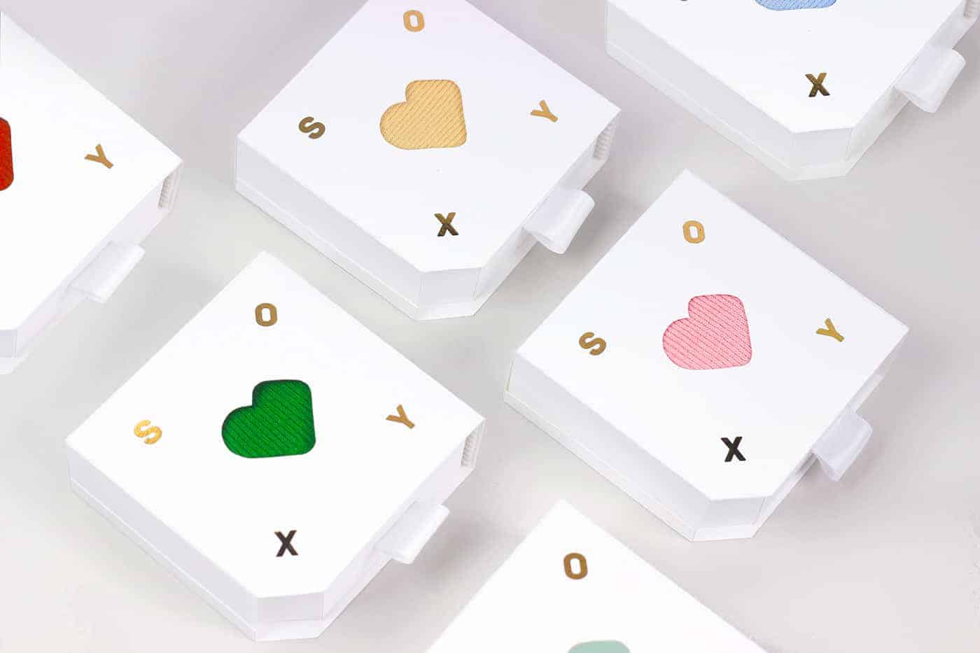
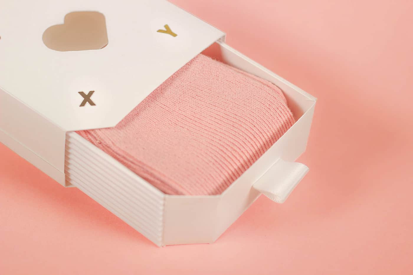
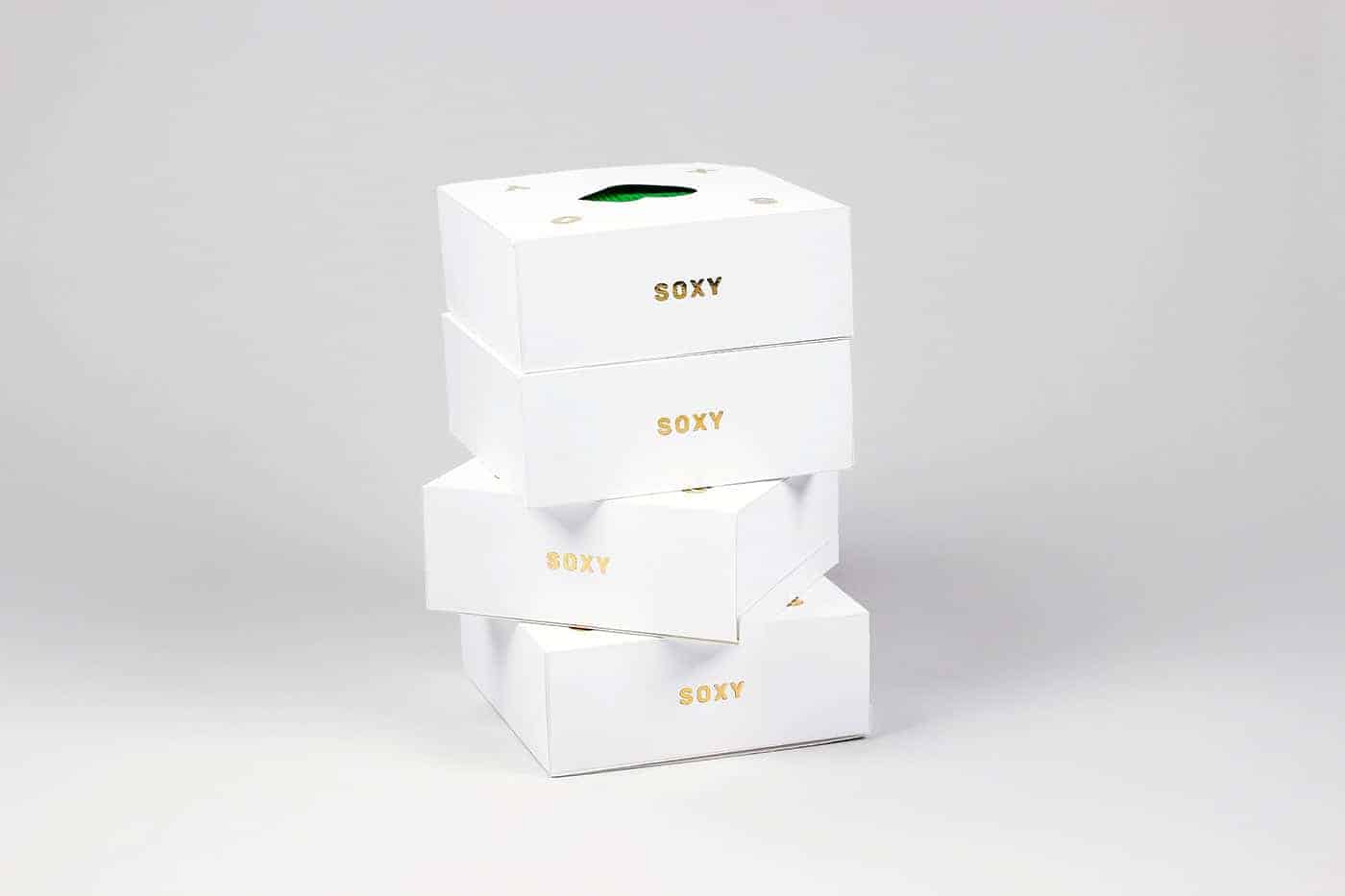
Soxy is the name of an imaginary socks brand I designed. Soxy's logo can be seen as either a pair of socks or a heart depending on the angle it is seen. The packaging is unique for its shape of the box which can be displayed in multiple ways. The box can be placed on the edge, revealing the playful aspect of the brand's logo.
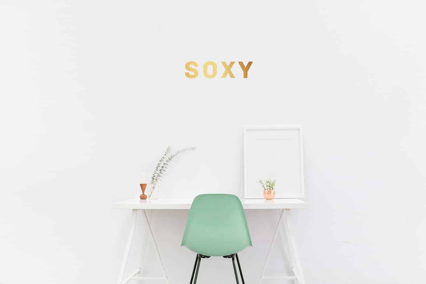
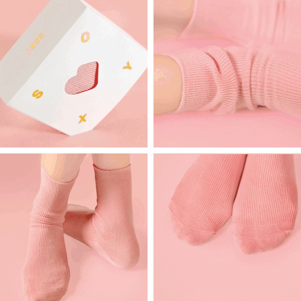
My love for socks was what really inspired me to do this project. I chose white color for the packaging because I wanted to put an emphasis on the color of the socks inside it. But at the same time I wanted the name of the brand stand out so I decided to use gold foil.
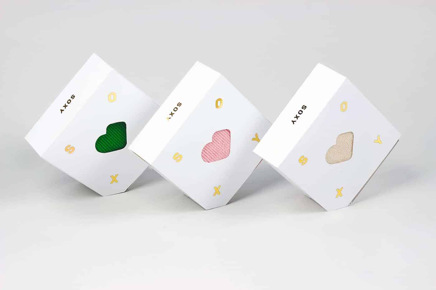
Coming up with the structure was quite challenging. I wanted the packaging to show the playful quality of the logo that changes depending on the angle, and I could not achieve it using a box template that's already out there. Only after a few trial and errors, I could come up with the design that works!
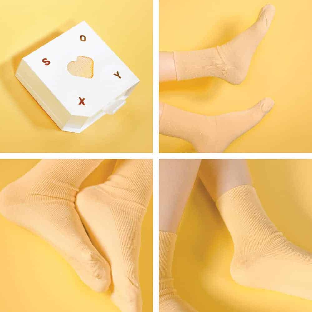
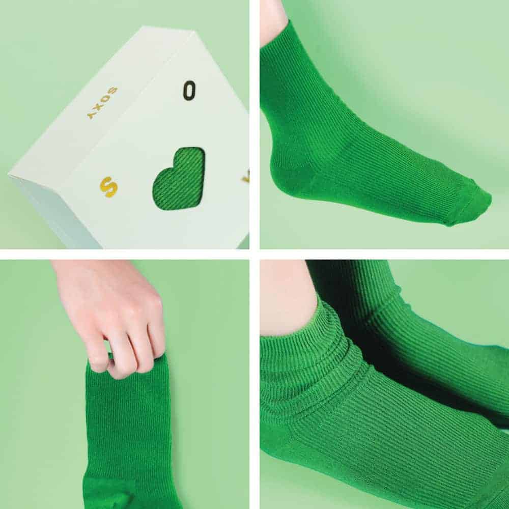
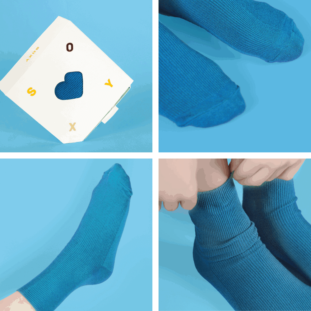
I think people liked that the box can be displayed at an angle the most. This project was featured on many different websites including Behance Student Show and Graphic Design Gallery. I had a lot of fun designing this packaging. Even though this is only a concept right now, if I had a chance I would really love to see this packaging being in the real world.
My instagram account! @juliette.kim