The Golden Fish

A simple visual identity for a maritime restaurant serving services to tourists and visitors from snacks and dinners to a heavy lunch, identity is fake and not formal - it is not a hand on the ground, but an experience of a certain kind of slogans and identities, Mine! Notes of the desired logo: It is simple, crossing and mixing between modern style (fine lines) and classical (writing in a circle)
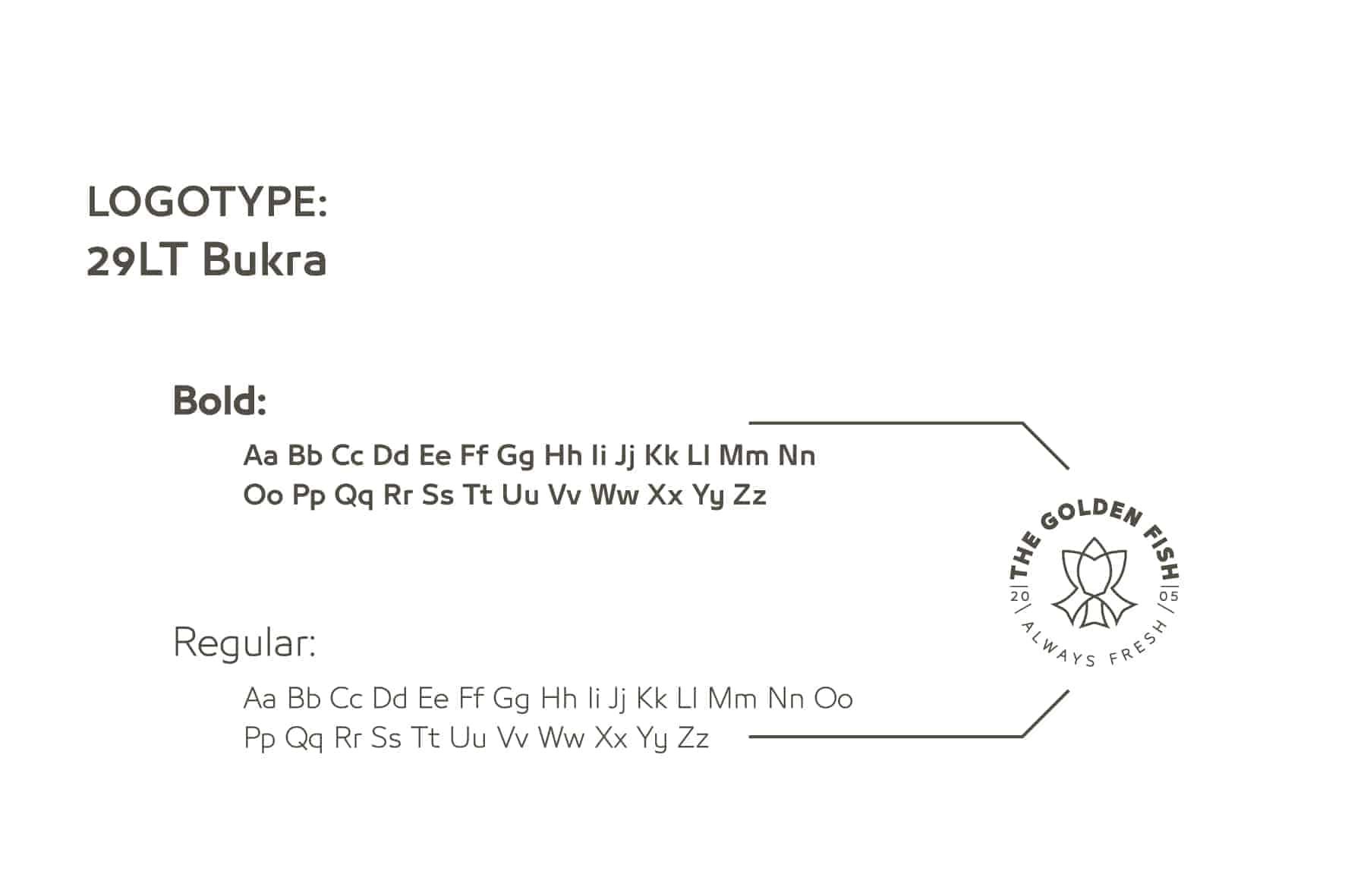
User Line: Strong and clear, uniform colors and three options.
I hope I have implemented implementation
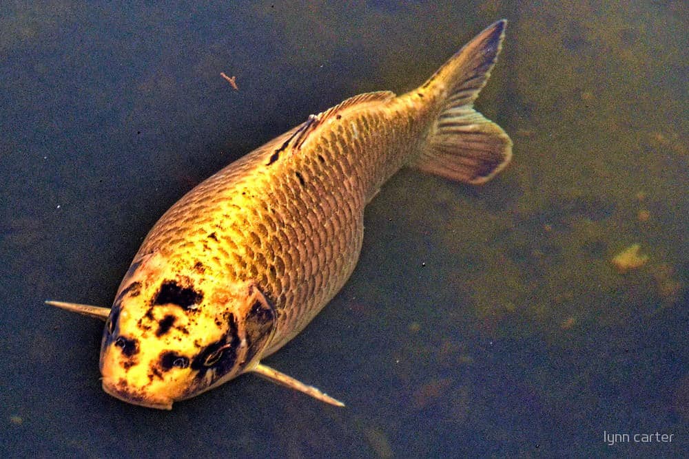
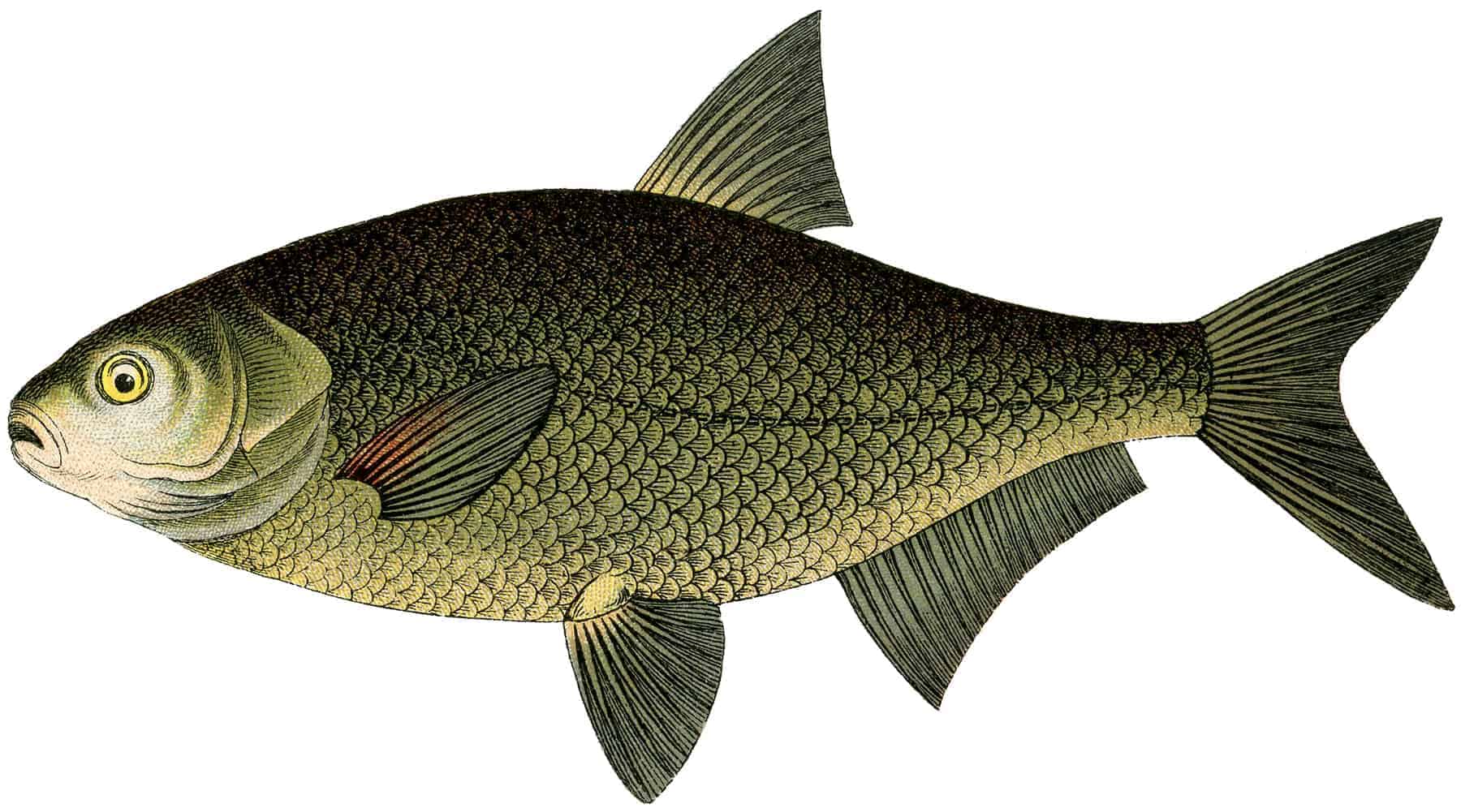
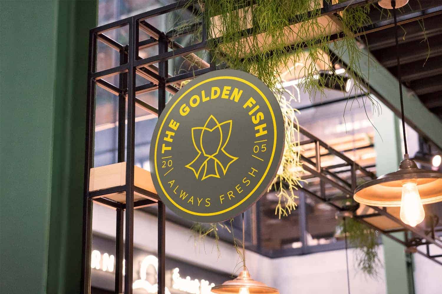
The idea came from the shape of the distinctive flowing fish, which allows it to dive easily into the sea.
Challenge: That's why I resorted to this method, which was new to me as I mentioned.
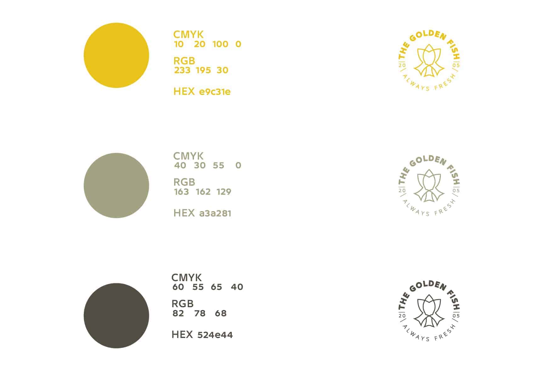
As for the choice of colors: it was based on the colors of fish (the fish of gold) and the color of brown and green as well, and white color green.
It is worth mentioning that the idea is derived from one of the old projects of a tourist city freely, which has encountered me on "behance" website.
Adobe Illustrator
Adobe Photoshop
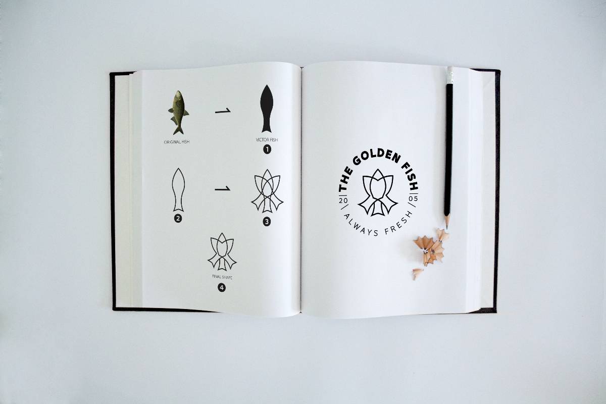
The basic idea:
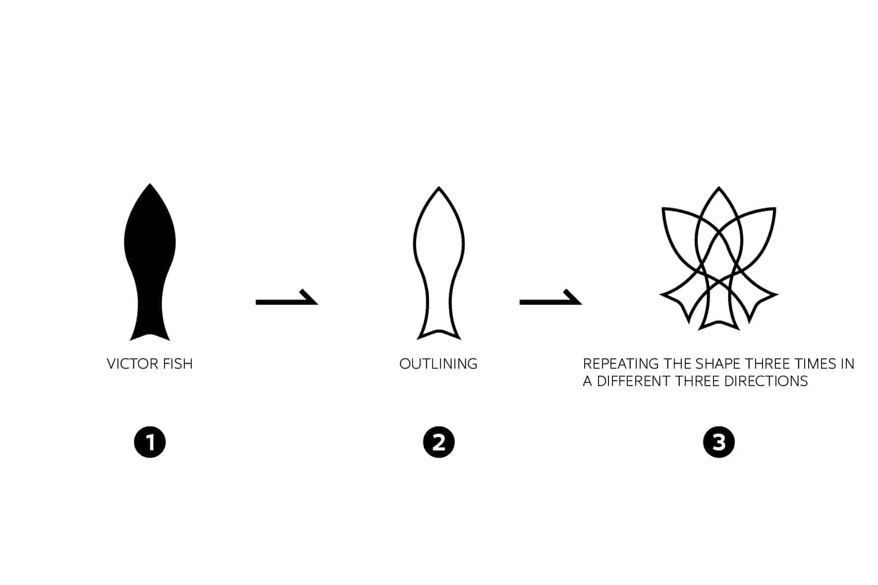
Stripping the shape of the fish in a very simple and easy way.
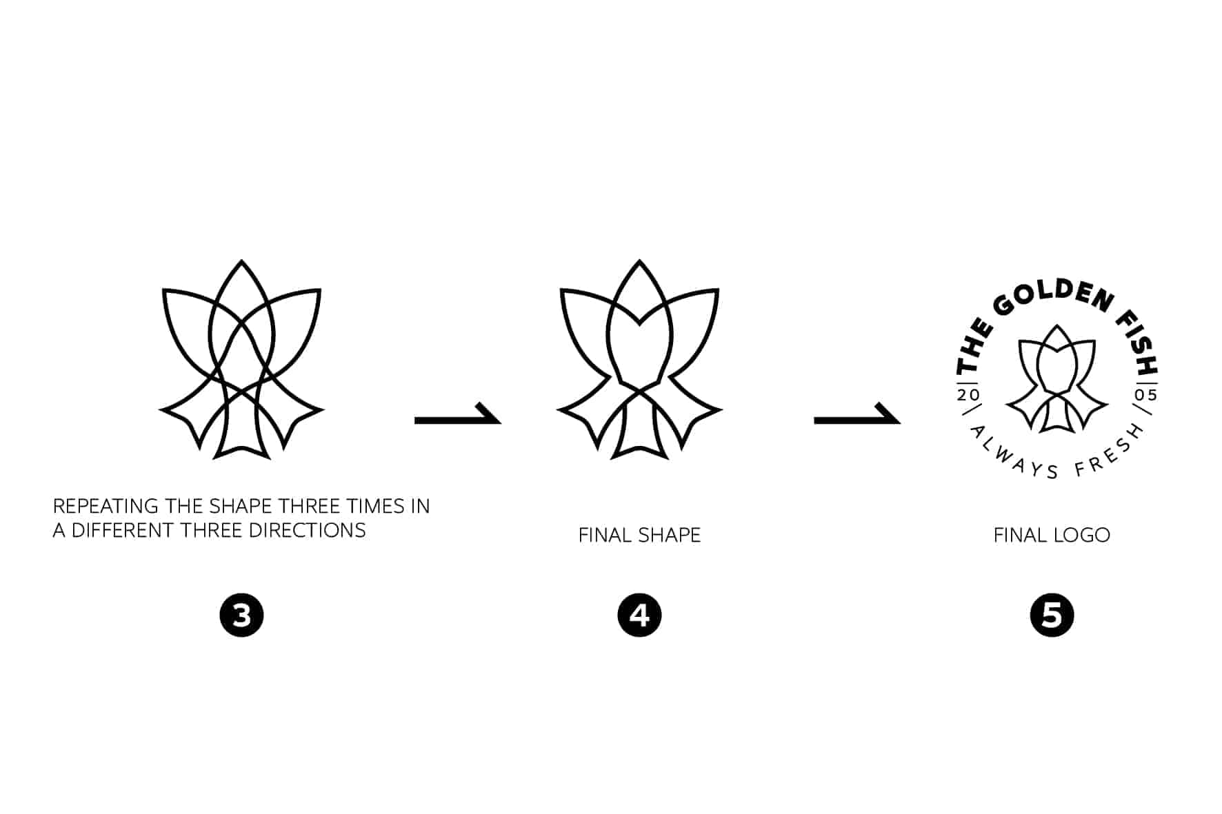
What I did was to draw the general shape of the fish in a simple details of fish body, then I repeated the shape three times in a different three directions to give a more elegant and beautiful form.
At last I typed the logo name around the shape I'v created early.
I think that the majority of those who saw the project actually benefited from the work because I reviewed the steps of the whole work very simply and in a clear way to all.
Others criticized the fonts and how they were used.