The Marmalade Pantry

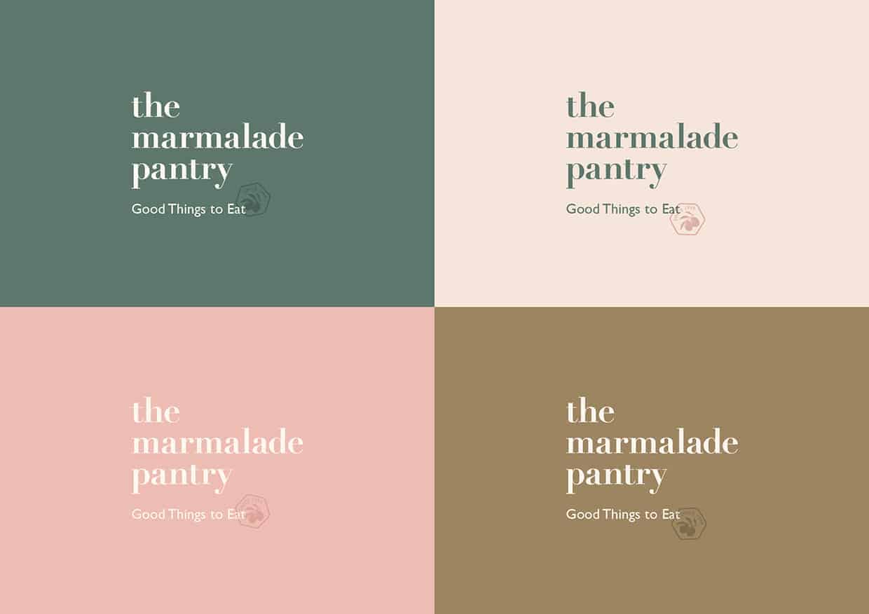
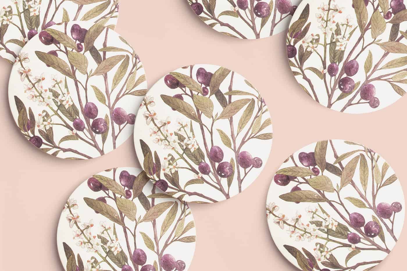
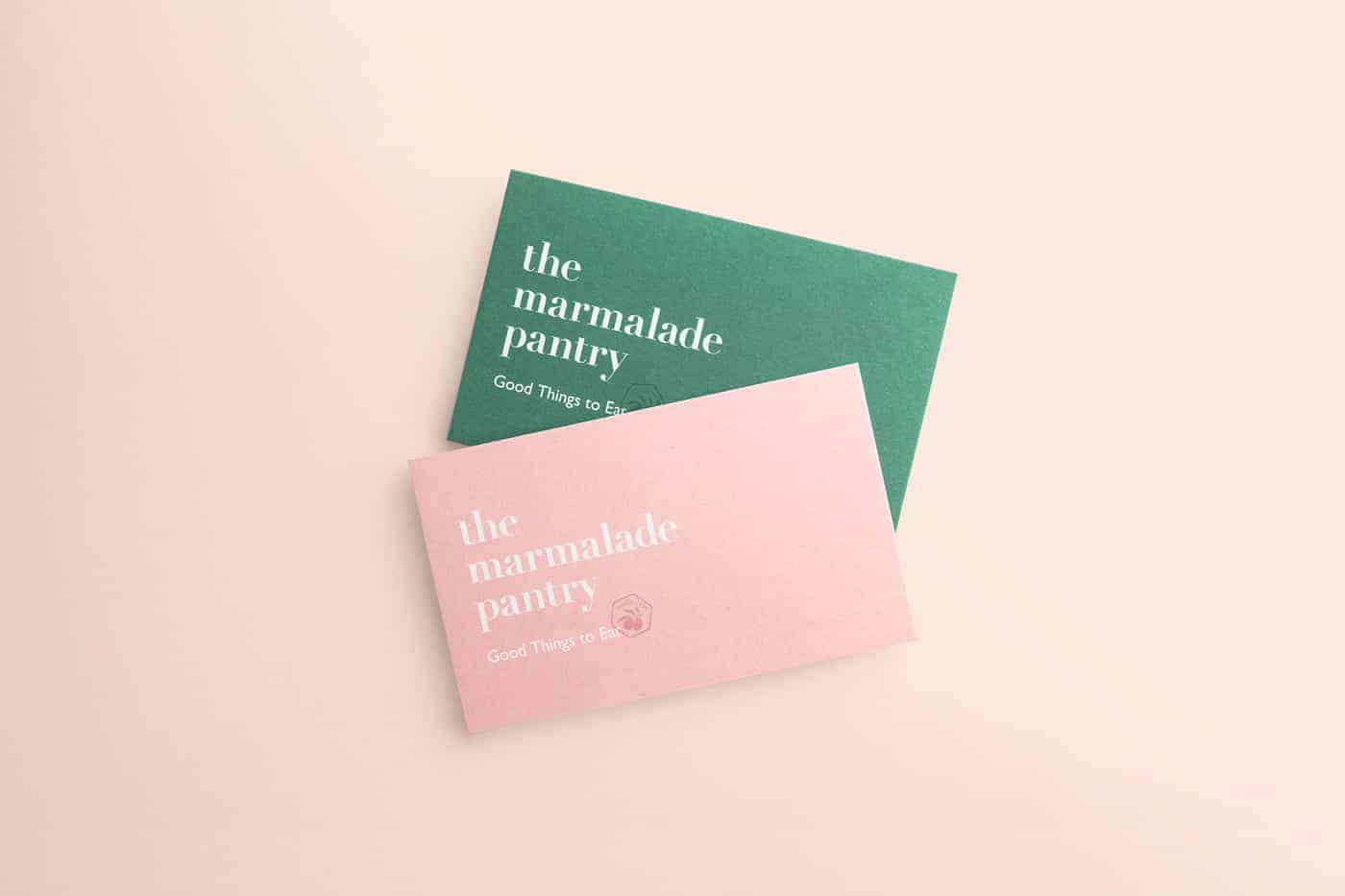
Founded in 1999, The Marmalade Pantry has set the pace and kept the buzz for modern bistro cuisine since opening its famed frosted-plated glass doors. We were tasked to reinvent the brand for a new audience to coincide with the opening of a new outlet at Oasia Hotel Downtown, Singapore. We invigorated The Marmalade Pantry brand from the ground up with a new trademark, a fresh hue and garnished it with some olives. Enjoy.
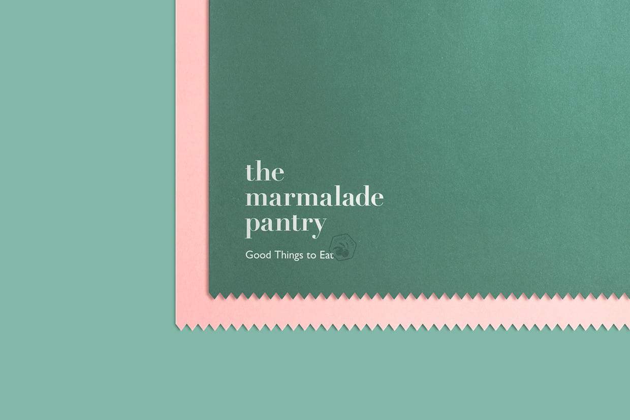
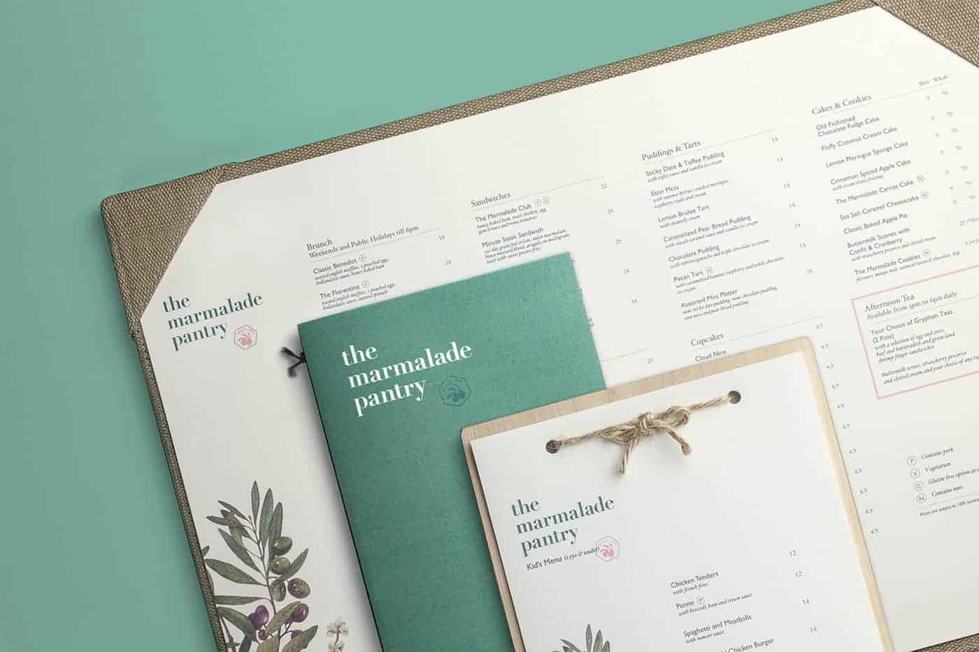
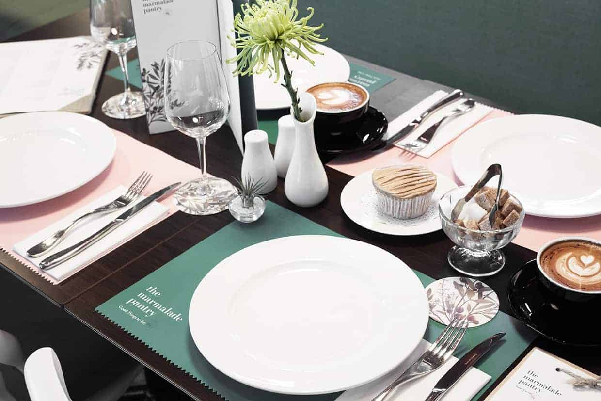
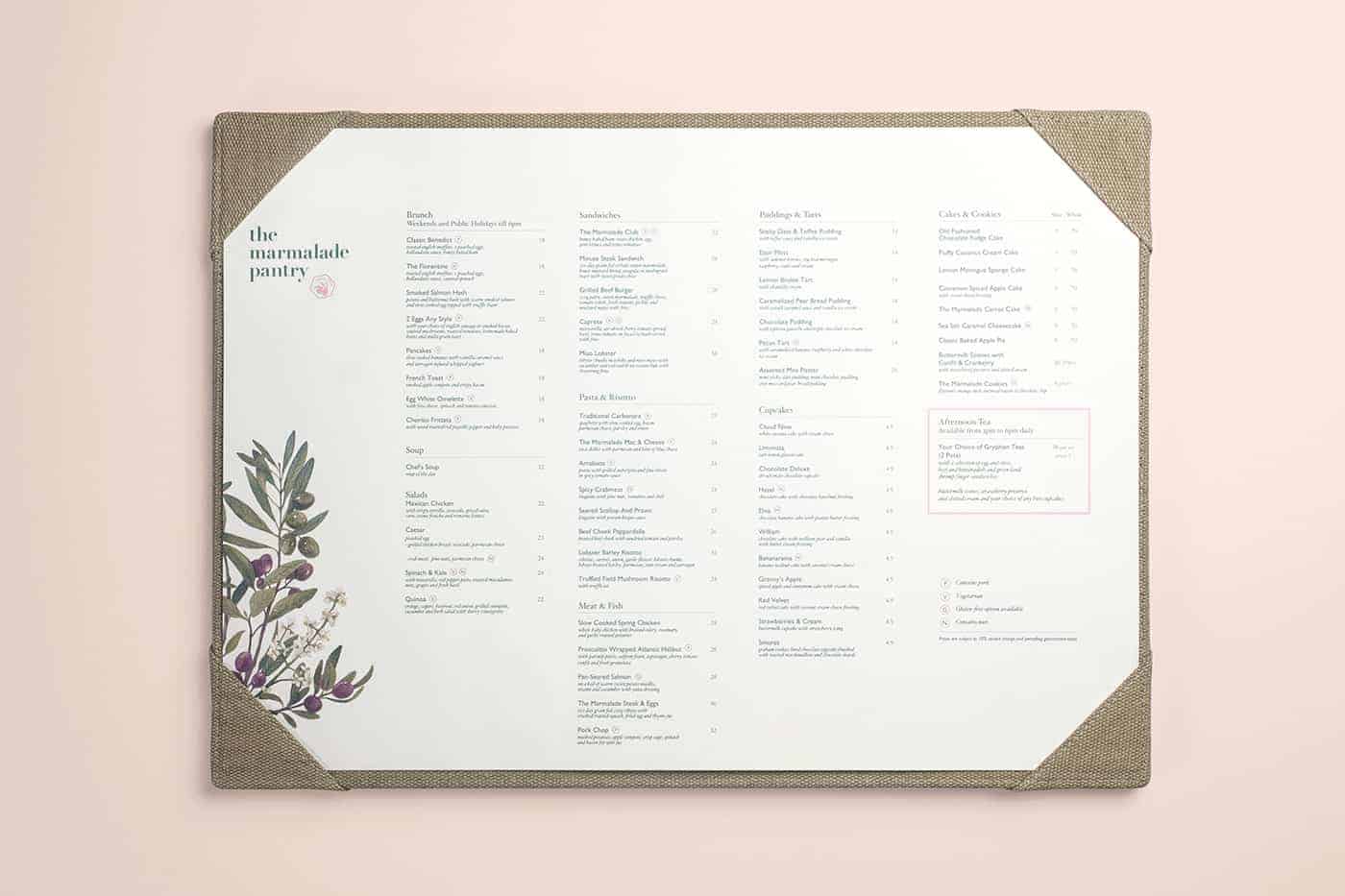
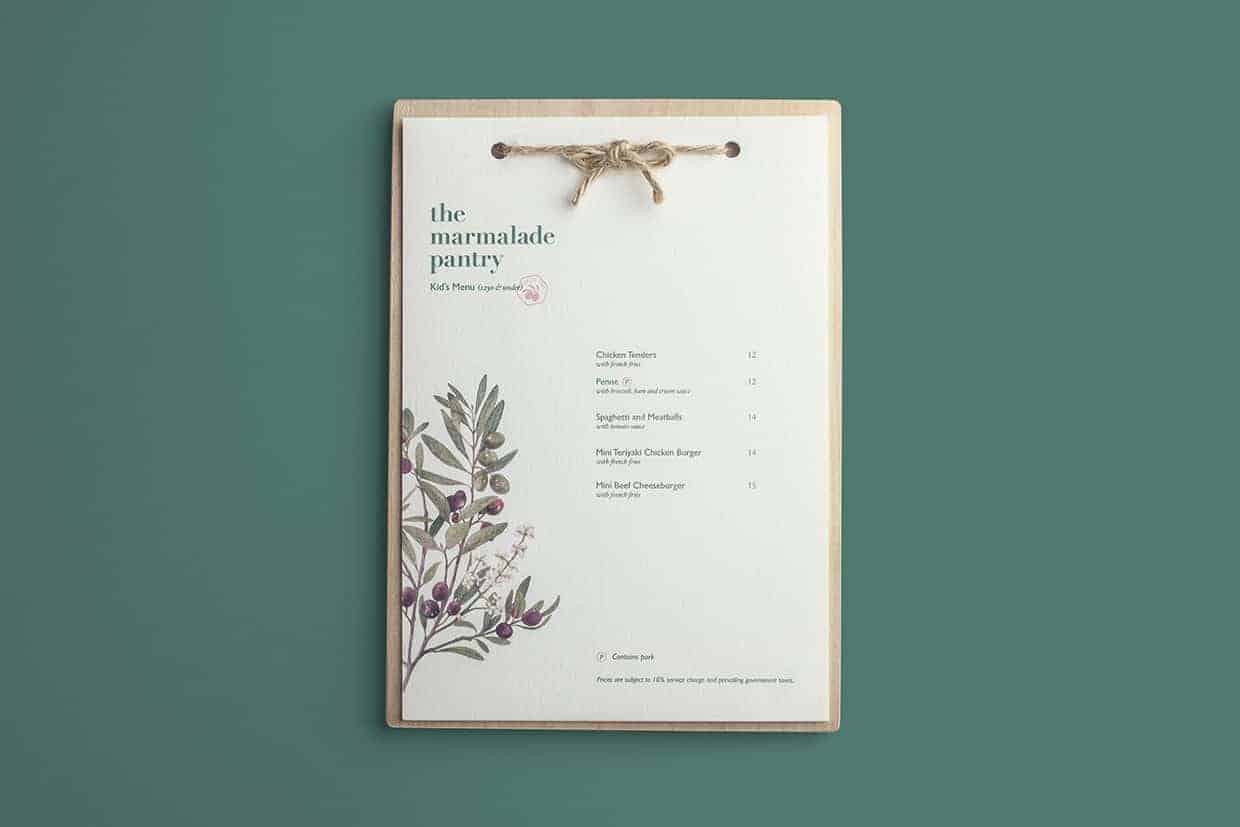
We wanted the brand to have a "farm fresh" and organic look. The logo features a casual placemat of a seal stamp that is inspired from the seal stamps commonly seen on fresh fruits. Certain elements such as a zig-zag cut was introduced to the placemat to mimic picket fences. Material such as wood and linen strings as we wanted the brand to have a tactile touch.

The design process was relatively smooth. We proposed a few options and the final outcome was actually a combination of two of the client's chosen proposals. We took a long time refining the brand's color palette, specifically finalising the shade of pink. Like most projects, there were a lot of back and forth involved to ensure that both the clients and us have the same vision and destination for the brand – which was a warm and welcoming brand with a touch of the English farm-side living.

This brand also just recently re-launched so it's hard to gauge the public response so fast. As this is a rebranding project of sorts, some learning points would be to learn from the old logo and understand its intentions. It's also important to be open and flexible to new ideas, which can be applied to all projects.