Tomfoolery Wood Co. Branding Design
Tomfoolery is a custom furniture business based out of Seattle, Wa. We took the brand a direction not often seen in this industry that is, we wanted the brand to not seem so stiff and structured like a lot of the other wood and metalworking businesses we came across during research. The whimsical mono-weight script style logotype really turned out well.
![]()
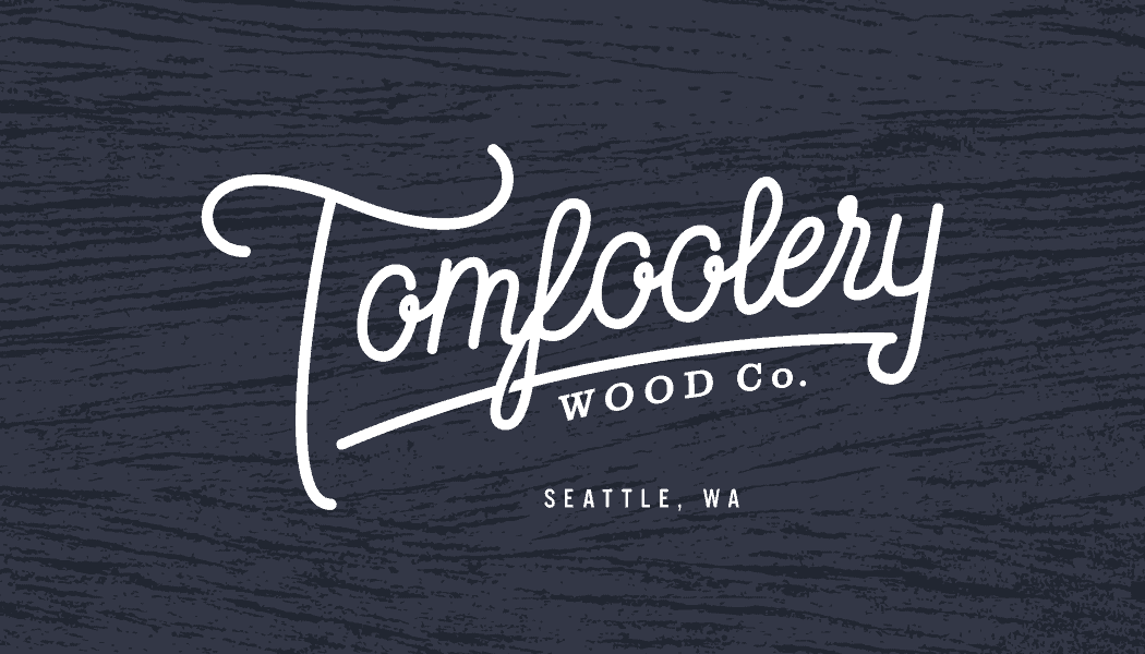
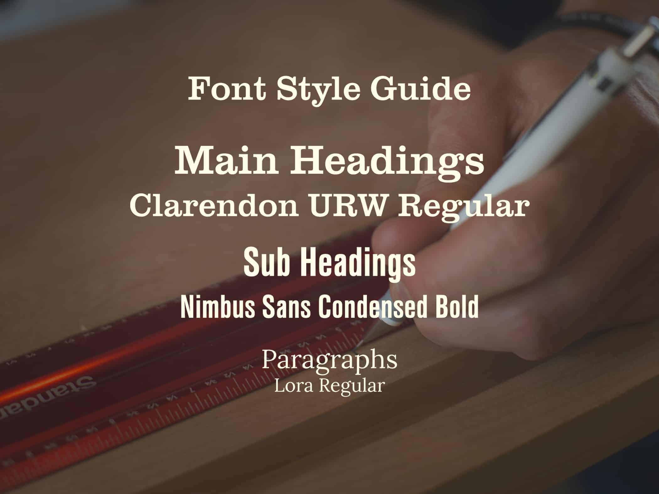
During research, I felt like the brand needed something that was very up on current trends in branding design right now but at the same time needed a very timeless look as well. We played around with a few different logotypes, some within a badge, some on an angle or an arch, some that were just totally out there. We decided on a mono-weight script style logotype that checked off all of my client's requirements while being a very stylish brand. One of the biggest requirements was asking the question "would this look good on clothing?" We both agreed it would absolutely look great on shirts and hats (still waiting on some swag to come in the mail). One of the biggest aspects we wanted to avoid was coming off too hipster and having a bunch of distressed and rustic looks like showing the logo next to an old record player and a film camera... No thank you. I think we kept a good balance. What do you guys think?
![]()
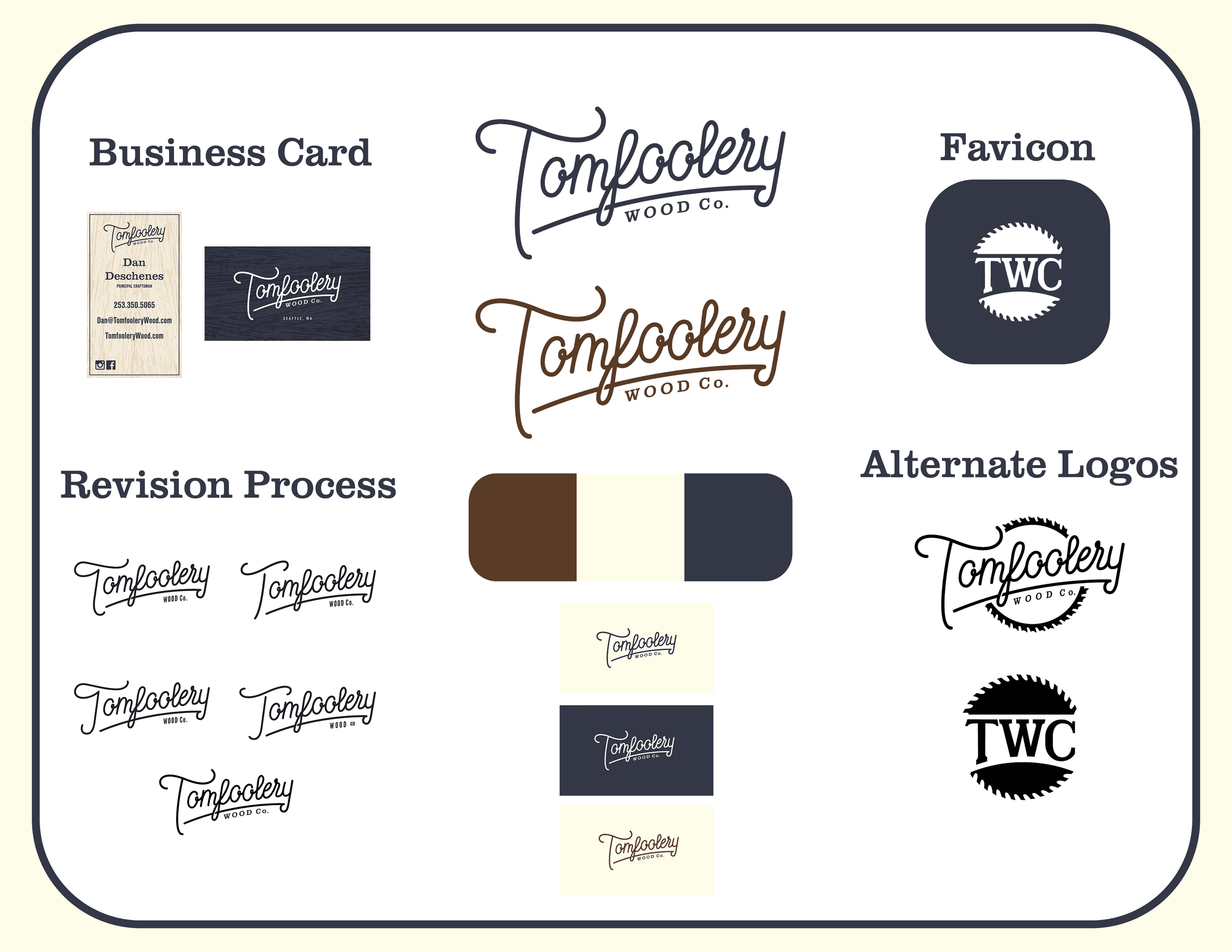
My process is pretty typical to most branding projects. I start with a lot of research. In this case, my research consisted of the industry, Tomfoolery's product and crafting process, and a large compilation of logos and typographical images for inspiration. Then it's time to sketch and doodle until my sketchbook looks like I have a deep and unhealthy obsession with Tomfoolery Wood Co. Once I get some clean sketches made up I pick three ideas, vectorize them on Illustrator, and send them over to the client for revisions. Once we come up with a basic style we go through a couple rounds of revisions then I come up with the rest of the branding package elements until everything looks just right. fonts, color palette, ways to use the logos, variations of the logo, and anything else the client and I decided they wanted at the beginning of the contract.
I always learn something from working on projects for clients. For this client in particular, I decided to present my first three ideas in a different way to help the client come to a more definitive decision. I took the advice of another graphic artist, you want to make sure you are proposing the design ideas to the client and not just showing your ideas to them. I gave the client a lot more detail into my thought process and why I chose to go in the directions I did. It made this project move forward at a much faster pace which is always a for the client and myself.
I hope everyone enjoys reading about myself and this project. It was a great experience from beginning to end. Thank you for checking it out.
Michael Deschenes
Deschenes Creative
2533505065