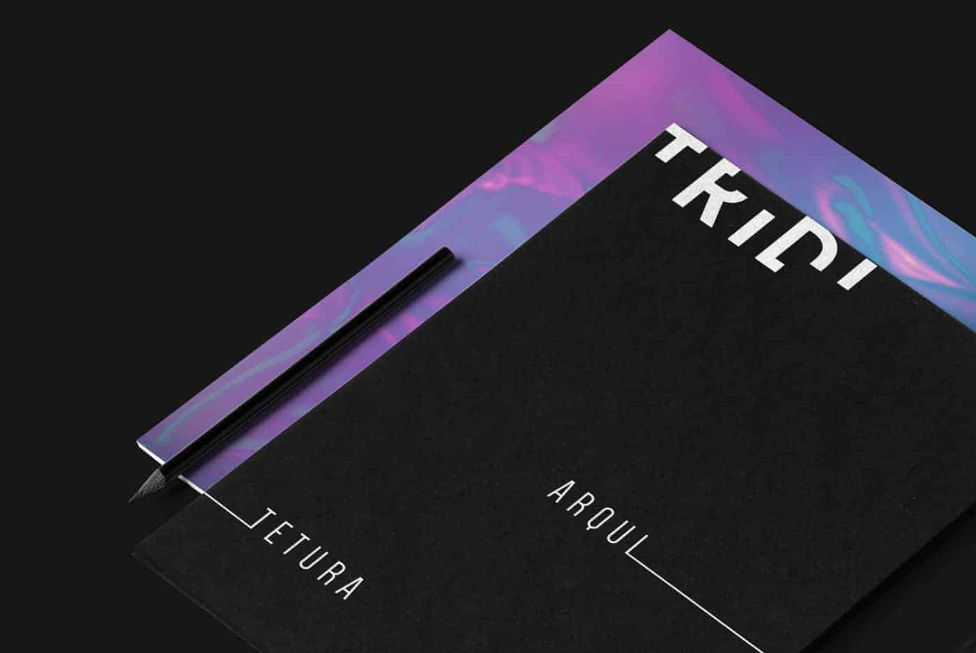
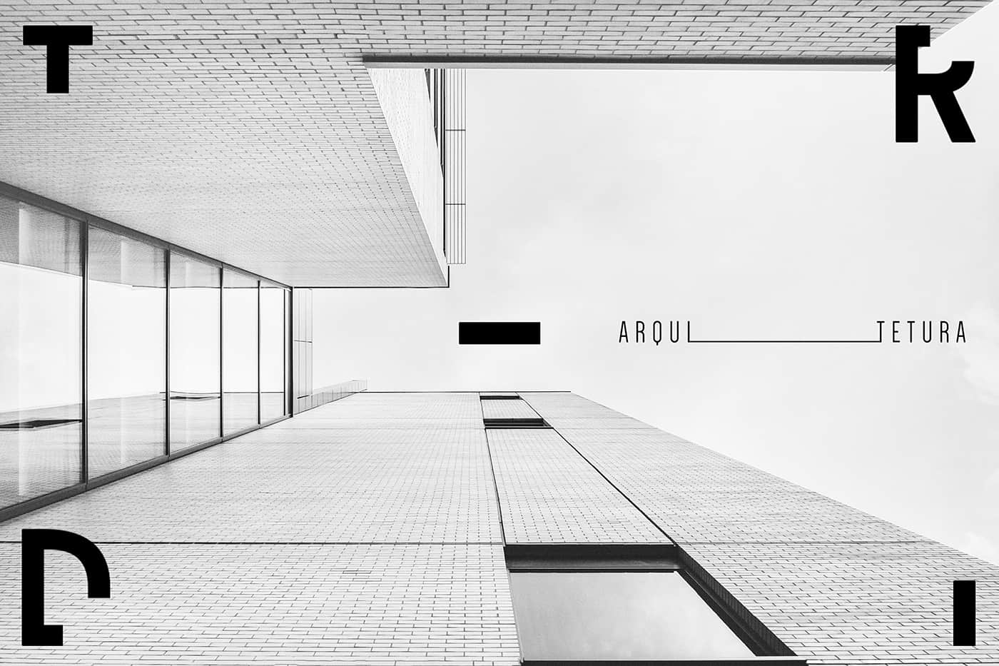
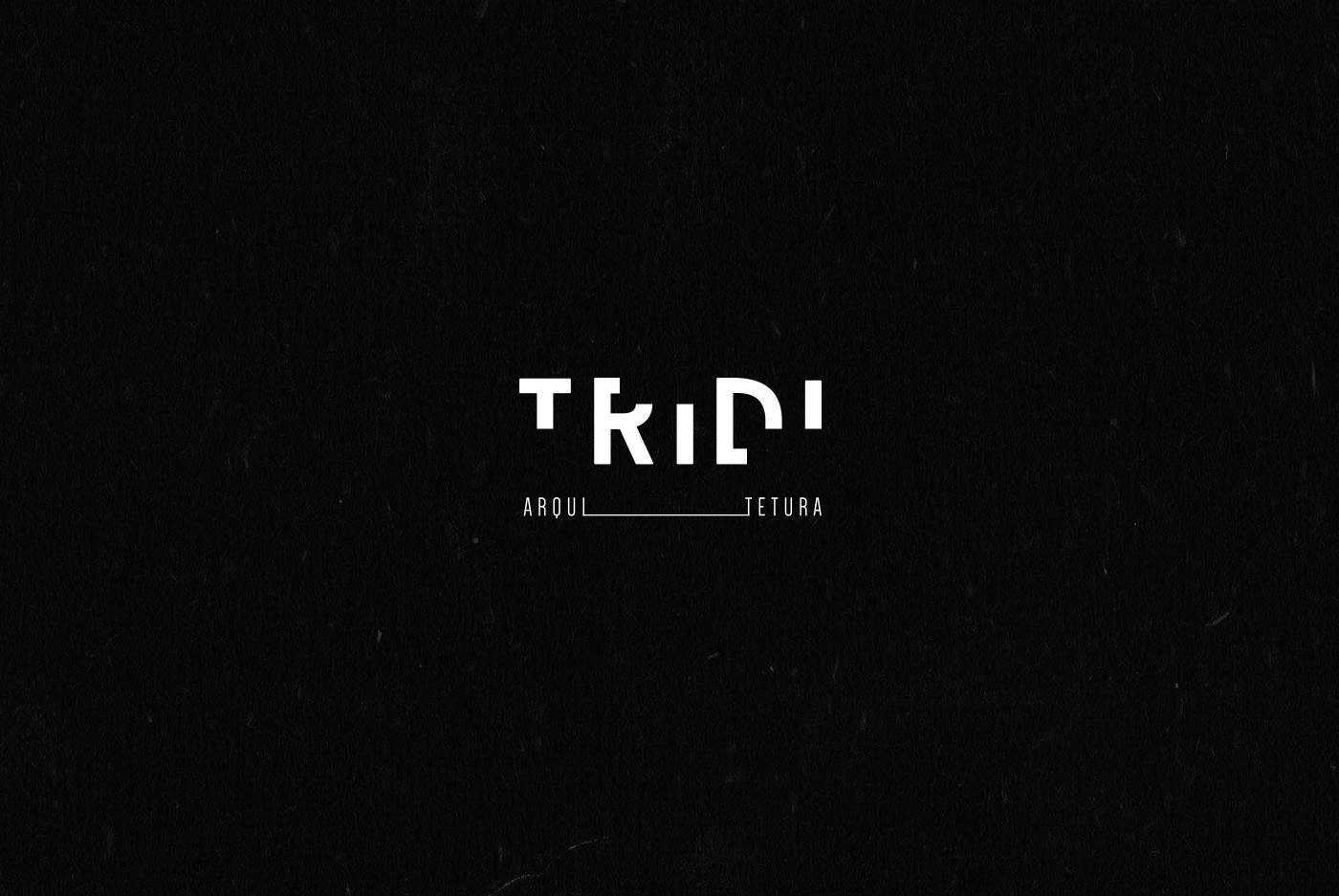
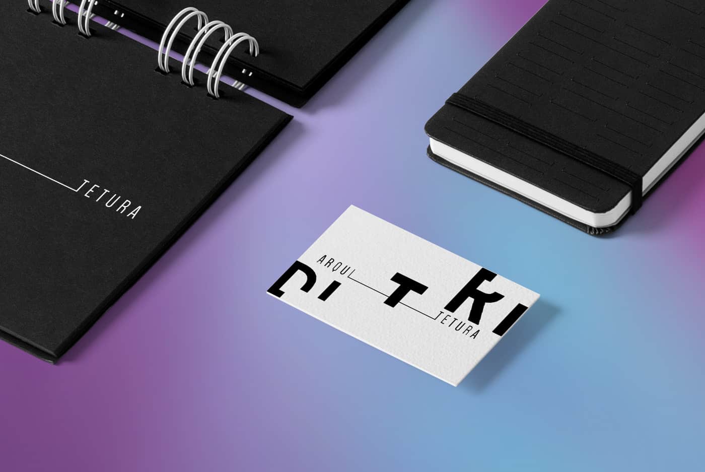
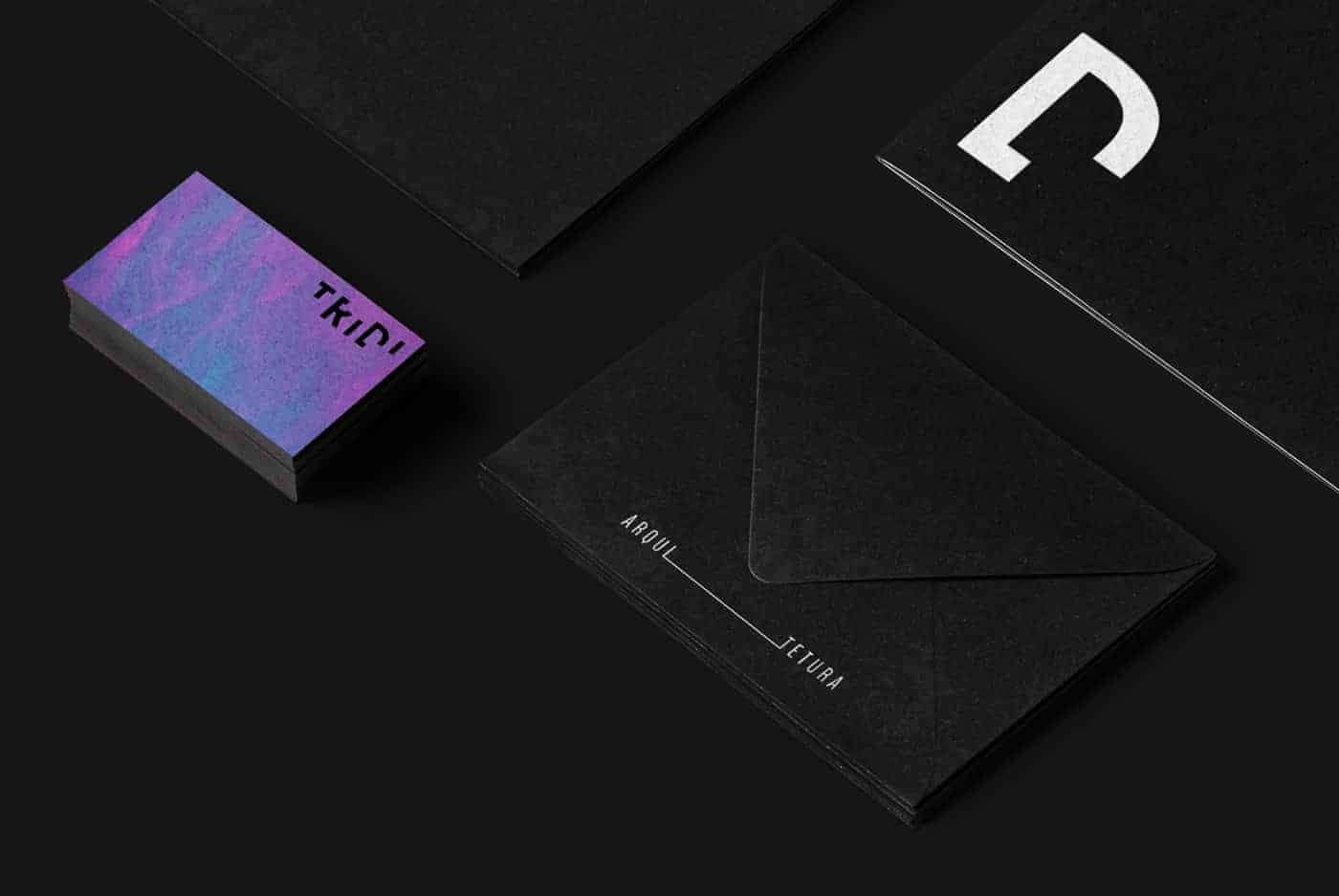
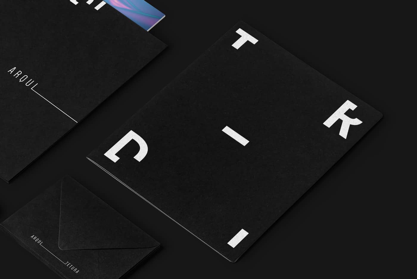
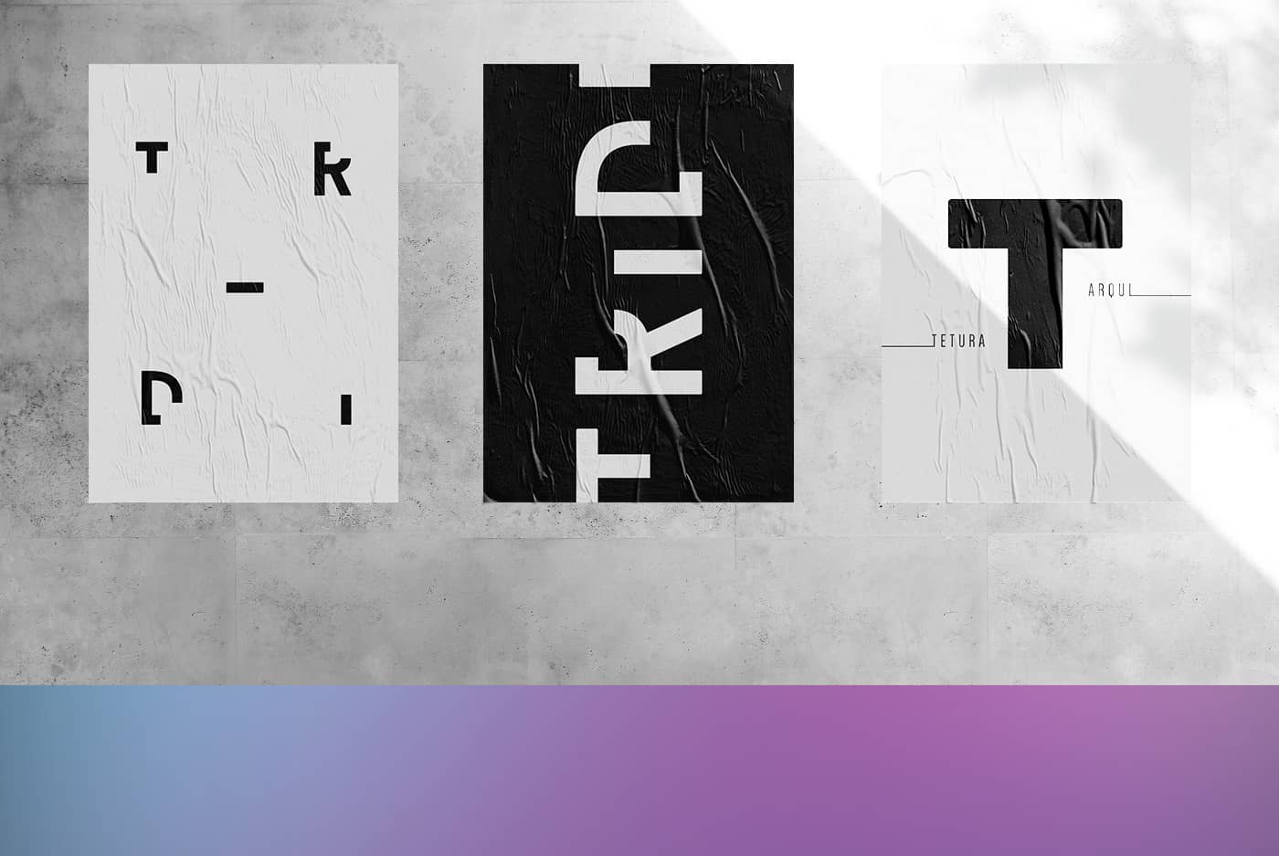
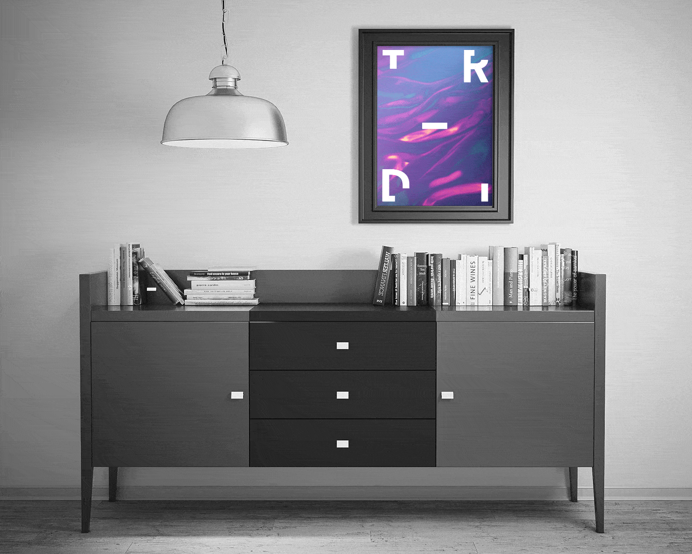
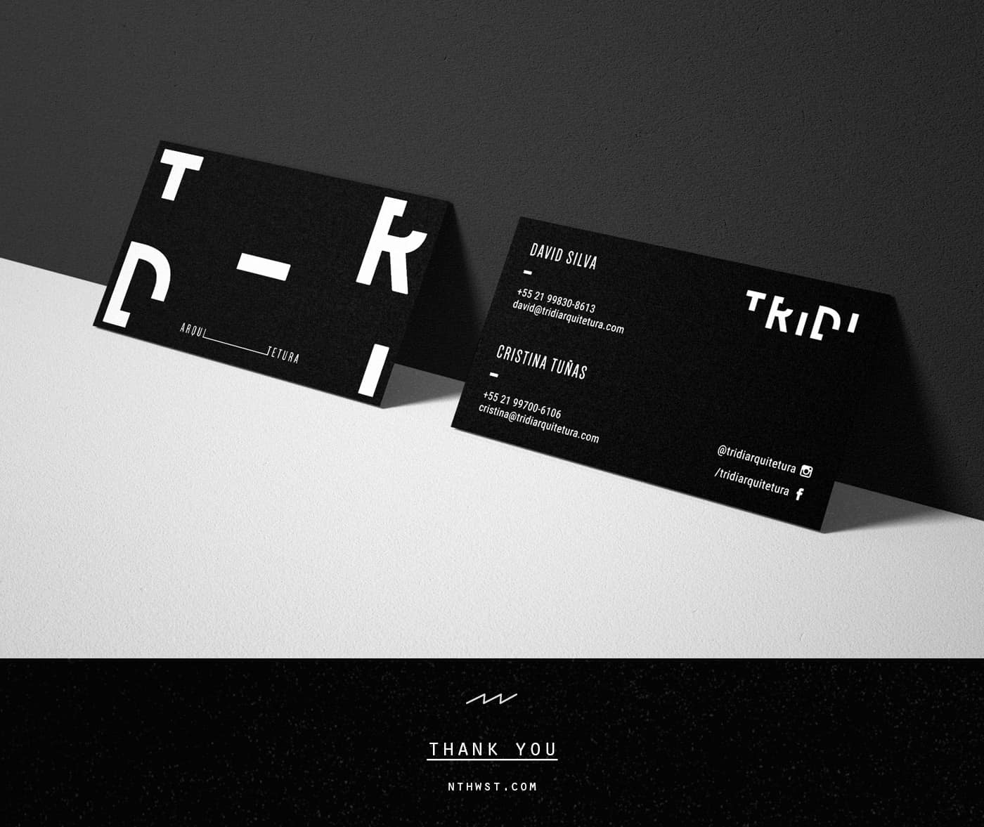
TRIDI

TRIDI Arquitetura is a new architecture studio, from Rio de Janeiro, owned by two young professionals. They had a clear vision of what they wanted for their identity: clean and contemporary. We translated their essence with a logotype inspired by architecture blue print.
The architects behind TRIDI approached me and my partner with a well defined mood board for what they had envisioned for their studio. Our goal was to merge their visual references with their personality and style as architects, so we could create their logo and identity.
We were very inspired by blueprints and the top view of architectural projects to create the logotype. The black and white palette translates the clean and contemporary aspects of their work; the iridescent texture used as support shows their bold side.
Our creation process starts with sketches on paper, so the first ideas can come out. The process involves concepts, key words and drawing. After some experimentation, it's possible to have an idea of which ideas work and choose which options to develop. Then, we basically use Adobe Illustrator to refine and finalize.
The clients felt very represented by what we came up with and understood that the identity really translated their work and personality. It's really important that the clients feel as satisfied with the results as we are and that's how we felt with this project.
This project is part of the work I do for NORTHWEST, a design collective of which I'm one half. Please, visit our page to learn more about our work! be.net/nthwst