Acooroo Brand Identity
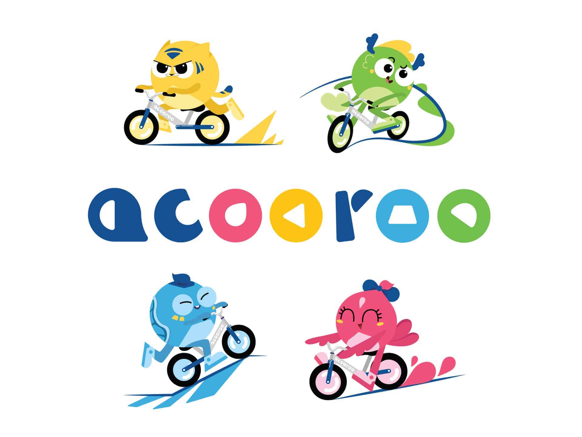
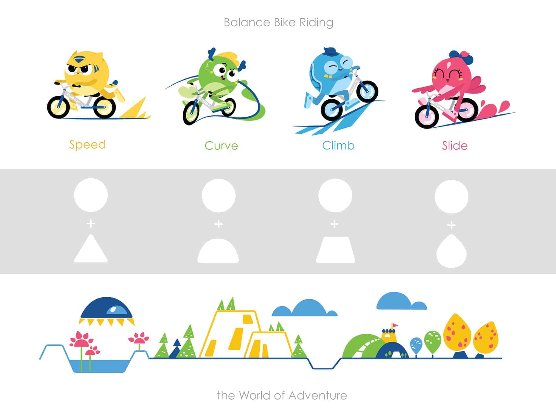
Acooroo is a children sports brand focusing on creating fun balance bike riding services/events for preschool children in China. In order to portray the brand's playfulness and connect it with its audience, we introduced four mascots into the brand identity as children's friends/training buddies for balance bike riding. The characters are based on 'The Four Divine Beasts' in Chinese culture and four balance bike skills (speeding up, curving, climbing, sliding). The movement of these skills inspires a visual system that utilizes simple shape languages throughout all elements to create a cohesive brand experience.
Interesting characters and storytelling engage the viewer in a powerful way. This became the concept which inspired me to introduce the mascots and a story of them being companions to the children for their bike adventures. The client and I would love to see the spirit of the brand to live on in children's heart even after they grow up. And loveable characters becomes an ideal way to carry this out.
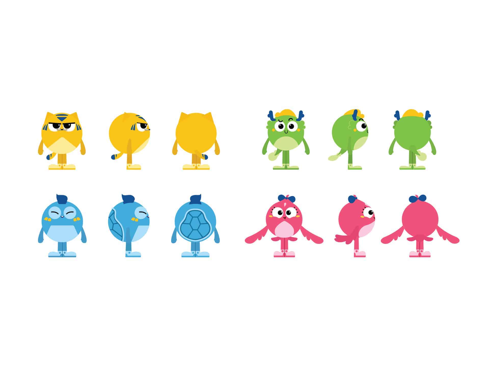
The brand is based in China. To add some culture nuance, we decided to use 'the Four Divine Beasts' in Chinese culture as the archetypes for the mascots, which are Tiger, Dragon, Turtle, and Finch. And pair each of them with one of the four balance bike riding skills: tiger for speeding up; dragon for curving; turtle for climbing; finch for sliding.
Since the target audience of the brand is children between 3-6, the design and visual language need to be simple, vibrant and also expressive. I pushed to simplify the look of each 'Divine Beasts' to create a stylized form and symbolize them as much as possible by using simple shapes. The shapes language further inspired the visual system that is carried through all graphic elements for the brands, creating an engaging visual world.
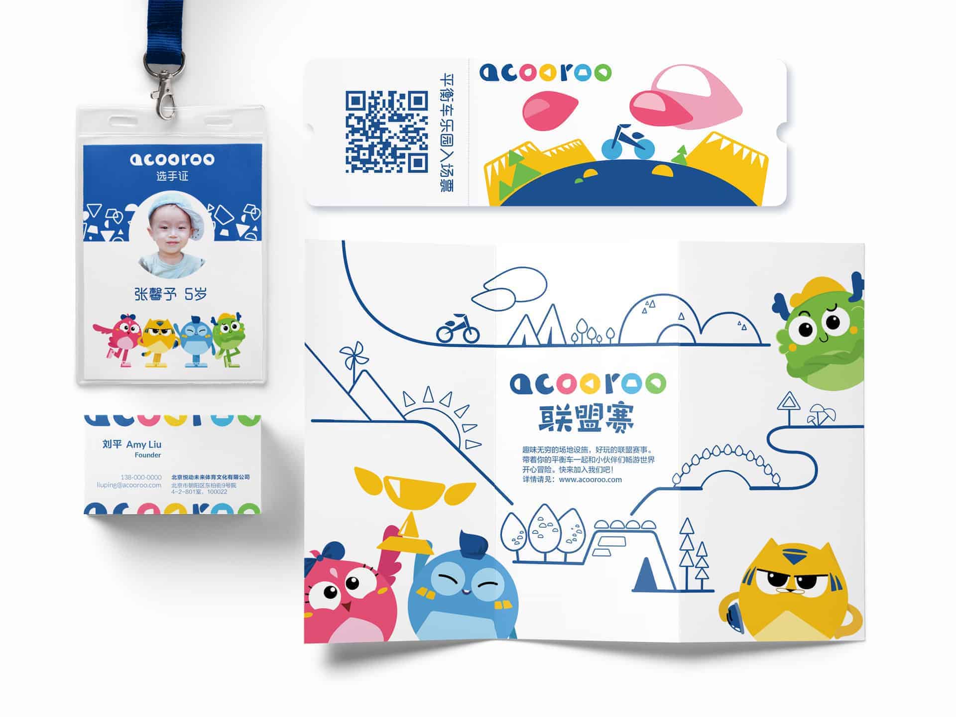
For the deliverable elements, I build them with adobe illustrators and photoshops. But for me, the sketch process happened on paper was more important. It is, of course, a very personal preference, because I feel that my mind and thought flows better when my hand moving across physical paper. The process always starts with an interview with the clients and market research to learn more about the customers and competitors. This helps us to create a clear brand positioning to guide the design process. Then during the sketches and design process, I set up multiple checkpoints with the clients (and sometimes even a sample of target customers) to show them the progress in different stages with references, sketches, and mockup.
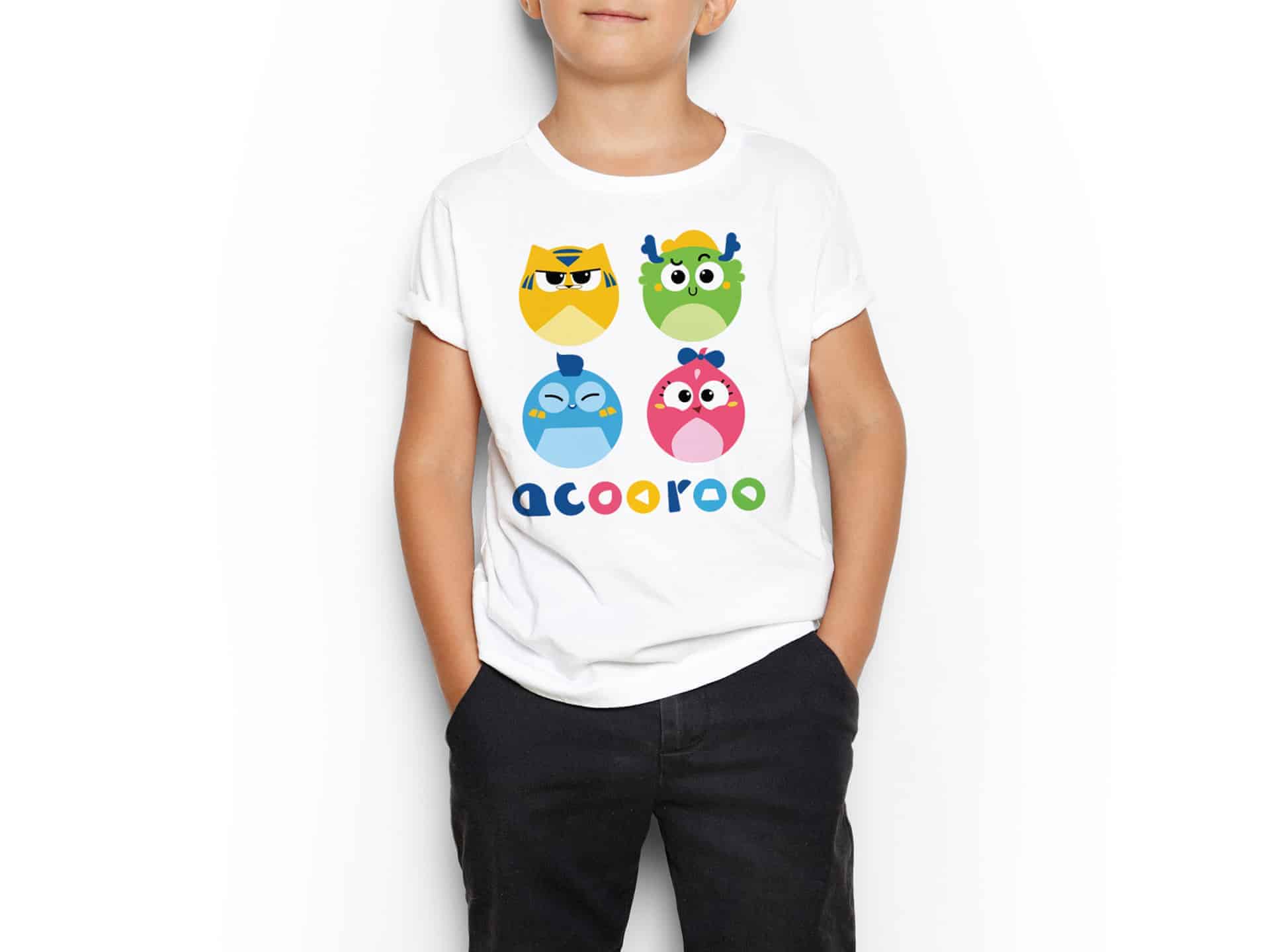
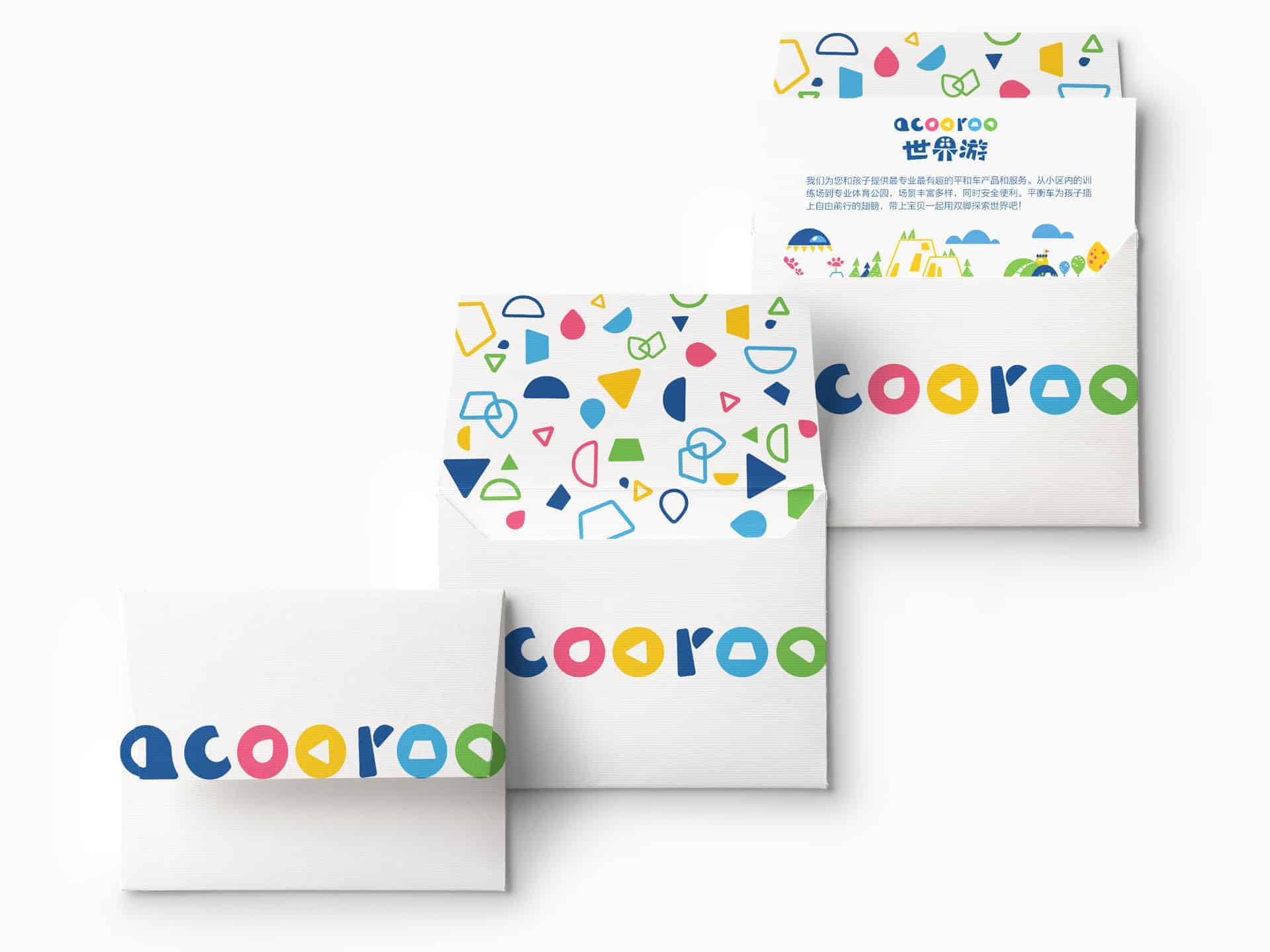
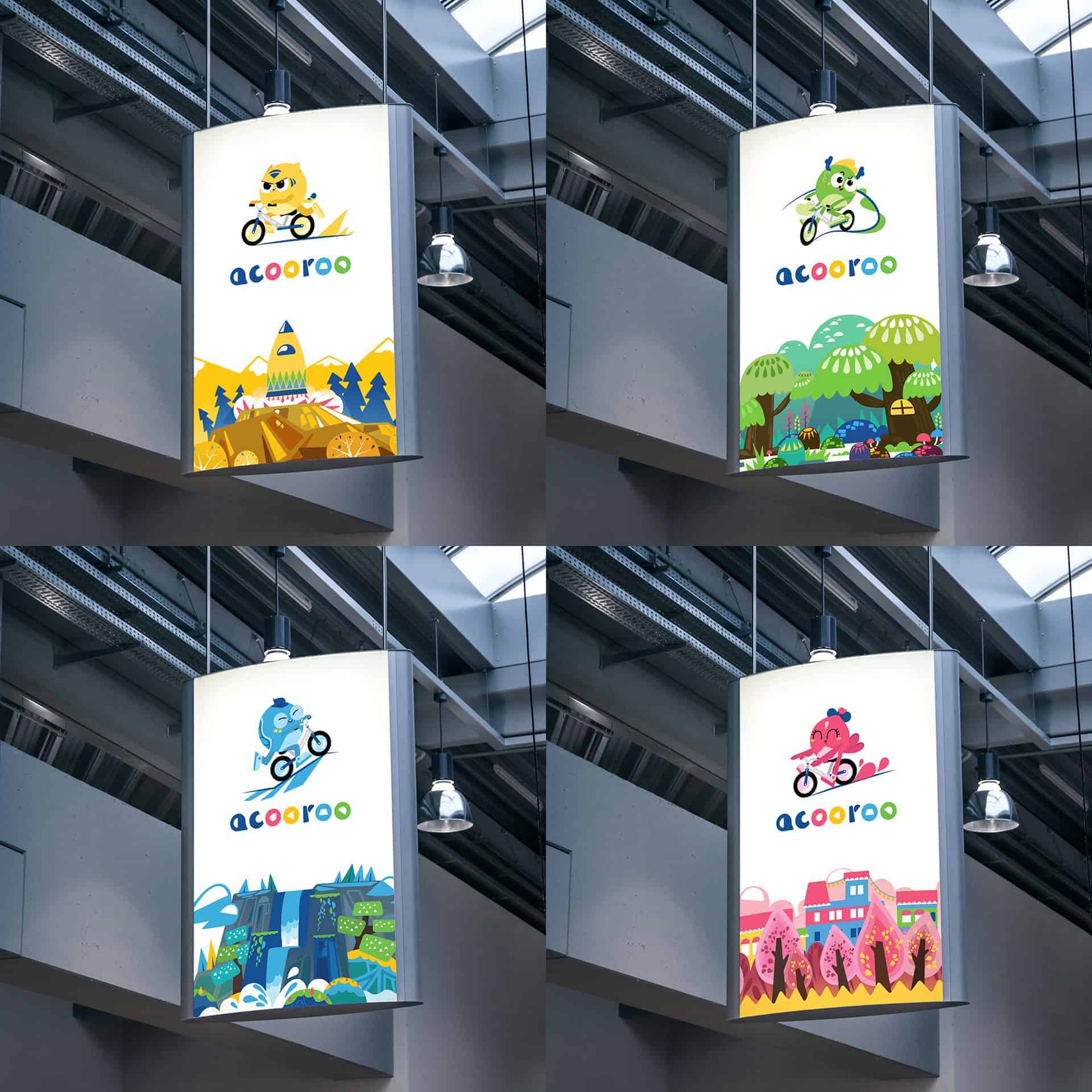
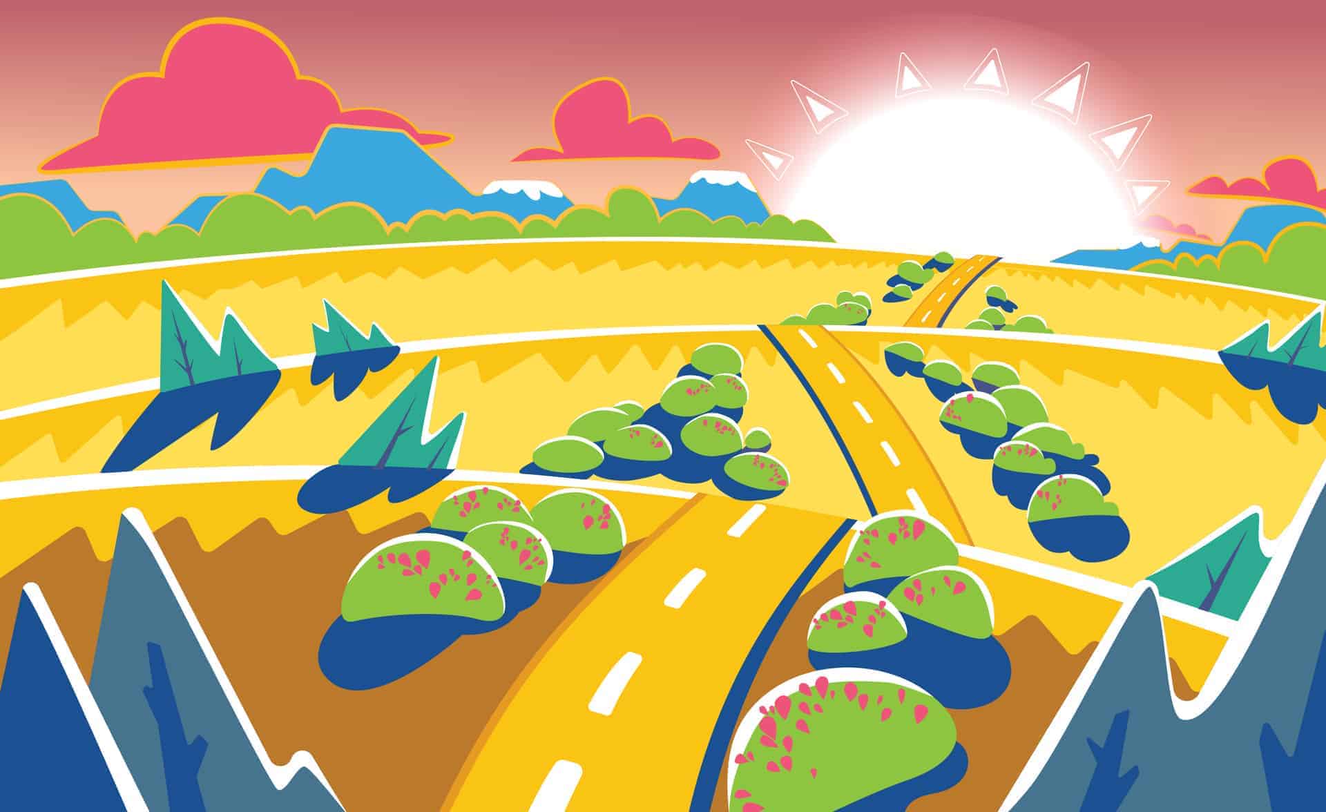
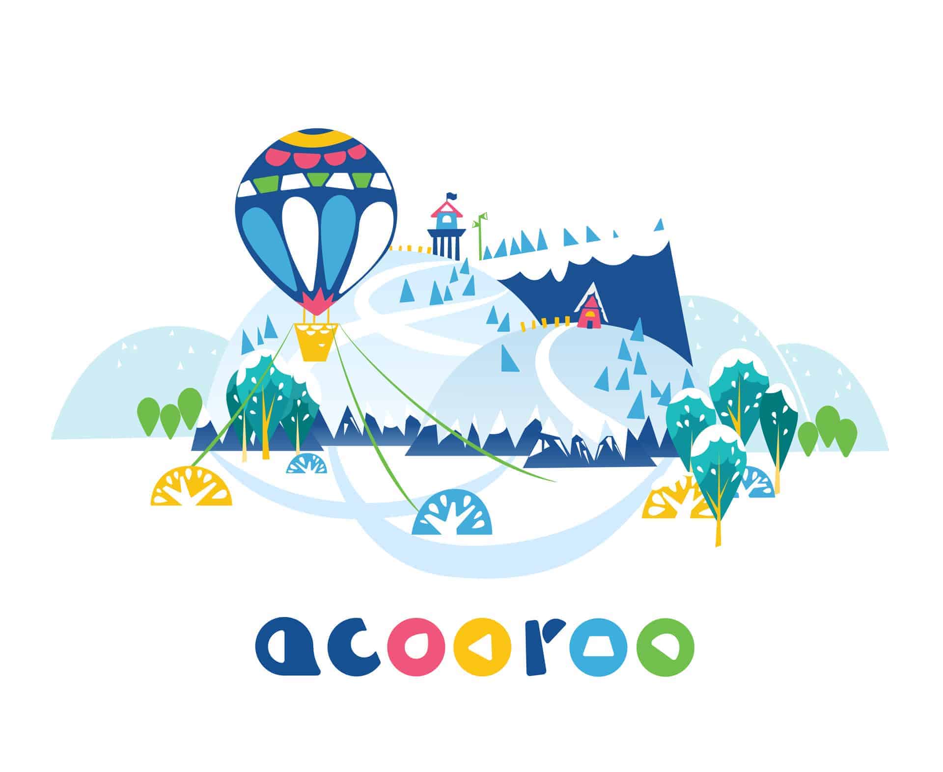
The client did some cutout boards for the mascots and other graphic elements for their events, and the children (as well as the parents) loves them. There were lots of children posing and took pictures with the mascots. The unique characters together with the vibrant and cohesive visual language created a strong identity for the brand.
Looking back at the design process, the client initially came to me for the character design. But later on, I conducted a project and brand alignment session with the client which gained us some very useful insight into the customers and brand positioning strategy. These became key guidelines for the following steps in the design process. Such experience is a valuable lesson reminding me to always have a big picture in mind and keep everyone on the same page when carrying out a complex project like brand identity.
I'm really happy and honor to know that Acooroo identity design won a Bronze award at the 2018 A' Design Award and Competition. For more information, you can check out A' Design Award and Competition's website.
These are so cute!