Agreste

In the new theatre play called "Agreste" of the company “Pé no Palco”, eleven actors and musicians act out the story. The play takes place in the brazilian northeastern region, but a story like this could be found in various parts of Brazil or the world. The suppression of the other, the "different" is the main theme of the story, also full of popular and religious references.

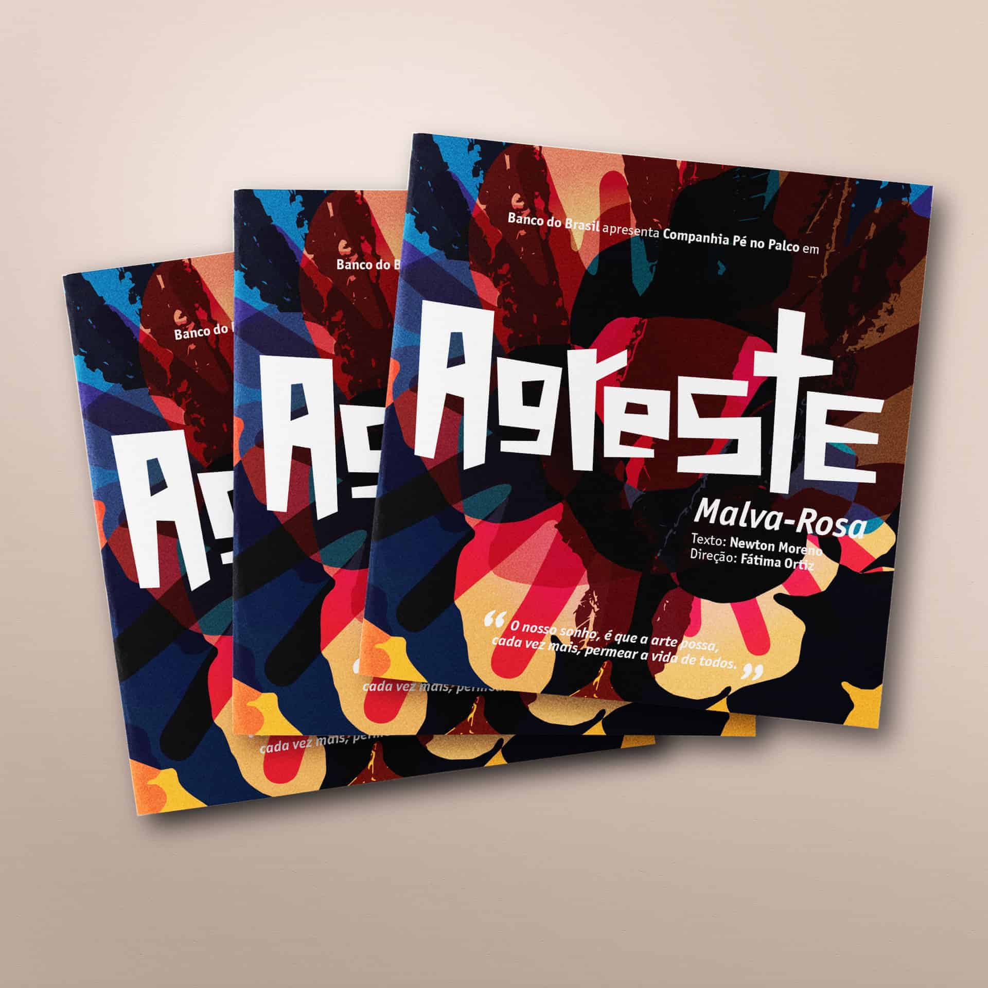
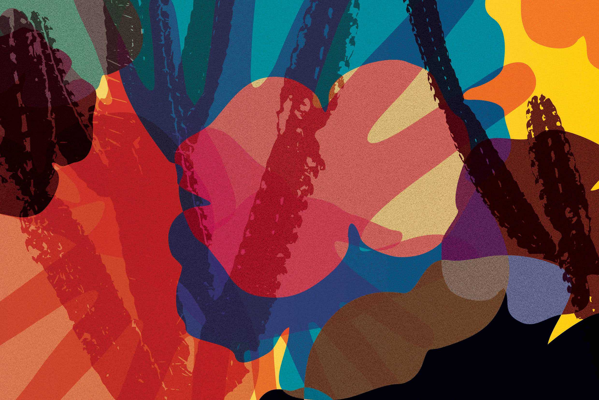
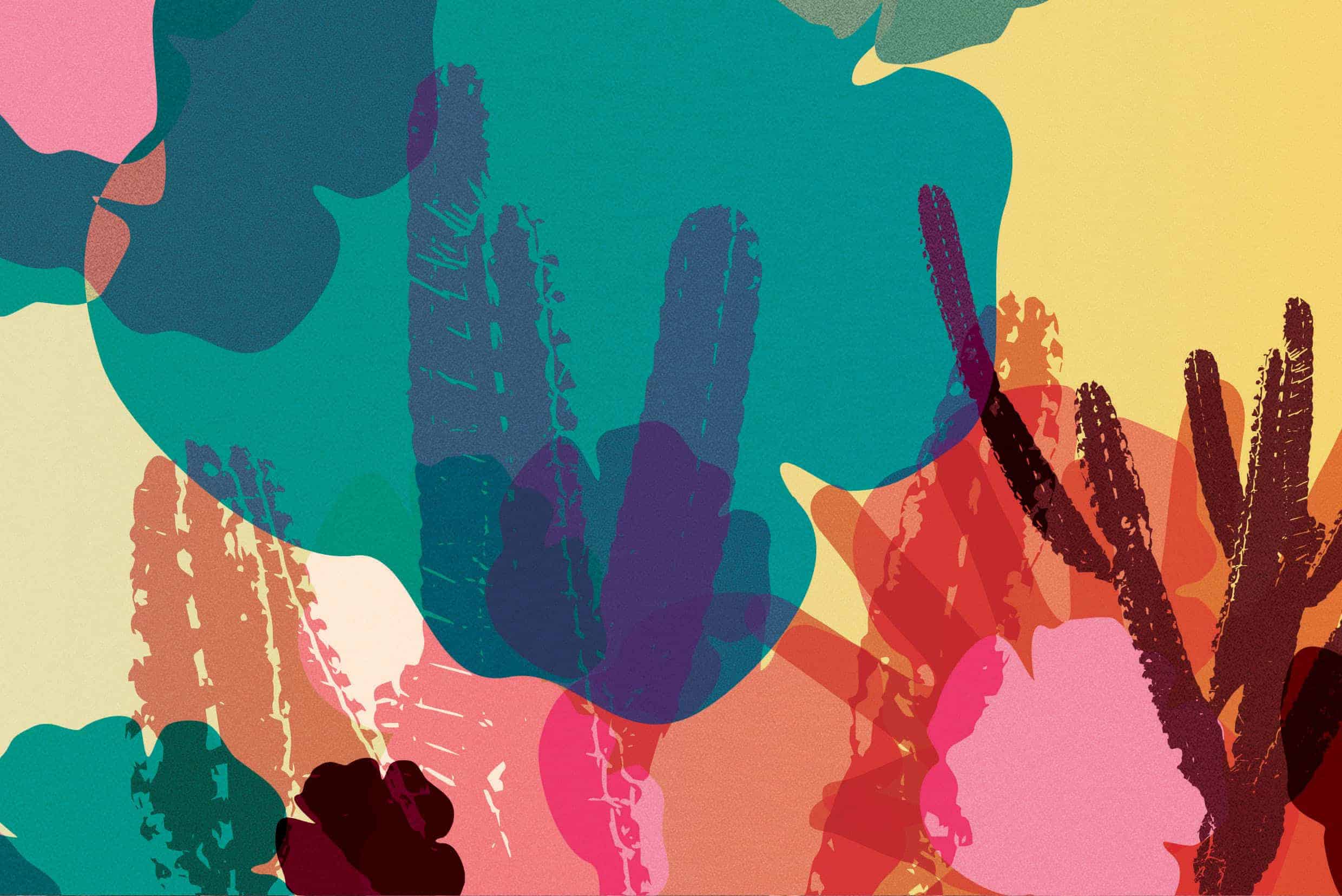
We’ve developed the entire visual identity of the theatre play, which features typical elements of the brazilian northeast region, such as mandacaru (a specie of cactus) and malvarosa flower, all mixed up with the human element (represented here by the hands), which in the final set can also be seen as a reinterpretation of the "chita" fabric, very traditional in that region. The colors chosen intend also to convey a "dry" aspect (once the northeastern of Brazil is very dry)
Typography refers to woodcutting and Cordel literature.
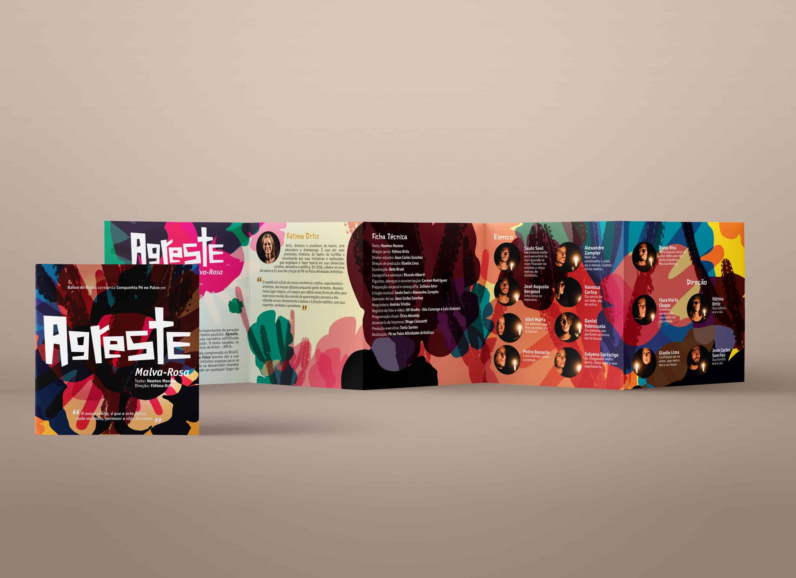
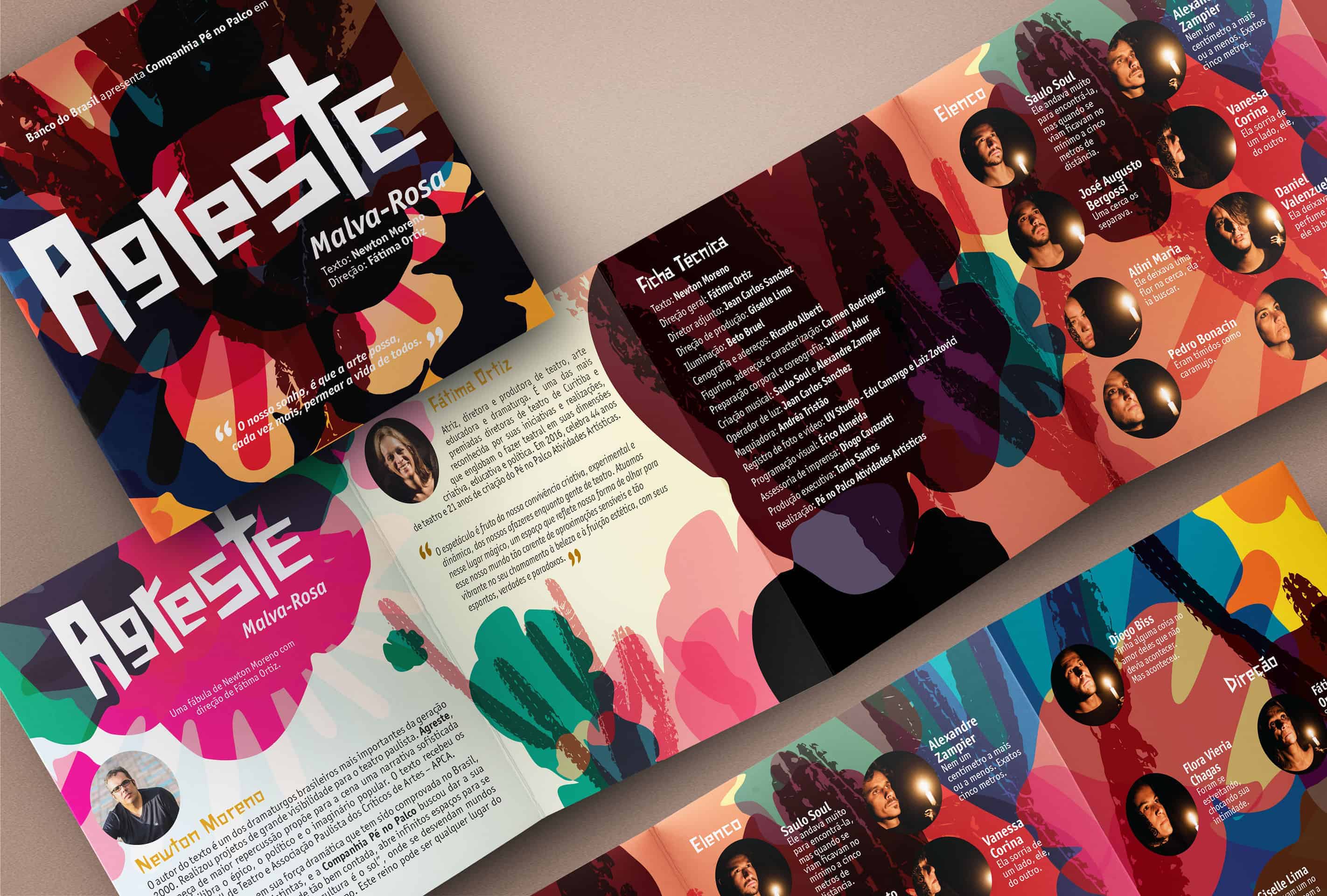
Illustrator and Photoshop were used to work on the elements and its colors and mix up all, creating an unusual artwork, where the audiences can discover the different images inside the mix. With the typography made, and the basic texture created, we adapted and apllied on posters, brochures, presentations, and all the graphic materials created for the play.
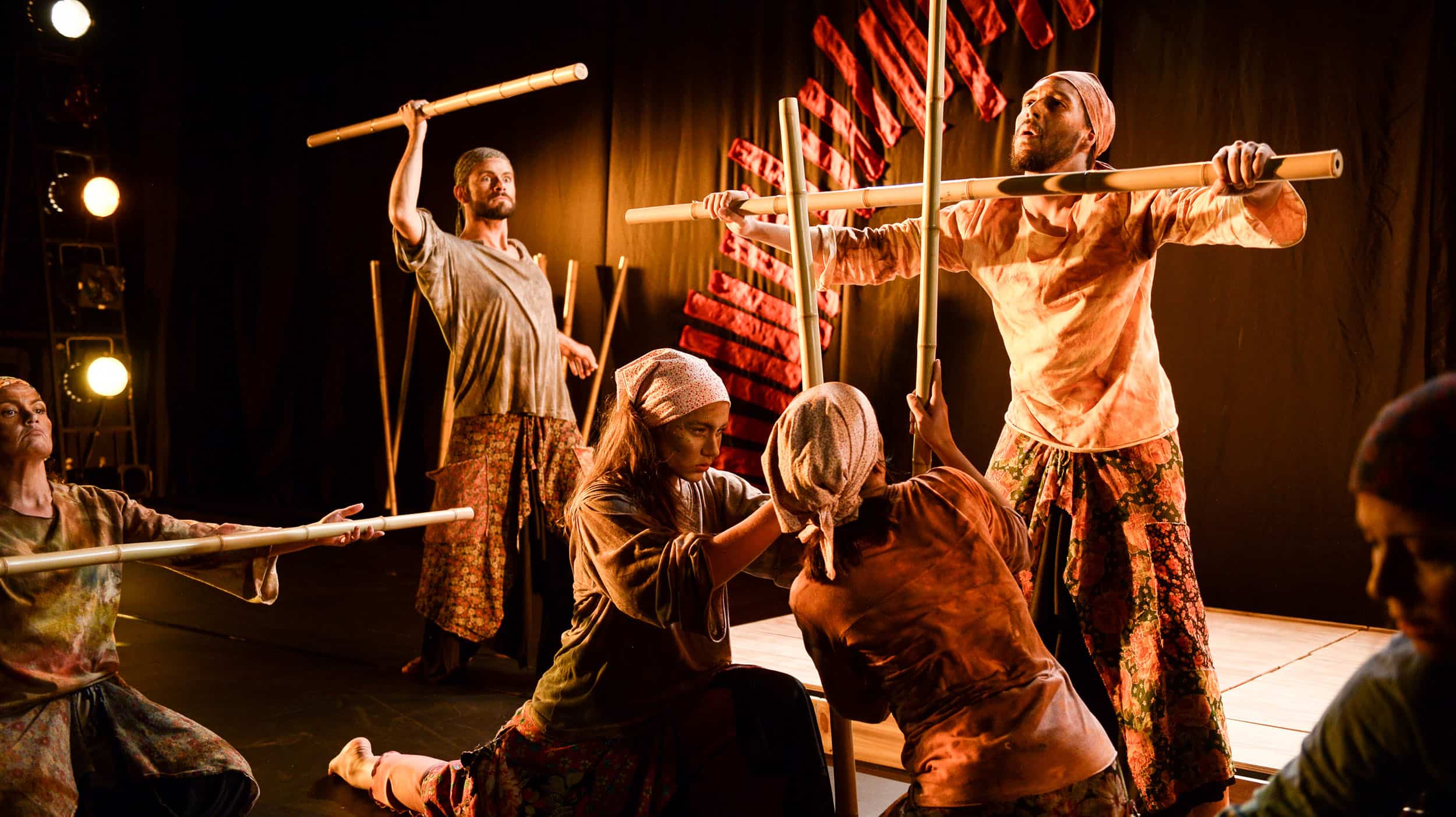
Audiences saw with curiosity, trying to discover the "meaning" of the design (or the meanings), which generated will to see the theatre play. I learned that sometimes it`s possible to work with more colors, even when you`re working in a dramatic material. Everything is relative, sometimes is pretty better keep away from the cliché.
Come more to the theatre!
What I can only say about this project is, stunning! I really like it.
Thank you very much for your kind opinion Anna!