Brand Identity for Sabu

My client contacts me to create the Identity of her new project which unites psychology with art (art - therapy) to provide professional psychological support to her patients; this includes counseling processes, art therapy, and emotional education for mothers, fathers, and
caregivers of children, adolescents, and young people who encounter affective, emotional difficulties in their interpersonal and social relationships. This brand seeks to promote care, education, attending to basic emotional needs, and being a reliable middle ground between parent and child to achieve well-being in families.
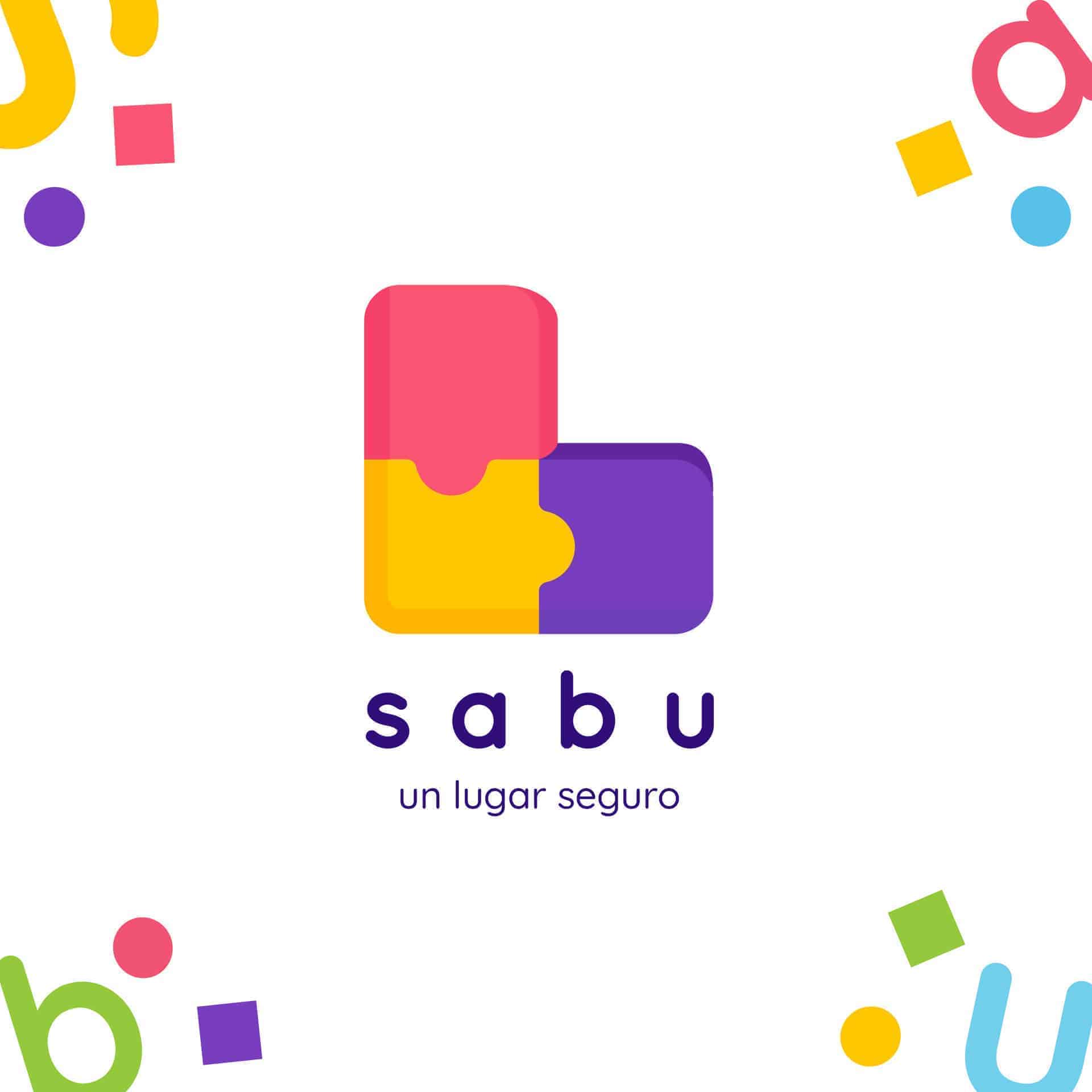
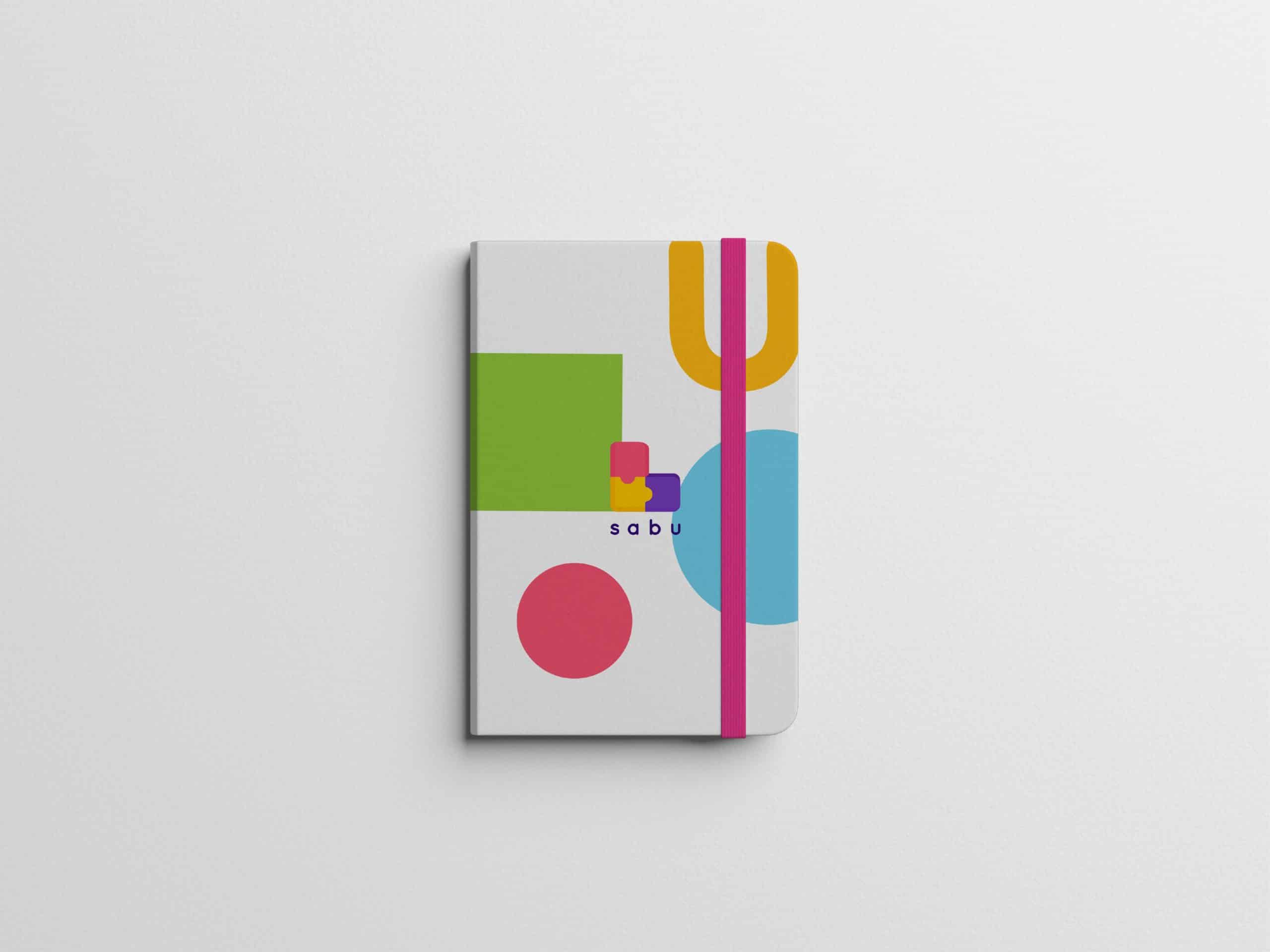
The first thing to do was make an abstraction of the name "En en el sofá de la Abuela" because it was too long and kind of boring, so after a long process the final name came as "Sabu", the S is for "sofá" and "Abu" for Abuela.
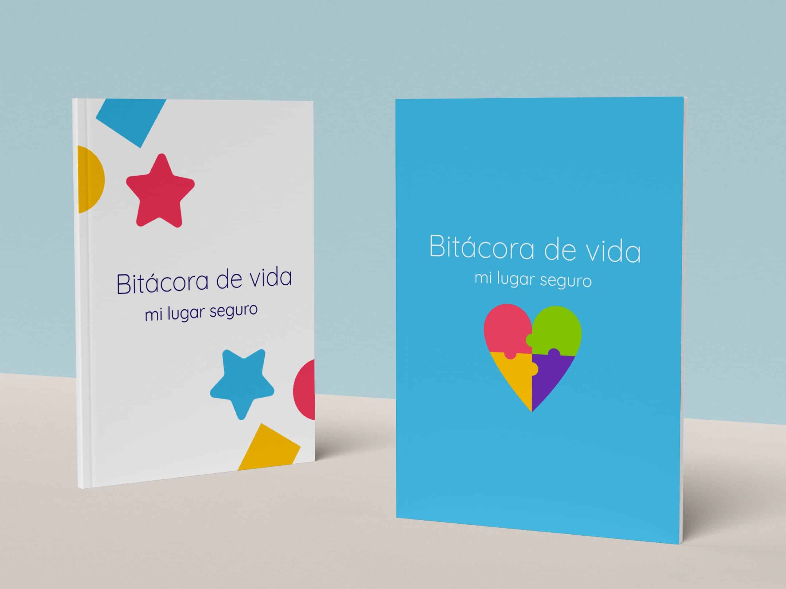
Then, carry out the process of research, data analysis, and formal work under the concept of "Building a safe place", taking into account sub-concepts such as art therapy, education, and care, taking into account the target audience, in which parents are first but also the children of 1-4 years old. In summary, the process was re-naming, research, benchmarking, information analysis, abstraction, conceptualization, and design.
After that, for the design part, I made abstractions of symbolic elements that were related to the brand, I took into account the color symbols from the book Psychology of Color by Eva Heller and after much sketching, the final idea arrived, a chair for children built from a puzzle that symbolizes the grandmother's sofa, a place of care and respect that is built both with the psychologist and with the families to form a safe place.
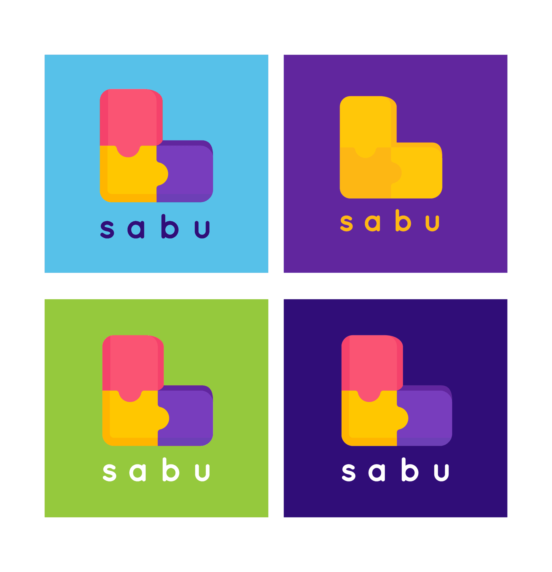
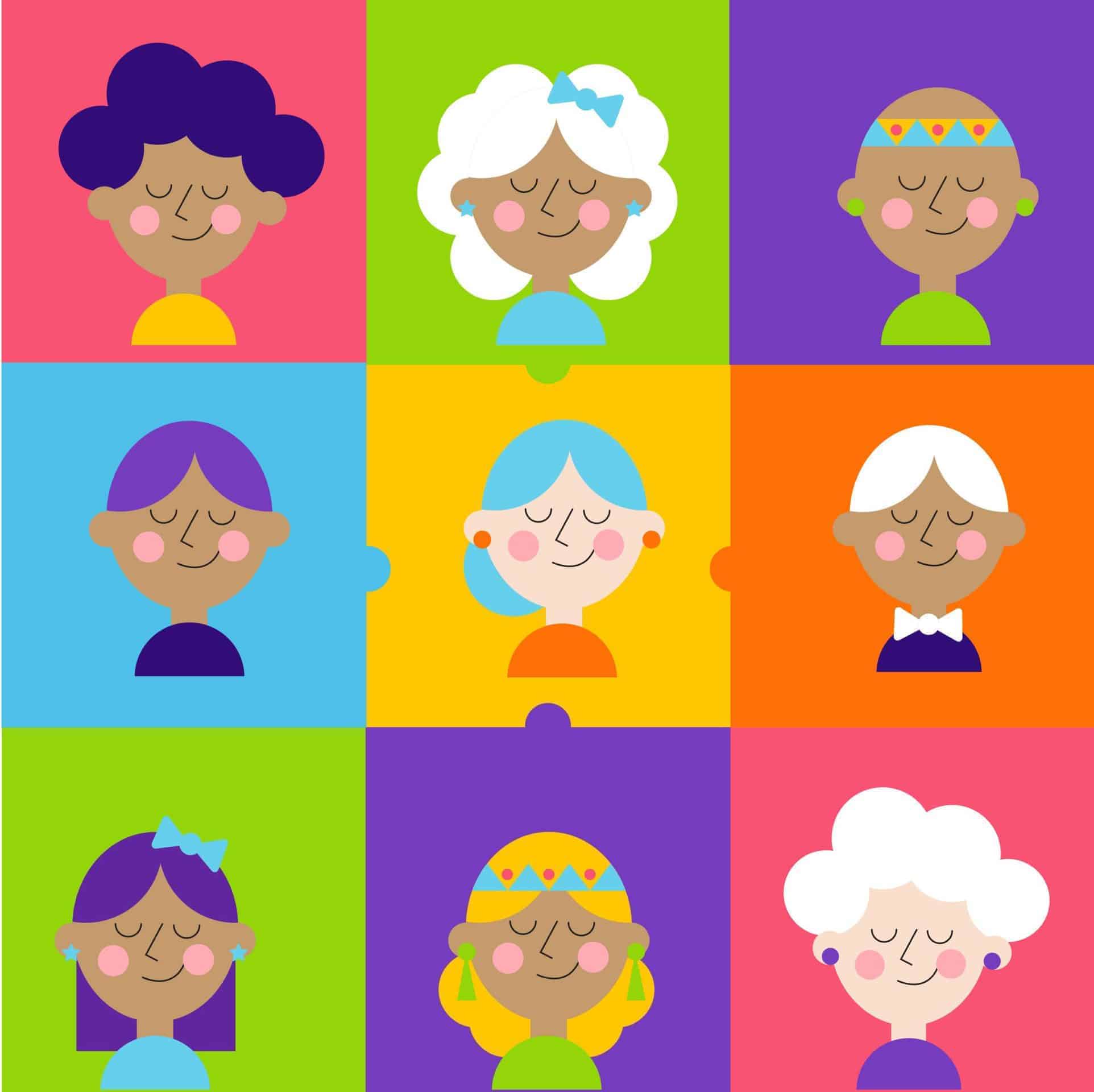
Finally, the most fun part was to create the complementary graph using the brand colors, typography, and highlighting the puzzle as the main element; also create a series of characters and icons to represent education, communication, wellness, and trust
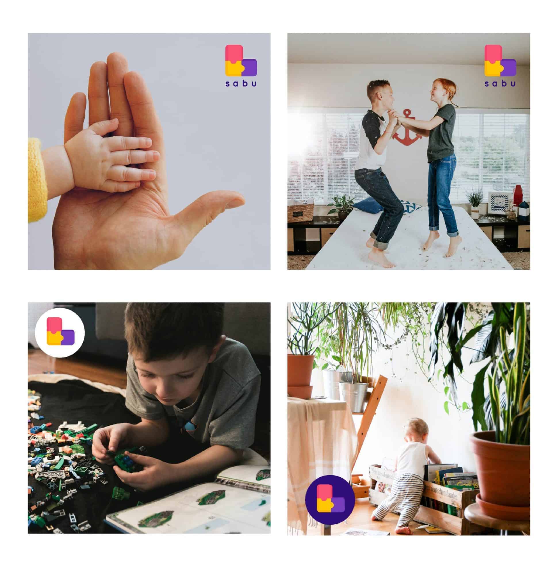
My work is divided into several phases, for the brand creation phase, that is, the logo, its variations, typographic and color use, I employ the Adobe Illustrator tools, then I make the brand Guideline, that contains all the specifications of the Brand Identity design, I use Adobe Indesign and finally to give context with the mockups I use Adobe Photoshop.

Despite the Brand Identity is ready my client has not published her project yet, it is programmed to be ready on March of 2021, but My client was very happy with the results, and some colleagues congratulated me for the work, also that DesignIdeas contact me to publish my work on their page is a great honor and makes me feel happy, satisfied and pleased with the work I do
To achieve good results it is essential to have a good work plan and a methodology to follow, I really like the methodology that Bruno Munari provides for green rice and it has helped me organize my entire branding process.
Agree, love the colors. Looks so neat!
The colors are so cute! Love the design too.