Editorial Illustrations

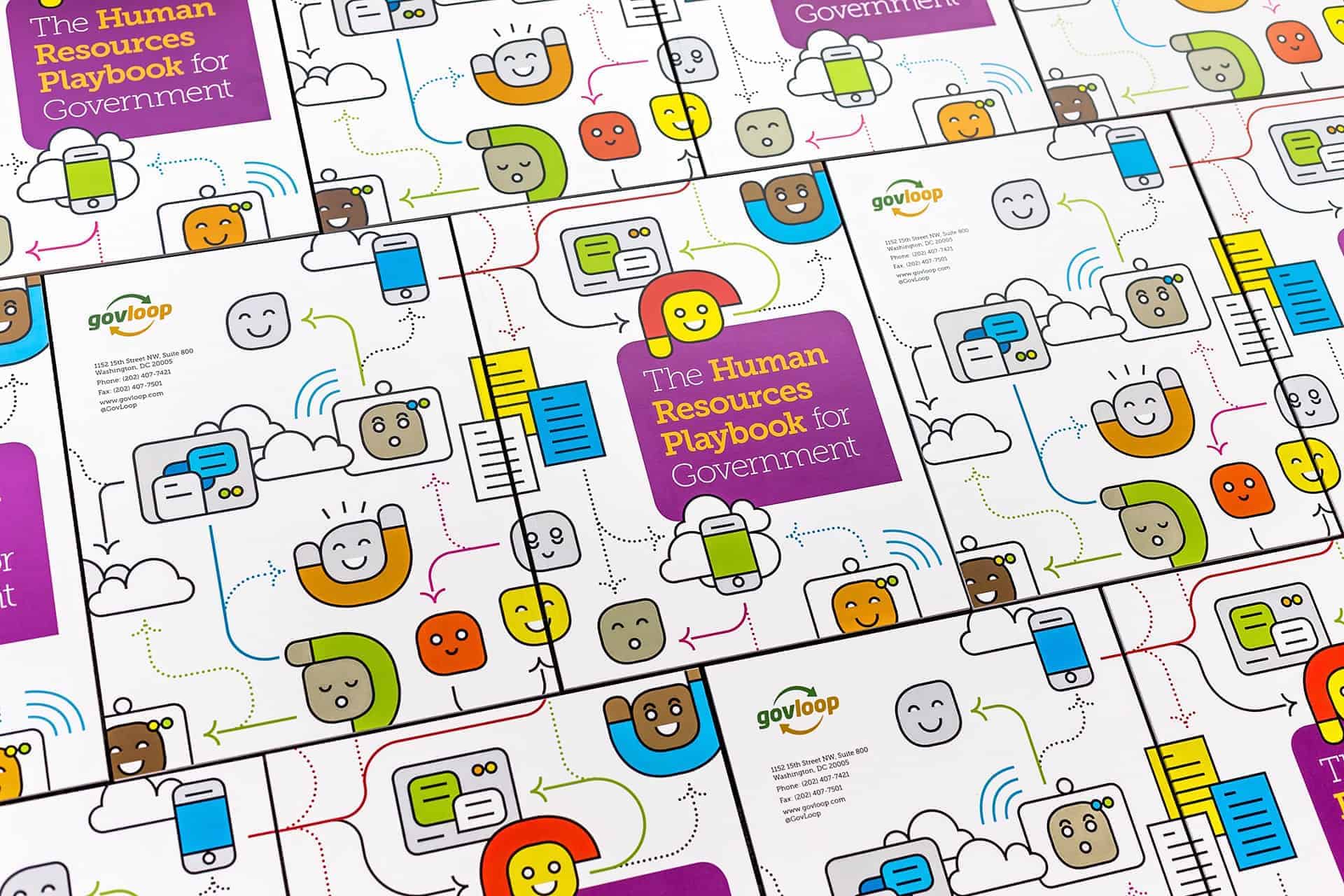
These U.S. public-sector publications have one thing in common: the people. The topics they deal with are very sensitive and therefore the illustrations always convey positivity and trust. Each publications has a different style depending on the content.
When I was researching publications aimed at the public sector, I realized how similar they all are because most of them use stock photos and so I decided that it was best to use my own illustrations.
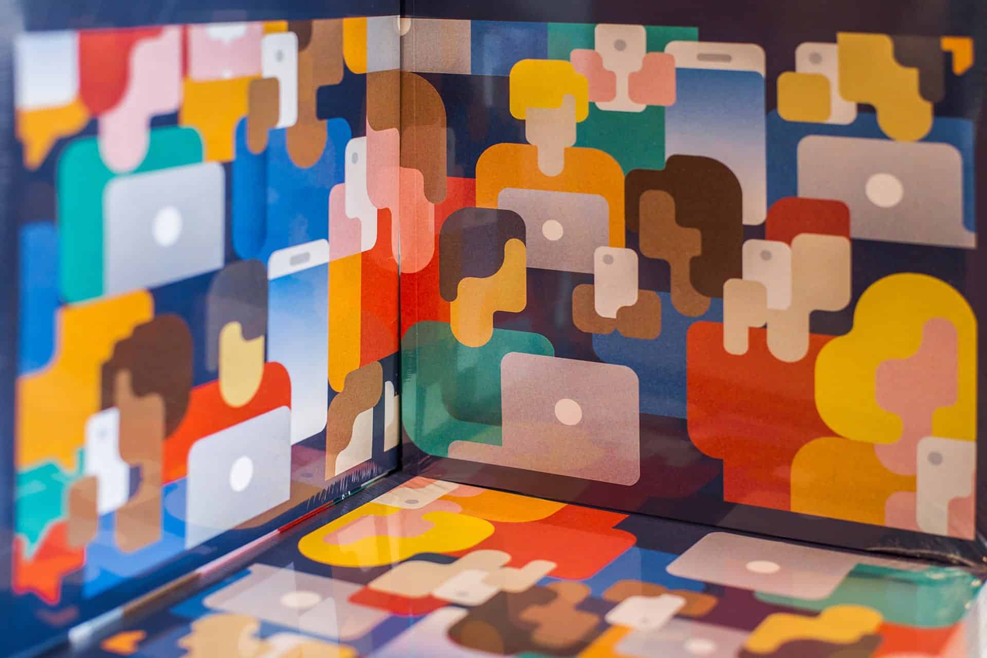
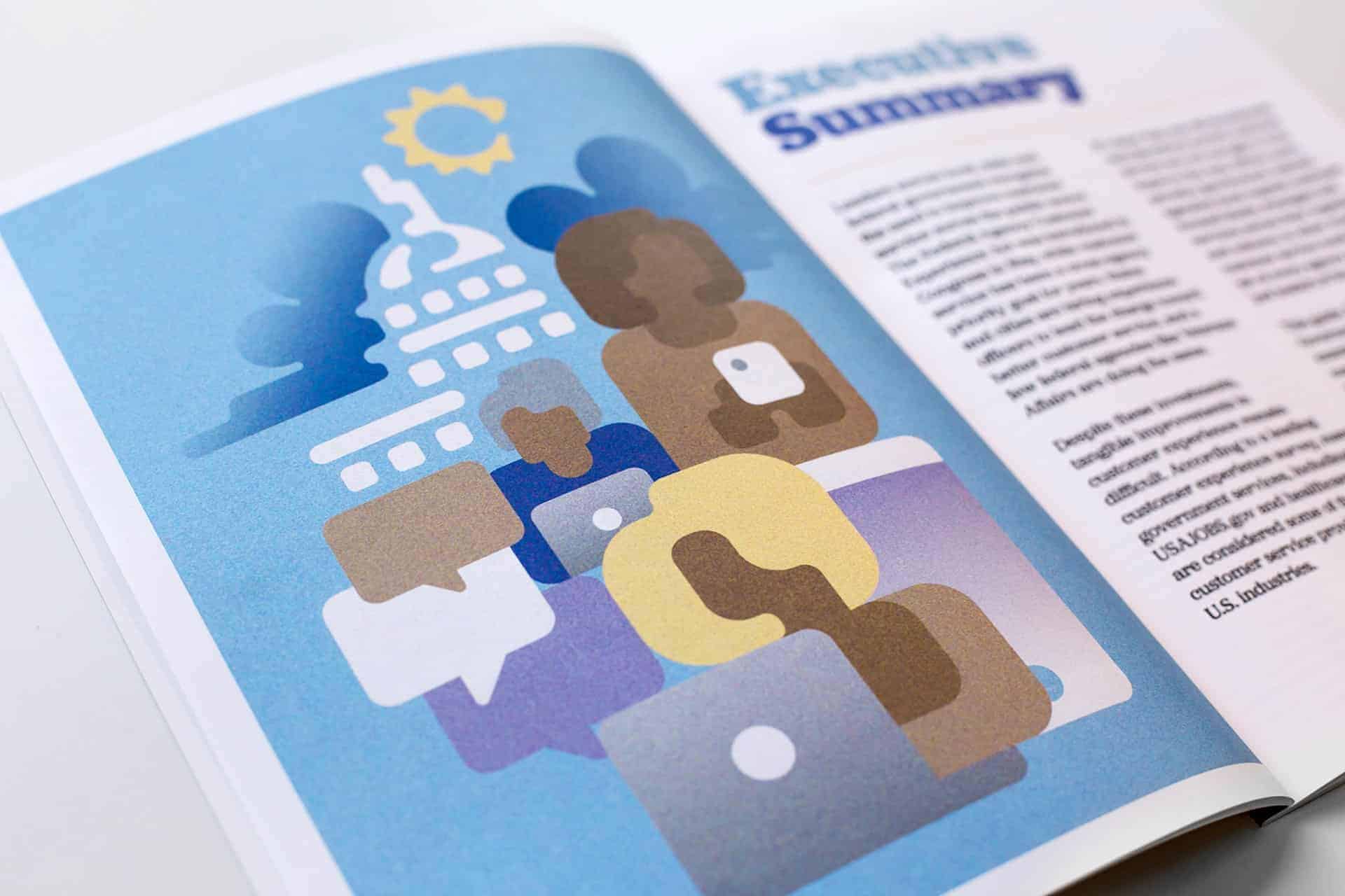
The styles I used are inspired by very different sources: the fauvist paintings of André Derain (1900-1910) http://www.theartstory.org/artist-derain-andre.htm, that I saw exposed at the National Gallery of Art in Washington, DC., the Lego store in the Rockefeller Plaza of New York City, and the cute Japanese Kawaii style https://www.japanpowered.com/japan-culture/what-is-kawaii.

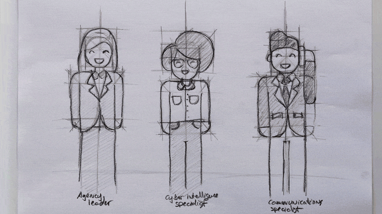
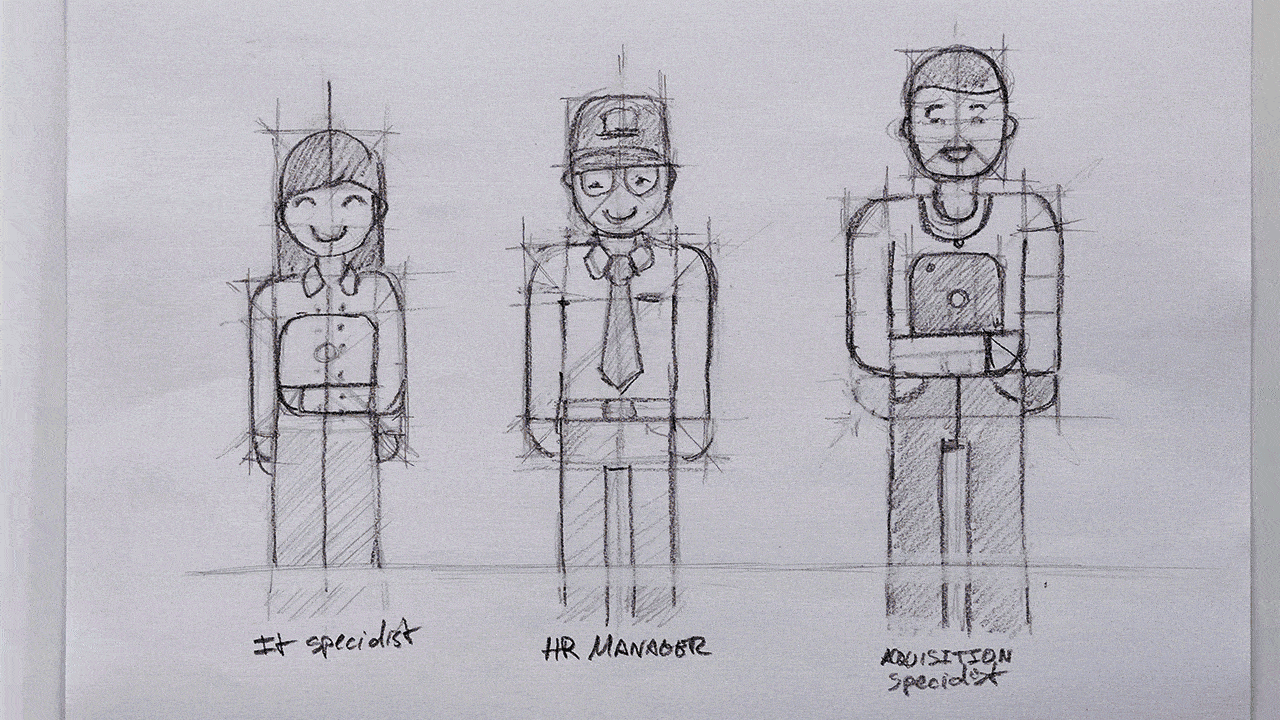
The first part of the process begins with the pencil. I draw a quick sketch with the composition of the main elements; with the help of a light table I repeat the sketch but this time stylizing the shapes; I repeat the process as many times as necessary until I am satisfied with the result. Then I scan the drawing and re-draw again the shapes using Adobe Illustrator, which gives me the versatility to edit and colorize for the final result.
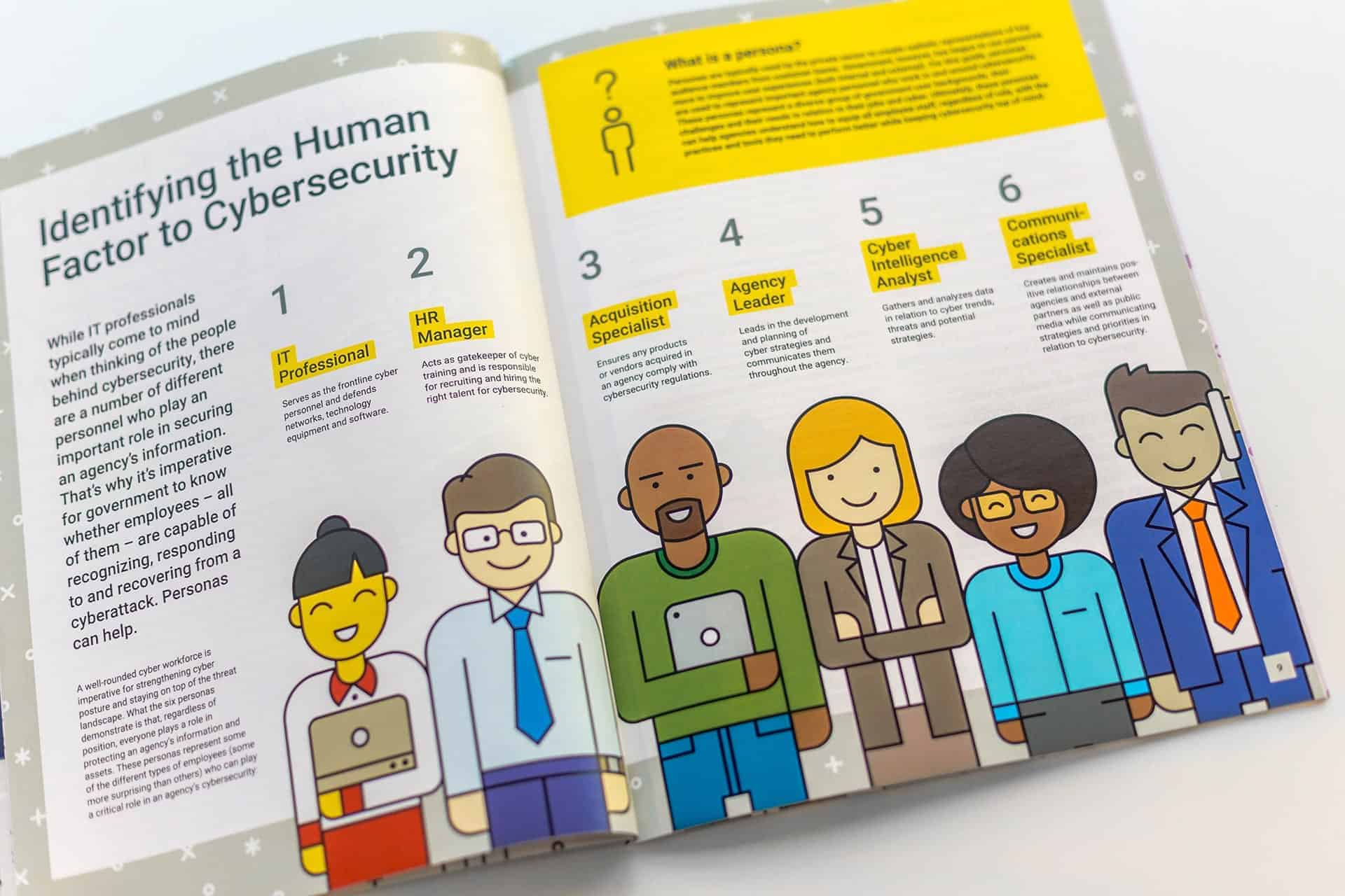

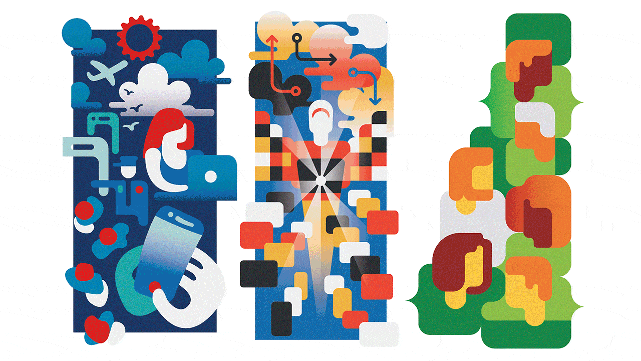
As a designer, I never forget the target audience for my work. I know that in general, people love figurative illustration with strong colors and contrast, so I strive to find a middle ground between pleasing the client, the audience and enjoying my work.
Each publication has a different style since I have as a rule to avoid as much as possible the repetition: this way each piece is unique and at the same time I never stop learning something new with each project.
https://www.behance.net/gallery/59882033/Editorial-Illustrations