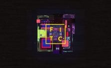
FITC Tokyo 2015 Titles by Michael Rigley

An incredible Glitch-inspired theme kickstarted FITC Tokyo 2015 conference. FITC stands for 'Future. Innovation. Technology. Creativity.' - four BIG words that portrays the essence of what the company and the events they hosted are all about. It aims to produce design and technology-focused events worldwide; to inspire, educate and challenge attendees. On its 6th year, FITC founder Shawn Pucknell reached out to Director Ash Thorp in late 2014, to create a set of posters for the event. This project is the first title sequence for the FITC Tokyo 2015.
Inspired by the foundation laid in the posters, Collective Podcast co-conspirator Andrew Hawryluk sought to take the project a step further and provide FITC Tokyo its first title sequence. Ash and Andrew brought me on in the early stages of the project to help with initial style frame design and later art direction and animation. The team quickly grew into a force of creatives, designers, typographers, animators and programmers spanning three countries and timezones.
- Michael Rigley
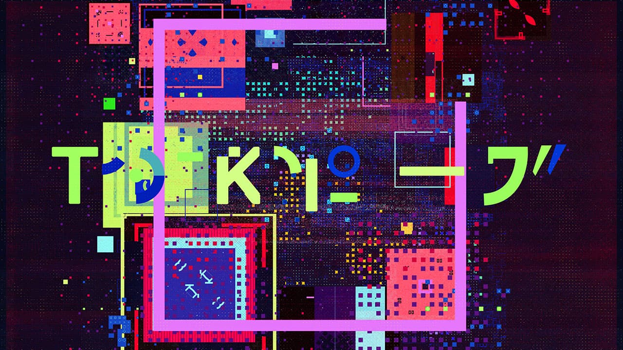
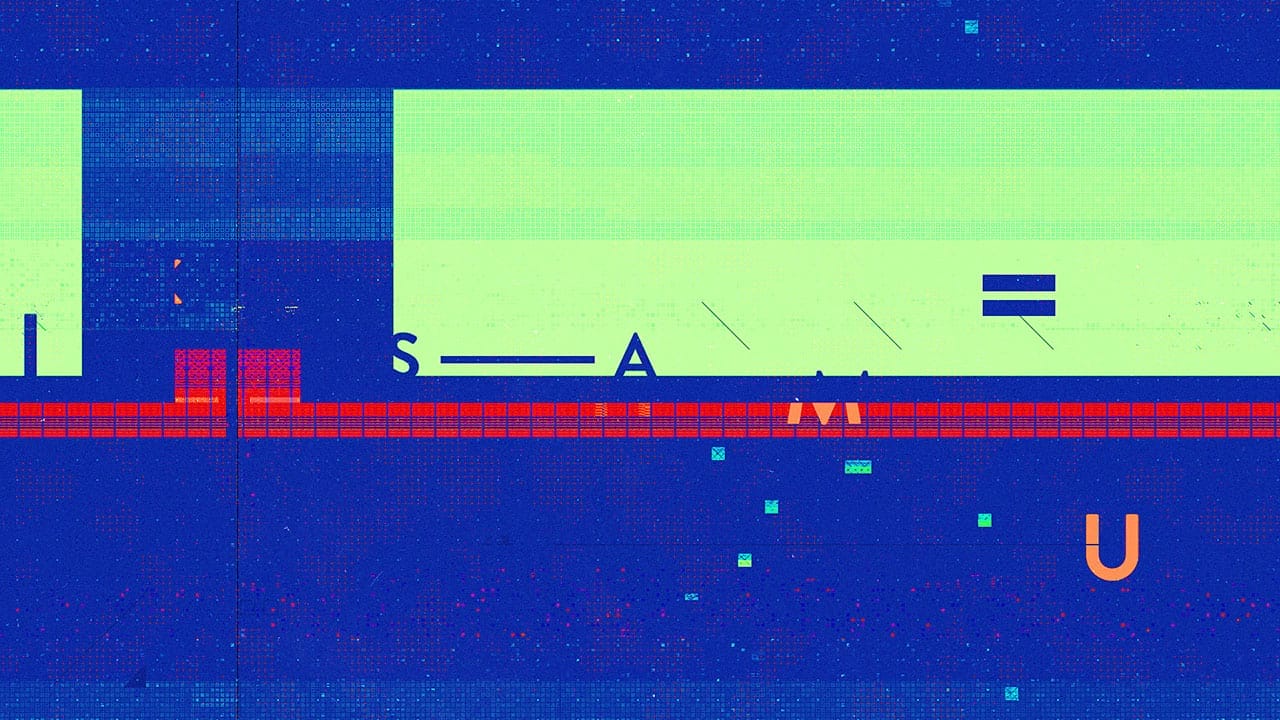
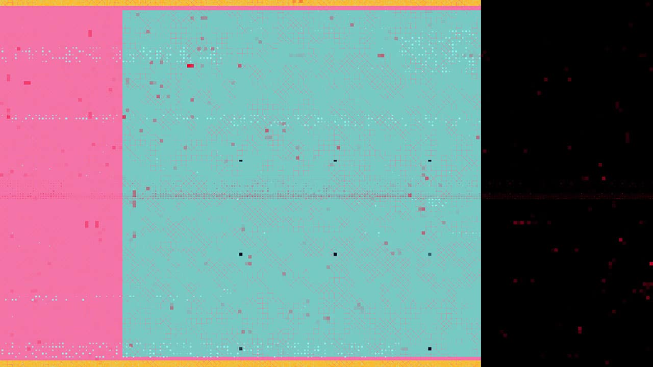
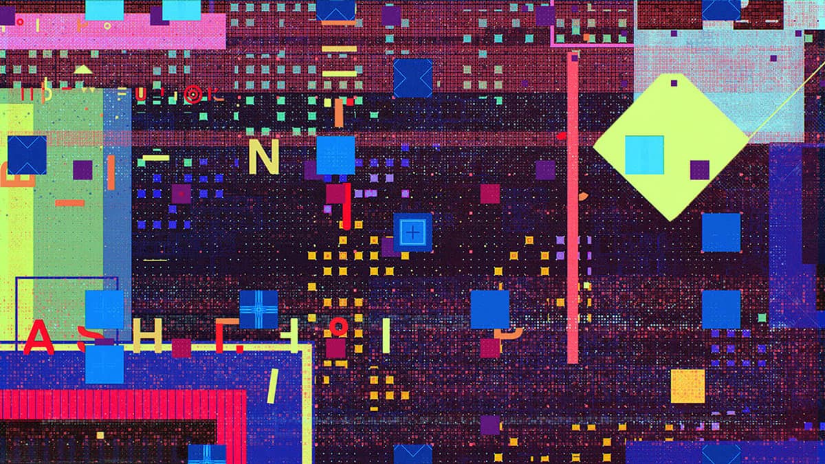
I was able to jump on design early in the process, helping to establish a style for the glitch elements/ textures, experimenting with symmetries and creating a stockpile of assets to design with. Ash’s design and direction provided a unique take on the style of glitch—pushing a harsh color palette, dominant typographic style, simple geometric shapes, dissolve gradients and various isometric elements.
- Michael Rigley
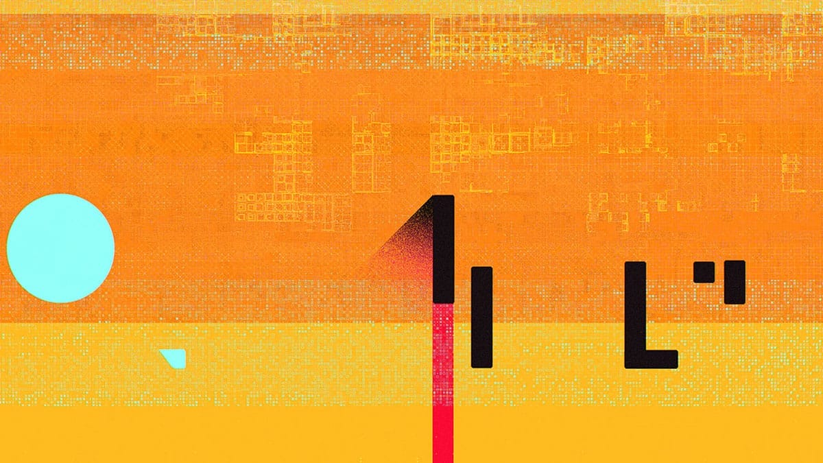
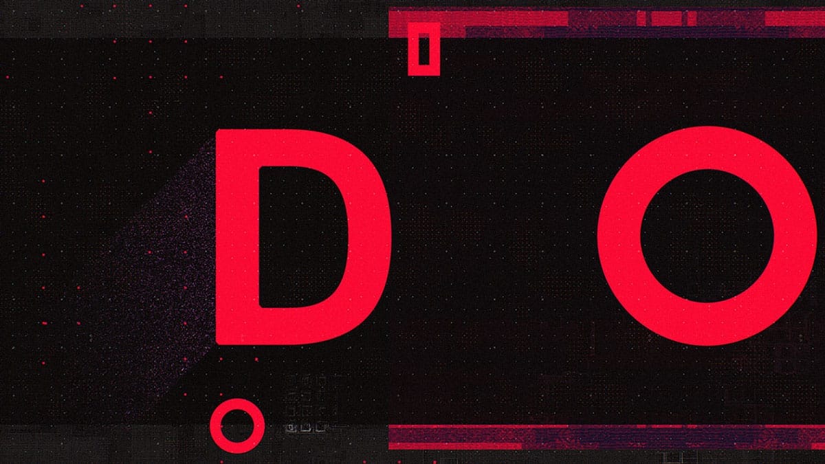
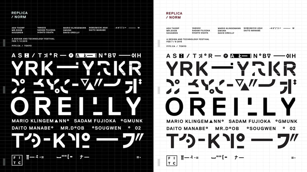
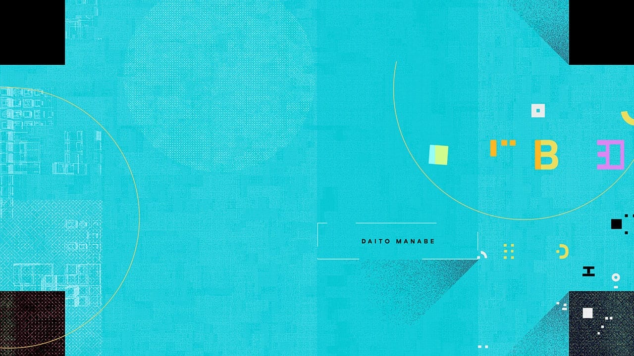
Type being one of the key components to this piece, we were in need of something special that could carry a lot of weight—able to be both abstract shapes that glitch and color fields could live on, as well as legible text for each speakers’ name. Master typographer and animator, Nicolas Girard, lead the way on font design. Expanding massively on the initial type direction set forth in the style frames, Nic crafted a custom font and glyph set based on Norm: Replica. By taking inspiration from the typographic forms of both Kanji and Norm: Replica he was able to generate a seemingly endless set of shapes for animation that could evolve from simple geometries to legible text without repetition. Armed with this set of glyphs, Nic and keyframe veteran Alasdair Willson animated the entirety of the type in the spot.
- Michael Rigley
The biggest part of producing the glitch effects was building up a massive library of textures and mattes that could be repurposed throughout the piece. The glitch we were aiming for was an editorial style glitch generated from cutting together a mass of simple graphic shapes and textures that together create more complex compositions. I lead the glitch animation effort with support from Andrew and later Chris Bjerre, who came on board to get us across the finish line. We would import Nic and Alasdair’s black and white text animations—cutting up, layering, coloring and stylizing them into nearly frame-by-frame compositions that would shift in tight sync with the audio.
- Michael Rigley

See the whole animated video of the project here.
Client: FITC
Director: Ash Thorp
Producer: Andrew Hawryluk
Art Director: Michael Rigley
Type Designer: Nicolas Girard
Designers: Ash Thorp, Michael Rigley, Nicolas Girard
Type Animators: Nicolas Girard, Alasdair Willson
Animators: Michael Rigley, Chris Bjerre, Andrew Hawryluk
Computational Artist: Albert Omoss
Process Reel Editor: Franck Deron
Composer: Pilotpriest
ABOUT MICHAEL RIGLEY
Michael Rigley is a Graphic Designer, Motion Graphics Designer and Art Director from Los Angeles, California. He developed a foundation in traditional and conceptual print design from California College of the Arts in San Francisco. While developing these skills, Michael discovered a passion for motion graphics and time-based media, teaching himself the tools along the way. Michael has been freelancing as a Motion Designer and Art Director for the last 4 years. During that time, he had worked with various studios on a range of projects from style frames and pitches to commercial graphics, live action shorts, concert visuals, UI design, feature FX design, brand films, web content and show opens. While maintaining a strong affinity for motion and animation, Michael is truly passionate about design and the development of visual languages, systems and style frames for production.
See more of his amazing artworks in Behance and his website.
superb work! Reminds me of Takuya Hosogane.
Neat! These designs are really interesting in that they are colorful and sort of crowded without seeming tacky or like they're too much. I like it a lot.
Awesome!